Finally, a proper iPad theme.
Those masochistic enough to read this blog on their iPhones have, for a long time now, been presented with a nice simple theme, devoid of the clutter in the desktop theme with its myriad of menus and dropdowns.
Well, finally, a like theme comes to iPad users, where at least you can make things out on the nice, large screen.
This is what iPad mavens have seen until now:
Not pretty.
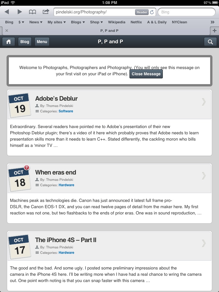
Fire it up on your iPad and you now see this.
Here’s the top of the menu:
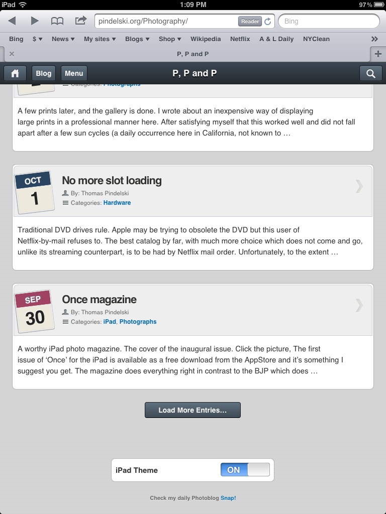
And here’s the bottom, allowing those who prefer pain to revert to the desktop theme:
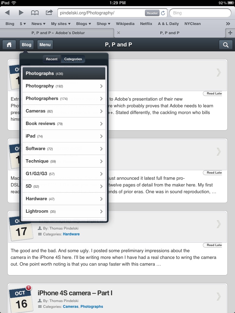
And if you want to access all the historical goodness, erudition and deep thought, you need only touch the ‘Blog’ button for the Categories dropdown:
Enjoy!
Nice theme!
It sort of works on Android tablets too. On my Asus Eee Transformer the menu entries are smaller than on the iPad.
You might want to get rid of the message box saying that you only see the message on the first visit on the iPad or iPhone. On the Android tablet you see it over and over again each time you hit the back button, it’s very confusing.
It’s a reminder to get an iPad! More seriously, the theme app used does not currently make provision for disabling that message.