Don’t forget to set these correctly.
One slightly frustrating thing about Lightroom’s menu structure is that preferred settings for how the application looks and behaves are all over the place. You would expect to see everything under Lightroom->Preferences, but that is far from the case. A last vestige of the truly frightful user interface enjoyed by Photoshop users for years.
I tend to prefer a really stripped down, minimalist look to the screen interface, opting for a minimum of distractions on the screen. Once you learn some of the most useful one-key short-cuts, then you will no longer need the top Apple menu or much of what clutters the side panels.
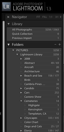
In the Develop module I right click on the left sidebar and choose to show only the Library and Folders. I have little use for Find, Collections, Keywords or Metadata Tags, so these are switched off. You cannot get rid of the Navigator selection at the top, but the very irritating flashing of the small picture preview as you go through pictures in the Grid view can be hidden by clicking on the small arrow to the left of the word ‘Navigator’. Because my photography is thematic, I do use Folders and sub-Folders named after the theme in question which, with my limited volume of pictures, works for me when trying to find something. Others will opt for keywording and dated folders. Here’s how my left panel looks in the Develop module:
The right panel is similarly stripped down – I have little use for Keywording or Metadata:
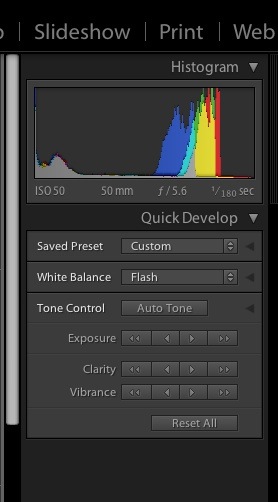
Like ‘switching’ can be accomplished in the other modules.
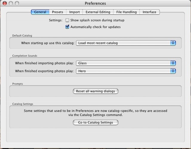
Much as I laud and respect the team which authored Lightroom, I do not need to be reminded of their names each time I boot the product, so I switch the display panel off by unchecking the first box under Lightroom->Preferences->General, like so:
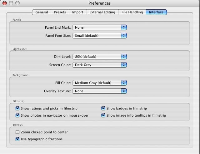
In Lightroom->Preferences->Interface I get rid of the bizarre antique ‘Panel End Mark’ which Lightroom shows by default at the base of each panel, thus:
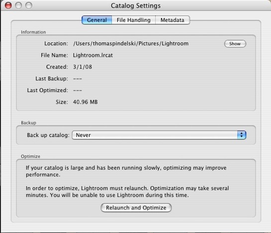
Now in File->Catalog Settings on the General tab, Lightroom comes with automatic file back-ups every thirty days switched on. First, 30 days makes no sense if you use the application more frequently. Your failing hard disk will not conveniently wait until your last back-up before blowing up. Second, if you are not making daily back-ups to a secure external drive, you are simply living dangerously. So I use SuperDuper! to make a daily bootable clone on an external Firewire disk and switch off this (now useless) choice, electing ‘Never’:
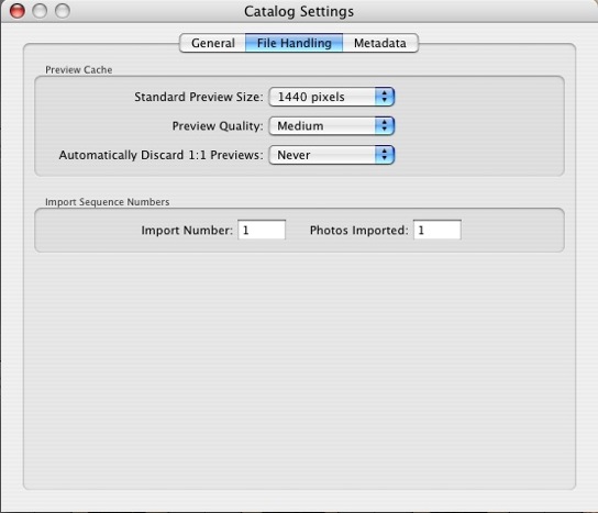
Still in the File->Catalog Settings menu choice in the Library (Grid) view, this time under the File Handling tab, Lightroom comes preset to discard 1:1 Previews after 30 days. Odd. It takes for ever to generate these when you import a lot of pictures and with the small increase in storage (my 40gB picture catalog creates a 6gB preview catalog) and given the vast increase in speed that 1:1 Previews add to the Develop process, you most certainly want to keep these. The third drop-down box is set to ‘Never’:
Next in File->Catalog Settings under the Metadata tab I leave the factory defaults for Metadata alone:
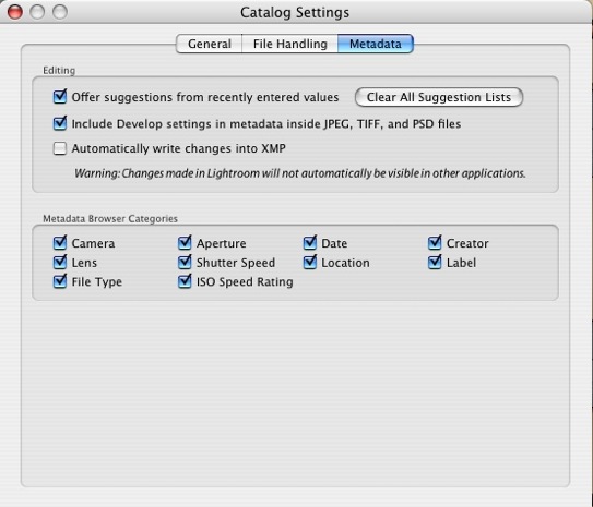
However, were I in the habit of frequent round trips to Photoshop and if I wanted my Lightroom edits to be automatically reflected in the Photoshop image, I would check the third box (‘Automatically write changes into XMP’) above. Otherwise, Photoshop will simply show the RAW unprocessed image in the database or the image as it was last saved. On those (rare) occasions where I do round trip to Photoshop I will do a file save (Command-S on a Mac) before round tripping, thus forcing Photoshop to show any Lightroom edits in its displayed image. If you check this box as a default, Lightroom will slow down as every change gets saved to disk. You don’t want that unless you are running on a Cray mainframe and work at Lawrence Livermore Labs. Meaning you have a super fast machine.
Finally, to get rid of the top white menu, I switch it off as explained here.
Now I have the lean and mean user interface I prefer.