A fascinating subject.
Some three years ago I wrote a brief piece on Aspect Ratios after acquiring my Panasonic LX-1 which came with a widescreen 16:9 picture option.
While 30 years with film Leicas has me pretty much convinced that 3:2 is the best for me (and that’s what I use most often on both the LX-1 and the G1; the 5D is, of course, 3:2, take it or leave it) a recent email from a reader got me thinking about the subject again.
Peter writes:
A subject that has annoyed me forever is the disconnect between common print and frame sizes and the aspect ratio of the most broadly used cameras.
The most common size for enlargements and frames is still 8×10. What percentage of photographers do you think are still using 4×5? How obscure is 11×14?
The move from 5×3.5 to 4×6 took hold just as digital was coming in at 4×3. And why 4×3? Because cathode ray tubes for TV were that size and could be used for early computers. As a fan of 16:9, I pretty much have to crop anything that needs to be printed.
Peter, by the way, typically views his digital pictures on a large screen LCD TV which, of course, is 16:9, consonant with the widescreen format used by most moviemakers today.
Rather than dwell on photographs, I thought it might be fun to pull twelve favorite paintings from memory and take a look at their aspect ratios, so here they are, in no particular order. These have been in my mind’s eye for, what, 45 years (I am 58)? With the sole exceptions of the Raphael and Uccello, both of which are carefully posed, all the others share an almost photographic snapshot vision, never more so than in the two Degas examples. No surprise, really, as that’s the way I tend to see things. To keep matters simple, I show the aspect ratios in the order longest side: shortest side, regardless whether the format is portrait or landscape:
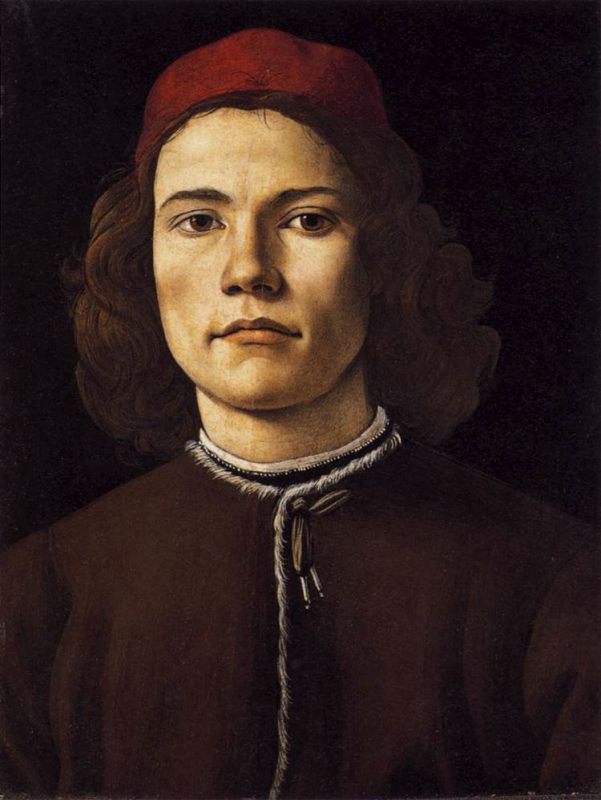
Botticelli – Portrait of a Young Man – 4:3
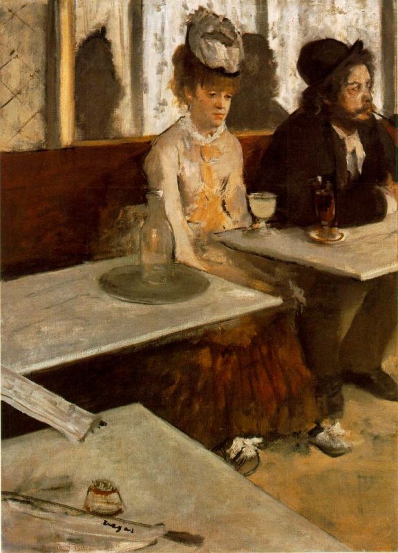
Degas – L’Absinthe – 4:3
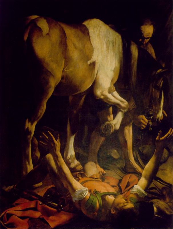
Caravaggio – The Conversion of St. Paul – 4:3
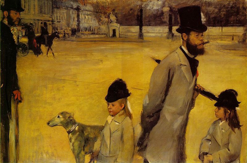
Degas – Place de la Concorde – 3:2
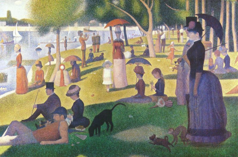
Seurat – La Grande Jatte – 3:2
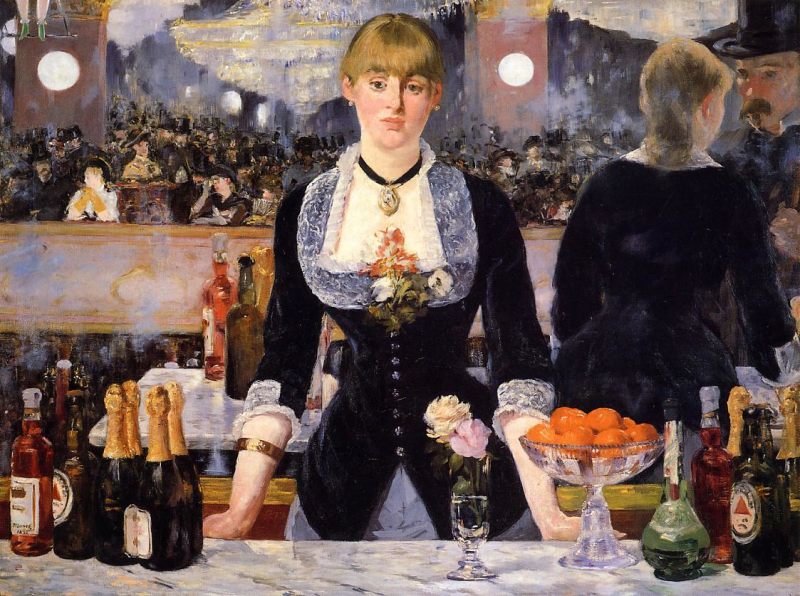
Manet – A Bar at the Folies-Bergere – 4:3
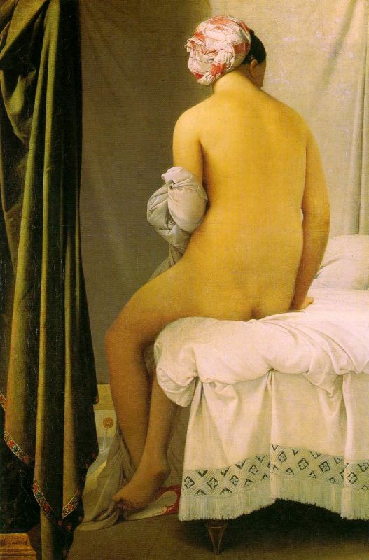
Ingres – Bather – 3:2
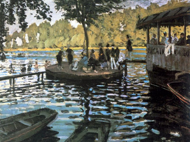
Monet – La Grenouillere – 4:3
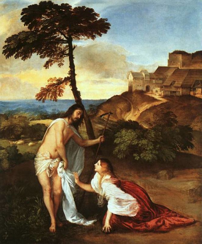
Titian – Noli Me Tangere – 5:4
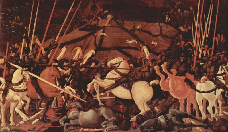
Uccello – The Battle of San Romano – 16:9
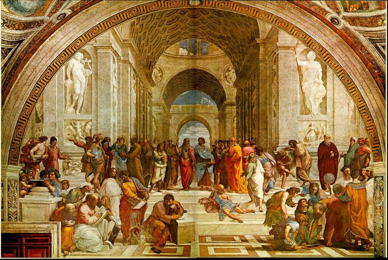
Raphael – The School of Athens – 3:2
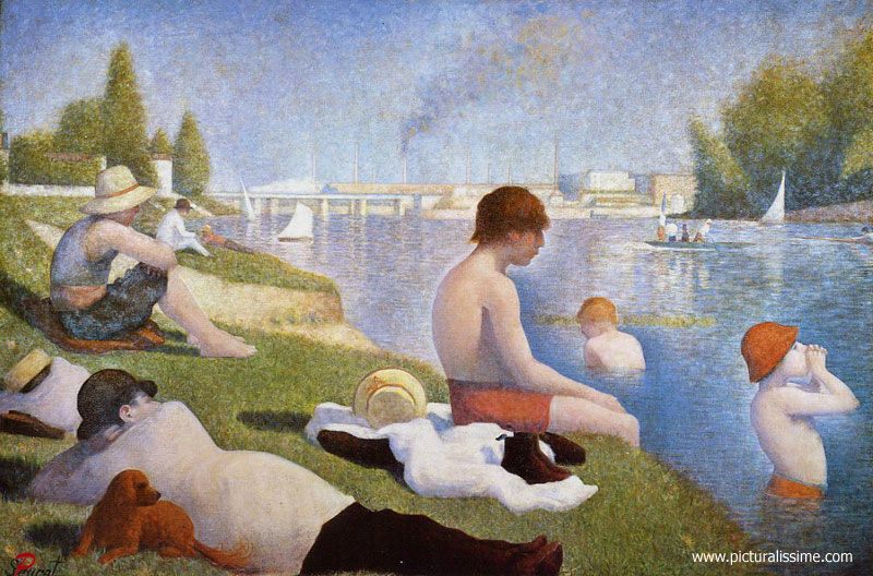
Seurat – Baignade – Asnieres – 3:2
I learned some interesting things from this little exercise. 4:3 and 3:2 dominate in my choices. Had you asked me what ratio Noli Me Tangere or La Grenouillere or The Bather or Baignade were, for example, I would have sworn up and down that they are 16:9 or even longer! Turns out nothing could be further from the truth. And, indeed, when you look at vast canvases like Uccello’s Battle of San Romano (Louvre, National Gallery, Uffizi) their unusually broad aspect ratio for the times – 16:9 and the only ‘widescreen’ painting here – is an awful lot to take in.
So maybe 16:9 is really largely a modern development, one of the movie age, because classical art uses it rarely. I realize that a dozen selections hardly constitute ‘Classical Art’ but I doubt you will find too many widescreen paintings ….
Thanks for those thoughts, Peter.
And as I’m dying to answer the question “Which of the above would you like on your wall at home?” let me say there’s no contest. By a huge margin it’s that magnificent Botticelli work at the beginning of this piece, prosaic as its 4:3 format may be. It’s in London’s National Gallery and once you enter the large gallery in which this very small painting is exhibited you will understand why.