It just works!
Feb 27, 2011 – cautionary update: Read the last part of this entry.
Unless xrite updates its EyeOne software to run on Intel Macs natively, your colorimeter will become useless junk, as the forthcoming version of OS X Lion will no longer support Rosetta, which is required to run the very dated current PPC version of xrite’s software. So if you use a Mac, until you hear that xrite has committed to updating its application for Intel Macs DO NOT BUY this device. Whether you like it or not, you will migrate to Lion sooner or later.
* * * * *
A while back I sold my Monaco Optix screen profiling colorimeter in dismay at its inability to properly profile my iMac’s screen for good color matching with prints from the HP DesignJet 90 large format printer. Further, I have abandoned my 24″ iMac which was on the verge of failure, replacing it with a MacPro and two Dell 2209WA monitors with far better adjustment controls.
Since then I have profiled by eye but it’s been a bit of a hit and miss affair, and gets pretty tedious after a while. Monitors drift over time so they need to be re-profiled occasionally.
After some online research, the decision to get a new colorimeter came down to the Pantone Huey Pro ($80 at Amazon) or the much costlier X-Rite Eye One Display 2 ($201). My ill fated Monaco Optix and both these two devices are made by the same company – X-Rite – which makes a host of other color measurement and profiling tools.
Three things pointed me to the X-Rite device – one was the excellent review at TFT Central; the second was the fact that Martin Evening, whose book on Lightroom I strongly recommend, uses one. And, finally, the Huey Pro has so many simply awful reviews on Amazon that I decided that life wasn’t worth the aggravation of saving $120 for a compromised device.
Once you migrate to two displays as I have, you will quickly find that any difference in color rendering between the two will drive you up the wall. A professional quality colorimeter is the answer. Before starting profiling, turn off any screen saver to avoid having it kick in part way through the process.
The software, which comes on a CD, installed quickly on my MacPro and for the first pass I used the quick method which does not permit user adjustments of display contrast, brightness and the red, green and blue channels. While the printed instructions are cursory in the extreme, the on screen guide provided by the software was all I needed – I’m running this with Snow Leopard 10.6.1. I use two Dell 2209WA displays which have a broad range of user adjustments but I thought it would be interesting to try the ‘quick and dirty’ approach first, my manual efforts having failed to provide a half decent match between the colors rendered by the two monitors.
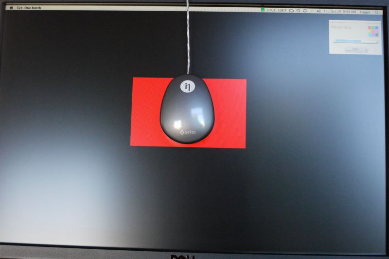
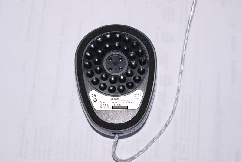
The software installs quickly and instructs you to place the puck, with its suction cups, on the display. As the thought of suctioning anything to the delicate surface of an LCD display fills me with terror, I simply angled the display back a few degrees and let gravity take its course, like so:

Eye One Colorimeter puck in place

Suction cups you definitely do not want to use on your LCD panel.
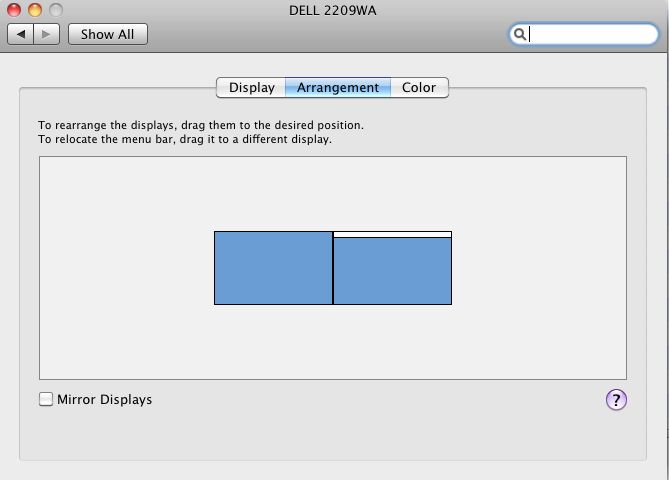
To force the software to read the left or right display you have two choices. The first, which is dead wrong, is to switch the cables plugged into your graphics card. It’s wrong because you are assuming that the profiles of the two outlets are identical, which is impossible given normal manufacturing tolerances. The right way to do this is to go to System Preferences->Displays->Arrangement and drag the menu bar to the display you wish the software to profile. It will appear on the display to which you have dragged the menu bar.

System Preferences->Displays->Arrangement. In this example, with the white menu bar dragged to the right, the right hand monitor will run the X-Rite software for profiling. To profile the left monitor, drag the white bar to the left.
From starting the process through generation of the display profile took all of 5 minutes on my first monitor using the basic method, though I did take the precaution of turning the displays on some 30 minutes ahead of time to allow them to stabilize. The Dell 2209WA seems particularly poor in this regard and needs quite a while to stabilize. I profiled the second screen in under 4 minutes.
The software can send you a periodic profiling reminder – the choices are none, 1, 2, 3, or 4 weeks. This makes sense as all monitors drift with age. I set mine for four weeks – whether that is often enough time will tell. Click here for the first four week update.
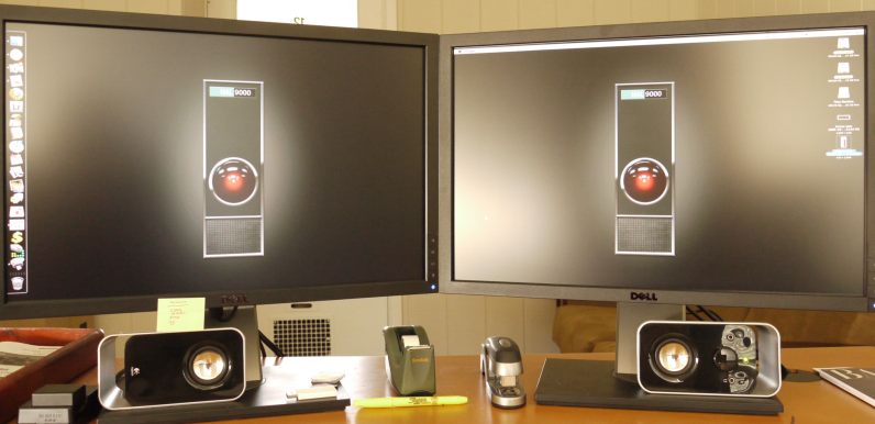
Here’s a photo of the two displays side by side after calibration – close, but you can see the difference. Having made a note of the names assigned by Eye One to the two profiles, I went to System Preferences->Displays and selected the appropriate one for each display. OS X does a really nice job of supporting dual displays and presents the user with a profile chooser for each.

Two profiles selected – one for each display
This first quick pass was very encouraging and presented a closer match between the two displays than I had managed with any amount of manual effort with those frustrating front panel switches. The quickest way to gauge the accuracy of the match is to drag a photograph with flesh tones of someone you know so that it splits across both displays. All I had to do was reduce the brightness on one display a tad and the match was fairly close, and certainly better than I had managed trying to do this by eye.
So now, getting ambitious, I decided to try the Advanced mode, as used by Martin Evening and explained in his book on pages 230-233. This requires the user to adjust Contrast, Brightness and Red/Green/Blue during the calibration process – options largely unavailable to buyers of Apple’s displays, whose LCD panels are made by the same company making Dell’s – LG Electronics in Taiwan. Apple Cinema displays (and all their other computers with built in displays) only allow the adjustment of Brightness.
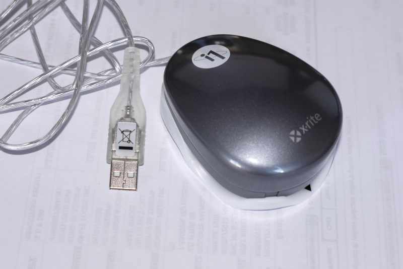
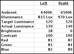
The Eye One comes with an Ambient Light Attachment which clips on the base of the Eye One and measures the light falling on the screen – mine measured at 6500K and 970 Lux on the right display – I work in a bright room by noon light. The clips on mine were far too tight but a few moments with a fine file applied to the attachment’s three retaining tabs fixed that. My left monitor, which is slightly more shaded, came in at 6400K and 815 Lux. The Ambient Light Attachment, if left in place, has the additional advantage of protecting the device’s sensors when the colorimeter is stored in your desk drawer. Reusing the maker’s packaging is anything but easy and, in the event, unnecessary.

Eye-One with Ambient Light Attachment in place.
The Advanced mode takes full advantage of the Contrast, Brightness and RGB controls on the Dell. The process takes 20 minutes per display and here are my results:

Dell 2209WA settings after Advanced calibration

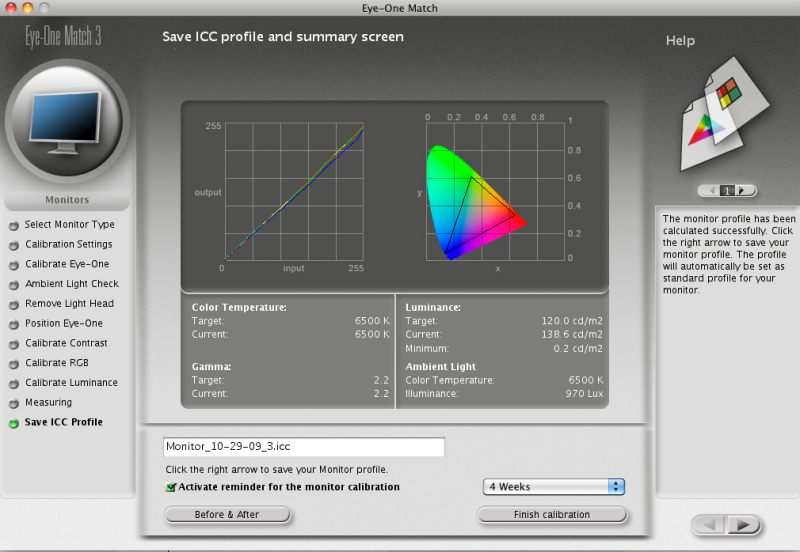
The Xrite result after profiling using the Advanced method
A couple of points. As you can see there are significant differences between my two Dell 2209WA displays, both bought at about the same time. The Right one had to have Brightness reduced to 0 and I still could only get Actual Luminance down to 140.3 – Martin Evening states that that is the maximum you would ordinarily use for an LCD display. My Right display is visibly brighter for a given Brightness setting than the left – witness that the Left display is set to 18 versus 0 for the Right. Gamma is set at 2.2, which is the PC standard. If you use the Apple standard of 1.8 your pictures will look too dark on 95% of the world’s computers, all of which run Windows and use 2.2. Finally the lowest luminance of 0.2 speaks to the outstanding rendering of blacks by the Dell monitor.
In practice, because I like a really bright display (my eyesight is not the greatest) I simply increased the Brightness on both monitors by 30 to 48 and 30, respectively, from 18 and 0. That works for me and the color match is unaffected. If my ambient lighting were dimmer I would simply turn brightness down on both displays.
The Contrast setting of 100 for both places the calibrator dead center to where the software dictates.
Color variations are low (look at the R, G and B settings) but noticeable if not adjusted, and can be fine tuned with exquisite accuracy using the X-Rite software and Dell controls, which make a just a wonderful combination in this regard. My Eye One software version is 3.6.1 – Martin Evening used 3.6.2. The current version is 3.6.3 and claims Snow Leopard compatibility, though I have had no issues using 3.6.1 with Snow Leopard version 10.6.1. I have also downloaded 3.6.3 from X-Rite (who may well have the world’s slowest file server – it takes ages to download) and it works every bit as well, but seems no different.
So how do the two displays compare after calibration using the Advanced method?
Absolutely dead on identical to my eyes. Well worth the additional effort involved using the Advanced method. This is money very well spent.
Users who are in the habit of processing and printing their pictures under various light conditions (say by noon daylight and by incandescent light in the evenings) may like to generate display profiles for each set of lighting conditions. This will be important for the best print/screen matching. In this case, the Brightness, Contrast and RGB settings for each lighting condition should be noted and input when profiles are switched in System Preferences->Displays->Color.
I have lost count of the number of times that I have read ‘experts’ pontificate how you should always look at your prints in 6500K light and how your work room should emulate that color temperature with special light bulbs. This, of course, is pure nonsense. If color fidelity is your goal, you must adjust for the light conditions in which the print will be viewed. So if your client proposes to view your artwork by incandescent room lighting, that’s what you should print for. Period.
In Part II I will take a look at how the display profiles match up with printed output from my HP DesignJet 90 large format dye ink printer.
Meanwhile, based on this first experience, the X-Rite Eye One Display 2 (which could use a simpler name) is highly recommended and for those wanting the broadest range of adjustments I strongly advise against buying Apple’s overpriced Cinema Displays, only one of which, the ridiculously costly 30″ model, comes with a matte screen. Any photographer interested in proper color profiling using a glossy screen for processing is simply wasting his time.
As for the 22″ Dell 2209WA, this has to be one of the greatest bargains on the planet – an IPS matte screen for under $300, including a three year Dell warranty which provides for delivery of a replacement before the user has to ship his faulty monitor back. No need to blow more money on the insurance scam known as AppleCare. You can buy two of these Dells and still have $300 left over for a professional colorimeter and a top class meal, had you purchased one of Apple’s 24″ versions with the mirror-like surface which will reflect your ego, if not your work.
Apple’s screens are intended to do but one thing – scream “Buy Me” at you in the store where, like that cranked up stereo system with the big bass in the music showroom, they seem so much better than anything else. (“Gee, Mabel, that iMac screen sure was impressive in the Apple Store. It just jumped out at you, didn’t it?”). Of course, once you actually start using the equipment and the headaches begin, things are a bit different ….
In his book, Martin Evening states (p. 229) “…. it is possible to buy a good colorimeter for under $250 …. and when you consider how much you might be prepared to spend on camera lenses, it really is not worth spending any less than $1,000 on the combination of good-quality display plus calibration package.” Prices have dropped since Evening wrote that and the Dell 2209WA, as the cheapest IPS panel on the market, now makes it possible to spend just $800, for which you get not one but two displays and a crackerjack colorimeter (the same he uses) into the bargain.
Follow up: Someone at EyeOne, ever grateful for free publicity, has seen fit to reference my review on their US home page for the device. Setting aside the fact that they got the URL wrong, the reader should be assured that there is no gain of any sort for me in this sort of thing.

Feel free to refer to my Code of Ethics to see what I am talking about. It will be a desperate day indeed which sees me trying to make chump change from my hobby of photography.


