Good and improving.
Yesterday I looked at hardware issues relating to the iPad.
Today it’s Software.
Software:
The best way to introduce this piece is to show what’s on my iPad’s Home screen. I’m reproducing this real size so you can get a sense of that gorgeous display.
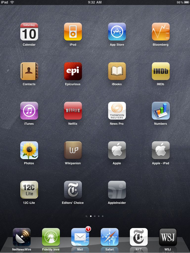
I always keep one spot open to make it easier to add/move apps. The dock holds the maximum of six apps and these are the ones I use most.
As you can see, for the most part it’s all business, entertainment being limited to iPod (music), iBooks (because it’s so out of sight good), Epicurious (I like to cook), IMDb (I’m a movie buff) and Netflix (just simply superb and something that good deserves a spot on the home screen). The rest has all to do with making money in the markets which is what I do for a living.
But what’s more important is what you do not see here and that is MobileMe. MM allows me to keep my desktop, iPhone and iPad in sync as regards Email, Contacts and Addresses and also provides cloud storage for moving files. While I do have the iDisk app on another page it’s still a work in progress as the iPad cannot open password protected spreadsheets I store there in Numbers. To do that I have to drop the spreadsheet on iTunes on my desktop then sync, whereupon it can be opened on the iPad with full password protection. I am not about to trust Apple (or any corporation, for that matter) with unprotected files wherein reside my crown jewels. I’m confident Apple will fix this oversight which will add a lot of power to Numbers, Pages and Keynote on the iPad.
The main alternative to MM is Google’s suite (mess?) of free applications. Anyone familiar with the user interface of those will realize that it compares unfavorably to Soviet era cameras for finish and polish. If you must use them, have at it, but I prefer cotton shirts to polyester with my Armani suits. And I trust a company which may be bound in a culture of theft even less than I trust one run by P T Barnum’s modern day version. You really think GOOG is Doing No Evil while it analyzes your usage patterns to better target you with advertising?
iPhoto is right now more business than pleasure for me. Getting a screenshot of a news story to a colleague for debate dictates holding the Home key, touching the on/off switch – which places the screenshot in iPhoto – then emailing the story from iPhoto. It’s far faster than it sounds and some time soon we will get screenshot apps which do this without iPhoto. I say ‘more business than pleasure’ as there are no processing controls in iPad’s iPhoto. At the end of the month I will receive the camera connection kit and will say more later. Still, this is version 1.0.
Numbers is a work in progress. I thought I would stress test it by importing a large spreadsheet with many formulae and lookup tables to see how it would cope. Here’s the warning message I received:
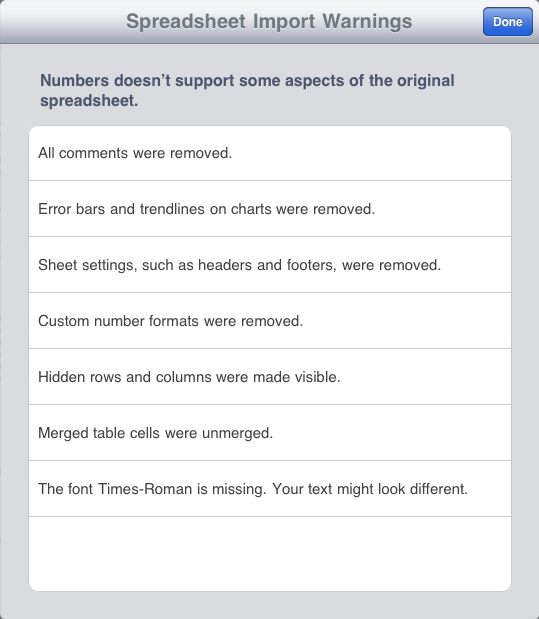
Not great. All the formulae worked fine but some of these errors – like the loss of Comments, headers (makes scrolling tough) and trendlines on charts make it of limited use for a money manager right now. Also lots of the row heights were wrong and too small, truncating data, and proved a pig to fix. Then next time you import it’s all wrong again. My major concern is that improvements will be slow (it took Numbers on the desktop two iterations just to get password protection ….) given Apple’s default assumption that most of its users are number blind. They prefer to focus on glamour and glitz in their apps, not hard core reality.
So where is the ROI with the iPad? Simple. Just look in the dock. NetNewsWire is the best RSS feed reader there is and totally explains the meaning of the mantra that has it that Information is Power. It pays for itself many times daily and I hope the authors make tons of money from it. They deserve to, after having given away the iPhone and desktop version for years. It syncs in background mode to all your devices using a Gmail account and works perfectly. Fidelity Investments speaks for itself. My clients and I have been with them for decades, I detest their lack of integrity (but at least I know where I stand) and they have the best execution in the retail business, even if their user interface sucks. Meh, I’m used to it by now and I get the satisfaction of calling them and proffering gratuitous abuse now and then. It’s innocent fun, and a great stress reliever after a visit to, say, an organization staffed solely by morons, like California’s DMV.
It’s hard to see how Mail and Safari can be improved on. If anything, Mobile Mail is even better than the desktop variant, and to all those complainers who say that the iPad/iPhone still lacks a unified mailbox for all your emails (coming to the iPad in the fall), all I can say is you are not thinking. Simply have all your other providers forward email to MobileMe and have the forwarded email automatically deleted from the providers’ servers. Then you only need setup Mobile Me on all your devices. Hey! Presto – a unified mailbox. MM is the single best thing you can buy for your connected devices. Further, once true multitasking and app switching come to the iPad with OS 4.0 in the fall, things will be even sweeter. Right now it’s a bit of a pain to interrupt reading to answer an email.
What’s that you say? MobileMe is just another annuity for Apple and a cost for me? Jeez, get real. Every company wants income annuities and that’s the ones you should be investing in. Suck it in and buy some stock in those. To make money you first have to spend it.
One important thing I have learned is that the three iPad apps for Thomson/Reuters, NYT Editors’ Choice and WSJ all cache content. So fire them up before leaving for a non-wifi location and when you get there you can happily read the news from locally stored content without wifi. The snag here is that NYT has yet to offer an app for all of its paper (what do you expect from the bunch of fools running that paper – they give content away free for heaven’s sake. Way to run a business.) WSJ has small pop up ads at the base of some screens but they are inoffensive and go away after a few seconds. WSJ is slow to load – 30 seconds – but the upside of that is that it caches a lot of content to take with you. If you want to access both WSJ.com and the iPad version, you need two subscriptions. You may accuse Murdoch of cheapening everything he touches (have you checked that parrot cage liner once known as The Times of London recently?), but the guy knows how to make money. Which beats the alternative.
Finally, for those of you into financial math with an engineer’s education (like me!) who love Reverse Polish Notation calculators (figures something so odd would be named after Polacks and as I am one, I should know), here’s the HP12C writ large:
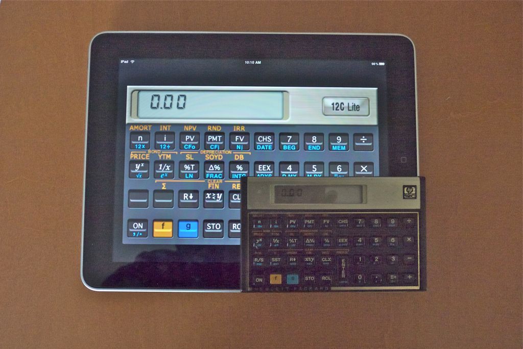
Finally proper sized keys. And no waiting for an answer to a complex calculation. And the iPad is thinner! So there. And be honest. Which would you rather use?
Challenges:
The major hiccup in the iPad’s interface is the challenge of moving data to and from it. There is no Finder like the one you get with desktop OS X. You can bet that when Apple solves that issue it will be done right.
- Most data can be moved to or from the iPad using iTunes. One more step in the process as you have to sync and over-the-air sync is not yet available. That includes Apps, Music, Movies, TV Shows, Podcasts (useful business and photography information there), iTunesU (very interesting for people with an IQ in three digits), Books and Photos.
- Email is a direct interface and screenshots are sent through iPhoto for now.
- There is no native printing function (doubtless coming with OS 4.0 in the fall) and the one app I have tried to work around this, named Print Magic, is indistinguishable from a bilge pump. Both suck.
- Heavy typing dictates use of a keyboard and my Apple aluminum bluetooth one works fine, or you can get the dockable one, but having to input some commands by touch is a PITA. For now, until a more versatile keyboard comes along, use a desktop or laptop for heavy typing.
- Apps can be downloaded to iTunes on your desktop and syncd or downloaded directly to the iPad, just as with the iPhone, then syncd back to the desktop for backup. Nice. Too bad the App Store is so awfully organized. How can I search for new apps when I don’t know what they are named?
- Games? I don’t play games. Our eight year old does and the look on his face, plus the difficulty I have extricating the ipad from his hands, suggests it’s a winner in this genre. Maybe I need to buy a third? His, her’s and the boy’s. Yes, I definitely need a third. Maybe the 3G version.
Stability: I have had to reboot (hold the Home and On/Off switches down for a few seconds) just once during this first week of very heavy use. Use included downloading many apps, much app switching, hundreds of emails in and out, lots of Safari searches, movie, photo, music and book downloads, hundreds of RSS downloads and, of course, a real pounding from our 8 year old playing several different CPU-intensive games. That was necessitated by the WSJ, of all things. They released a bug fix for their app during the week and the new version refused to recognize my account. A reboot cured that. In other words, the device is a model of stability, much as I expected after three years’ experience with the iPhone and comparable with – maybe even more stable than – the desktop version of Snow Leopard.
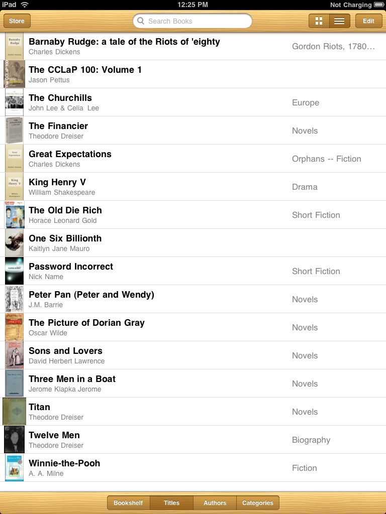
Free books: There are many sites offering tens of thousands of free books in the ePub format used by the iPad. Two favorites are Project Gutenberg and Feedbooks, the latter even coming over with cover art. Download these to your desktop as there is no direct download to the iPad yet, though Apple has promised one.The ones from Project Gutenberg come with numbers for file names so re-title them before uploading to the iPad. To upload, drag and drop them on iTunes->Books then do a sync.
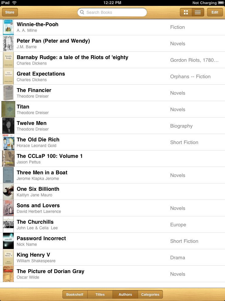
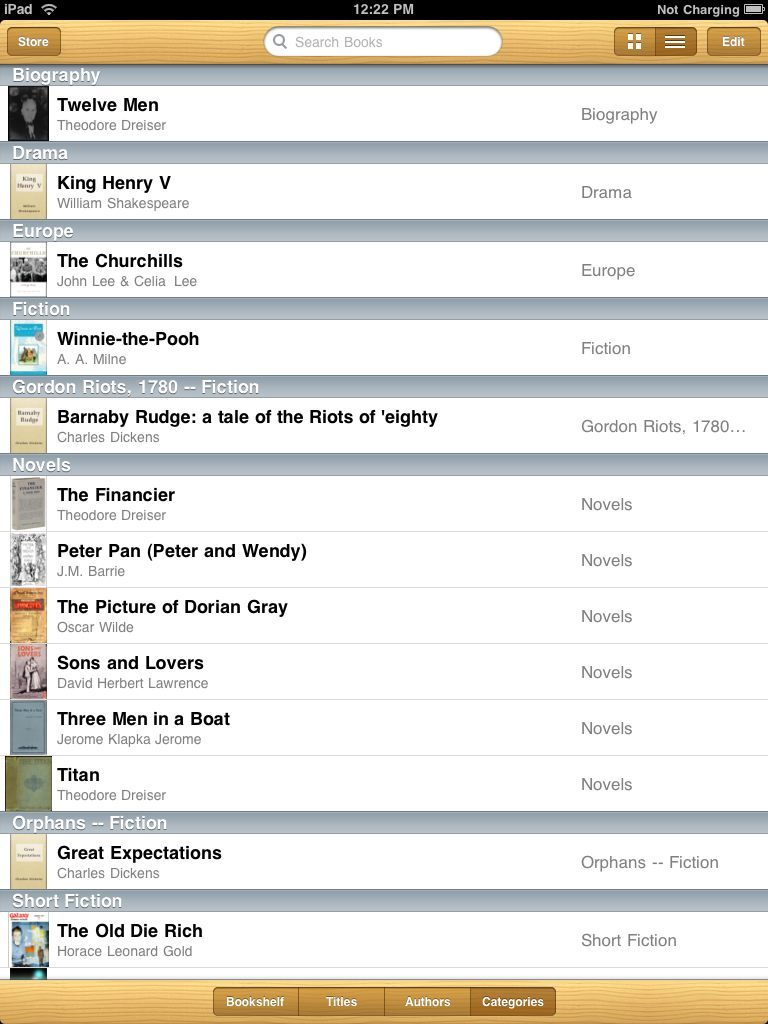
Here’s how my iPad iBooks screen looks:
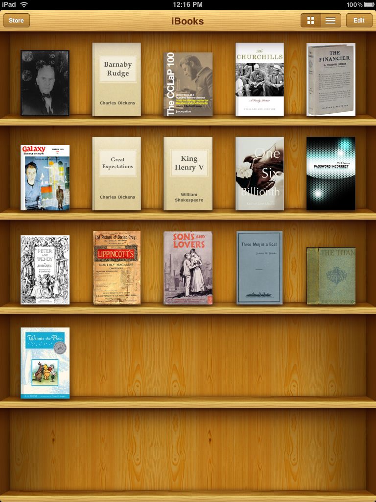
The Churchill book was purchased, Winnie-the-Pooh comes with every US iPad and the rest are free. Plain covers are from Project Gutenberg.
I have read using the iPad for 2 hours at a time with no fatigue. It’s nice that you can adjust font size and type and screen brightness to get things just so. I find I prefer landscape orientation with the iPad for a traditional two page book layout. You know, like they used to make out of trees in the dark ages.
There are three other Library formats:
Titles:
Authors:
Categories:
Bottom line: I would hate to be running a Redmond, WA laundry right now, for they must all be overwhelmed with soiled underwear.