Why are so few beautiful?
A friend kindly emailed me to alert me that a web chat board was offering a camera as a prize for the best picture taken in the style of Henri Cartier-Bresson. A worthy goal which will doubtless see some great work submitted.
Then I got to looking at the prize and was struck by how inexcusably ugly it was. Going by the name of the Zeiss Ikon ZM, there is no other way to describe this brick than in one simple word whose meaning needs no explanation: Ugly. I was going to preface the U word with a vulgarity describing part of the anatomy, the bit you sit on, but good taste prevailed. You get the idea.
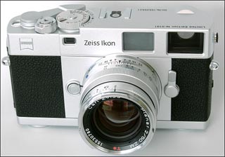
Equipment, it seems to me, is merely a tool to do the job, so dwelling on it to excess is not productive. But this kind gesture on my friend’s part, who suggested I should submit some of my street snaps to the contest, got me thinking about the aesthetics of equipment, or more specifically, why so little in the way of camera gear is remotely attractive to look at.
So, like most photographers, I thought about the equipment I have owned, have borrowed and have lusted after. And in the interests of keeping this piece upbeat, I will concentrate on the cameras my eye remembers as beautiful, a work of art to hold and use, rather than all the others. And that is important to me. The old saw that has it that a poor worker blames his tools has it all wrong. It should be that a good worker uses beautiful tools. You think Michelangelo and his buddies didn’t discuss paints, brushes and canvases? Sure they did.
So I won’t refer to the brutish ugliness of the Nikon F, nor the brick like facade of the Mamiya RB67, nor even the Leicaflex SL – a face only a parent could love – in this brief Statement of Preferences. And I will most certainly not refer to the Kodak Ektra.
The post-WWII list is, sadly, a short one.
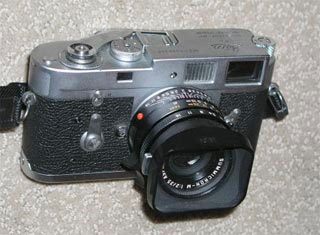
Headed, of course, by the chrome Leica M2. The most perfect blend of form and function ever designed. Color it black and you have nouveau riche – the young up-and-comer’s Porsche 911. Make it chrome and….aaahhh! Yes, this one is mine. With the wonderful 35mm Asph Summicron, no less.
But before that exemplar of taste and execution came along there was something equally fine to be had in the Zeiss Ikon Contax II and IIa. Forget the metered version with the ugly bump for the selenium cell meter. The un-metered camera was simply beautiful and aeons ahead of the cheesy looking screw thread Leicas of the time with their miserable viewfinders. A top hat compared to a cloth cap. Note the beautiful symmetry of the finder windows and the knobs, the gorgeous proportions of the body. You just must pick it up.

No Rolleiflex twin lens reflex can be left out of this reckoning with, perhaps the metered 3.5F at the pinnacle, the lens being just the right size for the body, something lost in the 2.8 variant. This one was mine until I gave it to a friend.
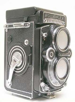
Whether it was because so many of the greats used it – Avedon, Penn, Beaton – or whether it had that secret something, call it balance, proportion, despite the rectangular shape, the Rollei is a beautiful camera.
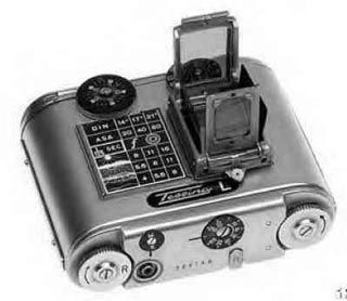
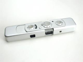
Some miniature format cameras had that something called beauty too. Two of the best were the Tessina and the Minox. Regardless of their clandestine Cold War role in life, these two, especially the watch like Minox, had the secret ingredient. Have you ever opened a Minox for action? Try it. Sensuality redefined.
At the other end of the size spectrum, Linhof had what no American manufacturer could approach. A divine aesthetic sense. I won’t say anything about the Crown Graphic (heck! I own one) but just feast your eyes on this Super Technika.
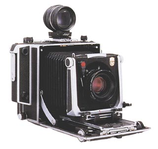
Aaah!
Now that is a camera.
Now there’s a lot of German equipment permeating this piece. A nation that makes fine cameras and killing machines. But its eastern emulator, Japan, has had some pretty fine things to contribute to camera aesthetics too.
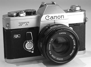
Take the fine line of early Canon SLRs. This is an FT. Note the finely sculpted controls and the general balance of the machine.
Olympus made a fine effort with the Pen F and even the bold gothic letter “F” seems to work well for this courageous, innovative design. A camera with a sweet, feminine grace, with a bold escutcheon. I loved mine. Wish I had never sold it.
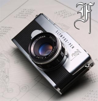
They tried later to recapture the spirit of the Pen F with the OM1 but the magic spark was, alas, gone.
Then two really great Japanese designs come to mind. One very good – the Pentax MV/ME. Another camera with jeweled precision and an absolute joy to use. My ME Super fell apart but not before we had had the most wonderful relationship.
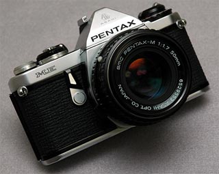
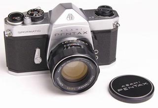
But their earlier Pentax Spotmatic was, after all, an impossible act to follow. Here was a camera that was a joy to behold. To hold. To use. Forget all that nonsense you read about the Japanese being imitators. Just take a glance at the raw sensuality of the advance lever. The most beautiful thing to ever grace a mass produced object. And note those angled “Zeiss” corners. The sincerest form of flattery is imitation. This was something that you would think should have set an example for the designers of the miserable looking Zeiss Ikon ZM, that execrable excresence passing for a camera. An example of which, sadly, they seem damnable unaware. As unaware as they are of their company’s glorious history of design.
