How does the Canon EOS 5D measure up? Mostly ramblings on ergonomics.
A couple of columns back I mentioned how bulky the Canon EOS 5D felt, compared with that svelte street fighter, the Leica M. Why, even compared to a medium format Mamiya 6 rangefinder, it still feels bulky. This bulk is a mixture of the Large Amorphous Blob school of body styling, compounded by the sheer bigness of the 24-105 mm ‘L’ lens. Not much one can do about that, but I did get rid of the worthless lens hood which made a dramatic difference, not to mention that you can now take the lens off and stand it on end without fear of expensive crashing sounds.
So how does it feel from a quality perspective? First, it’s clearly well put together. No, not Leica engineered, bespoke, hand fitted, quality. More Lexus mass produced but with great quality control sort of thing. Seams are as parallel as on any Toyota. Wonder what I mean? Next time you are following a Detroit product in traffic, just glance at the seam between trunk lid and body. See? The eye is very sensitive about parallelism, which is why we notice the products of Detroit’s union labor as quickly as we spot a crooked horizon.
Most importantly, Canon got the texture of the body covering right. Now the Rollei 6000 series of medium format cameras use a wonderful, high tech diamond textured body covering. It looks great but makes no difference as no part of your hand ever comes in contact with it. You use a pistol grip in the right hand and the left cradles and focuses the lens. So body covering has no tactile bearing on the equation. The Mamiya 6, by contrast, like any rangefinder camera, is made to be solidly grasped with the right hand, with the left optionally on the body or under the lens. So quite why Mamiya felt obliged to cover their very well thought out camera with a covering which feels like nothing so much as wet kelp, beats me.
After 30 years of the miserably designed screw thread bodes which will forever remind us of the world’s worst rangefinder and viewfinder, Leica finally got ergonomics right with the M3 in the early fifties. Needless to say, some accountant took over engineering, so they managed to make a meal of things when the M4-2 and later versions came out. You see, they replaced that wonderful, textured rubber body covering with something akin to used greaseproof paper. By then the quality of the M rangefinder had been well and truly compromised so one might argue that this move was perfectly in context. The feel was gone.
The texture of the EOS 5D body covering is just right. Grippy enough to create confidence but not so rough as to intrude. I hope it stays grippy with use. The lens controls on the 24-105mm are not quite as good. The zoom ring is too rough and the texturing on both zoom and focus rings could stand improvement. At least they avoided a ‘one touch’ zoom where one ring does for both focus and zoom. Lesson One in ergonomics. Controls sharing multiple functions cause planes to fall out of the sky. And similar disasters. They should take a look at the early 50mm Leitz Wetzlar Summicron for guidance when they redesign those ring coverings. Heck, the patents have expired.
Then there are four other oversights, mercifully all easily fixed. First is the world’s worst camera strap. Not only does it scream CANON EOS DIGITAL, it cannot be shortened enough and the ends splay out all over the place. Adding insult to injury, it always manages to end up with the rubberized side out, so an over-the-shoulder perch is precarious indeed. Still, I suppose the screaming advertisement is less visible that way. Thank goodness for Al Stegmeyer at Upstrap.com.
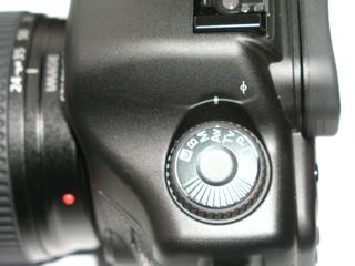
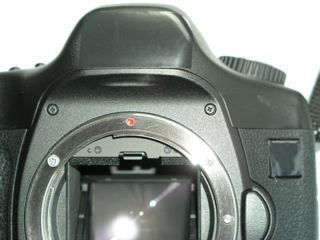
Second is the placement of the film plane mark on the left rear of the prism housing. Now quite why an auto-everything camera needs a film plane mark I will leave for you to decide. The answer probably features right up there with the intent of the more arcane sections of the Internal Revenue Code. Unfortunately, this film plane mark is easily mistaken for the indicator mark which shows the setting of the exposure dial. And, because of parallax, you always think you are one click out on that dial, until you turn the camera around and …. oh!, so that’s the right mark! Why not just make this dial show its setting though a cut out in an overlapping window? Cost, I suppose. There goes that accountant again.

The last two? These are straight out of the play book of the nouveau riche. Now I understand that the Japanese are label obsessed, whether it’s Levis, Chanel or Mercedes. Go to stores carrying any of these and there they are, long lines of them, buying branded sweat shirts and baseball caps. In other words things you really do not want to be seen in when unmarked, even less so when emblazoned with the maker’s name in huge type. So whether that’s nouve Japponais or nouveau riche, I took a few seconds with the ancienne regime, AKA black electrical tape, and fixed the problem. My 5D is now incognito, and a third piece of tape (I was in a spending mood, I admit it) covers that useless film plane mark.

The design and placement of the shutter release button works well for me, though I do have rather long fingers. In the vertical position it’s just as easy to use, provided you turn the camera counter-clockwise viewed from behind, shutter release pointing to the sky. The other way round it’s a bit tricky to use.
The balance of the camera in the hand with the 24-105mm mounted is just fine. On a tripod it is, of course, a tad front heavy lacking frontal support otherwise conferred by one’s left hand, but not enough that you worry about stressing out the camera’s baseplate. Just make sure you tighten that ball and socket head on the tripod fully!
The rear screen, which allows setting of some seventeen million parameters – I use it only to erase a full card once downloaded to the iMac – is completely useless in sunlight. You need shade or an indoor setting to read the thing. It also constantly reminds me just how greasy one’s nose gets. Still, it probably serves well as a makeshift make-up mirror for women users.
Out of the box the camera body smells quite foul; all sorts of chemicals which something tells me are not ideal for the old blood stream. I left the camera out to air for a couple of days and that, plus a couple of well intentioned licks from Bert the Border Terrier, seem to have fixed the problem.
Then there’s the ‘what were they thinking of?’ feature which seems to exist in most machines.
Let’s see. With the Leica M it’s the world’s worst possible film loading system. This was redesigned with the M4 and became a Quick Jam system, updating the Slow Jam original. Rangefinder Leicas, to this day, have a tripod socket on the M so far to the right that it might as well be on another camera. Smart, that. Then of course there were the soft brass camera strap rings which made many a repair man happy. I had mine replaced with stainless steel ones. However, one can forgive all these peccadilloes in light of the fact that the Leica M is simply the greatest street photography machine ever made. They add a sort of charm, like Cindy Crawford’s mole.
On the Leicaflex SL it’s the world’s worst film advance lever, unless you have fingers as long as ET. Mine just sold to, yes you guessed it, a Japanese collector, so he won’t care. I can excuse that also, in exchange for the best viewfinder ever fitted to a 35mm SLR.
On the Nikon F it was a pentaprism so hard to remove that you had to use industrial tooling to depress the release button on the back.
On the 6000 series Rolleiflex it’s the focusing screen holder, made by a bunch of West Hollywood fairies. You really do not want to be changing that one too often. Or the miserably dim standard focusing screen which allows Rollei to extort another $200 from you for one that works. Beyond cynical.
In the Rolleiflex 3.5F twin lens medium format camera with the built in meter, it’s a protruding meter needle cover which breaks as soon as you look at it. The needle follows soon after. Same lousy standard focusing screen, too.
In the Mamiya 6MF it’s a cluttered viewfinder with all those silly ‘multiple format’ frames no one ever uses as well as a film wind mechanism made of the purest cheddar. Plus a meter switch that is Off at the red dot instead of On. Go figure.
No, with the 5D it’s not the ‘print’ button on the back which allows direct printing to a Canon printer. Everyone seems to trash that. What’s the big deal? Sounds like a neat feature for quick and dirty results – the rich man’s Polaroid, if you like. No, it’s the two hinged rubber covers on the left of the camera, hiding the flash socket and computer connections. Now the latter will be seldom used – probably for the occasional upgrade of firmware – but the flash socket is another thing. I like to use a Novatron studio flash outfit for portraiture and this wretched little flap is not only hard to prise up, it is also not so much hinged as it is bendy, owing to a crease in the rubber. It would have been better to just make a little slide over flap like the one on the other side. Excellently designed, that one hides the Compact Flash digital ‘film’ card.
All in all, for a camera of this complexity then, there are few ergonomic boo-boos. Those that cannot be readily cured – the invisible rear screen when viewed in sunlight, the rubber left side flap – are, for the most part, no big deal.
Finally, thank goodness for the short lens-flange-to-‘film’-plane distance in the EOS body. That allows me to use my old Leica Telyt lenses, with an inexpensive adapter while preserving the ability to focus to infinity.
Great information Thomas. I have recently switched to digital (Nikon – I had a fair amount of Nikon glass that needed home) and am very, very happy. The quality of the images is fantastic. I just printed 30”x16” and it’s stunning. I imagine Canon produces similar results. The only thing I would like to challange you on is the strap. Canon cannot possibly make the worst strap – it’s got to be the Nikon. It boggles the mind that these guys can perform true engineering feats, but can’t design a damn strap.