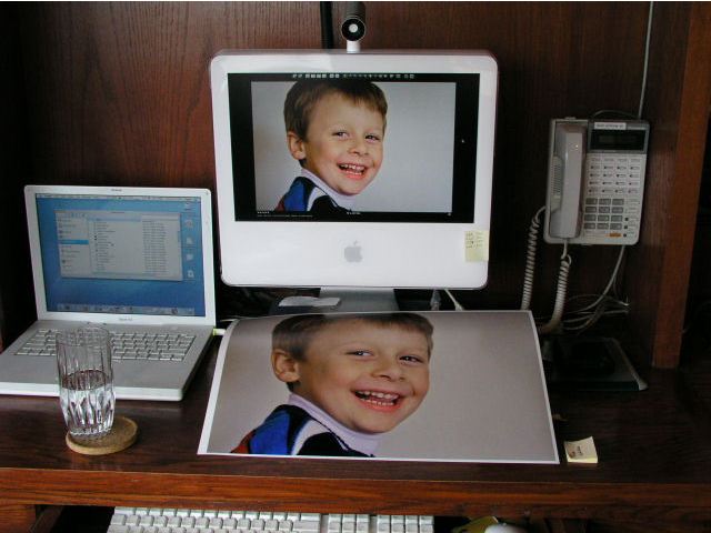
There’s little difference.
When making a couple of test prints for my son’s annual birthday picture I realized that the prints were coming out far too cool toned compared to the screen image.
Oh! boy!
Something had changed – whether my screen had aged or my HP DesignJet 90 printer has changed, or the Commies had got to it …. or some combination of these calamities.
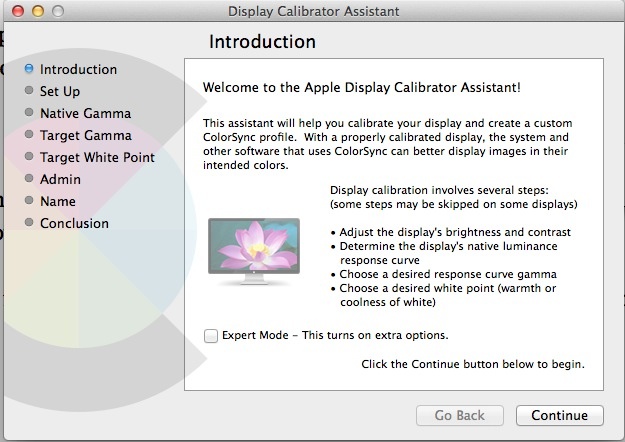
While a colorimeter is a nice tool, you can profile your screen almost as well using Apple’s built in profiler, accessed in System Preferences->Displays->Color->Calibrate:

I find a target white point of 6000K gets me the closest screen-to-print match in my environment. Yours will differ.
Then I loaded the latest, updated drivers from HP. It always pays to have the latest drivers for your paper of choice.
What is surprising about this process is how much the perceived colors of your print will vary as you walk around the house with it. My display space is in a corridor with warm, incandescent lighting, so I have to balance skin colors to be right in that location.
They say that to evaluate a sound system use the voice or piano for calibration because we all know how those should sound. Well, for prints, use a human being whose skin color you know.
The results are worth it:

Some day computers screens and color printers will come with built in colorimeters (the latest professional models from HP now have these built in) so that this sort of thing becomes less of an agony, obviating the need for test prints. Stated differently, printer profiling with the current stage of desktop computer technology compares unfavorably for fun with a root canal.