Guest writer Roy Hammans shares his experience with Adobe’s Lightroom
Roy Hammans writes a guest column today on his experiences with Lightroom with some Aperture comparisons. You can see Roy’s fine photography here.
I downloaded the beta of Adobe Lightroom as soon as it became available last year because I was looking for a good Digital Asset Management package. I’d been an avid Rawshooter user (which Adobe bought and absorbed into Lightroom) since that came out, but lately had not used it so much as I found its image management features limited. It also didn’t easily integrate with the Adobe products I was using (Photoshop and InDesign, mainly).
I ran the Lightroom beta on my Windows PC for a few months and was convinced that it would work for me, even with the few rough edges in the pre-release version – which were mostly smoothed out in the final release. I liked the way Adobe gave users the opportunity to use it and submit feedback – and that they acted on that feedback. It does need lots of RAM though, 1GB minimum, and a fast processor – Pentium 4 minimum in my view for Windows PC users.
I bought the full version as soon as it was available and have not been disappointed. It handled just about everything I threw at it and I found I was opening Photoshop less and less. I could process large photo-shoots in a fraction of the time I had done previously.
Then, after ten years of PC use, I moved (back) to using a Mac when Photoshop CS3 came out earlier this year. Lightroom installed on my Intel Core Duo iMac straight out of the (same) box. Unlike all the other Adobe products, this one is multi-platform, Mac or PC on the same CD.
Ninety percent of the images I make now are processed entirely in Lightroom, unless I need to add masks, special effects or use other Photoshop tools. Opening in Photoshop directly from Lightroom works like a dream, and whether you are shooting RAW files (as every serious user should), or JPGs, your original image file is left completely untouched, of course. When I need to use Photoshop, editing a copy (with Lightroom adjustments) is the most common path I take and Lightroom automatically links the edited copy with the original (although this is optional) stacking it next to the original in the lightbox view.
Ah, the views: the five modules – Lightbox, Develop, Slideshow, Print, Web – pretty much follow a logical work-flow similar to that used in the days of film. Moving between the modules is quick and painless, mouse or keyboard driven, as are most of the Lightroom commands. Aperture lets you do anything at any time, which many claim is an advantage, but I actually like the concept of ‘views’ as you can say “Right, I’ve finished processing, now lets move on to print a ‘contact sheet’ or create a web page.” As an inveterate ‘fiddler’ I need to close an operation and move on. Anyway, you can always go back at any stage and make changes, which is echoed through the workflow without further intervention.
Here are screenshots of the five ‘views’ offered by Lightroom:
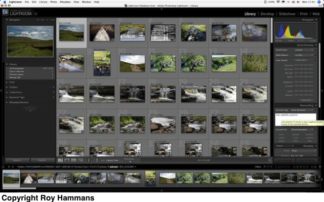
The Library view
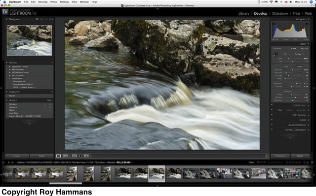
The Develop view
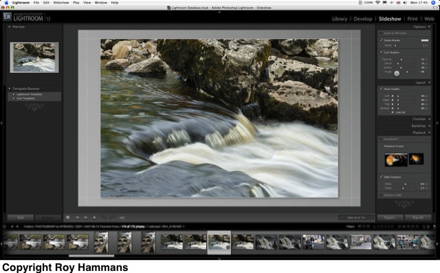
The Slideshow view
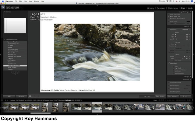
The Print view
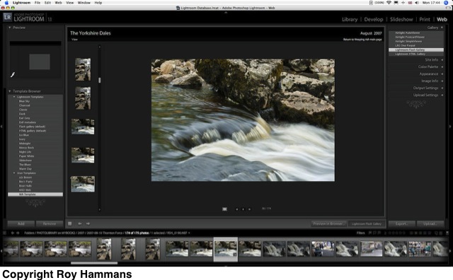
The Web view
It works even better on the Mac than it did on my Windows PC, but that’s probably due to the 2GB RAM and faster processor. The real joy however is that I could, if I wanted to, keep the database (which is where Lightroom stores all its activity) and all my images on an external hard drive, shared between the Mac and the PC. I’ve tried this and it works. Of course, I can’t run Lightroom from the same database simultaneously on both platforms (why would I want to?) but I can open it on either machine, see exactly the same image library, with same image manipulations, and work on whichever platform I want.
After getting the Mac I did try out both Aperture and Capture One which, together with iView, provided a very solid image processing and storage environment. There was nothing I could do in these that I couldn’t do in Lightroom however – and it just seemed a lot easier to work in Lightroom as it feels like a 21st century interface; Aperture is still a bit ’20th century’ and reminds me of Excel.
Aperture is a good program for sure, but to my mind it’s lacking the responsive development and improvements we’ve seen in LR. I’ve trained a few non-photographers that need to handle a lot of images using Lightroom and they have all found it easy and intuitive. I don’t think they would take to Aperture as quickly.
There appears to be a lot more ‘mousework’ needed with Aperture, moving around between icon groups that are fitted into every available piece of screen real estate, selecting, adjusting, moving around constantly. One major difference that many consider a handicap for Lightroom is the inability to separate the menu palettes and drag them onto a second screen. I certainly do this in Photoshop, but have never felt the need to do it in Lightroom – but then I am working on a wide screen and like everything in one place.
Version 1.1 of LR offers several features that give it an edge over Aperture, in my view. Speed has to be first on the list, with background tasking used extensively – but it does of course depend on how big your image library is – and the speed of your processor. The Clarity tool has to be next; sure you can do pretty much the same in Photoshop using a combination of local and mid-tone contrast enhancement, but it takes a bit of work. The Tone Curve and dynamic click-and-drag adjustment – very cool. The plug-in architecture – many folk have already produced a raft of new develop presets and web page modules that you can just load and run (for free). Finally, although I much prefer to work on Macs, an awful lot of people still use Windows and I have recommended Lightroom to many of them. I can’t do that with Aperture.