Getting rid of the silly things.
Apple’s latest OS, Lion, tries hard to dumb down the user experience compared with its awesome Snow Leopard predecessor. Mercifully, much of this silliness is reversible and I address some of the issues below.
This dumbing down reflects the effort Apple is making to have Lion’s UI more like that in iOS on the iPhone and iPad and I see where they are coming from. Nonetheless, I liked the way Snow Leopard worked, do not propose to use a touch tablet with my Hackintosh and therefore prefer things like they were. If you want to go the touch tablet route for your desktop, try one in an Apple Store first. I found the ergonomics did not work for me; they may be right for you.
Scrolling:
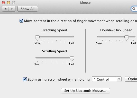
Scrolling has been reversed. Drag the scroll wheel down on your mouse and the screen scrolls up. That works with touch devices but is counterintuitive with a mouse. Go to System Preferences->Mouse and uncheck this box to revert to the old way:
Spell check:
Apps like Mail add the spell checker. It’s every bit as awful as in iOS, uses a rigid rule set, does not learn from mistakes and is insanely frustrating. A friend reports that he wrote that he wanted to “kick some ass” but ended up sending an email promising to “lick some ass” instead. He’s with his lawyers right now.
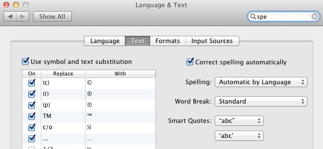
Disable spell check in System Preferences->Language & Text by unchecking this box:
Finder:
Finder has made many retrograde steps. Color is poorly used, directories hard to find. First, delete the ‘Show all Files’ choice. It’s useless. Right click, Remove from Sidebar.
Then make Finder show the Library directory. Go into Applications->Utilities->Terminal and copy and paste the following into Terminal:
Hit enter, quit Terminal and go to Apple->Force Quit->Relaunch Finder for this to take effect.
By default, Finder does not show your boot drive, though it does show attached drives. Duh!
Go to Finder->View and click ‘Show Path Bar’.
Click on any Boot directory in the Sidebar and you will see the path at the base of the Finder window. In this example I have clicked on the Desktop in the Sidebar.
Click on the word SSD Boot (or whatever your boot drive is named). Finder will display the Boot directory.
Now click-drag the word ‘SSD Boot’ into the Sidebar. You can now access the boot directory.
Mail:
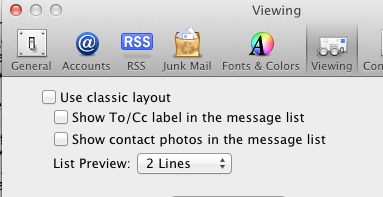
If you prefer the old look of Mail, go to Mail->Preferences->Viewing and check the top box:
Launchpad:
This one is about as dumb as it gets. The Launchpad icon appears in the Dock by default. Drag it out. The app purports to show an iPad-like screen with all your Apps on the display. Snag is, there’s no way of editing what shows so every Apple app, no matter how obscure or rarely used, shows up. And, in yet another childish knock at Adobe, Adobe apps – or any other apps for that matter – only display on the second and subsequent pages, out of alphabetical order. Too silly. This is a prime example of what I call ‘dumbing down’.
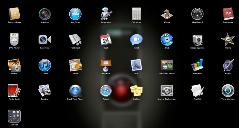
Launchpad. Can you spell ‘Duh!’?
Auto saving:
Apple made a big deal of this feature, long available on just about every app on a PC. Plus, it only works on amateur-hour apps like Numbers and Pages. For heavy duty pros who use Word and Excel, just save your work regularly like you always have or enable auto save. Even Microsoft added that feature a decade ago. Pure Cupertino hype, that one. If Jobs was selling water, his would be wetter and clearer than anyone else’s, I suppose. And 50% more.
Further, if you use TimeMachine for continuous versioned back-ups, it’s hard to see what this feature adds.
Safari:
Safari now wants to open with the last page you were using. Go into Safari->Preferences->General and change the New Windows and New Tabs settings to Homepage.
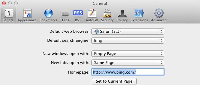
Then go to System Preferences->General and uncheck this box:

In this way, if you last quit Safari with many tabs open, you will not have to wait for all those pages to be reloaded when you next start Safari. Instead, you will be taken directly to your home page only, with no tabs open.
Mission Control:
I have saved the worst UI error for last. If you liked the ability to display multiple Windows of all your loaded apps as an app switcher (this was named Spaces in Snow Leopard), Mission Control makes sure that you now have a mess to work with. Use multiple monitors as I do and this mess is spread in random order across all three:
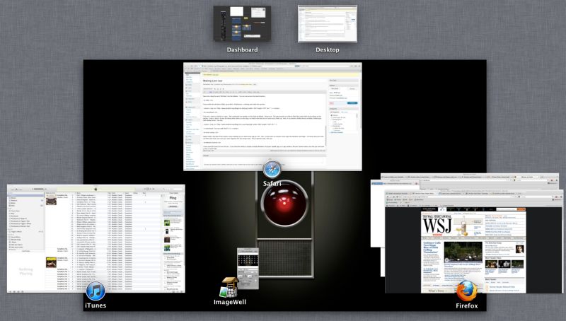
Suffice it to say that if Houston’s Mission Control was organized like this, Apollo 11 would still be searching for a landing site on the moon. Just drag this silly icon out of the Dock where it is installed by default.
Do the above and Lion starts to resemble the robust desktop OS which was Snow Leopard.
Why bother even upgrading from Snow Leopard?
- Because your Mac will be ‘bricked’ earlier if you do not.
- Because flaky MobileMe will disappear and be replaced by (hopefully less flaky) iCloud Q3/2012. As Snow Leopard and earlier OSs will not support full iCloud functionality, how else are you going to keep all your Macs and iOS device in Sync for Contacts, Mail and iCal?
- Because new apps will increasingly only run on Lion. Remember Rosetta and PPC apps? Cynically excluded from Lion to obsolete your great PPC iMac.
Finally, let’s not complain too loudly. This, my favorite Steve Jobs quote, remains as true today as it ever has.
Having just installed Lion on my Macbook (prior to risking it on my HackPro or iMac without prior testing) I wholeheartedly agree with all of these!
With a trackpad, the gestures that I’d got quite adept at are now all confused – the counter-intuitive scrolling being the worst, and Apple has the cheek to call the new default ‘natural’ scrolling!
I also use ‘All-in-one-Gestures’ in Firefox (my default browser) – that no longer works because of the general gesture changes with the trackpad.
Definitely a case of ‘one step forward, two steps back’. Dumbing down is right!
Couldn’t agree more. You took the words right out of my mouth.