Clutter be gone!
I wrote about the new look I had adopted for this journal on the iPad and iPhone here.
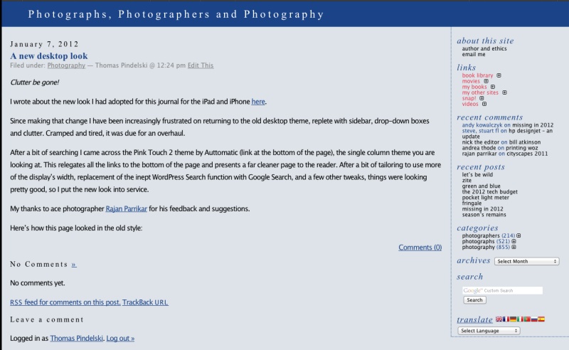
Since making that change I have been increasingly frustrated on returning to the old desktop theme, replete with sidebar, drop-down boxes and clutter. Cramped and tired, it was due for an overhaul.
After a bit of searching I came across the Book Lite theme (link at the bottom of the page), the single column theme you are looking at. This relegates all the links to the bottom of the page and presents a far cleaner page to the reader. After a bit of tailoring to use more of the display’s width, replacement of the inept WordPress Search function with Google Custom Search – the latter accessible through a link at the top of the page, and a few other tweaks, things were looking pretty good, so I put the new look into service.

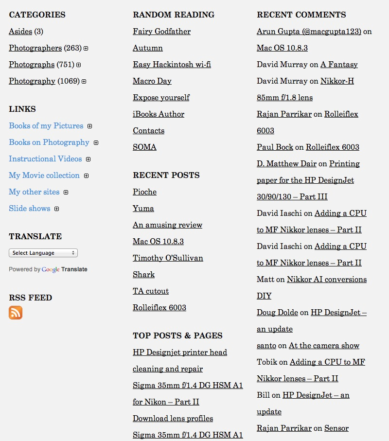
Links now appear at the bottom of the page.
Here’s how this page looked in the old style:

On those rare occasions where posts include long text paragraphs, I will break text into two columns (a real pain to do) and the new look serves that presentation well. For the technically inclined, the theme used supports widgets, making arrangement and inclusion of links at the base of the page a simple matter. The ability to translate content – however poorly – using Google Translate has been retained, as have all other link functions from the old theme.
Going forward I will be adding more multimedia display tools, including scrolling photo galleries and enhanced video integration.