Monthly Archives: November 2012

The iPad Mini – Part II

OK, but hardly innovative.

Part I is here.

Let’s look at some not so great things about the iPad Mini.

First, it’s not remotely innovative. The innards of the iPad 2 with a smaller screen is hardly innovation. There’s no new great UI enhancements and the black version I bought makes it very difficult to insert the (otherwise great) ‘Lightning’ connector as the small black socket disappears in the bezel. The slope of the latter makes it even harder to insert the connector in a perpendicular manner. The iPad 3 suffers from the same issues with the older 30-pin connector but at least there the bezel is unpainted aluminum so you can half see what you are doing. Apple should add a perpendicular shelf in the way the Kindle Paperwhite does, making it easier to find the socket and insert the connector. The Paperwhite is not all joy, by the way. It uses the awful non-reversible USB3 connector, an exercise in fragility and poor design.
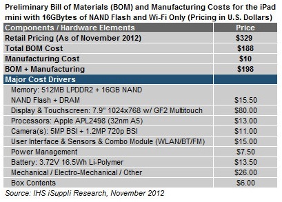
Second, it is wildly overpriced. iHS Supply, the reliable Bill Of Materials/teardown site estimates component cost at $198. So for a 34% gross margin, same as on the iPad Maxi, Apple should be charging $300 – call it $299. That accomplishes two things. It gets them under the magic $300 number and it earns a non-dilutive margin. The $329 asked is a canyon away in perception and impulse purchase power. Just plain dumb. $30 is a lot more than $30 sounds when the result is $329, if you get my drift.

Third, the screen remains glossy, with all the attendant issue of reflections, though the smaller size mitigates issues owing to the ease with which the display can be reoriented.

Fourth, the black anodized back is going to be a scratch magnet, yet buying a protector argues against the whole compact and light design brief.

Fifth, the volume control has made a significantly retrograde design step. The toggle heretofore used on iPads has become two separate buttons, meaning if your right index finger finds the wrong one by touch you end up searching for the other. Of course, the direction of your finger movement will be wrong half the time. With the toggle design there was no such issue.

Sixth, I really dislike the sloped sides Apple is using on current iPads. This is nothing more or less than a fake to make the device look slimmer, but every single ergonomic aspect of that is retrograde. iPad 1 simply rules here, with its perpendicular sides which don’t present a sharp edge to your hands and make operation of the various buttons and sockets far easier.

Seventh, the screen remains useless outdoors in bright light. Only the eInk Kindles can be used on the beach or in the California sun, which is why I own one.

Eighth, the camera is a major disappointment. It’s the same one found in iPad2 and iPhone4, meaning 5 megapixels, fixed ISO. iPhone4S added an 8 megapixel sensor which is really excellent, as I have shown here many times and as 13″ x 19″ prints on my walls testify. iPhone5 uses the same Sony sensor but with a far greater auto ISO range which enhances performance in poor light. iPad Mini has neither of these attributes. Disappointing. And the panorama mode from iPhone 4S and 5 is missing. Cynical cost saving ($2?) for a device which is going to cannibalize iPad Maxi sales whether you like it or not.

Finally, I am really beginning to wonder whether Tim Cook is the right man to lead Apple. His presentation skills make Donald Duck seem a gifted orator by comparison and he has made massive strategic errors in Q4 2012. Every main seller in Apple’s product line has been redesigned in Q3 and is now unavailable in the key shopping season – iPad, iPad Mini, iMac and, worst of all, iPhone 5. Further, manufacturing difficulties aside, by placing Apple on a calendar Q4 product replacement cycle Cook has significantly compounded the volatility in the stock. Now Wall Street will be looking to Q4 more than ever to deliver earnings and you can bet the stock will sell off massively after the earnings release until …. Q4 of next year. Just plain dumb. Business 101. To add insult to injury, Cook’s recent pogrom where he fired the smartest man Apple had – the inventor of NeXT’s OS, the inventor of OS X, the inventor of the awesome iOS and a polished speaker and presenter – Scott Forstall, does not bode well. Sure Forstall wanted the CEO job. He saw a weak guy in charge with no ideas, skilled solely in production engineering. And Forstall was a massive threat to a modestly skilled CEO who professes to prefer harmony to creative tension. Business is not a glee club. Business is about competition, external and internal and the weak should not survive. That does not mean you fire abrasive, ambitious leaders.
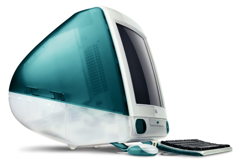
Jony Ive’s worst design ever, created before Steve Jobs rejoined Apple.

Then putting a design guy in charge of software interfaces is likely to prove another bad move. Jony Ive manages at most a dozen people making a few designs of a few devices using programmable milling mahines. Once someone approves his ideas, off they go to the production engineers to see how they can be manufactured in quantity. As the current designs show, there are major issues with this. And can you remember a memorable Ive design before Jobs rejoined Apple? Yes, I can remember many. Without exception they were execrable, the last being the Bondi Blue iMac, released shortly after Jobs rejoined, but designed earlier. Without doubt the single most awful Mac design ever, right down to the idiotic puck-like mouse. You can accuse Ive of variety but not of good taste. And his disdain for UI at the expense of looks seems exactly the wrong skill set for a software interface leader. Ever used a Magic Mouse? Or a Mighty Mouse? Or any of its predecessors? Shockers all. I have used the lot. Without exception the worst mice ever, from anyone. And don’t get me going on the iMac. Someone else needs to choose the right design from Ive’s mental meanderings. Form over function in extremis. Sir Jony is a basement player who needs to remain in the basement surrounded by his German high tech machines, not managing large teams of brilliant and argumentative software engineers, something Forstall clearly did with aplomb.

Right now Tim Cook is looking more like Gil Amelio than Steve Jobs.

And forget all the claptrap about skeumorphism. Most users have never heard the word and the frou-frou design elements in OS X can be easily removed with apps like Mountain Tweaks. If it’s really an issue Apple can add an on-off switch in Settings with a few lines of code. Indeed, for all but geek users, making things look on the screen like the things in your home is a welcome feature. Granny, with her first iPad, is more likely to say “Daddy, look at this Books app, just like the bookselves at home!” than she is going to start cussing out skeumorphism. A non-event.

Now some good things.

The Mini will – just – fit the pocket of your Harris Tweed jacket. It most certainly will not fit the one in your business suit. It’s so light that taking it along merits no second thoughts. The screen, which squeezes in all the iPad 1/2’s pixels into a much smaller display – is outstanding. Side by side with the Retina Display (how I dislike that fake description) of the iPad 3 there are no grounds for complaint. All the fan boys saying it’s clearly different must be on drugs. It’s identical to all intents and purposes.

The faster CPU in the iPad 3 not missed. The Mini is every bit as responsive and clearly faster than the occasionally sluggish iPad 1, which can only run up to iOS5, unlike the iOS6 in the Mini and current iPads. My guess is that the great demands placed on the GPU by the Retina Display more than negate the benefits of the iPad 3/4’s faster CPU.

I have had occasional issues with slow tethered Verizon cellular connections to my iPhone 5 but do not have enough data to say whether this is a design issue yet.

For the rest of the testing I gave the Mini to our 10-year-old son, Winston, who loves it. It’s an excellent gaming machine and much easier for him to hold than the heavier Maxi. He does not miss the added screen space and loves how easy it is to take along. Not a single performance issue cropped up in serious game play with the most taxing applications, far more demanding on performance than anything I would ever do. Even with demanding games the battery life is outstanding – 10 hours at a pop. The Mini remains barely warm to the touch after serious gaming unlike the iPad 3 which becomes uncomfortably warm, probably owing to the higher power consumption of the Retina Display iPad3 uses.

On the GPS front, a knowledgable friend of the blog points out that the cellular iPad Mini (unobtainable, needless to add) will be the first mobile tablet to have both US and Russian (GLONASS, when it works) GPS built-in. Thank you Qualcomm and doubtless heart warming news for all those Russian oligarchs.

So the iPad Mini is a mixed bag. It’s a pure consumption machine, creation on the small display being largely out of the question. The camera is dated, the ergonomics compromised. It’s overpriced and hard to make. It’s a featherweight but the display remains useless in bright sun. It cannibalizes iPad 2/4 sales yet long-term reading on it is an eye strain owing to the smaller font. Turn it to landscape mode and the fonts revert to iPad Maxi size unless the app insists on displaying a side bar in this mode – unfortunately like this site on an iPad, and I cannot turn that off – when the eyestrain remains the same.

Disclosure: Long 2014 AAPL bull call spreads, albeit with growing trepidation.

Update August, 2013:

I have sold the iPad Mini (Cost: $329, Sold for: $279) and replaced it with the 2013 Nexus 7. The Nexus ran a mere $229 and is superior in every way with a far higher resolution display, better form factor, higher speed, GPS, NFC, Qi recharging and a robust OS in Android JellyBean 4.3, which allows easy connection to all your data in Apple’s iCloud. The iPad Mini remains crazily overpriced for what you get and the high resale value it still commands means that I got almost one year’s use for just $50. That may be the Mini’s best feature of all.

In the gloom

With a couple of lenses.

Deciding to take a break from watching Apple stock plumb the depths under its new CEO who couldn’t get drunk in a brewery, I made off to the Mission District with the D700 and just two lenses. My favorite, the 38-year-old 24mm manual focus Nikkor and the current 85mm f/1.8D AF. The latter sports a foul plastic barrel but delivers excellent results. A handy street outfit.

It was a fearfully overcast day with light mist in the air, but all the better for those pastel colors.

And this is what I saw:


Waiting.


Muscle man.


Solidarity takes a nap.


Barbed Babe.


Painted window.


Frida. Frida Kahlo was the wife (twice!) of Marxist painter Diego Rivera.


Missing.


Family mural.


Hope.


You are here.


Who would Jesus bomb?


Orange and mauve.

When all was said and done, I repaired to the coffee shop, a lovely warm and welcoming interior, for a cappuccino.

The first five and the coffee shop on the 24mm, the rest with the 85mm.

Unfortunately, when I returned home, I learned that the inept Cook is still in charge of Apple’s supply chain mismanagement.

Disclosure: Long AAPL 2014 bull call option spreads.

Nikon MB-D10 battery grip

A ‘handy’ accessory.

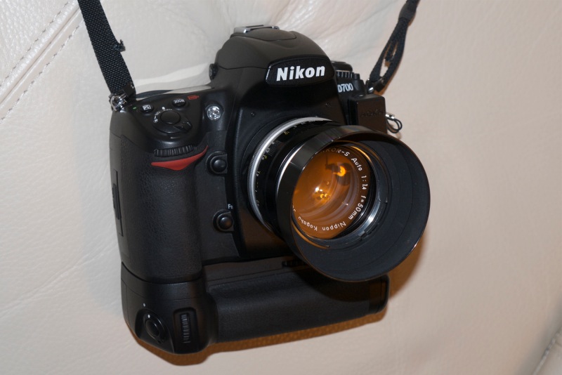
The Nikon MB-D10 mounted on the D700. Vertical shutter release and switch are at lower left.

My delight in discovering the superior handling of the Nikon D2X pro body with its built-in vertical handgrip and shutter release led me to track down the detachable handgrip for my D700, the MB-D10. It fits the D300, D300S and the D700 and is quite exceptionally well made. I found mine on the Fred Miranda Buy/Sell forum and some care is called for in this case. It seems there are many aftermarket knockoffs out there of varying quality and performance so it’s important to pre-clear the one of your choice as the genuine article before paying up. Mine arrived in mint condition and cost $125, half the price of a new one, and included both the Nikon and 8 x AA battery holders.

The battery versatility is exceptional. You can have the following combinations:

  • Nikon EN-EL3e in the D700, nothing in the grip
  • Nikon EN-EL3e in the D700, a second EN-EL3e in the grip
  • Nikon EN-EL3e in the D700, 8 AAs in the grip
  • Nikon EN-EL3e in the D700, Nikon EN-EL4 or EN-EL4a in the grip with the appropriate end piece
  • Nothing in the D700, Nikon EN-EL3e in the grip
  • Nothing in the D700, Nikon EN-EL4 or EN-EL4a in the grip with the appropriate end piece
  • Nothing in the D700, 8 x AA in the grip

The EN-EL3e is the standard D700 battery, the EN-EL4 (or the higher capacity 4a) is the standard battery used in the D2X/D3/D4 pro bodies.

It gets better. If you have batteries in both the D700 and the grip, you can tell the D700 to use the in-camera batteries first or the in-grip ones first. This is in the Custom Setting Menu->d->d11->Battery order. When the camera is using the grip batteries or if only grip batteries are fitted, then the battery indicator on the top plate of the D700 is preceded by a small icon stating ‘BP’. Further, if you use AA batteries in the grip, you can tell the D700 whether these are AA alkaline, AA Ni-MH, AA lithium or AA Ni-Mn. This is in the Custom Setting Menu->d->d10->MB-D10 battery type. Best of all, if you use two sets of batteries the D700 will report on the remaining battery life and battery condition for both the in-camera and in-grip batteries. This is in the Setup menu. Phew! Nikon simply will not allow battery drain and charge reporting to go unnoticed. Extraordinary.

After sifting through all the possibilities, I discarded the idea of 8 AA cells in the MB-D10. Too heavy and prone to leaking if heavily discharged. I don’t need the vast shooting capacity which comes with using batteries in both the body and the grip so I decided on one Nikon EN-EL3e only. Finally, because the MB-D10 has to be removed to access the in-camera battery, I decided on using the EN-EL3e in the MB-D10 only, where removal and replacement are simple.

To fit the MB-D10 to the D700 a rubber contact cover on the base of the D700 is removed and the MB-D10 simply screwed to the body with a large, well serrated dial screw. Thereafter you have all the functionality of the integrated vertical grip on the D2X/D3/D4. The MB-D10 adds a vertical shutter release which can be turned off to prevent accidental use, and both front and rear control dials. The vertical grip is well contoured for the right hand and adds materially to the ease of hand-holding the camera in portrait orientation. The CF card can be accessed in the usual way through the side cover and the MB-D10 can remain in place while this is done.

The base of the MB-D10 replicates the centrally placed tripod socket of the D700 body. While the MB-D10 adds heft and bulk, it actually makes for a much better balanced camera which really comes into its own with lenses like the 180, 200 or 300mm Nikkors.

To add icing to the cake, the battery grip increases the maximum shooting rate from 5 fps to 8 fps, if that’s your thing.

Highly recommended, but don’t waste money on new retail ones or on cheap knockoffs, some of which fail to even work properly. There are many of these, the genuine Nikon versions, lightly used on the secondhand market. Just make sure you get the real thing which is distinguished by an embossed ‘Nikon’ logo on the rubber base and says ‘Nikon’ on the box. Also, if you contemplate using AA cells, make sure that the MB-D10 you buy comes with the separate AA cell holder, or be prepared to pay some $40 for the accessory.

If you are a Nikon D800/D800E user, prepare to be upset. Nikon wants $400 for a like accessory and designing the D800 body to use a different battery grip must qualify as the height of cynicism. Not good, Nikon. And most certainly not British.

Funky wedding

The bride wore tattoos.

Spotted in Cypress Alley in San Francisco’s Mission District the other day, this odd couple was busy tying the knot.


The happy couple.


I was the unofficial photographer.


Here’s the official one, with the local enforcer.


The bridesmaids.


True love.

All snapped on the D2X with the 16-35 AFS and 75-150 MF Series E – a real sweetheart, that one.

Hackintosh goes Kepler – Part II

Benchmarks and observations.

Ace computer builder FU Steve reports on benchmarking results for the HP100, now renamed the HP100Plus.

Power consumption:

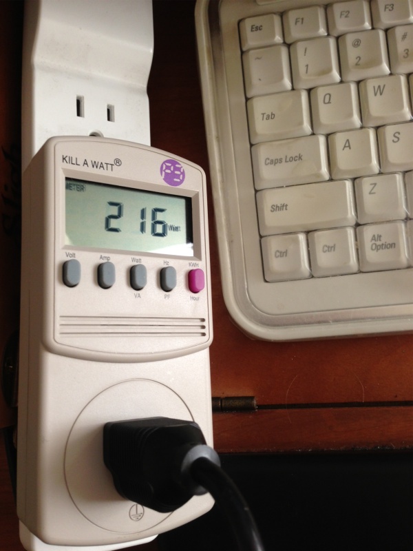
The first thing I did with the Hackintosh HP100Plus was to finally measure real power use. Theoretical tables where you list your components seem to assume that everything is running full bore simultaneously, which is clearly unrealistic. So I used a Kill-a-Watt power consumption meter (Amazon – $20) and inserted it between the HP100Plus (computer only, not the displays) to determine real, live power use in a variety of situations. HP100Plus uses a stock 500 watt power supply which has done fine with the old nVidia 9800GTX+ card and the new nVidia GTX 660 is benchmarked at a lower wattage than the old card. That means power use should not be an issue, but nothing beats this test method.

The Kill-a-Watt monitoring real time power use.

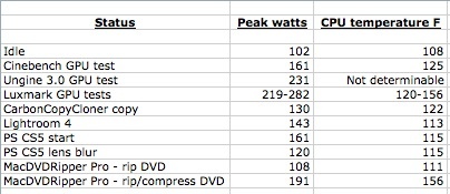
Here’s a table of findings:

HP100Plus power use.

So none of these activities remotely tax the 500 watt power supply, with the most demanding being the Unigine rendering test which uses the most sophisticated graphics around. To put these data in perspective, the CPU’s operating limit is 191F, and HP100 is running the Core i7 CPU at 4.3GHz, or 23% faster than the stock frequency of 3.5GHz – a modest overclock made possible by the use of the excellent Coolermaster 212Plus after market CPU cooler. The rest of the innards include a Gigabyte Z68 motherboard, a Core i7 Sandybridge 2600K CPU, 16GB of 1600MHz RAM, two SSDs both 120GB (one SATA 3, one SATA 2), two 1TB 7200 rpm SATA 3 HDDs, a USB socket card, and a wireless Airport card. Bottom line? Even for gamers, 500 watts should be sufficient.

Benchmarks:

Traditional GPU performance benchmarking apps like Cinebench do not cut it. The app fails to test all the great new technologies in the Kepler cards being put out by nVidia. The GTX660 has some 2.54 billion transistors, compared to a mere 800 million for the Core i7 CPU, and four times the memory of the old 9800GTX which HP100 used to use. The new standard in GPU performance measurement is Unigine which has immensely sophisticated video graphics – right down to fields of swaying grass blades – so that is what I used. Unigine refused to run on the 9800GTX+ as that card simply cannot hack it, so there are no comparative data.

In addition to installing nVidia’s drivers for the GTX 660, as explained yesterday, I also installed their CUDA drivers which make the best use of the latest rendering technology in the new card. CUDA speeds complex math calculations and will halve the time in ripping and encoding a movie, typically from 14 to 7 minutes. For reference, my system rips (no compression) a 4GB movie in 6.4 minutes.

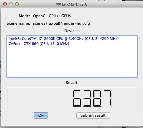
Luxmark is another rendering benchmark tool which I ran to simultaneously test CPU and GPU functions.

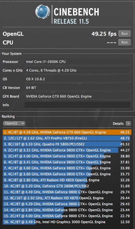
And finally, while Cinebench is outdated, I ran the GPU test this one last time and the HP100Plus came in top of the heap.

Here are the screenshots:

Note that in the Cinebench run I have also tested the integrated HD3000 GPU which comes with every i5 and i7 Sandybridge CPU. The current Ivybridge comes with the better HD4000 GPU and can be expected to maybe deliver twice the framing rate of the HD3000. Call it 25fps, still leagues below what the GTX 660 delivers.

The CPU speed for all tests was 4.3GHz – not all the apps report it correctly. Like tests without CUDA installed came in a few percent lower. Not dramatic, but why not install this enhancement?

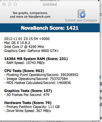
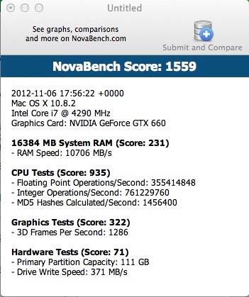
Finally, Novabench is yet another benchmarking app and in this case I was able to run it on the old and new cards.

Novabench – 9800GTX+ GPU

Novabench – GTX 660 GPU

The significant change here is the doubling of the Graphics Tests score, much as predicted on theoretical grounds in yesterday’s piece.

Lightroom 4 and Photoshop CS5:

In practical use there is little change from the 9800GTX+. The old card was already blindingly fast in these relatively undemanding tasks. The main advantage of the new card is that it will be able to far better drive larger monitors. Thomas’s three Dells are 1680 x 1050, and good 27″ displays are now sporting 2560 x 1440 pixel densities. That’s twice the number of pixels per square inch, and a lot more square inches to cover.

Other sockets:

The GTX 660 comes with two DVI sockets, one DisplayPort and one HDMI. Thomas currently has two Dells connected to the two DVI sockets with the third driven via USB using a DisplayLink adapter. I have read that the HDMI and DisplayPort outlets can be used at the same time as the two DVI ones to power two additional monitors, but until he gets the cables to test that I cannot comment. The advantage of this approach is that if it works, higher resolutions can be supported, as the DisplayLink is limited to 2048 pixels on the long side. That said, it has been super reliable, requiring only the occasional driver update as Apple introduces new major OS X releases.

Use with MacPro:

The GTX 660 only works with OS X Mountain Lion. It is not supported in Lion or earlier versions and it seems nVidia has no plans to release drivers for those. The latest builds are rumored to include nVidia drivers and at least one much maligned and disregarded MacPro user has reported success in installing the GTX 660 in a MacPro chassis with the latest version of 10.8.2 (with supplemental updates). I have not tested it but any MacPro user still poking along with older video cards should try the upgrade or, better yet, build a HackPro.

PCIe x16:

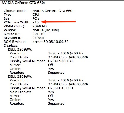
To make sure you are using the fastest 16-bit bandwidth to communicate with the GTX 660, make sure to turn off TurboSATA/USB3 in BIOS – Integrated Periipherals. Your USB3 devices will still work fine if the USB3 driver is installed. By doing so you will ensure that the x16 data path is used, rather than the x8, which will be the case if only one card is installed and the BIOS is wrongly set. Also make sure that the card is in the x16 slot, not the x8. On the Z68 Gigabyte motherboards, the x16 slot is the one nearest to the CPU.

PCIe = x16 correctly set.

Does it make a difference? Yes. In the Unigine bench test an occasional minor stutter at x8 disappears at x16.

Use of two SSDs:

HP100Plus uses two 120GB SSDs which store the OS and all apps, cloned nightly using CarbonCopyCloner. I highly recommend this setup as it makes major upgrades, like this one, very easy. The backup drive is used as a test bed and if anything blows – as it usually does – can be restored in a matter of two minutes using an incremental restore using CCC. I mean two minutes! Ask me how I know …. Life is simply too short to do major upgrades using spinning disk drives.

Cold start:

The time from the Apple logo splash screen to the Login screen is 14 seconds. For comparison the 2012 MacBook Air takes 10 seconds.

Warranty:

The Zotac USA warranty is for two years. No need to waste money on AppleCare ….

* * * * *

Thank you, FU Steve. Here’s until the next time you decide I need something upgraded.

Update March, 2013:

Apple has just released OS X 10.8.3 which now includes native GTX660 support for nVidia cards, whether EVGA, Zotac, PNY or any other brand. They did this as one of the 2012 iMac variants use the 660M GPU, the mobile (and less speedy) version of the real thing. Once you upgrade to 10.8.3 you can delete these two lines from your Boot Drive/Extra/org.chameleon.Boot.plist file on your Hackintosh as the presence of native drivers no longer requires the Hack to be informed that a 660 Kepler card is installed:


The above lines can be deleted.

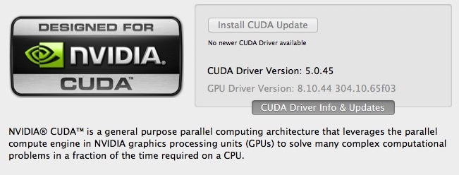
nVidia also released an update to its CUDA driver, which you can download through the related System Preferences pane, after which you will see this:


Latest CUDA driver.

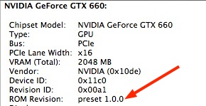
The above System Information display is also updated to reflect the use of native nVidia 660 drivers:

I can confirm that all works well with 10.8.3.