Tiling is the answer.
Background:
Back in 2005 I wrote about making Really Large Prints. That meant 13″ x 19″, a veritable wallet size compared to what I am doing here. We are talking 36″ x 48″ or seven times the area.
On occasion I have regretted buying the 18″ wide HP DesignJet 90 printer, wishing I had instead paid a little more for the 24″ DJ130. But when it came to making a 36″ x 48″ print the other day, neither could have done the trick. At least not in one pass. And making something really huge for my DJ90’s seventh anniversary seemed the right thing to do.
With my DJ in perfect tune after its annual checkup I was all set, comfortable that perfect colors would result following a recent colorimeter profile session.
Why not just delegate the work?
There are so many variables you cannot control in delegating this task that I discounted the idea in seconds. They include:
- Finding a good print shop.
- You have someone making minimum wage, charged out at $100/hr, giving tender loving care to your baby, in between beer and pot breaks. Yes, they will have a jumbo printer which makes this on one sheet. So?
- Getting the colors matched correctly to your calibrated display image – good luck with that.
- Getting the big print home undamaged. USPS/UPS/Fedex? Ha, ha, ha! They will fold it to get it into your mailbox. Don’t laugh – that has happened to me before.
- Longevity. How can you believe the claims made by the print shop for the inks and mounting board? I use original HP Vivera inks which have been tested fade-proof for 80 years by Wilhelm Research. As I’ll be 6 feet under, pushing up the daisies – or maybe fertilizing them – in under half that time, that seems long enough. My mounting board is certified, acid free, Bainbridge Alpha 3/8″ foam core, and will probably outlive King Tut. So there.
- Satisfaction. Sure, it’s a menial task and one you might not want to do daily. But it is satisfying as it gets doing this yourself and doing it to a higher standard than any agent ever will. I despise the saying “If you want a job done well, do it yourself†because it’s asinine in the extreme, but this task makes for an honorable exception. “Printed by the artistâ€, don’t you know.
Get my point?
Choosing the right image:
I had a large expanse of wall space viewable from the landing on the upper level but had never quite found a picture to fill it. As I started working on my Golden Gate Bridge series one image immediately suggested itself. Taken from the GGB overlook at the site of the old WW2 battlements, the image is simple, surreal and uncluttered. Just the ticket.
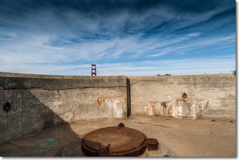
Simple, surreal, uncluttered. The ultrawide 20mm lens used adds to the effect.
Tiling application:
Next it was time to shop around for a good tiling app for the Mac. Tiling apps allows a print to be made over any number of abutting sheets of paper, the result being trimmed and joined just so for display. You can do this in Photoshop but it’s a pain. I settled for the inexpensive SplitPrint which had good reviews and indeed proved capable and easy to use. $5.99.
Preparing the file for tiling:
Before you do anything, examine your file square inch by square inch for sensor spots at 1:1 in your photo processing application, looking especially hard in big, continuous tone areas. Nothing will ruin your day more than finding you have missed some blobs once the print(s) are made. Retouching them now will save a lot of heartbreak later. Just about every sensor will accrue dust and oil spots with use, regardless of whether it has a cockamamie ‘sensor cleaner’ built in or not.
Thereafter the process is simple. I exported the image at the original pixel size of the sensor in the Nikon D3x as a TIF file to Photoshop CS5. Then I ‘uprezzed’ the image to the final print size desired, which would be 36″ x 48″, or four sheets of 18″ x 24″ paper through the printer – the largest it will take. Resolution was set to 240dpi, the maximum the DJ30/90/130 series of printers can handle.
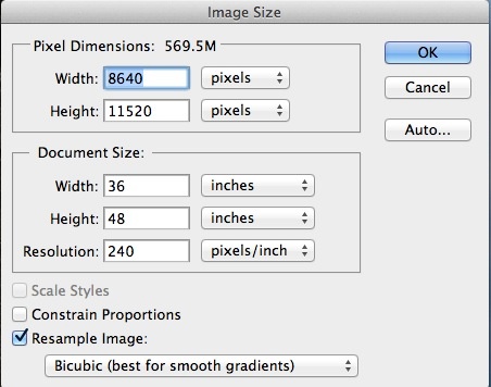
Uprez dialog from Photoshop.
The file was then saved to the Desktop as a JPG, highest quality. SplitPrint at this time only accepts JPG files. No matter. The file was some 45MB in size.
Then into SplitPrint and the required settings were made. I created a custom setting for 18″ x 24″ paper in the Print dialog of SplitPrint and told it to spread the image over four panels thus:
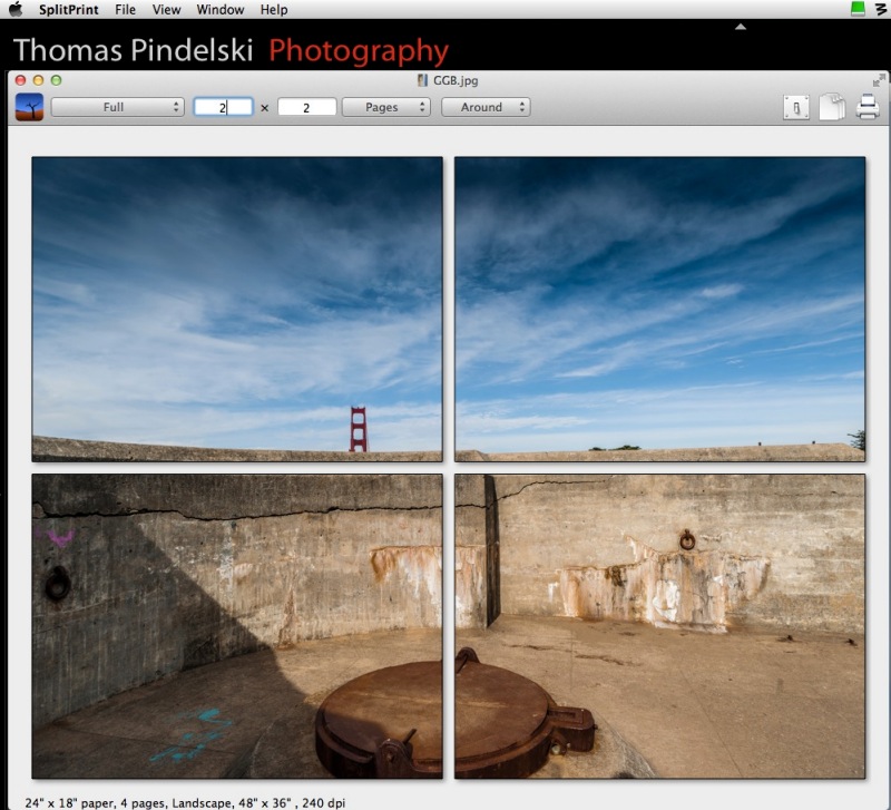
The SplitPrint tile settings.
Dry print runs:
Now 18″ x 24″ paper is not cheap and neither are ink supplies, so I first tested SplitPrint making a 16″ x 20″ print on my office monochrome laser printer using four sheets of 8 1/2″ x 11″ plain paper to see if things aligned and that margins were properly handled. You do not want the margins swallowing any content and neither my laser printer nor the DJ90 can make full bleed borderless enlargements. Margins are unavoidable and the inside ones will have to be trimmed off when assembling the four printed panes.
All went well but, ever cautious, I printed the first panel in color to the DJ90 on a test piece of 13″ x 19″ paper to check that everything was as expected and to verify that colors were true.
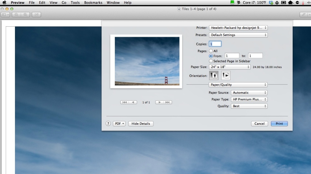
SplitPrint printer dialog.
This test confirmed good colors with a perfect match to my display thanks to the EyeOne colorimeter, so I loaded up the printer with four sheets of 18″ x 24″ premium glossy, checked that all the cartridges had ink (running out part way through will not make your day ….) and let her rip, telling SplitPrint to print all 4 images after setting it to use HP Glossy paper with bidirectional printing (‘Best’ quality). This takes a while, some 12 minutes a page, so I did the only rational thing possible. I took my assistant, Bert the Border Terrier, for a walk after the first page started coming out.
Tell me all you want about the romantic days of darkrooms, red lights, blackouts and poison chemicals, for me nothing beats the thrill of seeing a full color image emerging from the DesignJet in broad daylight.
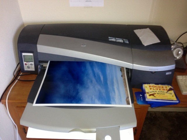
The first pane emerges.
The final prints:
Here’s the finished article, with Bert the Border Terrier for size. I will mount these on acid free board, after trimming the borders (SplitPrint permits small overlaps and draws the cut lines on the images though I had no need of these) then attach all four to the wall, ready for a faux wooden frame. SplitPrint did a perfect job of aligning the images on each page. If it’s of interest I will paint the wooden frame in the colors of the Golden Gate Bridge itself! The paint codes appear below.
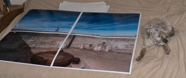
Bert and the untrimmed print(s).
Trimming and mounting:
Once the print borders are trimmed (carefully!), the prints are tacked to the mounting boards with the matching sides at the edges of the board. I do not own a 24” trimmer so have to remove the borders with a straight edge and Stanley knife. This is by far the riskiest part of the whole operation, rife with opportunities for error and injury. As the boards are very accurately cut this approach confirms that everything has been trimmed squarely. It’s either right or it looks schlocky. You can opt to leave the margins in place and install these as discrete panels on the wall but I find that sort of thing has been done to death and avoid it:
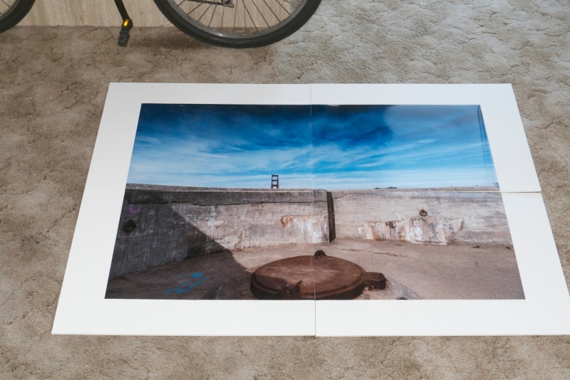
Tacked prints and boards assembled for dry run to check fit. 26″ bike wheel for reference.
Then it’s off to the dry mounting press to permanently heat mount the prints. Once that is done much of the risk of damage to the fragile prints fades.
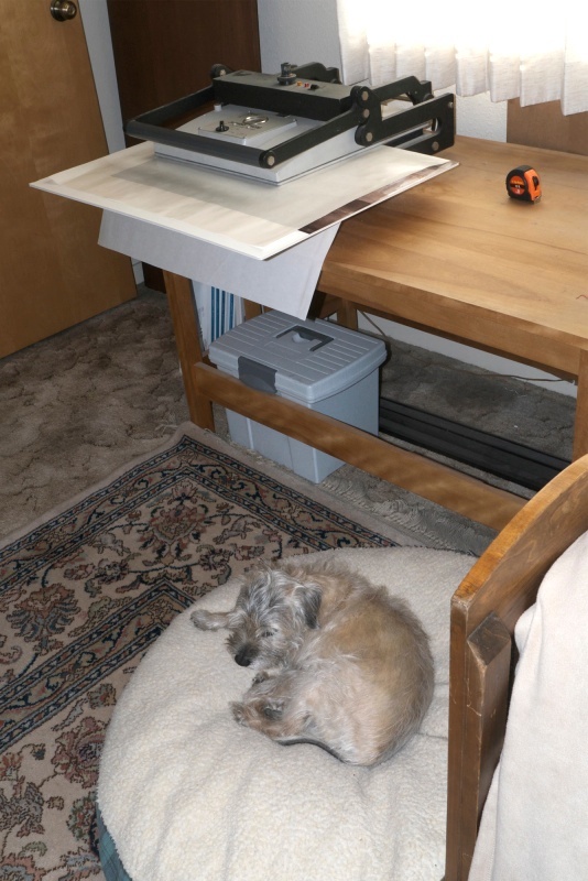
In the dry mounting press at 200F. Border Terrier at 102F.
It’s at this point that you start thinking that Michelangelo had it easy daubing that ceiling.
The prints are dry mounted and ready for wall installation:
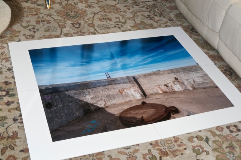
Ready for hanging.
I use glossy paper. Sure, it’s a pain to work with, fragile as heck and demands very high standards of cleanliness for it shows every blemish, but the result is unrivaled among paper prints for detail, resolution and punch.
Golden Gate bridge paint color codes:
Here are the color codes for those of you into the most beautiful bridge in the world; you can have the shade mixed at your local hardware store to paint any wooden frame you decide to install:
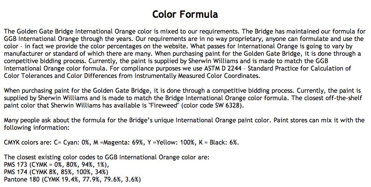
Color codes for the paint used in the Golden Gate Bridge. Click the image for details.
Speed:
There really are no shortcuts here. It’s hard manual labor. SplitPrint makes generating the four panes trivial but after that it’s an exercise in concentration and attention to detail. The next time I do this I doubt I’ll shave more than a few minutes off the total production time, which is several hours. Trimming and wall mounting are by far the most time-consuming steps.
How does it look:
In a word, stunning. While the viewer can get no closer than 10 feet to the print from the second floor landing, even at 2 feet resolution and detail rendering are to die for.
Gear:
Camera? Nikon D3x with the 24mp sensor. But, frankly, a 12mp D700 or any number of similar sensors (FF or APS-C) would be just fine for this setting, though the image would show lower resolution at the same ‘nose in print’ distance. There is more undiluted swill written about the need for high pixel count sensors than you could possibly imagine.
The lens? No magic sauce here either. An old 20mm Ai-S 20mm f/3.5 MF Nikkor – that’s the tiny one which fits in a jeans pocket, handheld at f/8. Mine is 1982 vintage and ran me $215. I added a CPU for $29. You spent how much on that plastic AF-S zoom?
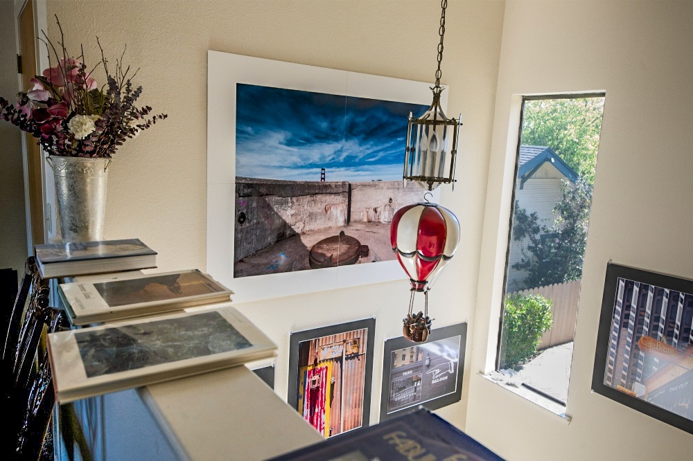
Installed. Wooden frame to come. Prints below are 18″ x 24″.
Cotton gloves on the window sill are used to handle the prints.