How things change
The addition of the Panasonic Lumix LX-1 to my equipment earlier this year, replacing my rangefinder Leicas, brought with it something new and exciting, over and above the superb overall capability of this pocketable digital camera.
An exceptionally wide image aspect ratio, meaning the ratio of height to width. The Panasonic uses a 16:9 sensor, which is identical to the format of most contemporary movies or, stated differently, 1:1.78.
Looking back over the past century but a handful of aspect ratios have dominated photographic images, or at least in-camera originals. None has been this wide.
Early plate and large format cameras used 3 1/4†x 4 1/4†film or 1:1.31. The 4†x 5†format, 1:1.25, popularized a whole range of printing papers in like ratio – contacts, 8†x 10†, 12†x 15†and 16†x 20â€. Until digital came along most photographic prints were made in these ratios, because that’s how the paper was sold and that’s how frame and mat manufacturers made their products. In other words, close to square.
The story has it that when Oscar Barnack, the Leica’s inventor, was ruminating on how best to transition from a hernia-inducing field camera to something pocketable (boy, would he have loved modern digital point-and-shoots or what?) he decided to make the film frame 24mm x 36mm, or 1†x 1.5â€, to reduce the grain effect of the movie film stock he had decided to use. A movie frame was a scant 18mm x 24mm and old Oscar decided, rightly, that that was just too small to permit a decent enlargement. So he doubled the size and thus was the famous Leica format born with an aspect ratio of 1:1.5, in contrast to the far squarer 1:1.33 of the movie original.
Of course, his efforts were, for the large part wasted, as printers were stuck in the 1:1.25 rut, so 17% of Barnack’s negative area was thrown away through cropping at the printing stage. Too bad he didn’t elect 24mm x 30mm, thus increasing the number of shots on a roll to 43 from 36, rather than wasting all that film.
Some photographers, most notably Henri Cartier-Bresson, made a fetish out of necessity, insisting that the composition of their originals was so perfect in every way on that long Leica negative that any French printer who would dare even think about cropping the negative would be deported to England, there to suffer a life sentence known as English cuisine. Truth be told, if you look at any book of Cartier-Bresson snaps and hack a bit off the long dimension, the picture loses nothing at all in power. Hey, don’t knock the artifice, it worked for him, no?
Brassai, extroverted Hungarian that he was, threw convention and aspect ratios to the wind and thought nothing of cropping one good picture into two or three even better ones. Viva Brassai!
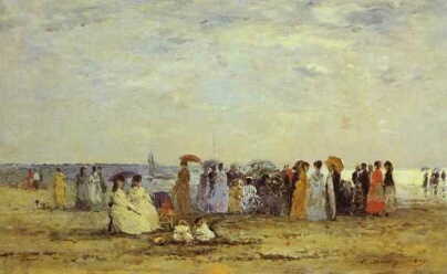
So Cartier-Bresson’s and Leitz’s predilections notwithstanding, 1:1.25 pretty much ruled the roost for most of the twentieth century. Add television, which adopted much the same ratio for its first fifty years, and you have a critical mass hard to overcome. Shame, really, because it’s a really boring look. Too bad few photographers learned anything from that great nineteenth century beachscape painter Eugene Boudin who though nothing of painting on canvases which were 1:2 or even longer in aspect ratio. He was doing nothing more than using a shape to fit the subject.

Boudin does Boudin
Towards the end of the twentieth century, home ink jet printers became affordable in even fairly large sizes, and for whatever reason someone decided that the carriage would allow a paper width of 13†and someone else came up with a paper length of 19â€. That just happens to work out to 1:1.46 so I like to think that inventor was a Leica man or the spirit of a much put-upon French printer had inveigled itself into the design process, because now the loss from a Leica negative was a mere 3%. HC-B could rest in peace, and given that a well printed ink jet print is indistinguishable from a wet process one, everyone was happy. I love the 13†x 19†format, finding it large enough to hang on the wall and long enough to afford the option of keeping everything in those many years of Leica negatives. It has become my default print size, replacing 8″ z 10″ for proofing purposes.
Before we segue to the current millennium it would be unfair to make no mention of the square format, beloved of Rolleiflex and Hasselbald users. Of course they never printed square prints, but take away the decision whether the camera should be held this way or that and you have one less variable interposed in the creative process. So, I suppose, that’s a good thing. Nonetheless, hack it down to 1:1.25 and the 56mm square Hasselblad negative promptly lost 20% of its surface area as the cost of this flexibility, though it was still more than 3 times the effective surface area of the Leica. So, for the most part, printers at Vogue and Harpers Bazaar hacked away, but at least one photographer decided to transmute this limitation and make of it an affectation. That photographer is Michael Kenna, and he resolutely prints most of his work in a square format. I’ll leave it to you to decide about his work, but if 1:1.25 is boring, then 1: 1 is near catatonic when it comes to visual interest.
I’m not sure what possessed Panasonic to adopt the 1:1.78 in the LX-1 (16:9 in common parlance, Europeans and Japanese preferring to put the long side first), but Hollywood had been transitioning to like-format widescreen movies for years and, guess what, Panasonic happens to be a major manufacturer of television sets. Visit your high street big box store today and you will find that more than half the TV sets are 1:1.78 and, making a virtue out of necessity, the ads scream ‘Widescreen’. Five years earlier the only widescreen display you could find was limited to megabucks home theater installations with overhead projectors. ‘Pan and scan’, where movies are chopped or scanned to fit the 1:1.25 or 1:1.33 screen is butchery indeed and a 1:1.78 screen fits the new sets perfectly, at the expense of black bars on older 1:1.33 movies. A good trade. Just try watching Sergio Leone’s Once Upon a Time in the West on a regular TV and you will wonder why this is considered by many to be the greatest Western ever made; switch to Widescreen and all is clear.
And for me, the widescreen format in the LX-1 is simply a revelation. I’m finding that I have to relearn how I think about pictures, just as I have to when making circular QTVR panoramas. Now I have no idea how to describe the aspect ratio of a QTVR 180 degree x 360 degree panorama, but it sure as hell isn’t 1:Anything!

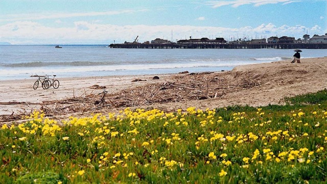
Pindelski does Boudin
I’m beginning to learn to photograph and print in widescreen and my next order of mats and boards from the wonderful people at Documounts will, you guessed it, have some 18†x 32†and 13†x 23†mat openings. They will cut any size you want, though these custom sizes command a small premium to all that 1:1.25 stuff. More of that later.
For this photographer this seemingly small change in aspect ratio has opened up new vistas indeed.