Category Archives: Book reviews

Photography books

Jack Dykinga – nature photographer

A master of the modern Western US landscape photograph.

If Eliot Porter’s nature photography appeals to the romantic side of one’s personality, Jack Dykinga’s appeals to the other extreme. A more formal, studied approach. Classical, if you like. That sounds boring on paper but the reality is that his work is astonishing. Whereas with Porter’s work the reaction tends to be “Hmmm, I need to think about that” with Dykinga it’s a more simple “Wow!”.

As is often the case in aesthetic matters, I chanced on his work by accident. It was 1983 and I was half way though my six year stint in New York City. The excitement I had first felt for the city was increasingly turning to dismay. Corruption, dirt and congestion. I reckoned I could get the same in Los Angeles and at least have good weather thrown in at no additional cost. So somewhere about that time I began thinking of going west.

Now there’s a lot that is good about Manhattan. Museums and art galleries everywhere. Restaurants of all ethnicities easily found. Central Park. Carnegie Hall. The Met. Broadway. Wall Street. Street photography opportunities to die for (sadly, literally true in the early 1980s, far better now) and those mom and pop grocery stores (mom and pop being Vietnamese or Korean) open 24/365, seemingly on every street corner.

But one of the best things about the City is the large selection of book stores, both traditional brick and mortar establishments, and the street vendors, just like in Paris. So it was some time around 1983 that I came across a magazine named Arizona Highways at just one of those places. Large format, slim and with no advertising, the photography, limited to Arizona, was stunning. There are no advertisements as the magazine is bankrolled by none other than the State of Arizona, or at least its taxpayers. To cut a long story short, it was there I first encountered the work of Jack Dykinga.

Best as I can tell, Dykinga still works with large format film and I was prompted to write this entry after pulling his book ‘Desert: The Mojave and Death Valley’ from the bookshelf the other day. If Arizona Highways was one reason I moved to the great landscape of the American West in 1987, then Dykinga’s photography was the catalyst.

In the winter of 1997-98 the heavy rains brought by the El Nino weather system produced a tremendous flowering of desert plants in the Mojave, and Dykinga was there to capture it. While large format is not necessary for the modest size of the book – some 10″ x 11″ in size – the photographs are simply magic. Far more than record pictures, Dykinga takes extraordinary pains over composition, thinking nothing of being up with the birds or going to sleep when the owls are coming to.

Thanks to the phenomenon that affects all photography books, you do not have to pay the $49.50 I did back in March, 2003 when this was published, as Amazon will sell you a new hardcover copy for the grand sum of $19.98. Add a fine and relevant text (rare attributes those, in photography books) by Janice Emily Bowers, and you have a treasure. I would spill the beans and tell you all about ‘The Racetrack’ but that section of the book is so extraordinary, so simply unbelievable, that I am going to keep mum and suggest you send some money to Amazon and find out for yourself. You will not believe your eyes.

And supporting a hard working photographer makes far more sense than throwing more money into the corporate coffers of Nicansonypan for the latest gadget. You can see Dykinga’s work on his web site. It does not do his work justice. Buy the book.

Robert Gambee – Downtown Manhattan

A standout from the crowd of Manhattan picture books.

Wall Street Christmas by Robert Gambee was published in 1990, some three years after I had taken Horace Greeley’s advice and moved west to Los Angeles. It is a wonderful piece with superb photography and text by Gambee – a monumental task. The book has over 270 pages and probably as many pictures.

While no longer in print you can pick up a good used copy for a few dollars from Amazon or other booksellers, and I recommend it unreservedly is you like superb architecture and photography.

I was reminded of the book when cataloging some pictures the other day and coming across a batch from my Wall Street days. Gambee records not only the exteriors but also the plush executive suites where the rich were made to feel better about parting with their money, for they could see so much of it hanging on the walls. My favorite recollection of the time is attending meetings in the board room of J. P. Morgan at 23 Wall Street where, for some inexplicable reason, I was always seated directly opposite the huge oil of J. Pierpont Morgan himself, dark glowering gaze and all. I have absolutely no recollection of the content of the meetings but the portrait will go with me to my grave! I recall traipsing down the corridor of this fine space – the building deliberately built to just a handful of stories to emphasize the wealth of the institution – and suddenly the industrial carpet changed to plush pile as you approached the hallowed ‘executive’ area.

There are the obligatory pictures of the World Trade Centers, of course, as it was impossible not to notice them. They only looked good at night when all those office lights made the facades look like some digital modern art piece. I had a client in one on the 95th floor and you had to take two elevators to get there. Each building was so large it had its own zip code for mail. Having dined a few times in the surprisingly good Windows on the World restaurant at the very top on the 110th floor, I recall on one windy winter’s day when the short elevator trip to the top was interrupted by the failsafes which would refuse to allow the elevator to move if the building and its shaft were twisting too much …. these buildings were tall!

Gambee’s pictures are far superior to anything I ever did in New York, but just for fun, here are a couple of my images.

Old and new, downtown Manhattan. Pentax ME Super, 200mm Takumar. Kodachrome 64

World Trade Centers. Pentax ME Super, 40mm ‘pancake’ Takumar. Kodachrome 64

A fine book, whether your interest is in architecture or just a vouyeuristic one wishing to glimpse the corridors of American financial power.

Kodachrome

Everything looks worse in black and white

Smirking with ridiculously self-satisfied glee at a joke he has just told to the wife of one of his flunkies, Hitler reaches for the cookie bowl. His pasty faced complexion contrasts strangely with the tanned, Aryan health evidenced on the woman’s beaming face, her gingham dress replete with red and white stripes.

Turn the page and there’s a post-Bitzkrieg Warsaw in September, 1939, its ancient buildings just so much rubble, with a proud, well fed line of Wehrmacht soldiers guarding their spoils, grey helmets shining in the sun, the sky a pure azure, doubtless wondering about that evening’s forthcoming excesses at the cost of their Polish captives.

One more page and Rotterdam is in ruins, one hour after the German bombardment, the sky a threatening dark indigo this time.

One more page and it’s the turn of the French, surrounded by German troops, brown shirts everywhere.

Yet another page and there’s a rotund, self-satisfied German actress in Hitler’s Chancellery, massive gold necklace and ruby red lips glistening just so in the Berlin of 1940. Enjoy it while you can, baby.

The sheer depressing nature of these pictures, blow after blow after blow, each speaking to the Master Race’s self-pronounced superiority, has a strange way of jolting the viewer into reality. Suddenly you are wide-eyed with amazement when you realize all these pictures, by unnamed photographers, were taken on Kodachrome.

Many, many years later Paul Simon was to crystallize the essence of this very American invention in the lyrics of his song. He was doubtless writing about the demise of TriX:

When I think back
On all the crap I learned in high school
It’s a wonder
I can think at all
And though my lack of edu—cation
Hasn’t hurt me none
I can read the writing on the wall

Kodachrome
They give us those nice bright colors
They give us the greens of summers
Makes you think all the world’s a sunny day, Oh yeah
I got a Nikon camera
I love to take a photograph
So mama don’t take my Kodachrome away

If you took all the girls I knew
When I was single
And brought them all together for one night
I know they’d never match
my sweet imagination
everything looks worse in black and white

Kodachrome
They give us those nice bright colors
They give us the greens of summers
Makes you think all the world’s a sunny day, Oh yeah
I got a Nikon camera
I love to take a photograph
So mama don’t take my Kodachrome away

Mama don’t take my Kodachrome away

Mama don’t take my Kodachrome
Mama don’t take my Kodachrome away

Mama don’t take my Kodachrome
Leave your boy so far from home
Mama don’t take my Kodachrome away
Mama don’t take my Kodachrome

Mama don’t take my Kodachrome away

And if you want to catch the spirit of the piece, go no further than the lovely Coneheads on DVD, to see what I mean.

The Leica may have been the greatest machine invented for photography, and its gritty, grainy black and white film stock enshrined an era seen through the eyes of street photographers everywhere. But the snaps were not color. And pragmatic Americans, ever looking for the latest gadget, the true reality, wanted color. So Kodak gave them Kodachrome.

The single greatest photographic invention since the Leica.

The book is ‘Kodachrome, 1939-1959, The American Invention of our World’, and you can get it for chump change from Amazon.

Yalta, 1945. Stalin decides the future of Western Europe while WSC and FDR look on. Click the picture.

It is, perhaps, unfair to refer to this as Kodak’s invention, though Kodak deserves credit for letting two professional musicians, one a pianist, the other a violinist, take up laboratory space in upstate New York in 1930. Leopold Mannes and Leopold Godowsky, Jr. just happened to be keen amateur photographers and geniuses at chemistry. Clearly, God did not allocate talent equally. After thirteen years of research, Kodak announced Kodachrome on April 12, 1935 as the first continuous tone color film. Imagine a thirteen year development cycle for anything today.

That early emulsion faded badly but by 1938 the Leopolds (‘Man’ and ‘God’ as they were known in Rochester) got it right and the Kodachrome you can still – if only just – buy today is little changed. Best of all, unlike any other color film ever made, processed and properly stored it is virtually fade proof. History may not record how Mannes and Godowsky felt about their emulsion being used to photograph the creator of the Final Solution, but the oh! so satisfying picture of German prisoners of war in a prison cage on Normandy beach (page 44) doubtless warmed the cockles of their hearts, especially as it was taken on the emulsion they created.

Kodachrome in 1938 was some 12 ASA in speed. Later, as Kodachrome II it became 25 ASA, where it stayed until being discontinued, now as Kodachrome 25 (I suppose that sounded faster) a couple of years ago. Meanwhile Kodak had also added Kodachrome X (later Kodachrome 64) and Kodachrome 200. For years, such was the repute of this emulsion, National Geographic would only accept Kodachrome slides for reproduction in its pages.

Jane Russell frolicked in the hay for all to admire for a poster for her film ‘The Outlaw’ in 1944. Howard Hughes, who bankrolled the movie, famously remarked “There are just two reasons to go and see her”, summarizing succinctly what every American male was thinking. Americans were happy in 1944, if not gay, and Kodachrome captured Jane’s …. womanhood just so. No one organized a protest, men continued to eat red meat and smoke Marlboros, and women had 2.4 children and craved a starter home in the San Fernando Valley, north of Los Angeles. Political correctness, refuge of cowards and lawyers, had yet to raise its ugly head. Marlene Dietrich looked ravishing in Kodachrome and jewels in 1948 (it’s OK, she was on our side) and General Douglas MacArthur could look macho in his jeep in 1950. Doubtless the vain General liked what Kodachrome did for him, even if Harry Truman later fired him for insubordination. Too bad we don’t do that with the generals today.

So a vital part of the chronology of American life, of what it meant to be American, is recorded for all time on fade free Kodachrome, in true colors that tell how it was.

There’s Elizabeth Taylor, ravishing in a white dress. The young JFK with Jacqueline Bouvier, film stars both, enjoying a game of tennis. Brooklyn Dodger Jackie Robinson helping destroy one of the last great bastions of White American bigotry, baseball. Marilyn entertaining the troops, her generous lines lovingly rendered. Hitchcock looking like … well, like Hitchcock, ruddy pink face and cigar. Kodachromes all. The El still ran in New York and Kodachrome proves it. Gamine Audrey Hepburn and blowsy Jayne Mansfield showed their true colors. Tarty Shirley MacLaine juxtaposed with a sneering Elvis. Zapruder used Kodachrome in his 8mm movie camera to record JFK’s murder in Dallas. Tricky Dick tried to look like presidential material next to Ike. Not very successfully, let it be said. Even Kodachrome could not hide the fact that his sly smile might just be something to worry about. And even the great Walker Evans got in on the act with a storefront snap in Kodachrome, though in this instance it’s only fair to add that he should have stuck to black and white.

I used Kodachrome exclusively during the period 1977 through 1990. The absence of grain, the consistency of processing by Kodak, the tonal range and color accuracy, all were simply wonderful. Eventually color negative films would rival, maybe surpass, these qualities, and once you could scan the originals and save them to properly backed-up hard disks, fading ceased to be an issue. For in much the same way as I used TriX during the years 1971-1977, Kodak showed what world class products were all about.

You can still get Kodachrome. K25 is no more and Kodak doesn’t want you to know about the alternative as evidenced by a search on their web site:

But go the the B&H web site and Kodachrome 64 can still be had in 35mm cassettes, in 64 and 200 ASA speeds. Only one lab remains in America that can perform the wildly complex processing of this emulsion, and the lovely 120 film size disappeared years ago, as I found to my cost. Unearthing two rolls from the dark recesses of the film shelf in the fridge the other day, it transpired that no one, not even Kodak UK, processed this size any more. Oh! well, I had to throw them out. Just think, through the late 1950s you could get Kodachrome in sizes up to 8″ x 10″. Imagine that. Today it’s 35mm or nothing.

And the inventors? Kodak’s historians have wiped them from the memory banks. Search on Mannes or Godwosky and you get nothing. Shameful.


Matanuska Valley, Alaska, 1978. Leica M3, 50mm Summicron. Kodachrome II.
Taken by this newly affluent immigrant shortly after arriving in America.
At last I could afford not just color film, but Kodachrome, no less.

So if you still use film but have never used Kodachrome, please rush and get one of the remaining rolls now. Your scanner’s dust removal software will not work (silver is required in the emulsion for that and Kodachrome has none), it’s not especially fast by today’s standards, but do you really want to go to your grave and say “I never used Kodachrome?”. No, I didn’t think so.


Lake Elizabeth, California, 1990. Leicaflex SL, 180mm Apo-Telyt-R. Kodachrome 64. One of my
last Kodachrome pictures. After that, scanners became affordable and Kodak color negative film,
impermanent as it may be, provided a far faster processing turnaround.

Looking at pictures

You can’t beat natural light

As we look forward to six dry months in central Caliornia, it’s nice to have a sheltered outdoor spot to look at pictures on those long, warm summer evenings.

This little walled patio on the north side of our home was a complete mess when we moved here a couple of years ago. As the US Government has yet to craft a method of taxing sweat equity, I set about fixing it up to make a pleasant enviroment to better enjoy the occasional book of pictures. The only taxes involved were iniquitous sales taxes which, wherever they may go rest assured it’s not to fix the local roads and freeways, which resemble those of a third world nation.

No matter. Get rid of the horrible hot tub that so spoiled this lovely spot, add a few rose bushes and magnolias, some mulch, a small fountain to set the tone and a few pieces of wicker furniture from the far east and you have the makings of a fine outdoor reading room. The tub was sold to a neighbor and the proceeds invested in what you see here. Throw in a Border Terrier and things are nigh perfect.

Yesterday evening I was leafing through Michael Kenna’s work in the beautifully printed ‘A Twenty Year Retrospective’ and couldn’t help but remark on how the prints looked so much better in the warm outdoor light. His photographs are reproduced in a gentle sepia which adds greatly to the overall feel. Kenna has a strong, consistent style and while the book credits him with works in many US public gallery collections, you would probably expect to find it on the wood panelled walls of classier business institutions like private banks and financial advisors.

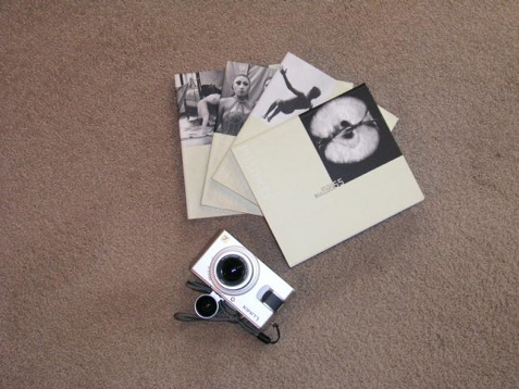
Anyway, with all that sepia going on, I grabbed that little jewel, the Leica DP, and took a couple of snaps to illustrate this piece. A few seconds with Photoshop saw the RAW images converted to TIF files whence two more clicks saw monochrome conversion and sepia toning.

Boxers

Book review

I confess that I approached ‘Boxers’ by Carol Huebner Venezia (an American photographer, the exotic name notwithstanding) with great anticipation. The publicity talked of how the photographer had got inside the psyche of the professionals in Gleason’s Gym in Brooklyn where many famous fighters had trained. Further, the publicists intoned, she counterbalances the tough end of the sport with pictures of fighters in Italy. I quote:

“Boxing offers those working class men who learn the sport a slim chance of realizing the American dream. But the price for social standing and above-average income is often broken bones and chronic health problems. In contrast, in Assisi, in the center of the Italian boxing world, boxing is about athletic competition and the art of the sport.”

Well, based on what I see here, she never made the remotest emotional contact with her subjects in either location. Indeed, some of the best pictures have no boxers in them – one of a young child in the ring and another of swinging sacks, or whatever you call those things, that boxers pummel. Nary a boxer in sight. Great pictures though.

Despite the high fallutin’ text, based largely in academic drivel, the woman’s inability to get inside the brains (or what’s left of them) of her subjects is mystifying. It’s not as if she didn’t try, as the pictures span over a decade.

Let me quote from the introduction just to reassure you I am not making this up:

“If we look at the group of pictures as a whole, there appears to be a clear impulse to movement both in the single photographs and as a sequence”. What? Nearly every picture in the book is stiffly posed in a pale imitation of August Sander. Sander is much lauded in the introduction let it be said, and the comparison only goes to show the photographer in a negative light.

One of the few snaps with movement is of the swinging medicine (yes, now I recall what they call them) balls in a deserted gym. Why these should be moving when there is no one in sight beats me, but it’s a neat idea, I suppose.

Here’s another Doozie from the intro:

“The objective approach of this photography avoids pathos or any explicit critique of society”.

Please.

So that’s where our higher education monies are going? To pay boobs to write claptrap like that? What a travesty. Time they got a real job and learned to write English.

Lots more of the above garbage is to be found in the introduction. No need to dwell there.

On to the pictures.

There are a scant thirty all told, one of which, the one so badly exposed that no facial details can be discerned, also appears on the cover. Not exactly what you would call value in a $30 paperback. Fully half of these are static portraits, some in what could be a studio setting, of half naked guys who, absent their gloves, could as well be construction workers. Or fit investment bankers, come to think of it. The remaining pictures are generally so irrelevant to the genre that I really wonder why the woman bothered? Maybe she liked to go to Gleason’s for the vicarious pleasure of seeing all those muscles, the camera as an excuse, but the guys in the ring clearly did not accept her as one of their own. Heck, she’s probably the wrong gender and color anyway.

I would like to say something positive about this book. I cannot. I just feel I have been ripped off.

Update May 18, 2009: This book is so unquestionably bad, the photography so regurgitably awful, that I finally consigned my copy to where it belongs. The garbage bin. Good riddance.