Category Archives: Photographers

The Krays

English gangsters..

The night club scene of 1960s London was dominated by two gangster brothers, the Kray Twins. Identical twins, Ronnie was seriously insane and Reggie just a tad less so. Each committed murders in public and ended up serving a life sentence in gaol.


Reggie and Ronnie Kray by David Bailey, 1965

While the brothers established a measure of respectability after opening an upper class night club which was a magnet to the knobs and actors of the time, they inevitably returned to their roots of psychotic violence and mayhem, their empire ending once they were incarcerated.

David Bailey’s superb portrait of the pair pulls no punches. They are in your face, the submissive Reggie and the dominant Ronnie looking ready to lay about them with whatever weapon came to hand. Bottle, lead pipe, knife, sword (!), gun. You name it. They were not fussy. Bailey grew up in the same poor East End of London as the Krays so he will have been particularly attuned to their make up. It shows.

Two excellent movies have been made about the Twins. The deeper psychological portrait is to be found in The Krays where the Kemp brothers from the rock group Spandau Ballet deliver insightful performances. The more recent offering, Legend, sees Tom Hardy deliver a tour de force performance, acting both brothers. The script is less nuanced but the movie is worth watching for Hardy alone.

Bailey’s picture haunts me to this day. The other week I was taking some studio portraits of a pair of Welsh Terriers owned by friends and, well, I couldn’t help but plagiarize Bailey’s composition. Buckley, the male at left is clearly submissive, while Tilly, the female is the dominant one of the pair.


Buckley and Tilly, the Welsh Terriers.
Nikon D800, 16-35mm AF-S Nikkor, Novatron strobes.

Welsh Terriers were bred to flush out badgers whose setts (underground homes) would cause foxhunting horses to break legs. You probably should not mess with these boys any more than you would with the Kray Twins.

Ripley

An orgy of monochrome cinematography.

“There’s no there when you get there”, Gertrude Klein once said of Oakland and when you look into Andrew Scott’s eyes in the new Netflix production of Patricia Highsmith’s eponymous character you have the same reaction. A cold blooded killer singularly interested in material possessions and La Dolce Vita, Tom Ripley has been filmed many times.

There’s the wonderful 1960 version directed by René Clément starring the physically beautiful Alain Delon, in French, named “Purple Moon”. A feast for the eyes.

Then there’s the 1999 Anthony Minghella version “The Talented Mr. Ripley” known to most viewers, with splendid performances from Jude Law and Gwyneth Paltrow, with a thoroughly wooden Ripley by – who else? – Matt Damon. The movie is watchable enough, but a repeat viewing is reminiscent of perusing last year’s tourist brochures for the Riviera. All gloss, no substance with a sadly underused Cate Blanchett.

Then John Malkovich delivered a terse comedic version in Liliana Cavani’s enjoyable 2002 sequel named “Ripley’s Game” where a mature Ripley, now ensconced in worldly luxuries, retains and practices his killer instincts to preserve his luxurious lifestyle funded by theft and mayhem. There’s a fine performance by Dougray Scott as a weak willed frame maker and Ripley tool with the always lovely Lena Headey as the questioning wife. This is actually a remake of a Wim Wenders 1977 movie named The American Friend with Dennis Hopper and Bruno Ganz, with Wenders exchanging violence for the humor in Cavani’s version. Dark and foreboding.

Now, from the usually low brow production studios of Netflix who mostly seem intent in pouring money into a string of disasters, (check that cure for insomnia “The Irishman” with its truly frightful ‘de-ageing’ technology), comes a new interpretation in eight 45 minute episodes, and it’s highly recommended for aficionados of black and white cinematography. I’m watching it in high definition streaming 4K (if that’s not a contradiction in terms where data compression is the order of the day) and the cinematography of Robert Elswit proves why there’s an Oscar on his mantelpiece.

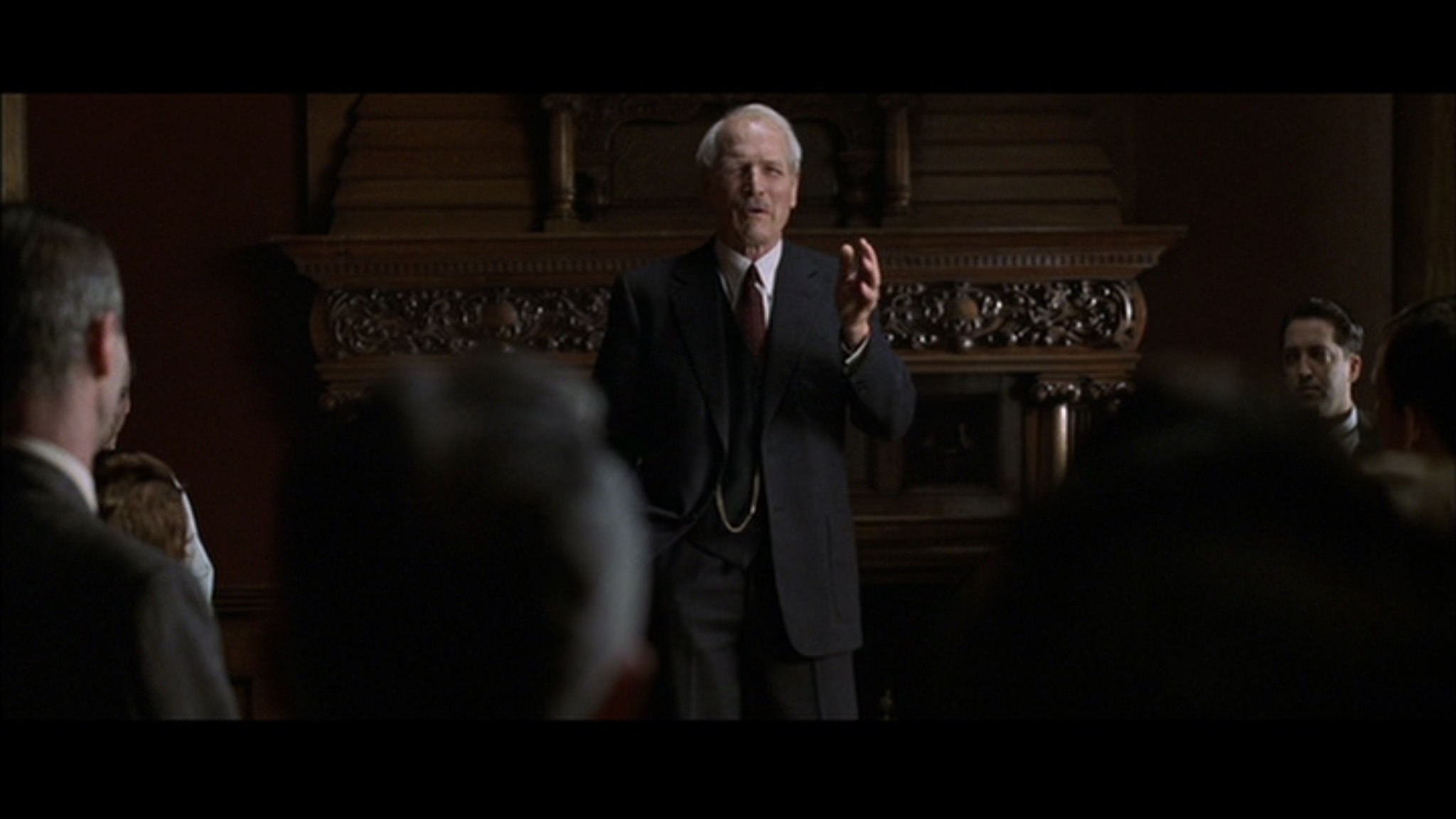
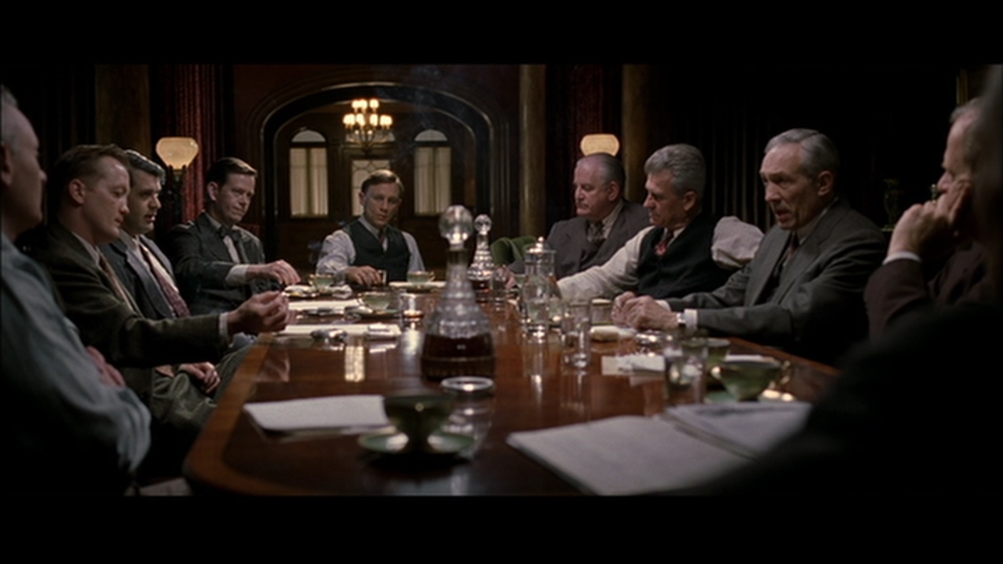
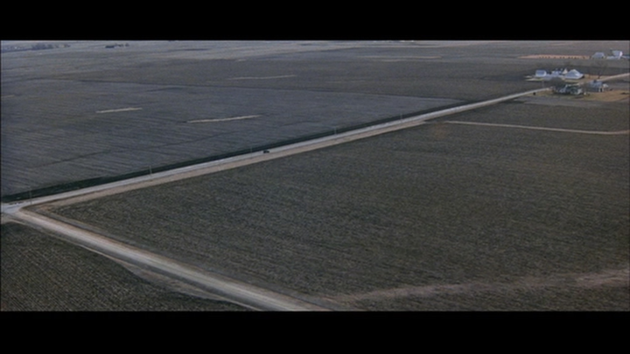
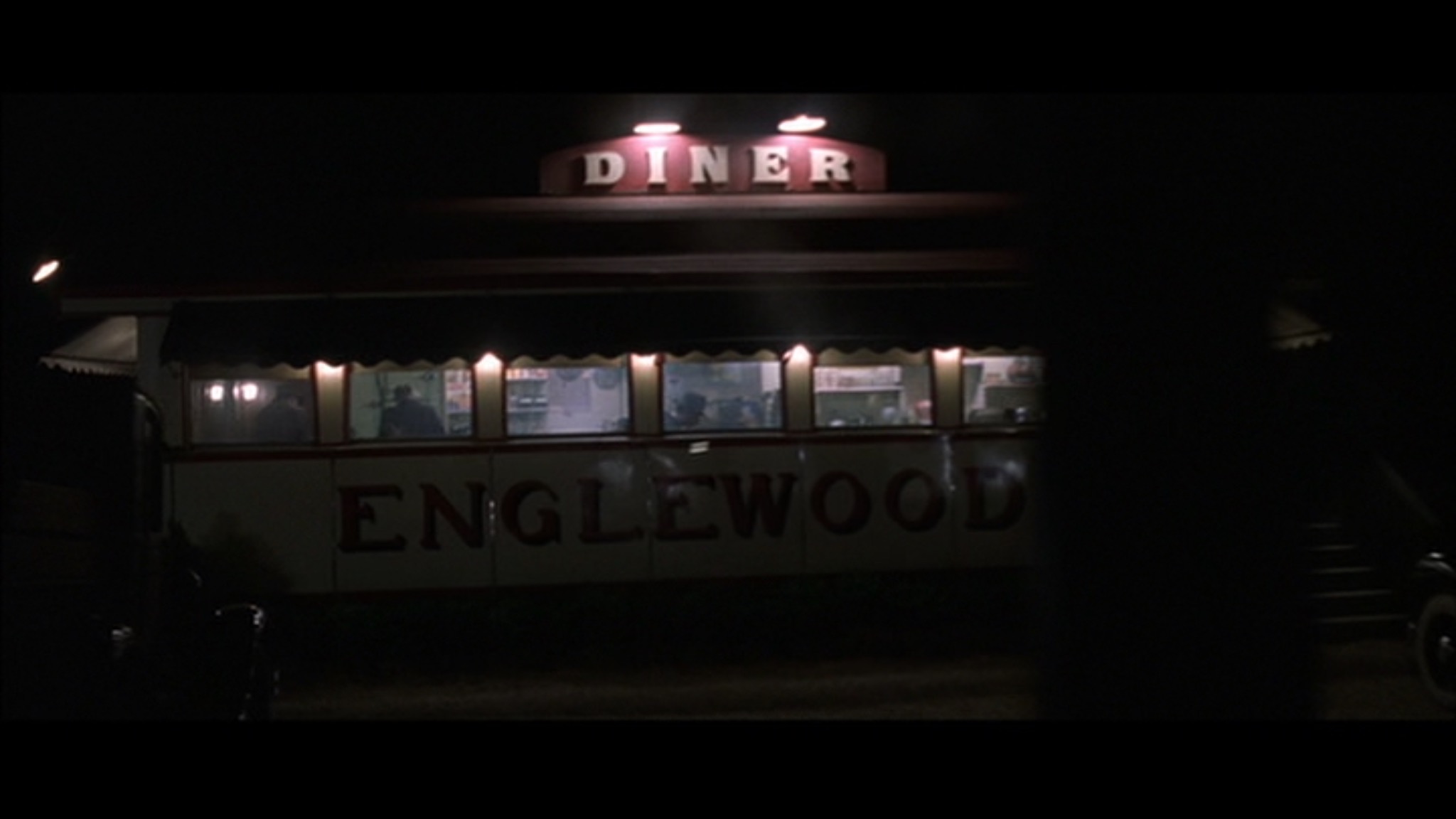
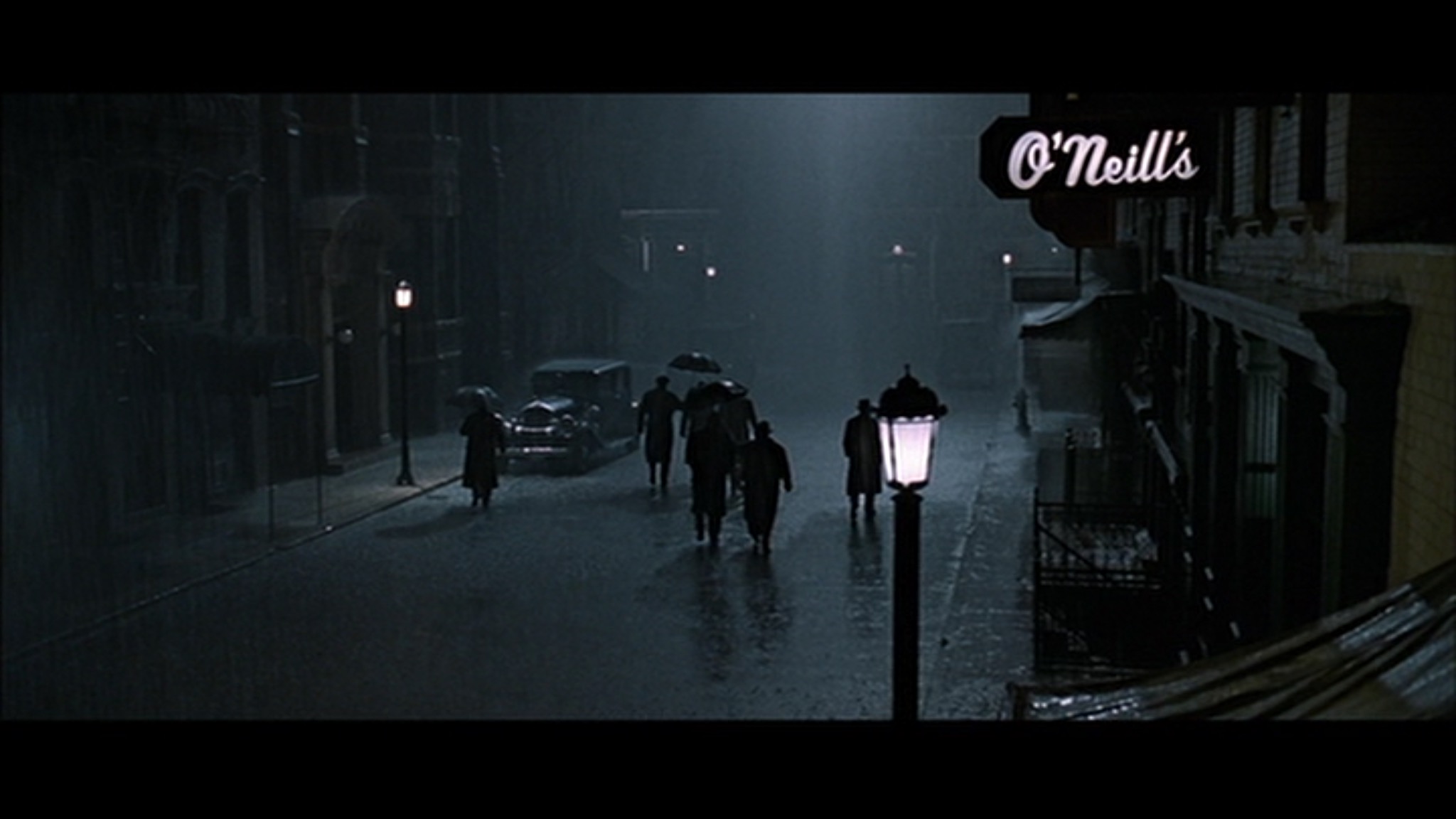
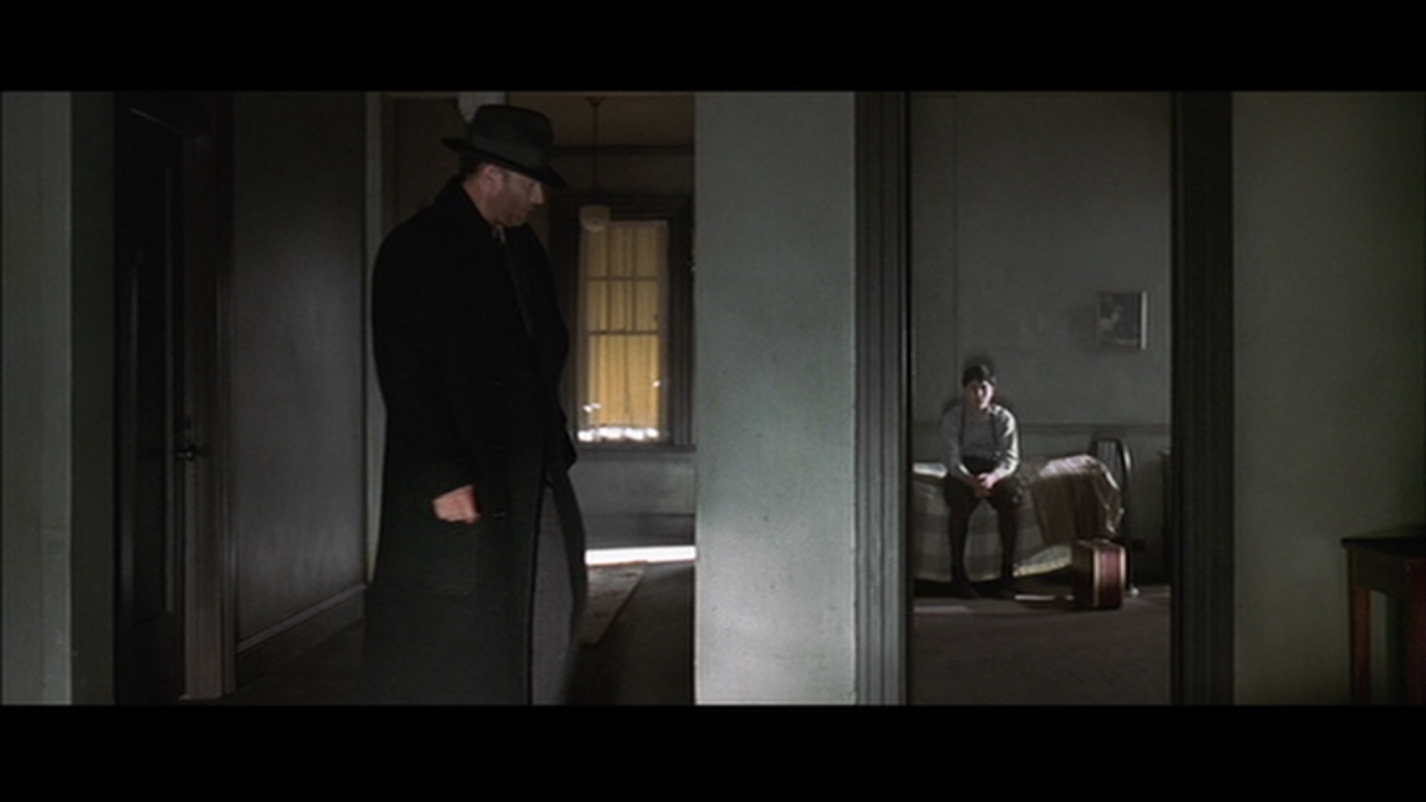
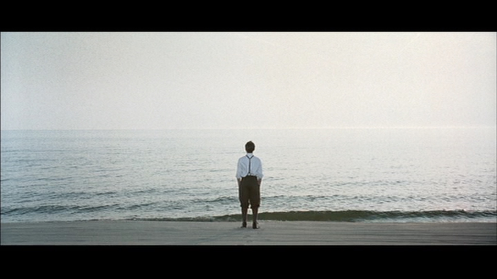
Here are some stills from the climactic Episode 3 where Ripley whacks the poorly acted Johnny Flynn as Dickie Greenleaf:


These monochrome images are reminiscent of the canvases of René Magritte and the photographs of Ralph Gibson and they are arresting. On several occasions I found I had to pause the movie to luxuriate in its monochrome splendor.

So, Andrew Scott as Ripley apart, you do not come here for the acting which is mediocre to awful (Eliot Sumner in particular should audition for fry cook when his/her/its acting career mercifully ends, which should be any day now), with Dakota Fanning an honorable exception as the Ripley-hating Marge. No. You come here for the cinematography which is very special indeed. Suffice it to say that this is HBO quality from a competing studio not known for its high standards in movie production.

Kodachrome – the only excuse to use film

Gone, but not forgotten.

The Big Yellow God. Thus was Kodak known in the 1970s because you mailed your exposed Kodachrome slide film in a yellow mailer to Rochester, NY and time and the USPS permitting, you would get your slides back, beautifully mounted in 2″x2″ cardboard, in a yellow box, in a couple of weeks.


The Ektachrome outlier was their 160ASA/ISO speed demon!

In 1970 Kodak lost a trust busting suit which allowed only the BYG to process Kodachrome and the floodgates opened to independent processing shops who could afford the costly gear and crack the 17-step process, which included a couple of re-exposure steps to effect reversal of the image. Consonant with that old economic adage that “All control drives up price” prices crashed and Kodachrome became the most popular film on the planet. That explains the above slides lacking the Kodak imprimatur on the cardboard mount. They were processed by indie shops which had a faster turnaround.


The Kodachrome process.

While my color snapping had seen but one roll of Kodachrome exposed in Paris along with one of grain crazy Ansco/GAF’s 500, I no longer had a darkroom after taking my last TriX monochrome image and, quite frankly, I was bored to death with black and white. So why not the best? I loaded up my Leica with Kodachrome 64 (I considered the 25 ASA alternative too slow) and had at it. This was in November, 1977.


My first color image in the US. November, 1977, Anchorage, AK.


Indie Kodak processing lab, Anchorage.


Harsh and high contrast.


Kodachrome yellows and reds were to die for.


On the Natchez, Mississippi River, New Orleans.


Brennan’s, New Orleans.


Bourbon Street, New Orleans.


New Orleans.


Bergdorf’s, NYC.


NYC.

Kodachrome was a very contrasty film with unique rendering of yellows and reds. It was not especially fine grained, as these ultra-high resolution scans from my Nikon D800 disclose. At ISO 100 on the D800’s monster 36mp sensor there is zero digital ‘grain’. You only see what was stored on the film itself. No matter. They print just fine.

Leica M3 and Leicaflex SL, 50mm Summicron, Kodachrome 64, ‘scanned’ on the Nikon D800.

Paris revisited

One last visit to The City of Light.

My first visit in September, 1974 had been nothing but joyful, confirming my love of all things French.

By October, 1977 my utter disillusionment with England saw a one way ticket to America in my baggage but, before boarding that Pan Am flight, a second and final visit to Paris was indicated. I simply wanted to cement the images of that gorgeous city in my mind. And in my Leica.

These are among the very last monochrome film images I ever took. Thereafter, once in America, my salary would double, my taxes would halve, my suit count would rise from one to three and my prospects would improve two orders of magnitude. And Kodachrome and the local printing place would obsolete TriX and the smelly chemicals and enlarger in the home darkroom/bedroom.


At the Arc de Triomphe


Self portrait with Leica


At the Elysée Palace, Cadillac and all


Wedding in Parc Monceau, quite possibly the most perfect public park …. after the Tuileries Gardens


Parc Monceau


At the Holocaust Museum. Appropriately spiky and threatening


At the Holocaust Museum


Café Cher(ie)


Working girl


The Venus de Milo has seen better days


Gorilla


Mailman


Train conductor


Gendarmes


If the English are a nation of animal lovers then the French are a nation of dog lovers


Pipe and pigeons

Leica M3, 35mm Summaron, TriX. What could be more perfect for street photography? All images ‘scanned’ using the Nikon D800.

Terence Cuneo

Steam train painting master.

Ask me which photography book I would choose if I could only have one and the answer has been unchanged for decades. It’s O. Winston Link’s (1914-2001) Steam, Steel and Stars. A masterpiece of nostalgia, composition and technique, it’s so good that I own two copies, the lighter paperback joining me on my travels:


Everyone should have two.

But a photographer can only go with what is there. Yes, he can change the lighting and composition but he does not have the creative freedom afforded a painter whose limits are those of his imagination. And if you want something of the same caliber as Link’s photographs on a canvas the only choice is the work of Terence Cuneo (1907-96).

High drama is a given in his moving train canvases:


High drama.

Yet the more mundane images are no less powerful and nostalgic:


The signalman.

Cuneo would generally make pen and ink sketches first and completed many commissions for British Railways. In this example, where the cab is being lowered onto the wheels and chassis, he arrived too late. Because he was well known by the operators it was a moment’s work for them to raise the cab so he could complete his sketch:


Preliminary sketch.

And then, Boom!, an absolute masterpiece:


An Engine is Wheeled.

Imagine an advertising campaign today with this ‘backroom’ approach? Pictures of Chinese slave labor assembling iPhones? I don’t think so.

And if you desire Impressionist genius, Cuneo is happy to oblige, as in this image on the Orient Express:


Impressionism on the Orient Express.

These images are from a splendid book titled ‘Terence Cuneo: Railway Painter of the Century‘. It’s long out of print but available from used sellers and the quality of the printing on very thick stock does justice to Cuneo’s canvases.