Category Archives: Architecture

Pictures of buildings

Architectural photography

An under-appreciated field.

While I cannot remember a time when I did not think about photography on a daily basis, an interest in architecture did not seriously take seed until the age of 29. That was the year I moved to New York City. While its inherent bias on the editorial pages sadly infects the news reporting in the New York Times, no such favoritism was evident in the writings of Paul Goldberger and Ada Louise Huxtable. Their topic was architecture.

Before I knew it I was attending lectures by prominent architects, fascinated by the melding of big business, art and massive budgets with all the related logistical complexity which is what results when you try to build in New York. I mean, look at the realities. Those seeking to do you harm include the Mob (concrete to this day costs 20% more in NYC than anywhere else), the City of New York (relatively cheap to buy, after the Mob is accounted for), Albany, Washington and just about every other government apparatchik you can think of. The only difference between the Mob and the government is that the latter wrote the laws. If you can make a tall building in Manhattan you can make one with impunity anywhere.

Absorbing Huxtable’s and Goldberger’s teaching I cemented my relationship with architecture by visiting Chicago for the first time. Simply stated, Chicago’s finest buildings are to Manhattan what Ferrari is to GM. But New York’s winters were tough enough, thank you, so it wasn’t as if I was about to move there, much as I love the people of the mid-west. And those writers’ teachings made an indelible expression. Give me those charming moments of partial consciousness that define falling asleep and, likely as not, you will find my mind straying to New York City architecture.

You can say an awful lot about a building by measuring your desire to touch it. Not metaphysically. Walk up to it and touch it. And for me there were always three which made that distinguished cadre. The Flatiron Building. Philip Johnson’s AT&T. And Seagram. Johnson again.

So bad did this habit become that I made a point of walking past the last two on the way home just to be able to brush them with my fingertips. Maybe some of the magic would rub off?

No secret that I would make special efforts to entertain clients at lunch in the Four Seasons at the plaza level of Johnson’s Seagram masterpiece. From there I could gaze at the no less wonderful Lever House, airily perched on stilts on the west side of Park Avenue. It was my privilege to watch AT&T grow from my 40th floor office in the so-high-tech Citicorp Center, sloping roof for solar panels and all. Still not installed last I checked. Like the corporation, the architecture was crass, vulgar and ethically challenged. AT&T was so beautifully made that you just had to touch it. And they had that Apollo chap in the lobby, all gilded, with massive transatlantic cables draped about him.

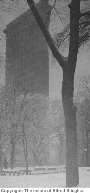
As for the Flatiron, forget about all those schoolboy statistics about it being the tallest, the first with a steel frame, the first with elevators, etc. All you had to know was that Stieglitz had photographed it in 1903.

I was lucky to be reminded of all of this by the loan of a book on architectural photography from a friend. There, on page 113, Stieglitz’s masterpiece of the Flatiron is annotated thus:

Stieglitz’s ethereal view of the Flatiron, taken with a hand-held camera, typifies the Pictorialist approach to architecture.

That got my attention. I am of that school, after all. And here is that snap:
The book is Building with Light by Robert Elwall. American architecture is remarkably well represented (the author is the Curator of the British Architectural Library) with not a trace of condescension, and the whole 240 page tome is a breathtaking survey of architectural photography from the early nineteenth century through today. (Note: Architectural photography has not improved in the last 150 years).
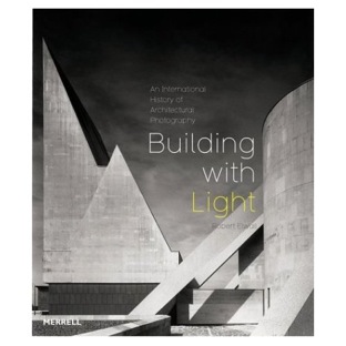
Some of my favorite images are, unsurprisingly, from California residential architecture. Shulman and Neutra are amply represented as they adapt the new international style to a smaller scale. The photography changes too. What was once formal documentation is now pure pictorialism. It’s the effect of the building, not its technical detail, that fascinates.

Sieglitz would be proud.

All of which gives me two suggestions. First, get the book if buildings speak to you. Second, stay tuned for some of my architectural pictures ….
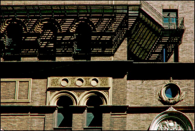
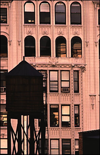
The Transamerica pyramid

A modern cathedral of commerce.

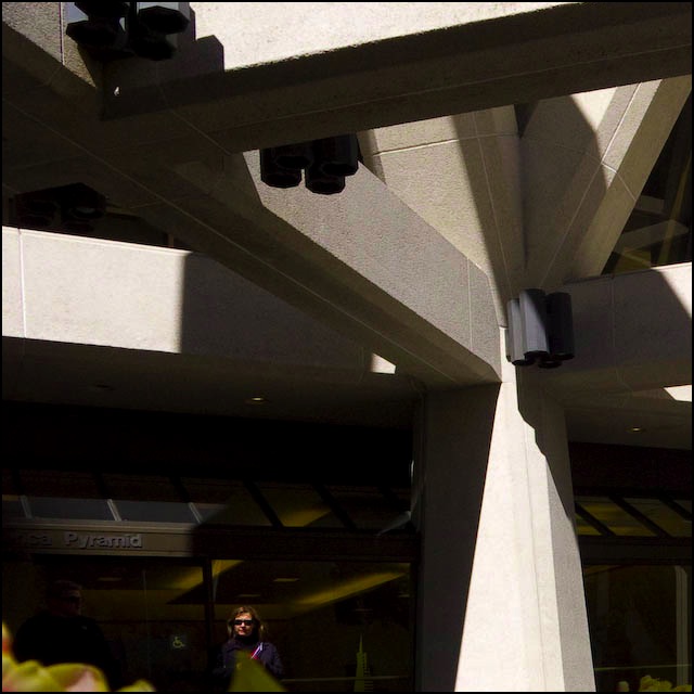
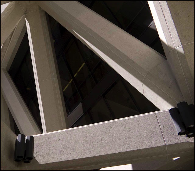
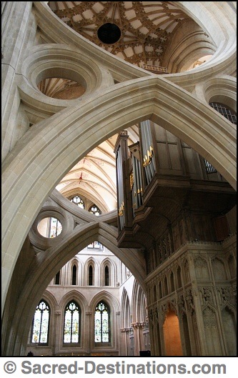
It may not be quite in the league of the scissors arches at Wells Cathedral in Somerset, but the attention to detail in the Transamerica Pyramid in San Francisco and the elegant execution holds its own in the world of modern architecture. For whatever reason, these snaps seem to work nicely in a square format.


Base of the Transamerica Building. Panasonic LX-1, 28mm, 1/1000, f/3.6, ISO 100.


Another view. Panasonic LX-1, 28mm, 1/640, f/3.6, ISO 100.

The fourteenth century designer of these arches in Wells Cathedral may not have had access to modern computers, but he did OK, no? Notice how the doughnuts confer strength while adding beauty. Simply wonderful. Somehow I think his work will outlast the Pyramid, given America’s love of tearing down good architecture.


An older cathedral of commerce. The scissor arches were an afterthought to spread the load. Some afterthought!

And let’s not get too high fallutin’ about motives here. Both clients were interested in one thing – making some coin. It’s just that the folks who commissioned Wells were smart enough not to pay taxes, whereas the underwriters at Transamerica really would prefer that life was infinite as that means they would never have to pay up on all those life policies …. and you though life insurers were callous and uncaring?

Disclosure: I have a thumping great big term life policy issued by Transamerica on my life, so my son, the beneficiary, prays that the Pyramid and its owners remain standing. Me? I don’t care. Once I’m gone, that’s all she wrote.

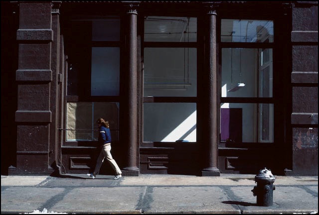
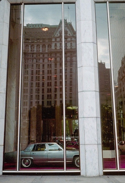
About the Snap: General Motors Building

General Motors Building

Date: 1981
Place: 5th and Central Park South
Modus operandi: Walking about
Weather: Lovely
Time: 11 am
Gear: Leica M3, 35mm Summaron
Medium: Kodachrome 64
Me: Dazed and Confused
My age: 30

Say what you may of Detroit steel, few would dispute the assertion that the last time a Detroit product had class was made about, oh, 1949. That’s the problem with Detroit and with GM in particular – their products have no class. Conjur up the image of a Corvette owner and you have Bubba himself, belly obscuring his toes from view, with a can of Budweiser in one hand, a Big Mac in the other. And it’s not just price. Take any small, inexpensive charmer from Renault, Peugeot, Citroen or Fiat and you have something fun and appealing. And as for class, well that only grows in Maranello and comes in red.

Now all of this is hardly news, for I would have written much the same in 1980 when I snapped this picture. (And I had been adulating Ferraris for many years already. A British tifoso). GM had just managed to completely beffudle its Buick, Chevrolet, Pontiac, Oldsmobile and, yes, Cadillac loyalists by making all of the sedans look alike. So your $40k Caddy looked like Bubba’s Chevy Impala. So while the leech-like unions can claim a fair share of the credit (debit?) for destroying GM, management must be first in line for that prize. Rarely in post-industrial history has so great a business, the absolute franchise of its time, been so thoroughly destroyed by pencil pushers who don’t know a crankshaft from a rear seat.

In 1981 GM was having one of its perennial losing years so this picture was no longer possible a year later. GM had left by then. You see, in 1981 GM still occupied the ground floor concourse of the GM building in New York where it displayed its wares. It was the work of a moment to see GM’s vulgar display window was reflecting one of the architectural gems of Manhattan, the Plaza Hotel. Shame that it is now owned by a latter day vulgarian, Donald Trump. A Corvette man at heart if ever I saw one.

Today the GM’s concourse is occupied by a giant cube with an Apple on it. Say what you may, at least that business brought class back to the GM building.

Robert Gambee – Downtown Manhattan

A standout from the crowd of Manhattan picture books.

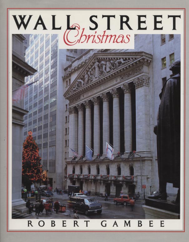
Wall Street Christmas by Robert Gambee was published in 1990, some three years after I had taken Horace Greeley’s advice and moved west to Los Angeles. It is a wonderful piece with superb photography and text by Gambee – a monumental task. The book has over 270 pages and probably as many pictures.

While no longer in print you can pick up a good used copy for a few dollars from Amazon or other booksellers, and I recommend it unreservedly is you like superb architecture and photography.

I was reminded of the book when cataloging some pictures the other day and coming across a batch from my Wall Street days. Gambee records not only the exteriors but also the plush executive suites where the rich were made to feel better about parting with their money, for they could see so much of it hanging on the walls. My favorite recollection of the time is attending meetings in the board room of J. P. Morgan at 23 Wall Street where, for some inexplicable reason, I was always seated directly opposite the huge oil of J. Pierpont Morgan himself, dark glowering gaze and all. I have absolutely no recollection of the content of the meetings but the portrait will go with me to my grave! I recall traipsing down the corridor of this fine space – the building deliberately built to just a handful of stories to emphasize the wealth of the institution – and suddenly the industrial carpet changed to plush pile as you approached the hallowed ‘executive’ area.

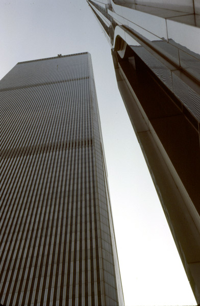
There are the obligatory pictures of the World Trade Centers, of course, as it was impossible not to notice them. They only looked good at night when all those office lights made the facades look like some digital modern art piece. I had a client in one on the 95th floor and you had to take two elevators to get there. Each building was so large it had its own zip code for mail. Having dined a few times in the surprisingly good Windows on the World restaurant at the very top on the 110th floor, I recall on one windy winter’s day when the short elevator trip to the top was interrupted by the failsafes which would refuse to allow the elevator to move if the building and its shaft were twisting too much …. these buildings were tall!

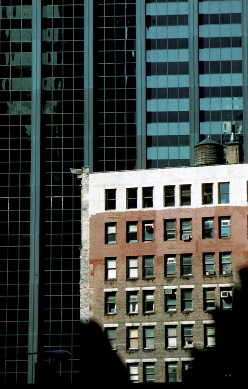
Gambee’s pictures are far superior to anything I ever did in New York, but just for fun, here are a couple of my images.

Old and new, downtown Manhattan. Pentax ME Super, 200mm Takumar. Kodachrome 64

World Trade Centers. Pentax ME Super, 40mm ‘pancake’ Takumar. Kodachrome 64

A fine book, whether your interest is in architecture or just a vouyeuristic one wishing to glimpse the corridors of American financial power.

In search of Edward Hopper

An American painter who has inspired generations of photographers.

I came to the works of Edward Hopper (1882-1967) late in life. I say ‘late’ as I was well familiar with the great European masters while still a teenager. No, it was not until the early 1980s, when I was in my thirties, that I became aware of this American master. England was not the best place to learn about Hopper. Becoming an American fixed that.

I was traipsing up Madison Avenue on a warm summer day, when I came across what has to be the ugliest building in New York City – the Whitney Museum of Art. Whereas the Guggenheim can be thought of as an interesting building in the wrong place, flanked by stately Fifth Avenue mansions, the Whitney is just plain bad. Frank Lloyd Wright’s Guggenheim should probably be in the mid-West somewhere to liven things up (please, not in downtown Chicago which boasts America’s finest buildings) but Marcel Breuer’s Whitney is nothing so much as a wrecking ball special. Not even Iowa would improve were it to be magically moved there. In any case, the city fathers would probably reject the offer.

Enough about architecture. So I was about to shuffle past, Leica insouciantly slung over one shoulder, when the poster caught my eye. No, not the iconic ‘Nighthawks’ but rather ‘Early Sunday’ which could have been painted in any number of American cities over the past fifty years.

The lighting was just so, that languorous sun ready to turn another American downtown into a cauldron. No one in sight. It is early Sunday after all. I simply had to go inside. The art was a revelation. On the one hand it played to the manic depressive Eastern European gene in my blood. On the other it spoke to the eternal loneliness of the big city. Here was a man after my own heart. Introspection and solitude permeate his painting – emotions somewhat alien to the American soul.

Over the years since, I have gazed much at Hopper’s art and it has unconsciously become a part of me. Yet, when I press the button on those special occasions, it’s the American master dancing in my head.

San Francisco. Leica M3, 90mm Apo Summicron Asph, Kodak Gold 100

Part of my web site, titled The Lonely, deals with the theme of Hopper and the loneliness of the big city. Needless to add, all these snaps were taken in America – Anchorage, New York, Washington DC, Pioche (Nevada), Pismo Beach, San Diego, San Luis Obispo and, the loneliest place on earth, Los Angeles. They cover a time span of some twenty-five years. I hope you enjoy them.

San Diego. Leica M6, 90mm Apo Summicron Asph, Kodak Gold 100