Category Archives: iPad

The future of computing

The iPad 3

Another quantum leap.
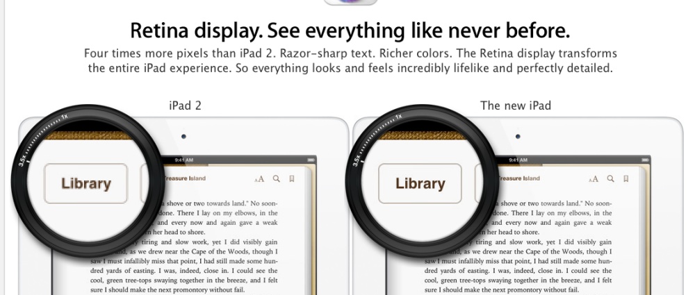

The New iPad – I call it iPad 3 for clarity.

When iPad 1 came out I bought it on the first day. This was unlike digital cameras which took many years before sensors were large/good/cheap enough to make err… sense and indeed, when the Canon 5D came along all my film gear – Leicas and Rolleis – was out the door soon after. Henceforth, film would be for people with time and nostalgia on their hands.

But the iPad was different. The technology had been thoroughly debugged in several generations of iPhones and the price was right. Most importantly, as I wrote in The Unfair Advantage, the iPad created a rift between those who got it and those who did not. It was a quantum leap in delivering information and it is now increasingly becoming a creative tool, in addition to being the outstanding consumption device of our time. To all those naysayers who said “It’s for consumption only” (This is a bad thing? Is not much of study and learning consumption?) I say that I’m glad I don’t have you managing my money.

Since iPad 1 came along two years ago the only paper books I have bought have been on art and photographers. The lamentable state of migration for the latter, and the absence of a 21″ iPad makes that a necessity. But a decade hence, I would expect art books to go the way of all others. Into the garbage. All my technical gadget manuals exist solely on the iPad.

So it’s no surprise to say that some time later today, the nice Fedex man will deliver my 64gB iPad 3, complete with Verizon LTE 4G capability. I have been using iPad 1 tethered to my iPhone using AT&T for 3G and it works well if not very fast when wifi is not available, which is far more often than the press would have you believe. And I’m talking in civilization, meaning the Bay Area, not Fly Over country. The switch to Verizon is rational – better service, better 4G, better coverage. I’ll drop the tethering option on the iPhone and the net will be cost neutral.

Why upgrade? Because the new display will be like moving to an HD TV from a CRT. And the iPad is mostly about the display. The machine will be noticeably faster than the iPad 1 and Verizon LTE is rumored to knock the socks off home broadband! With broadband being the slowest link in the chain, that’s not trivial. It depends on how crowded the airwaves are but I have read that 20mbs download and 22 mbs upload are common. Compare that to 11/1.4 which is the best AT&T can deliver over antiquated copper cables to our home. The display and LTE are revolutionary changes, not evolutionary. The iPad promises to be faster on some tasks than all but the most capable desktop machines and with an unchanged battery life of an amazing 10 hours. iPad 1 was revolutionary. So is iPad 3.

iPad 1? First it’s off to repair for a new back. I have dropped it on all four corners on concrete over the past 23 months and it’s pretty badly dented. That’s what happens when you ride your bike with cameras, iPad and a propensity to fall off. Once refurbished, it will become a home TV and sound controller, as well as a book reader lying around for anyone wanting to use it, and moving one step closer to the reality of a tablet in every room. And, for the life of me, I cannot think why any sane person would buy a tablet from any other maker at this time. So you don’t like Apple? Get over it. It’s just a tool which has nothing to do with brand loyalty and everything to do with fitness for purpose.

Arthur C. Clarke the great novelist and futurist, nailed it back in 1968 in his book which became Stanley Kubrick’s masterpiece, 2001 – A Space Odyssey; it would seem that Apple is well ahead of NASA at this point:
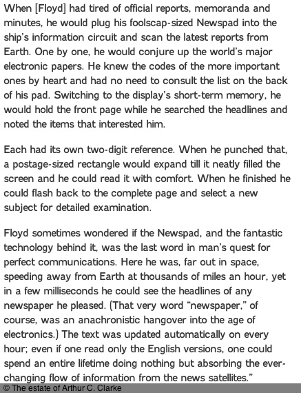
Aaah! So that’s whence the “pad” moniker came ….

Update:

My New iPad is up and running and I just signed up for Verizon 4G service. This is all you need to know – as expected the upload speed is completely insane and the download speed compares to home broadband:
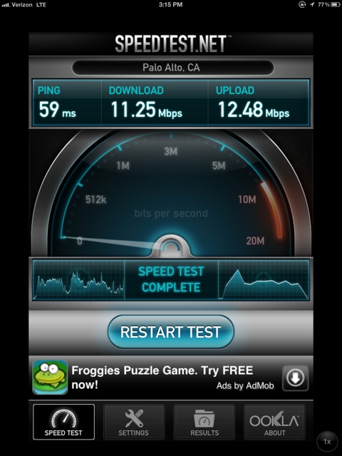
The New iPad on Verizon 4G.

Comparisons?

Home broadband – 11/1.4.
iPad1 on home wifi – 3.6/1.6
iPad1 tethered to AT&T 3G – you really do not want to know (OK, OK, it’s 1.4/0.3 if you really must know how much AT&T sucks)
iPhone 4S on home wifi – 2.9/1.8.

Like I said, the New iPad with Verizon 4G is a revolutionary development.

And finally, here is the iPhone 4S using the Verizon 4G hotspot from the New iPad – up to five devices are supported:
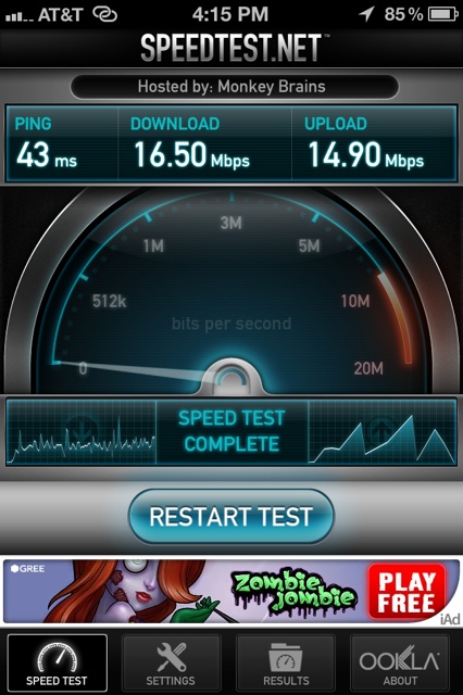
Can you say WOW!?

Unless 4G slows greatly with increasing adoption, Apple and Verizon have cut one of the biggest wires holding back true high speed mobile computing. And I promise this is the last time I will say anything nice about the US cellular oligopoly.

Recharging:

The iPad 3 uses a 43 watt Hour battery (iPad 2 – 25) so as both use the same charger, it will take 72% longer to fully charge. Based on my overnight measurement, iPad 3 will take 12.65 hours to fully charge from zero, compared with 7.4 hours for iPad 2. As there are only 24 hours in a day and the battery runs for 10 and needs 12 to recharge, you need to plug it in right away once fully drained, charging overnight, if you want to use the iPad 3 first thing in the morning. In practice, I find I rarely ran my iPad 1 down more than 50%, suggesting a recharge time of just over 6 hours to recharge fully.

Verizon 4G at peak hours – 3/20/2012 update.

Measured from a restaurant on Burlingame Broadway, at lunch. The diner has no wifi and I’m only getting 4 out of 5 bars signal strength:
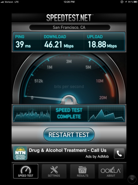
What the good people of Seoul, South Korea have enjoyed for ages but will take a decade or two to come to the most powerful nation on earth ….

At 40+mbs download speeds everything is instantaneous, and faster than I can touch things on the screen.

Zite

A news consolidator for the iPad.

For the past year my default RSS feed reader on both the iPhone and iPad has been Reeder, a product well attuned to the touch interface and continually improved. I use it for RSS feeds I elect, thus making an efficient process of reading just those sites which interest me and making it unnecessary to visit to see whether updates exist. Reeder looks at your RSS feeds in Google Reader (yes, the company which :”Does no evil” and derives content based on those.

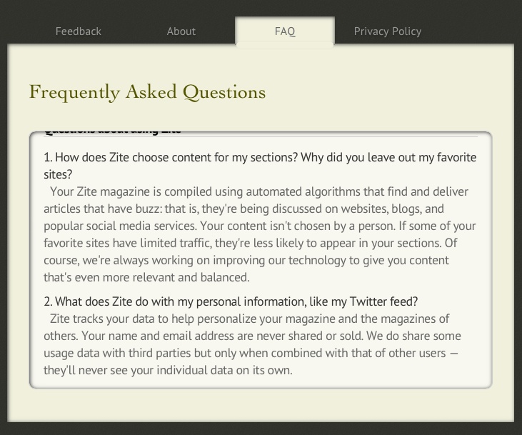
A new class of feed reader is coming along as an adjunct to Reeder, and one example is named Zite. If you wonder about the name it’s derived from German under the mistaken impression that Americans actually speak more than one language. (Had this been a News Corp app it would have been named ‘Scheiss’).

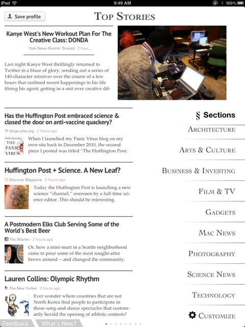
Zite also goes out to your Google Reader account (and Twitter and others) to look at what you are reading then returns stories based on the most popular sites within your interest areas:

So, for the most part, there’s relatively little overlap between what you choose in Reeder and what Zite chooses for you based on your Reeder feeds. The layout is magazine style and on my iPad1 everything loads quickly. Setup is a breeze, with the user choosing major categories of interest, which you can see down the right hand column:

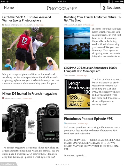
Touch ‘Photography’ and you get:

Touch the story for the full text. Swipe left for the next page under the same Section heading.

There are links on the right of the iPad’s display (not shown above) which permit emailing or saving to Instapaper, etc. Nicely done.

The app uses the touch interface really well and I’m enjoying it greatly, not least for some of the unexpected source materials it presents. The one shortcoming I have asked the developers to address is that once read a story should be ‘greyed out’ to make the whole thing more efficient. With so many stories, I find that I was choosing ones I had already read before they were relegated to the dustbin of history.

Zite is free and I have not been troubled by any intrusive advertising.

Bad news – 11/2015:

Too good to last, Zite is closing down 12/7/2015, asking that you join some foul social network instead. Hasta la vista, Zite.

New! Improved!

Finally, a proper iPad theme.

Those masochistic enough to read this blog on their iPhones have, for a long time now, been presented with a nice simple theme, devoid of the clutter in the desktop theme with its myriad of menus and dropdowns.

Well, finally, a like theme comes to iPad users, where at least you can make things out on the nice, large screen.

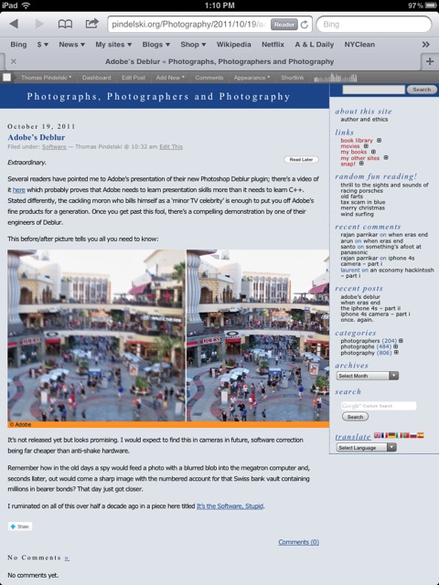
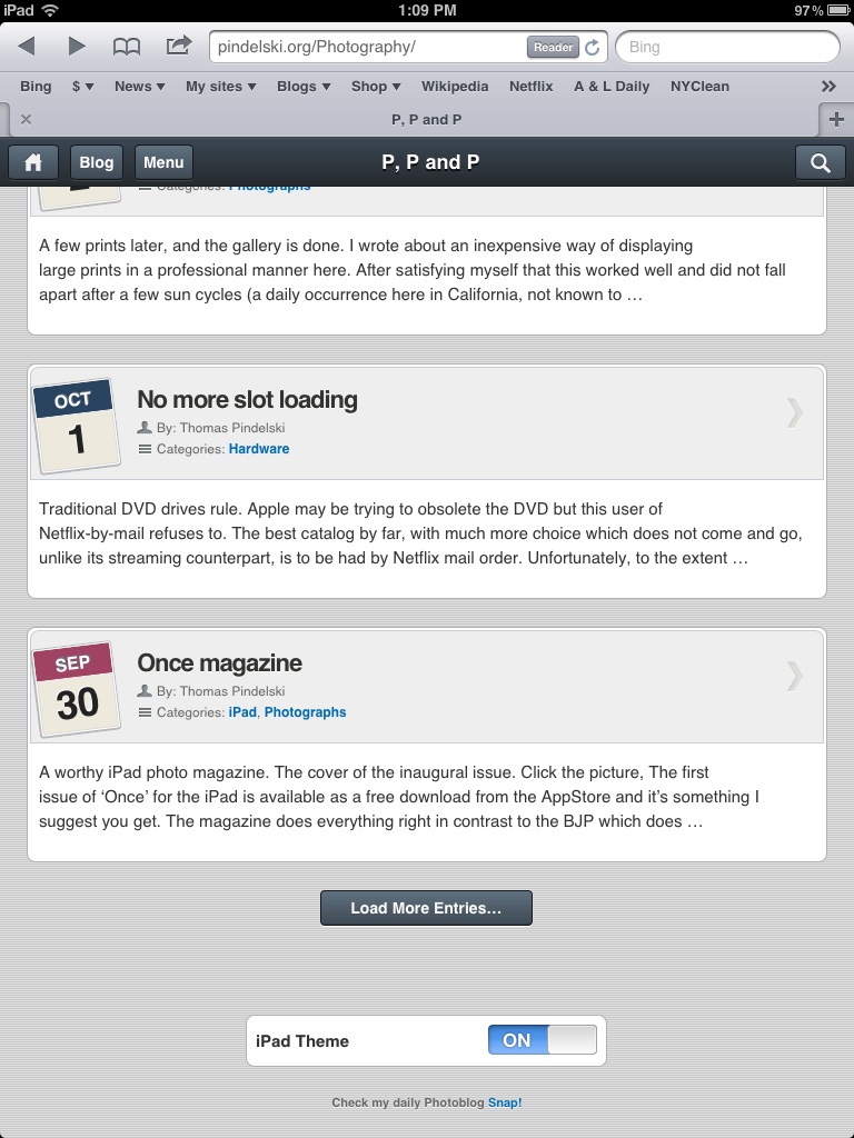
This is what iPad mavens have seen until now:

Not pretty.

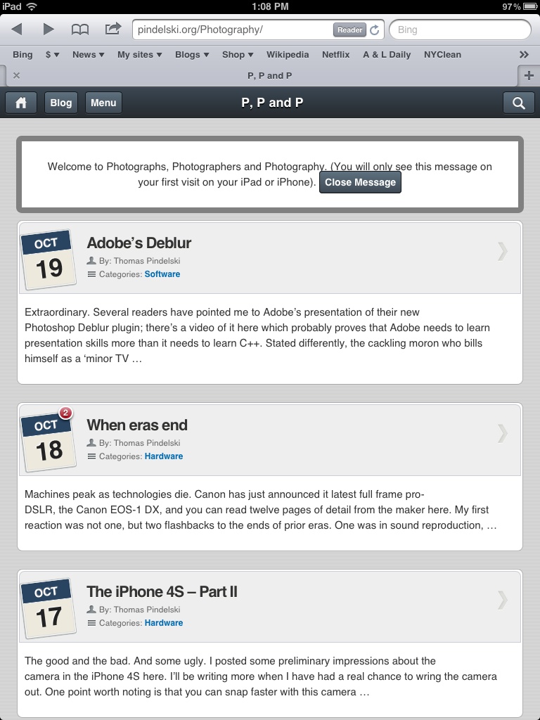
Fire it up on your iPad and you now see this.

Here’s the top of the menu:

And here’s the bottom, allowing those who prefer pain to revert to the desktop theme:

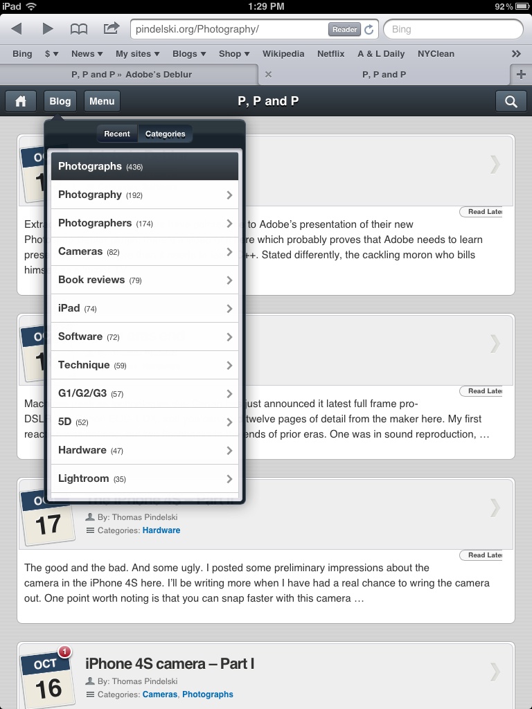
And if you want to access all the historical goodness, erudition and deep thought, you need only touch the ‘Blog’ button for the Categories dropdown:

Enjoy!

Once magazine

A worthy iPad photo magazine.

The cover of the inaugural issue. Click the picture,

The first issue of ‘Once’ for the iPad is available as a free download from the AppStore and it’s something I suggest you get. The magazine does everything right in contrast to the BJP which does just about everything wrong.

First, it downloads fast and loads quickly.

Second, content is limited to three photo essays, some with nicely integrated sound clips.

Third, navigation is excellent – intuitive, direct and simple. Everything about this says “Designed for a touch tablet”.

Display quality on the iPad is as good as it gets – just like looking at Kodachrome slides on a light box.

The magazine is a sort of modern LIFE, with traditional high quality photography accompanied by excellent writing. True photojournalism. There are no advertisements and no equipment reviews. The focus is on the pictures and the story.

The first issue has articles on the dispossesed people living in the no man’s land between Russia and Georgia in the aftermath of the hostilities there; on the last suvivors of an ancient lifestyle in Greenland – this piece is quite special; and on a retirement community in Arizona. Typically these include a 5 page essay and 20 photographs. Unlike with the BJP, there is no bloat so there are no attention span issues, nor is there any frustration in finding things.

Recommended. Let’s hope it’s published more than its title suggests.

Update August 24, 2012:

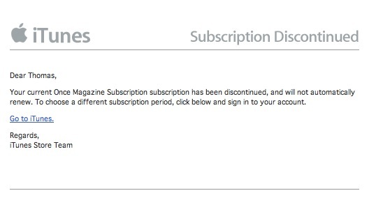
Sadly, as the following email indicates, Once has folded after just 11 months:

Seems it’s pretty much impossible to make money at these things.

The Kindle Fire

A well placed offering.

At $200, the new 7″ Kindle Fire color LCD tablet is attractively priced and designed, for what it offers. However, I see limited use for photographers at this stage, and all the talk of competition for the iPad seems to miss the point of the very meaning of the word.

Click the picture.

Simply stated, you do not choose between a Porsche and a Ford when buying a car, though you may own both. The comparison between the iPad and the Fire is much the same. They can coexist in a market which has not remotely been penetrated yet one whose lower demographics have nothing to choose.

With apps like Snapseed bringing a well designed touch interface to the oft tedious job of photo processing on the iPad’s 9.7″ screen, the migration of the iPad away from a pure consumption device to a content creation one is accelerating. I often find, for example, that I create or edit blog postings using the WordPress app on my iPad, especially now that the app’s many early problems, with lots of bugs, seem to have been overcome. The latest mobile version offers most of the editing tools of the desktop variant.

The Kindle Fire is a more narrowly focused device than the iPad in its first version, but Amazon’s touting of its ingeniously designed predictive web browser, named Silk, is very promising. So, in addition to all the usual book access, now supplemented with music and videos, you will be able to browse the web for content. If the browser is fast then the Fire will make a tremendous tool for schools at all grades. And, if content is king, then the Fire is only the second tablet to hit the market not only with a full complement of content in all its guises, but also with a loyal and growing customer base.

At its attractive price, maybe our 9 year old will cease having to lug 10 lbs. of books to and from school daily, when all he needs access on any day is a page or two. Carrying 10 lbs and accessing 2 ounces really is rather silly. The Fire weighs but 15 ozs …. A touch Kindle at $200 plus lots of public domain content should be substantially cheaper than traditional hard copy while adding video and sound to the learning experience, so it’s not like the device represents an increase in operating costs. And teachers will be able to maintain dynamic curricula on the school’s servers, accessible at the touch of a screen. One can but dream, with makers of traditional – and very profitable – academic text books even now warming up their slush funds to delay the inevitable victory of digital delivery and consumption. It’s called the US taxpayer-funded abomination which is our public schooling system.

Meanwhile, until proposed screen designs which meld eInk (traditional Kindle and excellent in bright sun) and LCD (excellent in all other lighting conditions) are perfected and manufactured in volume, the Kindle Fire will have the same issues with readability as the iPad – meaning it’s unusable outdoors most of the time.

So the iPad soldiers on without any competition, all other tablet makers are in big trouble (Dead Pool: HPQ, RIMM; Two shots, back of skull: Asus, Acer, B&N Nook, Xoom, Sony) either because they are clueless drunks (Dead Pool) or overpriced with no apps or content (Two shots crowd).

For photographers, there’s little here. The Fire’s screen is small and the absence of apps, at least for now, debilitating. However, a rumored 10″ Fire in 2012 may change the competitive landscape and I most certainly hope it does. Competition is always good – have you checked you monoplistic provider’s cell phone bill recently between all your dropped calls?

Disclosure: Long AMZN stock and long AAPL 2012 call options.