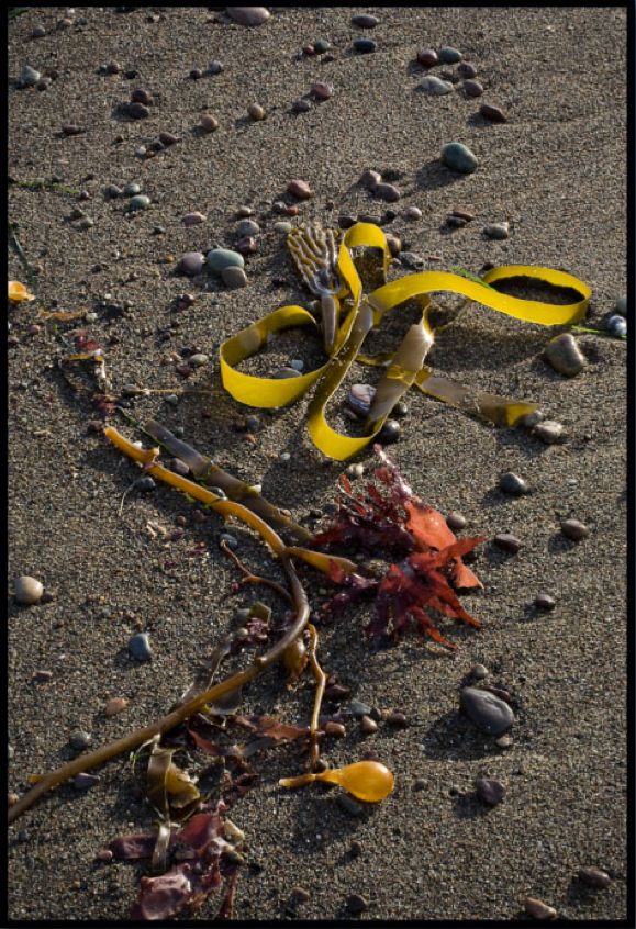
Beautiful engineering.
Click the picture to download the book.
Beautiful engineering.
Click the picture to download the book.
More discoveries in LR3.
[column width=47% padding=3%]
After the first early experiments and successes documented here over the past few days, I have started digging deeper into the excellent Slideshow module in Lightroom 3.
Click on the ‘ABC’ panel at the base of the screen when in the Slideshow module then click on the arrows and this is what you see:
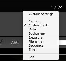
This means that you can click on any of these so called ‘EXIF’ data fields (stored by your digital camera and uploaded to Lightroom when you imported them) for inclusion on the slide itself or add your own custom text.
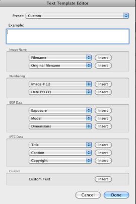
Further, Click the ‘Edit…’ option and you can create a custom field of your own design:
[/column]
[column width=45% padding=5%]
When you add these fields of information to your image, sizing and placement are easily controlled with the mouse, though the font appears to be fixed at this time.
I illustrate this technique in my Abstractions eBook, where I have included the Camera and Exposure data as well as sequential numbering, as examples. The snag with EXIF data is that film originals scanned into the Lightroom catalog will have none, so I’m looking into batch editors to determine effective ways of doing this.
This has long frustrated me as when someone asks for a particular picture (and I confess my keywording within the Lightroom catalog is less than spectacular) I often find that I associate an image with the gear I was using at the time. “Oh! yes, I recall taking that on the old Rollei 3.5F” sort of thing. So I want to search on Camera but naturally that only works on digital camera images.
Further, as you will see, some of the Camera data in Abstractions is missing the lens in Panny G1 images. Early G1 (and Canon 5D) firmware had a glitch which precluded upload of lens data, so even some of the digital camera images need work on the EXIF data.
So in a forthcoming piece I hope to have researched software which will allow batch additions of EXIF data to old film images, thus making the filter tool fully functional and speeding location of pictures within Lightroom. Something tells me this process will not be easy.
To view the result, click the cover of the eBook below.
[/column]
[end_columns]
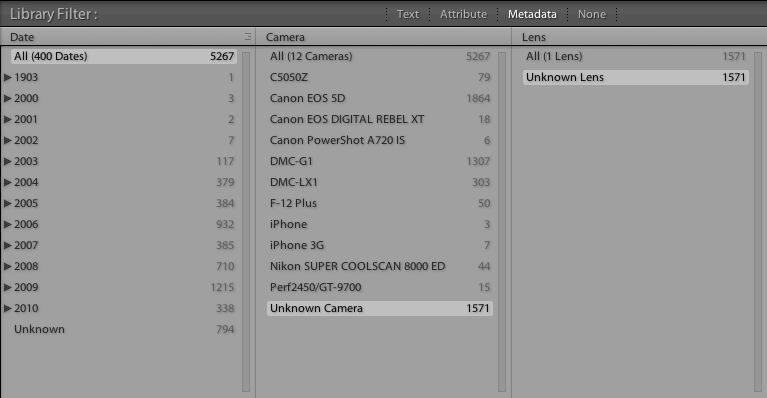
You can see just what a mess my EXIF data are by looking at the EXIF summary of my Lightroom catalog – no, I was not around in 1903! And ‘Camera = F-12 Plus’ refers to a commercial Fuji film scanner used by a local photo lab. Go figure. The ‘Unknown Camera’ pictures are all from scanned film originals, as are the Perf2450 (my Epson flatbed scanner) and Nikon SUPER COOLSCAN (my slide scanner, now sold).
To read the whole series on eBook publishing, click on categories->photography->technique->ebooks in the right hand column above.
What works best?
[column width=45% padding=5%]
Read the past few columns here and you will see that I have put into practice my enthusiasm for creating ePhotobooks for viewing on your monitor or, better, on the iPad.
The goal of today’s column is to determine the minimum PDF file size which will work well with the three most common display devices – an iPad, a computer monitor and a large screen TV.
[/column]
[column width=45% padding=5%]
One of the dictates for any data file which has to be downloaded is to make it as small as possible.
No one is going to sit around for ages waiting for downloads and this column is being written in America where time is money. Or is that debt? Residents of Club Med nations likely couldn’t care less, but they probably don’t have broadband in any case. Well, sunshine cures all ills.
When exporting a slideshow as a PDF from Lightroom 3, LR3 suggests a default file size, based on the setting of the Quality slider. For my At The Beach book in yesterday’s column that was a Quality of 63 on the slider:
[/column]

The default slider setting in Lightroom 3 for At The Beach.
[column width=45% padding=5%]
Optimal settings for the iPad:
I decided not to experiment with the output dimensions as 1024 x 768 is the native size of the iPad’s screen, so that seems optimal. Any more is overkill, anything less underutilizes the device’s capabilities.
[/column]
[column width=45% padding=5%]
To test things a little more objectively I exported four more PDFs in addition to the default one (63), using 12, 25, 50 and 75 settings on the Quality slider. Bear in mind that these are screenshots. The original is far sharper, effortlessly yielding pin sharp 24″ x 18″ prints. I know, because I made them on my HP DJ90 printer.
Here are the file sizes:
[/column]
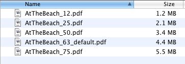
PDF files sizes at five different Quality settings in LR3.
[column width=45% padding=5%]
Exporting all five to the iPad I could not tell any difference between image quality viewing all but the smallest (Quality=12) using GoodReader. Unpinching to magnify the image did show that the Quality=25 version broke up earlier than did the larger versions, but the three largest looked much the same at regular, unmagnified size. The Quality=12 version showed signs of pixelation in normal size and does not make best use of the iPad’s display definition, so it should be avoided.
This suggests that even at a low setting of Quality=25, a PDF intended for viewing on an iPad is more than sufficient in quality and does not compromise definition compared with higher settings and larger file sizes.
Optimal settings for a computer monitor:
There are a lot of variables here. Computer monitors tend to be viewed from very short distances and come in a wide variety of definitions and screen sizes. My two Dell 2209WA IPS displays are 21.5″ diagonally and display 1680 x 1050 using an Nvidia 9800GTX+ card, the latter still unequalled by the latest MacPro, despite nomenclature changes to fool the uninformed.
[/column]
[column width=45% padding=5%]
I would describe that combination as upper-middle display quality and a state-of-the-art graphics card.
(When my ship comes in I want to be able to migrate upmarket to a better display without having to blow more coin on a better GPU!)
The best way of illustrating the differences is to do a ‘rollover’ demo, but to see this you must be using a modern Webkit browser, meaning Safari or Google Chrome. The original image used here was taken on a full frame Canon 5D using the 24-105mm ‘L’ zoom lens stopped down to f/8, its optimal aperture – a sharp combination. If the mouseover pictures do not appear in your webkit browser simply refresh the URL and all should be well.
I have placed two pictures in the rollover demo – the top one is from the Quality=25 file, the rollover one from the Quality=75 slide. In each case these are screenshots from Preview with the Zoom ‘+’ button clicked twice for an enlarged image. The full image is 12.7″ x 19″ and shows signs of breaking up regardless of Quality setting. However, the rollover illustrates the degree of breakup between the two:
[/column]
Quality=25. Rollover for Quality=75
The difference is extremely subtle. You can just see noise disappearing from the white area of the registration plate and from the spokes of the wheel when you roll over the image with your mouse cursor.
Now here is the same exercise but this time the top image is Quality=12, the rollover remains Quality=75.
Quality=12. Rollover for Quality=75
[column width=45% padding=5%]
On my monitor there’s a big jump in quality from 12 to 75.
Bottom line? For my purposes the Quality=25 version is more than adequate for my computer monitor as long as the image is not zoomed in and also happens to be optimal for the iPad.
For even higher computer monitor display quality, you should increase the export image size in Lightroom 3 to approximate that of your monitor. If you click on ‘Screen’ in the size drop down (see screenshot above) LR3 will automatically adjust the export size to match your screen dimensions. Doing this for my 1680 x 1050 Dell 2209WA monitor, the Quality=25 file size grew from 2.1mB to 2.8mB. However, the perceived image quality was indistinguishable, suggesting that the modestly larger file size confers no benefit on image quality.
Finally, with export Quality=100 and set for the 1680 x 1050 Dell display, file size balloons to 24.9mB with slightly smoother tone characteristics in large areas of plain color. Definitely not worth it when comparing a 2.1mB Q=25 S=iPad file with the 24.9mB Q=100 S=Dell whopper.
Optimal settings for a large screen TV:
Increasingly we are using the large screen TV as a viewing device in lieu of making large and costly wall prints. So I displayed the 12, 25, 63 and 75 quality PDF on my 42″ 720p Vizio LCD TV (4 years old it’s somewhat removed from the state-of-the-art, but works for me at a very reasonable price).
I used a MacMini, the just discontinued version MC238LL/A which uses an Nvidia 9400M GPU and can resolve up to 1920 x 1200. My TV is 1280 x 720, and thus is
[/column]
[column width=45% padding=5%]
the limiting factor in the equation.
The very best viewing experience was already reached at Quality=50, viewed from my usual 10 feet but the quality drop when viewing the Quality=25 version was so slight as to be almost unnoticeable. The lower quality of Quality=12 was just distinguishable, but far less so than on a computer monitor or iPad.
Bottom line:
The best compromise for one file size for use on an iPad, computer monitor or big screen TV is Quality=25 when exporting a Lightroom 3 slideshow. That results in a file less than half the size of the default Quality=63 setting in Lightroom 3, meaning it will download more than twice as fast from a server.
Another user’s experience:
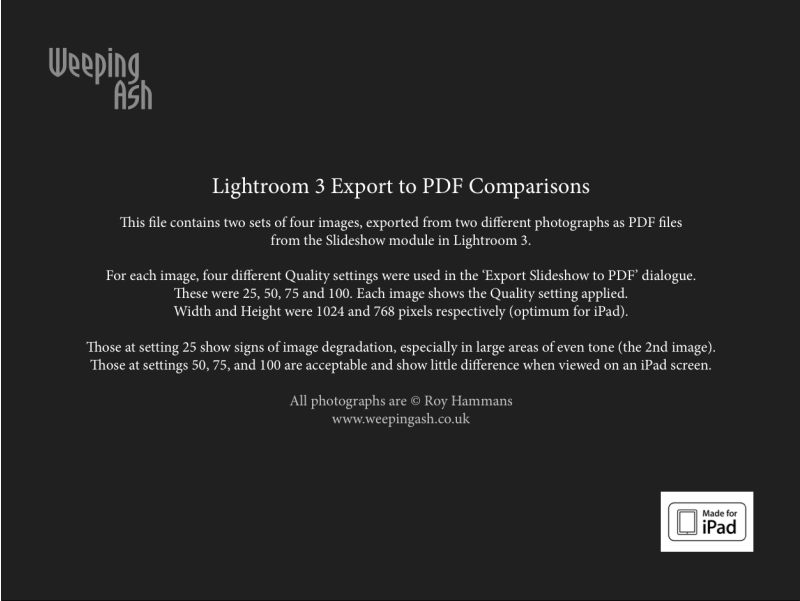
UK pro Roy Hammans shares my interest in the techniques discussed above and was kind enough to forward some samples created at different quality levels. Roy uses both 24″ iMac (1920 x 1200) and 24″ HP LP2475w (1920×1200) displays, and used the highest quality equipment to make these pictures. The first four were made with the 18-200mm VR lens at 24mm on a Nikon D300 in DX mode, 400 ISO. The second four were taken with the Nikon 10.5mm fish-eye on his NIkon D700, at 200 ISO, (in DX mode), the equivalent focal length becoming 15mm. He used the LR3 built-in lens profile correction for the 10.5mm to remove barrel distortion inherent in the design of the lens.
His PDF images were also generated using the slideshow function of LR3 – click the picture to download his PDF file:
[/column]
[end_columns]
Click the picture to download
So between us we are at Q=50 (Roy – great eyesight) and Q=25 (me – lousy eyesight) for the best compromise setting at an export size of 1024 x 768, whether for iPad or computer monitor display. Those using large 30″ computer monitors (2560 x 1600) should probably adopt the Q=50 setting. In any case Q=50 yields a file size much smaller than Q=100 (4.5 times the size at 1024 x 768), which is overkill in any scenario I can imagine.
The dream is becoming a reality.
[column width=45% padding=5%]
Before the iPad even hit the shelves I was fantasizing in these pages about the value this tool would add for working photographers. It’s easy to generate PDF files of your work using the simplest tools (Lightroom, Pages and Preview is what I use) or, if you are a real publishing maven like UK photographer Roy Hammans, you can use sophisticated tools like Adobe’s InDesign to craft very professional looking eBooks. Take a look at Roy’s splendid collection of weathered boat hull abstractions which you can download from his site here. Do yourself a favor and move it to your iPad which displays them far better than a regular computer monitor, if my well calibrated Dell 2209WA is anything to go by. Also, I much prefer GoodReader on the iPad as a viewing app for PDFs to iBooks, which is clunky to load and slow to focus and sharpen each image.
I have asked the makers of GoodReader to provide enhanced slide-to-slide transitions (fades, dissolves) – let’s see if they come through. I would have asked the arrogant fruit company to do this for iBooks on the iPad but have you ever received a response from Apple on anything? After all, this is a company whose philosophy is increasingly “That’s how we like it. Take it or leave it, pal.”
I can generate a PDF of, say, 100 pictures from Lightroom (maybe Aperture has a like feature?) in a few minutes, add cover pages in a few more and have the whole thing on the iPad seconds later; imagine how this would work at any magazine with a lot of art directors, editors and photographic content. The photographer bangs away, the pictures are moved to Lightroom and thence to the iPad and the art director, minutes later each of the many team members is holding an iPad in his or her hands and making the decision what to cull and what to keep. Separately, a version is placed on the photographer’s server for downloading to the Big Cheese’s iPad in the sixtieth floor’s corner office. Eventually, the iPad app will have a Keep/Reject function for the editor to use, will be handed back to the photographer’s assistant, sync’d with Lightroom and, hey presto, off we go to press. Or rather, off we go to ePress.
[/column]
[column width=45% padding=5%]
Anyone looking at the nineteenth century paste-up technology used by Anna Wintour in making the September Issue of Vogue would be blind not to see the possibilities.
Now that I have done this a couple of times, I checked my timing when doing a 24 page eBook of beach pictures. These were all in Lightroom 3 and I simply copied them to a Collection, added the color wash in LR’s Slideshow module, exported to a PDF, opened the PDF in Preview and then dropped in the front and Colophon pages which I made in iWork Pages. Start to finish took me thirty minutes. Had there been 100 pictures the additional time would have been a couple of minutes or so, the most time consuming step being the creation of the front and Colophon pages. I have saved these as template files for future use to make things easier. Click the picture to download the PDF:
Now available FREE.
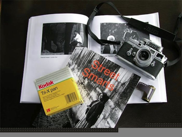
Back in 2005 I published a book of one hundred black and white street snaps named Street Smarts, using Lulu.com. It sold well which gratified my ego and made my charities happy, as they got the proceeds. The pictures were taken during my last six years of life in London and my first six years of what became a 35 year love affair with my first Leica, an M3. They were taken in London and Paris during the period 1971-77, right until I left permanently for America.
You may contrast my street snapper style from 40 years ago with today’s by also downloading the identically priced Street Snaps 2009-2010 and, in addition to the exclusive use of color where monochrome once ruled, I hope you will also find more joy and humor in the later work, and a more spontaneous approach. Over a forty year period one changes ….