Lighting is the key.
For an index of all Leica-related articles click here.
Whereas the southern European painters of the 16th and 17th century typically focused on the adulation of religious figures, northern artists – Germany, Belgium and especially Holland – were more interested in showing property, a secular conviction. Never was this more so than in the 17th century work of the Dutch Masters which typically had a high window light one one side with the other half of the subject in the shade, some light captured from an adjacent white reflecting wall. And whether the subject was possessions, food, flowers or people, much the same lighting approach was used, to great effect.
A fine example is the work of Jan de Heem (1606-1684) who specialized in still life painting. This splendid Vase of Flowers (1660) can be found in the no less splendid National Gallery in Washington, D.C.:
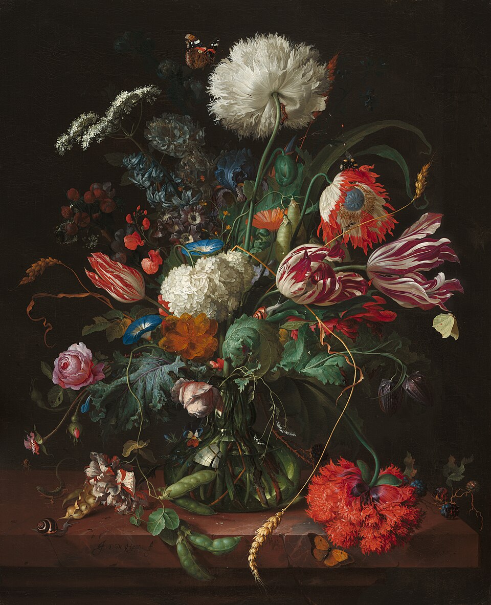
Jan de Heem, Vase of Flowers, 1660.
In my image of the Common Ninebark wildflower I have emulated the Dutch lighting approach and while the subject is simpler than de Heem’s complex one, the lighting effect is similarly dramatic:
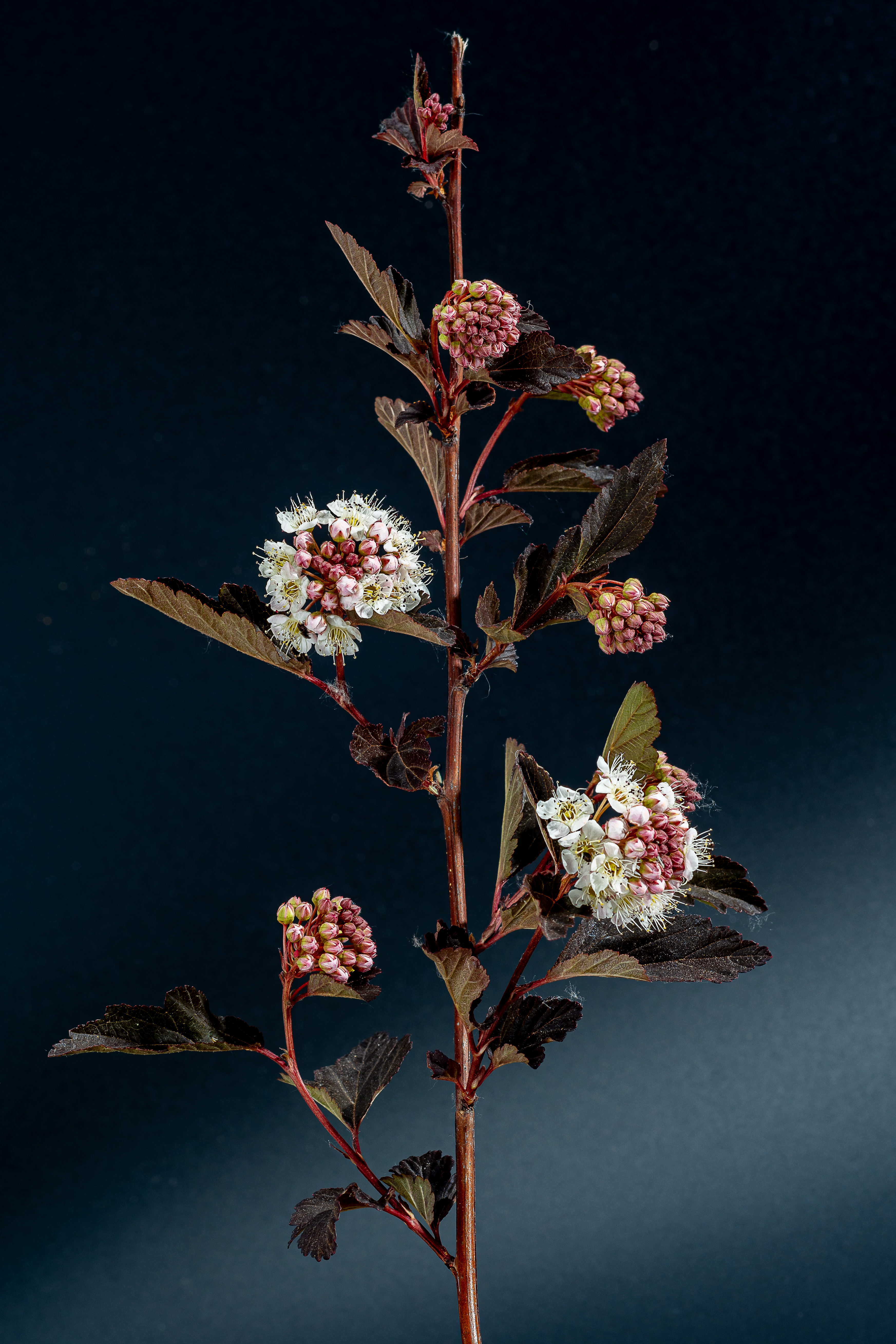
Common Ninebark
Leica SL2S, 100mm Macro-Elmar-R at f/11, Bellows-R, three Novatron strobes, ISO 100. Composite of 55 images, focus stacked in Helicon Focus. I prefer a touch of light on the black background to emphasize depth.
I had the local Postal Annex print this on their Canon 12-ink 44″ wide printer in a 24″ x 36″ size for wall display and the results is a knockout. The file I uploaded included the related Adobe sRGB color profile. With this not so little hummer costing over $5,000 and a set of ink cartridges running over $2,000 alone I’m not about to buy one for home use, especially when the print cost me a modest $45, and the color rendering is exactly what I see on my monitor. I would imagine that maintenance of this monster must be an absolute nightmare, what with 12 ink jet nozzles just waiting to clog …. definitely a case of where delegation beats ownership.