Yearly Archives: 2006

Early photographic vision

Uccello and Carravaggio had it down 500 years ago

As a boy growing up in London I lose count of the number of visits I made to The National Gallery in London. Whether going through my Impressionist period, High Renaissance or early Renaissance, there was always something there to fascinate and to intrigue. While photography had always been my first love in the visual arts, I think I learned more about seeing from gazing at the art in this great collection than from any number of photography books.

Some of these experiences left deep impressions. When asked which of the works on display I liked most, nay, desired to possess, the choices narrow to a few. Titian’s ‘Noli Me Tangere’ (1512) (Do Not Touch Me) of course. I have always been captivated by the dynamic use of diagonals – Christ, Mary Magdalen, the tree, the lovely warm light, Christ’s daring near-nakedness. You can feel the motion as he grabs the shroud to prevent Mary pulling on it. It is hard to conceive of a more perfectly balanced composition and if you think you cannot get away, as a photographer, with lampposts growing out of people’s heads, well just look what Titian did with that tree!

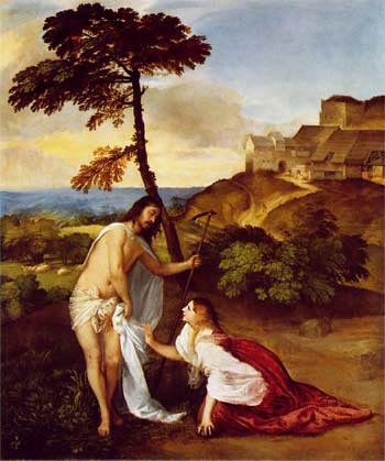
I have always felt that The National Gallery has way over-restored its Titians to near-Cibachrome color intensity, and that clearly shows here, but the magic of the picture saves the day.

So when it comes to lessons in composition, just check a few Titians out.

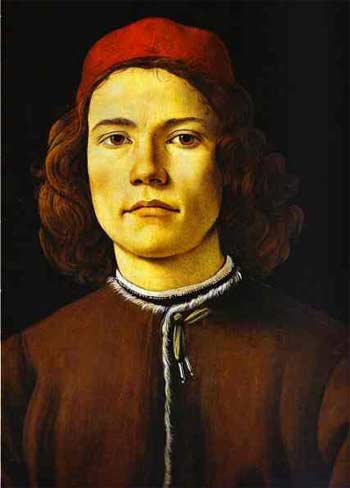
Botticelli’s Portrait of a Young Man (1485) is simply arresting. It’s one of the smallest paintings on display at 16″ by 12″ – the size of a regular photographic print. But you walk into that gallery and there’s only one thing you can see. The certainty of the gaze, the confident bearing, the red cap accent, the somewhat rushed rendering of the tunic, all to good purpose. It places all the focus on the eyes. When I first saw this – I was probably fourteen at the time – I made such a bee line for the picture that I nearly knocked over one of London’s dowager ladies in my rush. It’s that good. I frequently fantasized about pinching this masterpiece – how hard would it be to make off with a 16″ by 12″ canvas, after all? To this day the use of daylight and the way shadows model the face leave anything Vermeer did with lighting in, well, the shade.

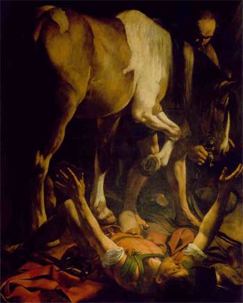
As a photographer it is simply impossible not to like Caravaggio. Versions of The Supper at Emmaus hang in both the National Gallery and the Louvre, the diners’ ragged clothing rendered just so, the worms in the fruit on the table and, of course, Caravaggio’s signature lighting. But great as that painting is, it is simply eclipsed by The Conversion of Saul (St. Paul). In London’s Swinging Sixties the 21mm lens on a 35mm camera was de rigeur for any self respecting trendie. You saw its abuse everywhere, especially on record sleeves of the more extreme rock groups. Wild perspective, severely receding lines, objects very close to the lens, distortion galore. Well just take a look at this. Caravaggio had the 21mm figured. What is breathtaking about this canvas is how little space he has worked in. Painted in 1601 the canvas is simply enormous – some 7 1/2 by 6 feet. In other words, the horse is rendered at almost life size. Why so large? Caravaggio was a student of perspective. He knew that viewers would get too close to the painting, but that, by doing so, the grandeur of his ultra-wide angled vision would be correctly rendered and the perspective distortion would disappear. And so it does. The painting is immensely involving. You are there. Like a movie in a theater compared to the same thing on television, you have to see this live. Not reproduced.

But easily the strangest use of perspective on view in The National Gallery belongs to a visionary whose work preceded that of all the above, none other than Paolo Uccello. In 1450 he painted three enormous panels depicting the battle at San Romano in which the Florentine army defeated Siena some twenty years earlier. The three panels are some 6 feet by 10 feet in size. One (the weakest, and that’s a cruel critique) hangs in The National Gallery. The others hang in the Louvre and the Uffizi. Fitting that three of the greatest masterpieces of the early Renaissance should hang in the three greatest Renaissance collections.

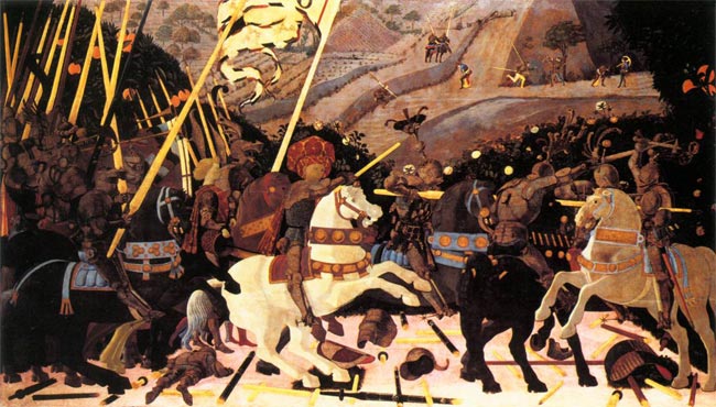
Appropriately, the best hangs in the Florentine collection, but look, if you gave me the one in London I would have no issues with finding wall space for it. I assert that there is more to be learned, as a photographer, from this one painting than from any number of academic studies on the use of perspective. By the time this painting was made, artists understood the rendering of perspective well. Uccello just chose to disregard the rules, dramatically foreshortening perspective, predating surrealism by some six hundred years. The repeating motif of the lances, the purposeful abuse of sizing (look how small the dead soldier in the left foreground is), the steep, tilted, climbing background with the horsemen rendered way too large, the detritus of battle painted in seemingly random perspective. It’s magic. Simply the greatest lesson in the (ab)use of perspective on canvas.

As photographers, we have a lot to learn from the masters.

And no, I harbored no fantasies about making off with the Uccello. It’s just too big to stash under a genuine English raincoat.

Boxers

Book review

I confess that I approached ‘Boxers’ by Carol Huebner Venezia (an American photographer, the exotic name notwithstanding) with great anticipation. The publicity talked of how the photographer had got inside the psyche of the professionals in Gleason’s Gym in Brooklyn where many famous fighters had trained. Further, the publicists intoned, she counterbalances the tough end of the sport with pictures of fighters in Italy. I quote:

“Boxing offers those working class men who learn the sport a slim chance of realizing the American dream. But the price for social standing and above-average income is often broken bones and chronic health problems. In contrast, in Assisi, in the center of the Italian boxing world, boxing is about athletic competition and the art of the sport.”

Well, based on what I see here, she never made the remotest emotional contact with her subjects in either location. Indeed, some of the best pictures have no boxers in them – one of a young child in the ring and another of swinging sacks, or whatever you call those things, that boxers pummel. Nary a boxer in sight. Great pictures though.

Despite the high fallutin’ text, based largely in academic drivel, the woman’s inability to get inside the brains (or what’s left of them) of her subjects is mystifying. It’s not as if she didn’t try, as the pictures span over a decade.

Let me quote from the introduction just to reassure you I am not making this up:

“If we look at the group of pictures as a whole, there appears to be a clear impulse to movement both in the single photographs and as a sequence”. What? Nearly every picture in the book is stiffly posed in a pale imitation of August Sander. Sander is much lauded in the introduction let it be said, and the comparison only goes to show the photographer in a negative light.

One of the few snaps with movement is of the swinging medicine (yes, now I recall what they call them) balls in a deserted gym. Why these should be moving when there is no one in sight beats me, but it’s a neat idea, I suppose.

Here’s another Doozie from the intro:

“The objective approach of this photography avoids pathos or any explicit critique of society”.

Please.

So that’s where our higher education monies are going? To pay boobs to write claptrap like that? What a travesty. Time they got a real job and learned to write English.

Lots more of the above garbage is to be found in the introduction. No need to dwell there.

On to the pictures.

There are a scant thirty all told, one of which, the one so badly exposed that no facial details can be discerned, also appears on the cover. Not exactly what you would call value in a $30 paperback. Fully half of these are static portraits, some in what could be a studio setting, of half naked guys who, absent their gloves, could as well be construction workers. Or fit investment bankers, come to think of it. The remaining pictures are generally so irrelevant to the genre that I really wonder why the woman bothered? Maybe she liked to go to Gleason’s for the vicarious pleasure of seeing all those muscles, the camera as an excuse, but the guys in the ring clearly did not accept her as one of their own. Heck, she’s probably the wrong gender and color anyway.

I would like to say something positive about this book. I cannot. I just feel I have been ripped off.

Update May 18, 2009: This book is so unquestionably bad, the photography so regurgitably awful, that I finally consigned my copy to where it belongs. The garbage bin. Good riddance.

Stamp out sensor dust

Apple’s Aperture has a unique tool for the job

It’s no secret that image sensors in digital cameras with removeable lenses are prone to atrract dust. The Canon EOS 5D I use seems to be especially bad in this regard from what I have read on the various chat boards. While I give my sensor a swipe with the anti-static brush now and then, the reality is that sensor dust does crop up and can be a real problem if many snaps are exposed with the dust mote in place on the sensor.

The one positive about all of this is that Apple’s Aperture has a tool to remove such dust spots, as the designers recognized that any particular speck of sensor dust will have the exact same position on the resulting photographs from image to image. The dust mote does not move even if the camera does.

Apple’s Aperture provides a tool, unique as far as I can tell, which permits rapid removal of sensor dust from mutiple images. So if you have just taken two hundred pictures only to find an offending dust spot in each, at the same location, the Aperture Lift and Stamp tool is for you.

Here’s how it works. In this picture you can see the Spot and Patch tools cross-haired locator at the top of the image, where the offending dust spot makes its home:

Hit enter and the circle becomes yellow, effecting removal of the spot on the selected image:

Unlike with Photoshop, there is no need to select a source for the patch – Aperture does it automatically based on the area sorrounding the defect.

Now click on the Lift part of the Lift and Stamp tool icons visible at the top of the screen – it’s the one with the arrow pointing up.

The type is small here, but the original discloses that I have made four adjustments – Spot & Patch, Exposure, Highlights & Shadows and Sharpening.

Now highlight all the images with a like dust defect (Shift-Click for contiguous ones or Control-Click for non-adjacent ones), click the Stamp icon of the Lift and Stamp tool (the one with the arrow pointing down) and click on any one of the selected images.

The dust mote is removed in all of them. In my case, as I have also made Exposure, Highlight & Shadow and Sharpening adjustments, these would also be conferred on all these images. So if the images are different, do the Spot & Patch and Lift & Stamp work first, then selectively change other parameters in images as you please. The images selected for dust removal can be versions of one image, disparate images, or both.

Don’t forget to clean the camera’s sensor after doing this!

See what I mean about good design? Care to find this feature in Photoshop? I think not.

A simple precaution

Protection for that exposed LCD screen on the Canon EOS 5D

For a few dollars from the good people at B&H I picked up a packet of three sheets of matte surfaced stick-on plastic screen protectors for the exposed rear LCD screen of the Canon EOS 5D – click on the topical index to learn more about this camera.

I couldn’t get quite the right size so I purchased the 3″ one and shaved 9/64″ off the long side and it fits fine. The packet comes with a nice cloth to make sure you have removed all grease from the screen before applying the plastic sheet and also includes a small hard plastic blade to smooth the film once in place. This spreads even pressure better than your finger can.

A side benefit, apart from the protection against scratches, is that the matte surface does a far better job of supressing reflections than the smooth surface of the original.