No, not the one by John Berger.
One of the books on art I enjoyed most was John Berger’s About Looking which went on to become ‘Ways of Seeing’ when the BBC filmed it. What was especially interesting about the piece is that it is cast in the author’s Marxist viewpoint of the world, where every object or possession is examined through the eyes of society rather than seen as the thing itself. That is no bad thing. After all, are we not told that small minds speak about people, middling minds talk about issues and great minds cast about for concepts? Berger is all about concepts.
The only snag with this thinking is that just because the author addresses concepts does not mean that his frame of reference is sane.
But, for much the same reason that I sometimes read the New York Times or watch Fox News – a recheck of reference points on the loonie left and the psychotic right – it is always an education to read the works of a Marxist as it serves to freshen one’s ideas about freedom, personal responsibility and the sanctity of the individual. So far, my belief in these attributes has only been strengthened by digesting the claptrap put out by these media.
Just think. In a perfect Marxist paradise there would be no music – you might, after all, enjoy it more than I, and we can’t have that. There would be no art – we all look alike and dress alike and live alike, do we not, comrade? And, worst of all, there would be no photography. That is the purest form of subversion. You want my likeness? The Ministry of Truth will not like this, you know.
Crazy? Ever seen any good snaps of Mao’s totalitarian China?
No. I didn’t think so.
No photography. Just think.
Horst and Hoyningen-Huene would never have made their homo erotic-tinged masterpieces. Mapplethorpe’s illustrated history of perversion would never have been seen. Newton’s jejeune dirty pictures would not have been published.
Hang on. Maybe Marxism would not be so bad for photography.
Just a minute, though.
That means we would have never been afforded the chance of seeing the guilty confections of Beaton. The just-so elegance of Cartier-Bresson. The soaring aristocracy of Blumenfeld. The gay abandon of Doisneau. The passion and sophistication of Parkinson. The guts of Bourke-White. The vision of Evans and Weston. The courage of Adams and McCullin and countless others. And, yes, even the second rate candy box tripe of Ansel Adams.
So maybe Marxism is not such a good thing.
I was reminded of all of this on reading in the Wall Street Journal (centrist mostly, loopy right on the OpEd pages) of the Met’s exhibition of no fewer than 228 pictures from its Dutch collection. Thank heavens for the robber barons. They provided labor for all and bequeathed great art collections to the Met. Works for me. And that got me thinking about the differences between religious art (meaning ‘Vatican-religious’) and secular art (being the Dutch and Belgian schools of the 17th century and their British and German forbears).
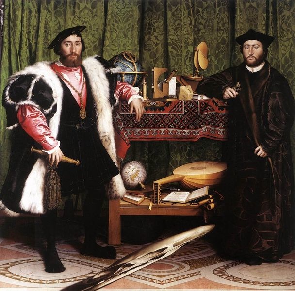
While painters of both schools were working on commission, the Vatican types enshrined their subjects, whether biblical or Papal, in halos and angels, the better to hide the foul stench underlying their accession to power. The Dutch chaps surrounded their clients with the attributes of wealth, perhaps never shown better than in Holbein’s ‘The Ambassadors’ (OK, so he was a German painting in England. The point is he adopted a secular rather than religious tone). And the stench? There is none. As my grandfather used to remind me, pecunia non olet. Money does not smell.

Holbein. The Ambassadors. 1533. The National Gallery.
The fine cloaks, the tools of navigation, attributes of wealth like the lute, are all seen large. These people are rich and successful. Of course, most photographers care not a whit for that. All they can fixate upon is the elongated skull in the foreground which, viewed obliquely from the lower left, shows itself in full splendor. You can interpret it as you like but I have long preferred to think of it as the ultimate statement in secular art. It is there because the clients wanted it there. It’s as spontaneous as, say, a White House speech or a politician at the site of an airplane disaster.
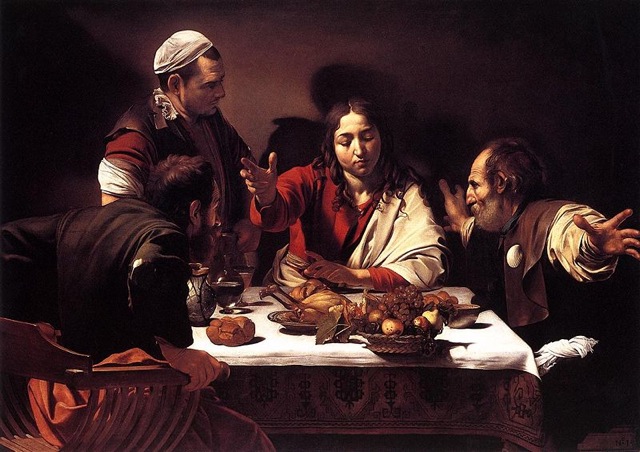
That’s not to say that the Vatican types didn’t try to subtly subvert the system. Take a look at Caravaggio’s ‘Supper at Emmaus’ – the one in the National Gallery is the corker, not the one in Milan.

Caravaggio. The Supper at Emmaus. 1601. The National Gallery.
At first it is what you want to see. Christ surrounded by fawning apostles on his resurrection. I first saw it on the obligatory school outing, short trousers and all, when I was maybe 10 years old. And, like every misbehaving schoolboy, I stuck my nose in the canvas and all I could see was the imperfections. (OK, so my mother was Germanic and demanding. Leave it.) The tear in the sleeve. The worms in the fruit. The ravaged and bloated faces. Years later, the secularist in me acknowleges how smartly Caravagggio has hidden the stigmata, despite their being the object of focus for the two at the table. He isn’t buying it! In every possible way the painter is saying “Screw you and your religion” and I fell in love with him there and then. Even if my original admiration was for the worms. And even if I was having to go to mass three times a week.
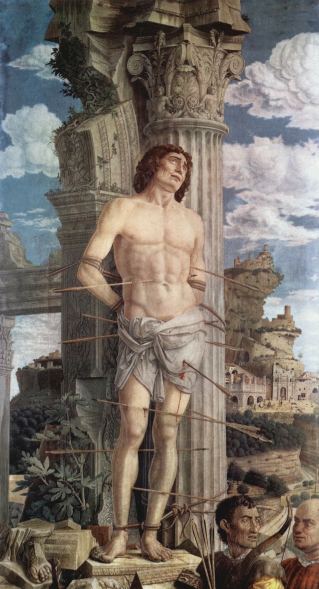
Another guy who got it really right, meaning he got paid though his clients didn’t notice his work was no less subversive, was Mantegna. In his Death of St. Sebastian (I am reproducing it in a large size here as the detail in the painting merits it) you must agree at first glance that, surely, this is the proto-religious picture. The martyr is well and truly martyred, and true to form, is saving his dying gasp for the one true God, with that damnably condescending look of forgiveness for his killers. The only snag is that Mantegna, like some latter day cartoonist, has neatly insinuated two of the shooters at the lower right. And what do you think the one is saying to the other? “Nice shot, Ernie?” “Fancy a couple of quick ones at the pub?” “Did you catch the thing at the Coliseum last night?” It is a superbly crafted piece of subversive, secular propaganda.

Andrea Mantegna. The Death of St. Sebastian, 1480. The Louvre.
Now do you see why Sebastian’s expression gets my goat? Don’t you think a guy who just got one through the privates would at least admit to some pain? And the painter was Spanish. Can you say Spanish Inquisition? Catholicism’s version of modern Islam. Whoever painted this had real courage. Viva Mantegna!
So great painters were making ‘photographs’ 500 years ago. The Decisive Moment was there – it just took a while to place it on canvas. No 1/60th @ f/8. Their genius in reducing imagination to canvas gave us works like those above. Not being as good, we needed Kodak and a button to press. And by the time real photography came along the religious had disappeared. The world, as western hemisphere photographers know it, was secular. And hooray for that. May all our photographs be as subversive as those of Holbein, Caravaggio and Mantegna.
