A Panasonic G1? Are you crazy?
I have absolutely no reservations about cropping and manipulating an original picture if it results in a better result.
Never does this apply more than in architectural photography.
The other day, making my way through the horrors of the UCSF-Mission campus in south east San Francisco, I was struck yet again by how ugly much modern architecture is. Given the incredible cost of land, bribes to officials and unions, the cost of design and materials, how much more would it take to make something beautiful rather than just another precast, soulless box? And this is on a campus of higher learning, for goodness sake, where you are meant to encourage open communication, sharing and ample leisurely exchange to help brains grow. How do you do that surrounded by architecture seemingly inspired by concrete makers and designed by structural engineers?
Gazing at the horrors around me I was reminded how Prince Charles has been pilloried over the years for his stance on keeping British architecture beautiful. Whereas he was written off as a privileged nutter with nothing better to do but gripe about buildings and talk to his daffodils, we now increasingly see him as a voice of wisdom in an ugly urban world and a pioneer of the green movement. UCSF-Mission needs him.
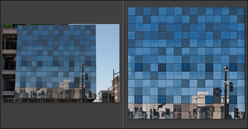
Back to the topic at hand, architectural photography. When I know I cannot but have leaning verticals, I make a point of leaving plenty of space around the subject as it will be needed when correcting these at the processing stage, if correction is needed.

Before and after. G1, 41mm, 1/250, f/8, ISO 100
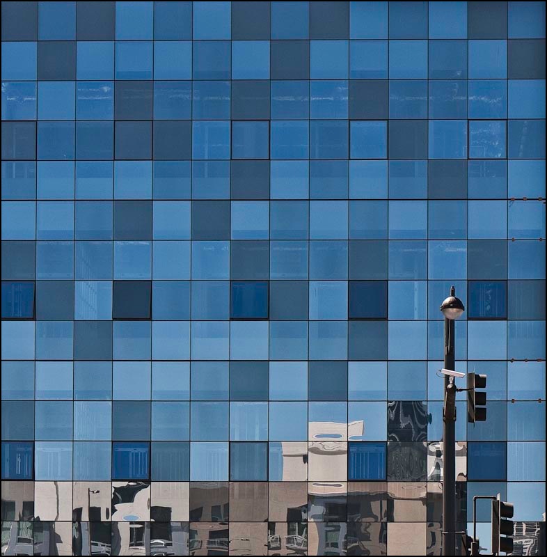
Here the G1’s kit lens was almost fully extended to bridge a building lot in front. I knew that what I wanted was a borderless image of the multi-colored glass (a movement originated by Cesar Pelli in New York, if I am not mistaken). The lamp standard lower right was simply icing on the cake. Here’s an example of the use of modern materials in a lovely, refreshing manner, providing visual interest and harmony in an otherwise uninspiring box shape. And some of the windows actually open! Nice work.
Once the RAW original was in Lightroom 2, I exported it to PS CS2, set up a background layer and used the Edit->Transform->Perspective function with the Grid turned on (Command-Apostrophe) to aid in aligning the verticals. This corrects leaning verticals but shortens the image, squashing it vertically, so to return the correct aspect ratio to the windows I switched to Edit->Transform->Distort and simply stretched the picture vertically until the windows looked right. Finally, before saving (PS integrates with LR so the ‘Save’ creates a second stacked image in LR – nice) I go to Layer->Flatten to keep the file size small – no need for the bloat of layers in the LR catalog of images. I use a lossless TIFF format to save the PS-processed image.
So there you have the G1 as a compact view camera! Here’s the final image. It will make for a nice 30″ square print.
