Grunge lives!
G1, kit lens @34mm, 1/1000, f/6.3, ISO320.
Punching up the textures here, plus the grunge, really works!
On Bluxhome Street at 4th Street in San Francisco.
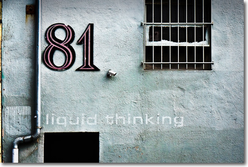
Grunge lives!
G1, kit lens @34mm, 1/1000, f/6.3, ISO320.
Punching up the textures here, plus the grunge, really works!
On Bluxhome Street at 4th Street in San Francisco.
The woman who won the war.
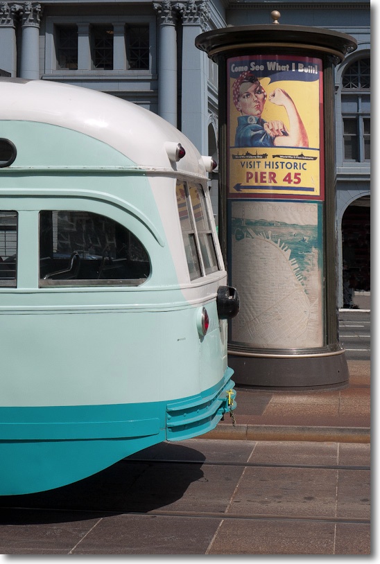
G1, kit lens @19mm, 1/1600, f/5.6, ISO 320.
Rosie the Riveter, here with San Francisco’s 1899 Ferry Building as a backdrop, not only did the cooking. She also built the planes and munitions which helped America win WW2.
When I spotted her it was a matter of waiting for a few minutes for one of the classic old trolleys to come by, and the flashback was complete.
While apparently static, this was anything but a stationary subject. The bus was moving and composition was pure instinct. A perfect example why, in most street snapping, shutter and focus lag in a camera is simply unacceptable and, mercifully, the lag in the G1 is negligible. This is where so many camera ‘reviews’ fall down. As most testers cannot take a picture to save their lives, they rarely comment on shutter lag.
I made an 18″ x 24″ print, mounted 22″ x 28″, for the wall and it would just knock your socks off. Nothing much wrong with the G1’s MFT sensor – can’t wait (well, I have no choice but to wait) for the even better one in the G3.
As odd as it gets.
This is one of the oddest poster advertisements I have seen, and I’m not sure whether it’s trying to be offensive or funny:
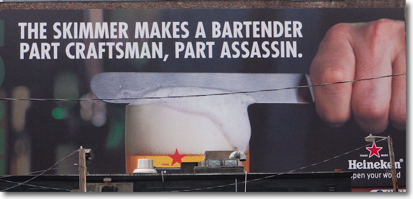
G1, kit lens @45mm, 1/1250, f/5.6, ISO320.
A memory.
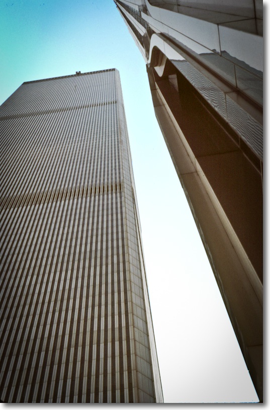
1982
No one could accuse them of being great architecture. Minoru Yamasaki’s sole nod to aesthetics were the Mayan columns at the base. Everything else was just bigness. Get as many rentable square feet in as possible. Then double it to save money on design fees.
The plaza was one of the most soulless places on earth. Dominated by an ugly spherical sculpture in its center, you rarely saw anyone out there at lunch. The ugliness was one reason. The wind tunnel that the design had created was the other.
On some days the upper floors would quite literally have their head in the clouds. My client on the 95th floor of the south tower could see nothing but white from the windows. On others, it was so clear that the sheer gargantuan overkill of these monoliths left all around them dwarfed. The lovely art deco Bankers Trust building at 1 Wall Street seemed like a miniature. All you could see was the steam rising from the rooftop air conditioners.
They were so large and housed so many that the Postal Service gave them their own zip code. At traffic hours the flow of people through the giant rotating doors was a spectacle that simply said ‘New York’ – energy, speed, bustle.
Windows on the World was the restaurant on the 106th floor of the north tower. You took a separate elevator for the last few floors. Once, when I was in it, the high winds made the tower rock and twist causing failsafes to lock the elevator car half way up. We waited patiently, helpless, for the thing to restart. At 100 floors up you are the obedient, hapless servant of structural engineers. The restaurant, strangely for a tourist location, was as good as it gets.
The only time they really came to life was on a clear night. I was walking up Broadway from 1 New York Plaza, late, where I worked at Salomon Brothers, to the Chambers Street station inside the towers, and was dumbfounded by the sheer beauty of the digital art they portrayed. I simply stopped and stared. Some windows lit, others black, it seemed like a perfect realization of the synapses of a digital computer, silently coming on and off in their obedient response in Ones and Zeroes.
I lived on West 56th Street and would take the subway downtown at weekends to Wall Street to wonder at the architectural wonders everywhere to be seen. The area was always deserted. No one lived in the financial district back then. And, try as I might, I never did take a good picture of WTC. I’m not sure it was something that was possible.
(Snapped with a Leica M3, 50mm Summicron, Kodachrome 64).
A British institution.
The British Journal of Photography has been around since Fox Talbot was snapping on his wet plates, meaning over 150 years. While today if you want detailed, insightful gear reviews you go to DPReview.com (if, that is, you can stomach the endless brand flame wars and detritus passing for Comments), until digital came along the place to go was the BJP.
Under its former long standing editor Geoffrey Crawley (editor 1966-87), you got technical analysis at a high level, unsullied by commercial considerations. Maybe his landmark work remains his review of one of the most advanced (and complex and expensive) cameras from the end of the film era, the Zeiss Ikon Contarex Super. He also extensively reviewed pro grade equipment, frequently Nikon and Canon hardware, each eventually accorded a book of his reviews.
When I was a kid you would find me every Saturday morning at the Kensington Public Library poring over the latest edition of the BJP, back when it was a weekly. The BJP was always a very serious – and slim – offering and once a year they used to publish an annual book of the best avant garde photography, containing some 150 pages – the BJP Almanac of Photography, to give it the full Victorian-era name. I remaindered my many issues a while back. What was purportedly new and modern in 1970 was simply awful in 2000. Tired, derivative, excessive. But it seemed like fun at the time.
Now the paper magazine is monthly and I’m not even sure if you can get it in the US. However, BJP just released an iPad app which I have been trying for a couple of days now, with mixed results.
What follows is based on my use on the iPad1. As the iPad1 represents fully 45% of all iPads ever sold, it doesn’t cut it to excuse slowness because of the more modest A4 CPU in this model. It accounts for almost half of all readership, after all. Maybe it’s faster with the A5 in iPad2? I do not know as I do not own one.
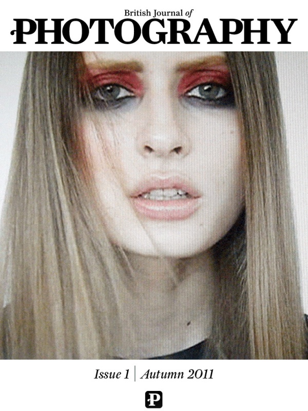
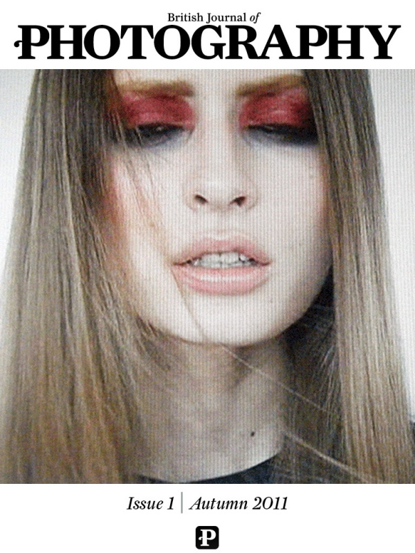
The blinking model on the cover of the first issue. A needless gimmick.
The first issue is free if, that is, you can figure out how to download it, matters being made worse by the fact that a couple of the articles in it are also advertised as for sale. Stability is reasonable – I was kicked out a couple of times in a couple of hours of browsing, and returned to the last page viewed. Screen refresh rates are so-so – it takes a couple of seconds for the image to sharpen. Zinio started much like this and progressively improved. BJP has to do better if it is to succeed as an online publication. Blur-to-sharp delays look most unappealing. Navigation is sub-optimal. Sometimes a touch-and-drag is refused. You flick side-to-side to view photographs yet many pages require the iPad be turned to landscape to view the 5% of the image cut off in portrait mode. Everything should be in portrait fit – that’s how we read. Keep the landscape option, by all means, but make everything fit in the portrait orientation. Worse, when the content switches from photograph to text, the text has to be scrolled vertically rather than simply continuing to the next page. Consistency of finger motions between pages is a must for touch screen consumption.
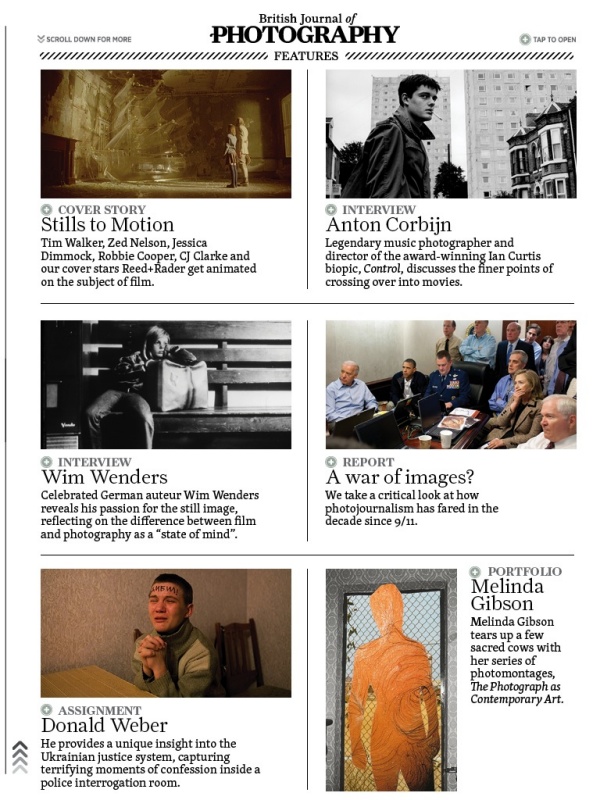
One of the (many) index pages.
I have no idea what the eventual price will be but if I have a major issue with the iPad magazine it is that the editors seem to have forgotten the old dictum that ‘less is more’. The first issue resembles more of a core dump than edited content, running to some 182 unnumbered pages, and it’s simply too much. No working pro, who is after all the target audience here, will have the time to go through this sea of mediocrity in search of the occasional gem. Over half the pages contain photographs, which is good, but the content is shockingly mediocre. There are some two dozen photographers featured and most, names withheld, really should consider road construction or sewer cleaning as hobbies, where they would doubtless excel. A random search of online photoblogs will, for the most part, find better work. That one of the photographers interviewed seemingly prides himself on his ignorance of technique makes a statement about editorial policy in a pro magazine that I do not want to think about.
As for the gear reviews, they vary from poor to awful. with the one addressing the Sigma SD1 being one of the worst pieces of pseudo-technical clap trap I have ever read. It manages in one fell swoop to leave you confused, angry and dumber than when you started reading it. Quite an accomplishment.
Indexation is a mess. The main index at the front repeats every page of the many subsequent indexes buried in the body of the work. What is needed is a simple multiple choice main index – Features, Profiles, Technology – with a touch on any one of these jumping the reader to the relevant sub-index where the contents can be displayed without clutter or confusion. The sub-index, in turn, should have a ‘return to main index’ touch icon. As it is, the consolidated index page at the front is very hard to use, being one huge, scrolling mess. Simple always wins, especially within the space-constrained confines of an iPad’s display.
There are also a dozen or so gear advertisements – not enough, I fear, to sustain this effort – with many including videos to display features. The Hasselblad ads are especially well done.
It obviously took a lot of hard work to produce this massive tome, but hard work alone does not correlate with success. The publication needs the underlying code tightened and made to work faster and more responsively, indexation needs a major work over, the photography content needs drastic editing and a move to excellence and the gear reviews would best be dropped, being largely useless. These are done much better by any number of web sites and it’s hard to see how the BJP adds value here. Geofrrey Crawley must be spinning in his grave. You might as well read manufacturers’ press releases where the lies are more prolific, but the English far better.