Not quite as new as it sounds, but much easier today.
Stumbling the ten yards down the main drag from bedroom to office this morning, I tripped on not one but two border terriers. Which is strange as, last I checked, the Pindelski estate was the proud owner of just one of these fine beasts. So either there was some serious hanky panky in the night or something else was afoot.
Now, come to think of it, yesterday was Friday night and it happened to coincide with a presentation of Steve McQueen’s superb film, Le Mans, on the big screen. Anytime one sees a brute Porsche 917 race the gorgeous Ferrari 512 is an occasion for some serious medication to calm the nerves and suffice it to say that the gin martinis were flowing freely.
Which probably accounts for the presence of that second border terrier this morning.
Sitting down at the computer and erasing all those email suggestions that I could not possibly satisfy my woman without a horse’s dose of Viagra, my first reaction was to do something more exciting like paying the bills, but I gave one of the HDR links in a clean email a passing click only to come across this page from Photomatix. When the first thing I saw was their exhortation ‘Increase the Dynamic Range of your Photographs’ I wondered whether this was some sort of spam, and that in fact this was yet another attempt to sell me performance enhancing chemicals. Look, I know I grew up in England where the average male prefers a hot water bottle to a cuddle with his girlfriend, but this was going a bit too far.
Anyway, I scrolled the little wheel on my Genuine Apple Mighty Mouse down the Photomatix page and, well, saw a revelation. What their application does far better than Photoshop can (no surprise there) is to combine three photographs, identical except as to exposure, to create a result with huge dynamic range. You now see the highlight and shadow details that were missing before. The revelatory aspect of this is that the Photomatix software does this with one click, even working on RAW files. All the photographer has to do is take three exposures, 2 stops under, correct and 2 stops over, then let the software work its magic.
Not that this is all that new. Unknown to me I have been an HDR devotee for most of my photographic life. With black and white prints it meant overerexposing, underdeveloping, then printing on a contrasty grade of paper with lots of burning in using the hands over the easel. Then for a long time, having migrated to color film, it was either displaying the slide on a screen using a projector, which confers tremendous dynamic range, or living with prints which either opted for burned out highlights or dungeon dark shadows. Once those slides could be affordably scanned in the 1990s they took on a new lease of life as dynamic range could be restored to some extent with software. Plus, while a computer screen cannot compare to a projected image for dynamic range, it’s a lot better than a print in this regard. The way I would do it is to simply use the Highlight-Shadow slider in PS, later the far better one in Aperture, and bring back the details. For example, take these two snaps of a shaving shop on St. James’s Street in London, taken in 2000 on Kodak Gold 100 negative film:
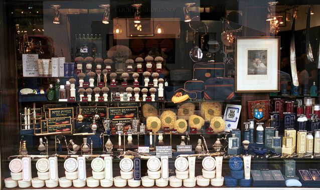
The original, scanned using a Nikon Coolscan scanner.

With Highlight-Shadow correction applied using Aperture.
There’s life in those old pictures yet!
With more recent pictures, taken using RAW in the 5D, the manipulation range is far greater. In this example, I underexposed by a couple of stops to preserve details in the exterior, then corrected exposure and used the Highlight-Shadow slider in Aperture to balance interior and exterior lighting. The Aperture RAW converter was used.
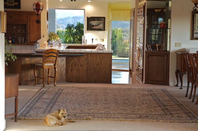
This suggests that, if I do indeed have two border terriers, one was away at the time this was snapped.
So maybe HDR isn’t so new after all. Indeed, look at what chaps like Canaletto did when lazing around Venice trying to make some coin from his oils:
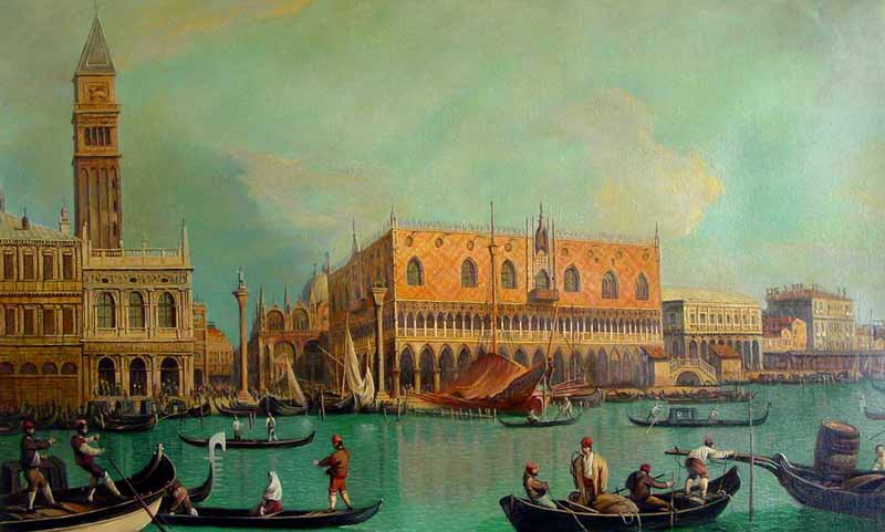
Canaletto has a go at the Grand Canal
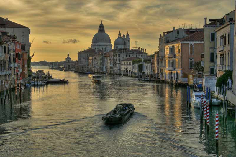
A latter day Canaletto from the Photomatix web site.
It’s little wonder that modern HDR photographs tend to look like oil pantings, as they recreate the great dynamic range that the old masters were creating intuitively. I sort of doubt that Pope Julius II would have ponied up the lira had the ceiling of the Sisitne Chapel been delivered with blown out highlights.
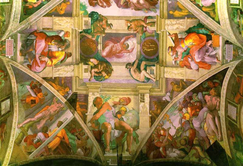
Michelangelo. The Sistine Chapel, 1512.
So Michelangelo was into HDR some 500 years ago. Clearly, he did not use Windows or he would never have finished the job.
In my early experiments with Virtual Reality photography, I mentioned the challenge posed when it came to correct exposure. To permit seamless stitching of the panorama, the camera has to be set on one fixed, manual exposure while all the pictures are taken. To do otherwise is to ask for trouble. The issue, of course, is that means the likely huge dynamic range of a panorama will results in exposure problems in some of the frames. Now it seems that the automated approach offered by products like Photomatix would cure that. True, you have to take at least three pictures for each frame and there’s a little more work to do in assembling the panorama, but cameras like the 5D allow automatic bracketing at two stop intervals – press the button in burst mode and the camera takes three pictures in one second.
So now it looks like my return trip to the redwoods will call for some burst mode under and over photography. More when I have the pano head in my hands. Which probably means my own head will be in my hands shortly thereafter.
By the way, here’s another picture where I used HDR. I wanted a picture of our home theater in daylight, to show the environment and photographs on the walls, but I also wanted the screen filled with a movie picture.

The Home Theater. Canon EOS 5D, 24-105 at 24mm, PS CS2, RAW
I simply exposed for the room, reckoning the fabulous sensor in the 5D would preserve data for the screen image, even if it would be washed out. After converting the RAW file to PSD in ACR, I used the Lasso tool freehand to highlight the screen area then used Levels to bring back the detail. Hey presto!
