Category Archives: Photography

At the Movies – 10 years

Nothing new here.

As with books, the movies which most inspire the visual senses were all made a long time ago. The modern obsession with the action/adventure genre, along with attention spans shortened by video games and the like, largely preclude the making of beautiful movies. There’s no money in them and the Hollywood system no longer has time for art house movies.

But go back a few years and choosing just five of the most beautiful movies is not at all easy, for there is so much great work out there especially from the 1960s and 1970s.

In no particular order, then, these are the five which have most stimulated my visual cortex this past decade.

1 – Death in Venice, starring Dirk Bogarde, directed by Luchino Visconti. 1971

Based on Thomas Mann’s novel of the same name, Death in Venice chronicles the last vacation and death of one Gustav von Aschenbach in fin de siècle Venice. Visconti’s work was always rich and lush with Italianate color and from Bogarde, a lightly regarded British comedic heart throb, he coaxed one of the very greatest performance on film. Never less than lovely to look at the movie is a treat for the ear, too, much of it set to the Adagietto from Mahler’s Fifth Symphony. The movie demands attention and patience, both amply rewarded. I originally saw it on its first run in Mayfair as a young man of 18 and recall well stumbling out into the Belgravia streets simply dazed and overcome with emotion.

2 – Streets of Fire, starring Michael Paré, directed by Walter Hill. 1984.

You could not find a visual masterpiece as culturally removed from Death in Venice as this rollicking good time. Set seemingly in 1950’s Chicago and filmed almost exclusively at night, the imagery – set to a raucous Ry Cooder rock track – is startling and attention getting. Even the video game generation will get this one. The youngest movie here.

3 – Barry Lyndon, starring Ryan O’Neal, directed by Stanley Kubrick. 1975

This three hour long movie is not for those in a hurry, and visually it remains unsurpassed. Rather forgotten in a Kubrick oeuvre whose admirers prefer ‘2001: A Space Odyssey’ and ‘The Shining’, this lushly filmed and costumed period piece is balm for the eyes. If your visual senses matter to you, this is probably the movie to see above all others. If nothing else, Marisa Berenson (the niece of that great Renaissance art expert and charlatan, Bernard Berenson) has never looked lovelier. Handel’s Sarabande dominates the sound track and could not be bettered.

My son, aged 13, had already watched it – all rapt attention – thrice, which tells you something about how you should bring up a kid in today’s world. He will be successful as a result of his attention span, not despite it.

4 – 2001: A Space Odyssey. The star is the English cinematographer Geoffrey Unsworth, directed by Stanley Kubrick. 1968

In the previous column, one on photography books, I made mention of the adjective ‘breathtaking’ as one which is abused yet remains useful for lovers of good English. And ‘2001: A Space Odyssey’ is nothing if not breathtaking. It does not hurt that the movie includes simply the most stunning cut in world cinema, the moment when the monkey hurls the bone/weapon victoriously in the air and Kubrick and Unsworth cut to a space station set to Strauss’s Blue Danube Waltz. Breathtaking. And if you have never quite understood Varese’s music, this is a good place to start.

5 – Lawrence of Arabia, starring Peter O’Toole, directed by David Lean. 1962.

Jackson Bentley: What is it, Major Lawrence, that attracts you personally to the desert?
T.E. Lawrence: It’s clean.

A rare moment of humor in a film which you should see, if at all possible, in a revival movie theater on a huge Cinemascope screen. I saw it thus twice when it played in the Carnegie Theater in Manhattan, close to my home on 8th Avenue and 56th Street in the mid-1980s and it really is the only way to do it justice. And speaking of great cuts, the one here is in the same class as Kubrick’s money with the femur. Lawrence, showing off his disdain for pain, snuffs out a match with his bare fingers and Lean cuts to the infinite vistas of the desert. That is special and Maurice Jarre’s music is the icing on the cake. One of O’Toole’s earliest movies and one for which he was cruelly denied the Oscar.

If there was ever a more physically perfect leading man than O’Toole, I cannot think of one and it’s lovely to hear him speak in the proper English of my youth, not the grammar school garbage emerging from the mouth of the average English speaker today.

* * * * *

With the exception of Barry Lyndon, made on Kodak film (Kubrick opting for the pastel rendering), all were made in Technicolor. No surprise there. ‘Death in Venice’ comes on an SD DVD only (a so-so print) as does ‘Streets of Fire’ (an excellent print). The others all come in Blu-Ray options and there really is no alternative but to get these.

You can see all my movie reviews here.

Photography books – 10 years

10 years of inspiration.

When I write ‘Photography books’ I am not referring to tomes dealing with the dry arcana of Photoshop. Rather, I mean books of photographs by great photographers, books meant to inspire and improve one’s own vision.

On that basis very little of substance has been published during the decade I have been writing this journal and one might go further and say that very little of substance has been published since Henry Fox Talbot was knee high to a grasshopper. The same goes in most fields of endeavor. There are only a few great, memorable buildings in the world. A few great leaders. A few cars. A few scientists. A few artists. A few great composers. You name it and Pareto’s principle is not 80/20 but rather 99/1. 99% of most every genre is garbage.

And so it is with photography books.

Click here and you can see the contents of my library of photography books, some three hundred all told. They lie merrily around the abode in absolutely no sort of order, an approach based in the simple belief that a good photography book should always come as a surprise. A long lost friend made new again when savored after a long absence.

And while reading devices like tablets and cell phones have obsoleted most books the one genre which remains untouched by this technological upheaval is the art book. Can you imagine enjoying Raphael’s frescoes or Cartier-Bresson’s masterpieces on a poncy 11″ display? No.

What are the qualities which makes a photography book great? The one which must surely take first place is repeatability, by which I mean that every time you return to it you see something new. Your pulse rises and you ask “How did he see that?”. So if forced to name just five favorites for the proverbial desert island, a location devoid of the culturally arid expanse that is Facebook, the choice is surpassingly simple.

1 – Steam, Steel and Stars by O. Winston Link.

‘Breathtaking’, like ‘gay’, is a once charming word which has lost all meaning, overuse and abuse having confined both to the status of grammatical detritus. Yet used in the traditional sense, the one in which maybe a Spitfire pilot might have used it about his machine when battling the Hun in the skies over London in 1940, Steam, Steel and Stars is so obviously the greatest chronicle of a bygone age that this photographer has seen. It is breathtaking.


Click the picture for Amazon US.

More than documentary, it’s a passionate memoir of the last days of steam seen through the eyes of a photographer who spared no effort in lighting his subjects – be they trains or the people charged with their care and nurture – invariably at night. And it’s literally breathtaking when you realize that as often as not his miles of cabling for the complex flash apparatus used would be severed by the very subject illuminated, as the train thundered over the wires. An absolute masterpiece and you cannot call yourself a photographer if it’s not in your library.

2 – Henri Cartier-Bresson – The Man, the Image and the World.

Realistically, just about any HC-B book will do. It’s the images which matter not the invariably blathering, pseudo-psychological texts which accompany them.

Those lucky enough to own his first – Images à la Sauvette – probably have the finest précis of the man’s oeuvre, and if you want the early HC-B, still mightily influenced by his painting teacher, the surrealist André Lhote, that’s a fine place to go. Sadly, it’s rare and costly, so the choice here – more comprehensive in its coverage – is a suitable alternative.


Click the picture for Amazon US.

When negotiating with the prickly Charles de Gaulle, France’s greatest post war leader, Churchill once remarked “I have the cross of Lorraine to bear”. But even WSC knew that a world without the French, a world without Paris, without Parisian culture and gastronomy and clothing and light and sheer style, would be a worse place. And complain as one might about the cowardice of the French in the face of the Germans in 1940, of their Vichy government and its collaborationist ways, if you do not love France and its culture you simply do not get it. We have their weakness to thank for the fact that Paris, that most perfect of cities, survived unscathed. Krupp’s guns were directed at the land of my parents and then on the land of my upbringing, but mercifully not at Paris.

And it’s hardly a wonder that the greatest slice-of-life snapper ever was French. Arguably he could not have originated anywhere else.

3 – Paris by Night – Brassaï.

And speaking of Paris, never was that wonderful city done greater justice than in Brassaï’s – yes, breathtaking – slim tome of night pictures. More than breathtaking, it’s magic and is likely the only book I own where you can smell the city. In Paris de Nuit the Hungarian émigré, to use modern vernacular, absolutely nailed it, in that most welcoming of cities for artists and revolutionaries.


Click the picture for Amazon US.

I confess to being so fond of this book that it’s within arm’s reach, as often as not.

4 – Horst, His Work and His World.

Another émigré who was to leave his definitive stamp on the world of photography is Horst P. Horst. The young German had wisely changed his name from Horst Bohrmann when immigrating to New York, where his talent was immediately noticed – first as a model then as a photographer at American Vogue. American Vogue may not have had the style of it’s French counterpart but it had great couturiers galore in Horst’s time and, of course, Americans were rich and willing to support them. (British Vogue can be largely dismissed as English women of the period were clueless about clothes sense. Horses and tweeds may go together but it’s not a pastime supportive of haute couture).


Click the image for Amazon.

Horst is the master of the formal, carefully staged, studio portrait, his work putting the efforts of the likes of Cecil Beaton to shame. The famous corset image, above, is of none other than Lee Miller who went on to becone a great photographer (and lover of Man Ray, no less) in her own right. Her experience of seeing the Nazis’ death camps almost destroyed her as it would many a man.

In much the same way that Brassaï’s images of Paris at night will never be surpassed, one can comfortably place Horst’s studio work in the same category of excellence.

5 – Nature’s Chaos by Eliot Porter.

This lovely book was a 1990 Christmas gift from a great American capitalist and his playwright wife with the charming inscription “These photographs remind us of your work”. Roy and Carol had always made their magnificent Venice Beach home open to me with its expansive displays of art and sculpture and their generosity in turn inculcated in me that great American spirit of philanthropy.

Their inscription was more politeness than accuracy, as I am generally completely clueless about nature photography, but the book is special. Porter has published many books of his images, and this one is as fine as any. There is nothing remotely picture postcard about his work which tends to abstraction and thoughtfulness.


Click the image for Amazon US.

So there you have it. My five most favorite photography books, ones from which I have learned much and continue to learn more. And ten years earlier I very much doubt that short list would be any different.

Click here for an index of all my book reviews.

Fan management in the Mac Pro – Part XXIX

Apple’s changes to fan management are a retrograde step.

For an index of all my Mac Pro articles, click here.

I have expressed my frustration at Apple’s seemingly mindless and unending tinkering with OS X before. One of the strangest changes was made in the transition from OS X Mavericks to OS X Yosemite (10.9 to 10.10) and it relates to how the OS manages cooling fan speeds. My findings are based on over a hundred data sets and are statistically significant.

Yosemite vs. Mavericks fan management:

Set forth below are two stress test charts from CPU upgrades I performed on 2009 Dual CPU Mac Pros:


Mavericks stress test.


Yosemite stress test.

These charts display the temperatures of both CPUs (orange and red) as well as the power supply (green) and ambient temperatures (brown) and are logged over a 70 minute cycle during which a stress test utility loads up the CPUs to near 100%.

As you can see, the temperature chart for Yosemite differs dramatically from that for Mavericks (and indeed for earlier versions of OS X, not shown here).

What Apple has done in Yosemite is to set the OS to ramp up the cooling fans far later in the heat cycle than in Mavericks with the result that CPUs (and other cooled devices) get much warmer before the fans speed up, with the minor benefit that less energy is used at idle. (Of course, thinking holistically, your Mac Pro gets warmer and you have to crank up the air conditioning ….) The result is that everything runs hotter (bad) with the sole benefit being that the fans run slower and hence quieter. Awful engineering. A cool electronic component is a happy electronic component. What was Apple thinking of – an increasingly common question when it comes to OS X?

I have repeated the above measurements dozens and dozens of times on any number and variety of CPUs and the results are always the same. The charts above are neither in error nor do they represent statistical anomalies.

Now during normal, low stress use, this is no big deal. Components at idle rarely exceed 115F with only the hot running Northbridge chip (with an operating ceiling of 220F) running at some 125-140F. That is normal. The NB chip is the main ‘traffic cop’ which parcels computing labor out between the two CPUs and if you are wondering why CPU A always runs warmer than CPU B it’s that it also has additional traffic cop duties, so it works harder. The oft stated ‘fact’ that CPU A’s heatsink gets warm air from CPU B’s fan is nonsense propounded by dabblers who fancy themselves engineers – you will get the same differential with a cold Mac Pro as with a warm one, clearly disclosed in the above charts during the warming stage in the first few minutes of stress.

However, under heavy stress it is not exactly a comfort to see CPUs run up to over 160F before the fans spool up (the service limits are variously between 162F – E5520 2.26GHz 80 watt Nehalem 4-core – to 173F – X5690 3.46GHz 130 watt Westmere 6-core). For the technically inclined I am referring to what Intel calls TCASE, which is the temperature at the top of the Integrated Heat Spreader on the CPU. The actual internal components run a good deal warmer than this but TCASE is what the Mac Pro’s sensors measure, so we are comparing apples with err…. Apples. So while it’s fine in normal use to let the OS manage the fans, I recommend manual intervention when high stress use is contemplated.

Fan control utility:

The fan control utility I use to manually override the fans is named Macs Fan Control and it’s a free download, installing itself in the menu bar thus:


Macs Fan Control

Here’s what the fan names refer to:

  • PCI – the large grey fan mounted with two screws on the backplane board which cools the PCIe slot devices (800rpm default)
  • PS – the fan in the 980 watt power supply unit (600rpm)
  • Exhaust – the rearmost grey fan in the processor cage (600rpm)
  • Intake – the frontmost grey fan in the processor cage (600rpm)
  • BOOSTA – the fan on the right side of the processor tray when it is removed, cooling CPU A. The CPU fans are buried in the heatsinks and are ordinarily invisible (800rpm)
  • BOOSTB – the fan for CPU B (800rpm)

Your Mac Pro will also have one or more fans in the graphics card(s). Those are not shown above.

When freshly installed, Macs Fan Control runs all the fans at the factory defaults shown above – or higher if operating temperatures so dictate. If you are using your Mac Pro under heavy stress (typical in movie and advanced audio processing) I recommend that, as a minimum, you switch Macs Fan Control from Auto to Ambient thus:

This will adjust the fans to the ambient temperature inside the Mac Pro’s case (generally warmer than your room temperature) based on the related sensor inside the Mac Pro. As components heat up the ambient temperature inside the case rises and the fans will accelerate.

Your settings will look like this and it takes but a few moments to ‘flip the switch(es)’:

Optimal cooling:noise fan speeds:

In extremely stressful scenarios, I recommend completely overriding fan automation and setting all the fans to at least the settings below:

  • PCI – set to 2500, which increases noise from 42 to 46 dB (max is 4500 – 57dB, loud at max)
  • PS – set to 1500, 42 to 46dB (max is 2800, 60dB – sounds like a jet engine at max)
  • Exhaust and Intake – set to 1500, 42 to 48dB (max is 2750, 60dB – these really roar at max)
  • BOOSTA and BOOSTB – set to 3500, 43 to 45dB (max is 5200, 47dB – fairly quiet at max as they are buried within their respective heat sinks)

The noise levels above were measured at four feet from the front of the Mac Pro – a common distance for a machine on the floor next to a desk, and the recommended ‘high stress’ settings above are based on the maximum fan speeds consistent with a tolerable noise level. All the fans ramp up noise significantly as they approach the upper end of their working rpm range.

Here are the fans set in accordance with the above recommendations:


Stress settings for all the fans.

With these override settings, the normal 43dB noise level of the Mac Pro (a whisper) rises to 51dB (clearly audible but not intrusive). Fan wear? Fughedaboutit. Fans are dirt cheap. CPUs are not.

A caution on manual fan speed overrides:

If you use manual overrides for fan speeds there is a potential danger that you will be running your fans too low. For example, if your override sets a fan at 2,500 rpm where the system would ordinarily call for a higher speed, the 2,500 rpm override will prevail meaning that your fan will be running slower than the system would elect. To be safe, then, if using manual overrides check your component temperatures during the most stressful period of use and make sure all is in order. If any temperatures are too high, adjust the overrides for the related fan(s) upward.

How loud is the Mac Pro will all the fans maxed out? Intolerably so at 63dB. It’s an unlikely use case, but if it occurs you really want your Mac Pro is a separate room, well distant from your ears.

Mavericks (and earlier OS X) users do not need to interfere as much, as those versions of OS X have a far smarter approach to fan control, ramping up the fans earlier as the above charts disclose. It bears repeating that the best, leanest, meanest version of OS X ever was Snow Leopard 10.6. You can still buy Snow Leopard 10.6 from Apple for $19.99 and then update it online to 10.6.8, the final version. That version will give you access to the App Store and you will have everything a serious user needs. Later versions – Lion, Mountain Lion, Mavericks and Yosemite add little and, as the above discloses, delete common sense in the case of Yosemite.

Yet another case of form (quiet running) trumping function (keep it cool) in the continuning erosion of common sense in the engineering of OS X.

Apple changes – 10 years

A mixed bag.

Desktop and laptop hardware:

When I started using Apple hardware in 1999 it was a disgust with Windows and PCs which drove there. My first iMac was the classic G4 ‘screen on a stick’ design, an ergonomic bull’s eye, which is still in use to this day. It was a revelation, never locking up, recognizing all manner of peripherals instantly and came with an OS which was night-and-day compared to the horrors of Windows.

As my time becomes more valuable daily , seeing as it’s a pot amortizing at an accelerating rate, I see no way that I would revert to Windows, something I have not touched since 2004 when I commenced self-employment. All of my work and computing leisure are spent on Macs or iOS devices. If my son so much as mentions Windows, I threaten him with my will and an eraser.

A decade ago that great CEO/marketer/carnival barker/charlatan/thief Steve Jobs was well into the AAPL revival, which peaked on his death when the business became the most valuable public company on earth. I published a picture taken the day of his death in downtown San Francisco and it remains as moving today as it was then:


Pacific Stock Exchange building, Pine and Sansome, San Francisco.
G3, kit lens @ 71mm, 1/1250, f/7.1, ISO 1600

You can read that piece here.

But, I’m afraid to say, since then Apple has gone nowhere as regards the pro video/audio/photography user set. Sure they sell lots of phones, but for pros it’s all been downhill. The obsession with thinness and looks, driven by designer Jony Ive, has lost its governor on reality, one Saint Steve. With everything but looks sacrificed on the Altar of Thin, today’s iMac 5K is every bit as bad when it comes to thermal management as the iMacs which ushered in the Intel era, purportedly running CPUs much cooler than the IBM G4/5 ones which preceded them.

However, bad as the early Intel iMacs were, if any iMac takes the prize for multi-purpose machine, it has to be the pre-Intel G5. Computer and toaster in one. My new one was sold so fast that I think I left the bread in it – its fans would roar at the slightest provocation and, often as not, the machine would also leak coolant all over the place as soldered joints melted in the inferno. An abomination. It looked nice, of course.


The worst Mac of the past decade – the iMac G5.

Thus, when I wrote Putting out the Garbage five years ago I simultaneously abandoned desktop Macs in favor of a Hackintosh, a machine using common PC parts but hacked to run OS X. The machine was a blast to build, the hacking was a nice challenge (and sweet revenge), fast, infinitely upgradable and robust as it comes except …. when Apple made changes to OS X. Each saw the Hackintosh gurus scrambling for a fix as a host of new things was broken. After a while this began to get really old. That emotion coincided with the classic Mac Pro becoming very affordable on the used market and the 2009 model I specialize in upgrading is easily modified to current performance at modest cost.


The best Mac of the past decade – the 2009 dual CPU Mac Pro.

And the Mac Pro, introduced in 2006, really was a nod to Apple’s roots, comprised of movie makers, sound artists and photographers. Not cellphone dabblers but rather people who used the Mac Pro to make a living, with all the attendant demands on robustness and coolness (literally) under pressure. And it bears repeating – for heavy processing, especially video, you must be certifiable to use an iMac. Only the classic or new Mac Pros (the latter also thermally well managed, albeit at a high price) are up to the task.

And even in the new Mac Pro you see the invidious creep of form over function in Ive’s designs. I mean, all the storage is external? The GPUs cannot be upgraded? The CPU is difficult and costly to upgrade? And it looks like a garbage can? What was Ive thinking? And it’s doubly tough for those working pros who really do not want to build Hacks or join the PC world, preferring to work on their clients’ projects rather than spending time endlessly debugging their machines.


The 2013 Mac Pro – form and function. but at a price.

The other change to Macs since the white Intel iMac machines melted down is that every Mac screen out there has a ghastly, glossy finish. There used to be an option for the MacBook Pro of a matte screen, but I have not the energy to check the fine print to determine if that still exists. Even their Cinema Displays are glossy. Again, what are they thinking of?

In fairness, Apple’s laptops are superb in every way. Take into account annual depreciation of maybe 20% and an annual or biennial upgrade is perfectly feasible economically for just about anyone. People who talk of the ‘Apple premium’ probably failed finance classes. Then again, they mostly use PCs. Every Mac today runs Windows if that’s your thing, many buying them for just that purpose, they are fast and so long as you do not overtax them, stay reasonably cool. Battery lives only get better, keyboards and trackpads are the best in the business and there seem to be no reports of fundamental design flaws. Even the glossy screen intrudes little for who, after all, would use that for serious work? You switch to closed lid mode and procure a mouse, keyboard and (non-Apple branded) display with a matte screen. Just lay off the heavy video stuff.


The MacBook Pro – Retina Display. The best laptop in the business.

So if the pro user has a beef with Apple’s hardware it’s easy to see why.

OS X:

More troubling is the direction OS X has taken. I recall all the bloatware which PCs came with when new and while OS X is not in that league, we are constantly seeing insanely frustrating changes which seem to deny the platform-agnostic nature of the Unix core on which OS X is built.

OS X arguably peaked with Snow Leopard OS 10.6 in 2008 which took Leopard, shook out all the bugs, introduced nothing new and was lean and mean. That’s what I call software development. Since then we have had Lion, Mountain Lion, Mavericks and Yosemite and none has added anything useful over Snow Leopard, except for a lot of feature bloat and sheer stupidity (making icons monochrome in Finder, for heaven’s sake? Hiding Library directories? Translucent menus? Backward scrolling? The arrant idiocy of the ‘fly away’ option on cursor hover over a dock icon?). And you really want to take phone calls on your computer or hop off the desktop and take over on the laptop in mid-sentence? Really?


Snow Leopard – the best OS X ever.

It’s as if there is a child with Attention Deficit Disorder running OS X development, ignorant of when it’s best to just leave things alone. And the constant dumbing down, directionally pointing to iOS, is insanely frustrating, no less than the constant rounds of application upgrades with every major release. I do not want OS X to look like my iPhone and know no one who does. So far that idiot child has not managed to break the main reason for using OS X in the first place, its rock solid reliability, but give him enough room and he will get there. Apple, please, just leave OS X alone. No one ever bought a Mac because a new version of OS X just came out and no one ever will.

The iPhone:

Today’s Apple is a cell phone maker. Nearly all of its revenue and net profit is from the iPhone. The iPad is doomed to no growth owing to its long life cycle and the tablet craze has rather faded.

And in that regard it’s fair to say that the original iPhone was the technological product of the new century so far. I bought mine on July 31, 2007, the day it became available, doing so in the college town of San Luis Obispo where the predominantly student population had either not seen the keynote some six months earlier or was too stoned to go to the Apple Store. I queued all of 5 minutes, with the news full of mile long lines elsewhere. Some people, whose time was worth nothing at all, even lined up in San Francisco. Only in America do the unemployed line up for cell phones.


The first iPhone. Apple’s greatest product ever.

Sure, later iPhones added the App Store, sharper screens, 3G, 4G, a better camera and on and on. And, of course, they became thinner and thinner. But inside every iPhone is that first iPhone with its no less brilliant operating system, iOS. iOS may see constant tinkering by Cupertino but, unlike with OS X, you are free to largely disregard bloat features you do not need. And in the iPhone 5 and 6 it’s no exaggeration to say that the camera is superb. The iPhone destroyed Blackberry and Nokia, arguably made Samsung (a work in progress, that one, as Sammy finds it increasingly difficult to steal/copy/clone), and bankrupted Nokia and Motorola. It will eventually destroy Canon and Nikon as camera makers.

Steve Jobs’s roll out presentation of the iPhone is perhaps the greatest display of marketing prowess ever and you can (and should) watch it here, even if your parents dropped you on your head when you were knee high to a grasshopper, leaving you hating all things Apple. “A widescreen iPod with touch controls, a revolutionary mobile phone, and a breakthrough internet communicator. Today Apple is going to reinvent the phone”. Genius. And true. As thrilling to see today as it was in early 2007. And, of course, “You had me at scrolling”.


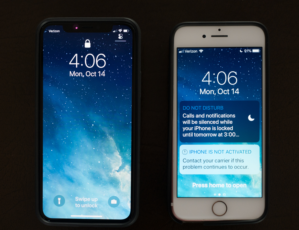
The author’s iPhones – now and then.

Carnegie, Rockefeller, Ford, Westinghouse …. Jobs. A pantheon of American capitalists and originals all.

Here’s hoping:

So my hope for Apple is that they leave OS X alone, at least make some effort to maintain a professional computer product in their increasingly bloated product line (Gil Amelio, anyone?) and continue to improve the camera in the iPhone. Of these three, only the last is a realistic expectation, and that’s sad.

Oh, that and have its CEO stick to talking about what he is paid to do during business hours, not about what he does in his bedroom. And enough already with that dumb watch.

Top class

The best marketing campaign ever.

I have written before about the lovely photographs the Swiss watchmaker Patek Philippe has been running seemingly for ever.

Their latest father-and-son image maintains the high standards of the campaign and is suffused with charm and class.

The price of entry for the world’s best wristwatch is about the same as the cost of a new Leica M240 and a couple of lenses. The Leica will be useless junk by the time your son comes of age. The Patek will have doubled in value. I dumped my Leicas years ago ….