Category Archives: Printing

Printing with an emphasis on the HP DesignJet dye printer

Mounting glossy prints

Care needed.

I finally got around to mounting some glossy prints made on the HP paper I received as a gift.

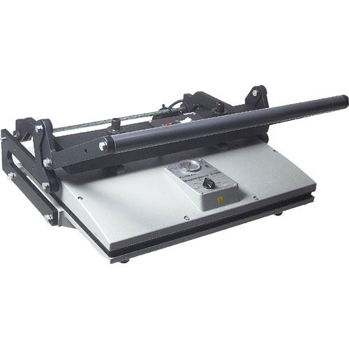
The Seal 160M.

I use a Seal 160M press which I bought ages ago, used, on eBay for some $400 + half my net worth in shipping. It weighs a ton! They are still in business and even shipped me some missing nuts no charge. Today’s price- some $1,400 – reflects the uncompetitive cost of US labor. Will we ever see a flood of cheap ones from China? After all, a press is just a couple of slabs of cast iron and a heater. I doubt it. Few make big prints for mounting any more and I doubt the replacement market in commercial businesses is significant.

Only a fool buys these new. They regularly crop up for $250-500 used and all parts are readily available, not that there’s much to go wrong. The 160M weighs 60 lbs so try to buy locally. The 210M comes in at a whopping 75 lbs. Buy locally and bring a friend.

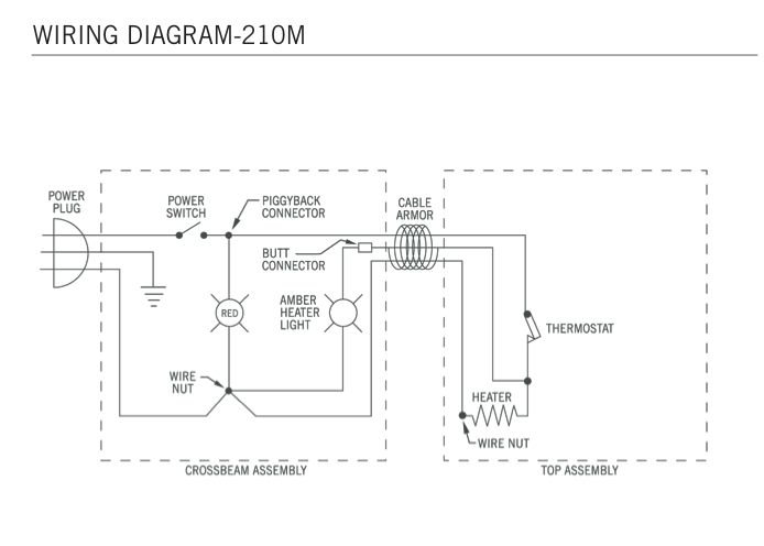
Typical eBay selling price – this is for the 210M. The 210M has two pressure adjustment knobs in contrast to one for the smaller 160M

The device could not be simpler, so if the heater or thermostat blows, replacement is cheap and the process simple. The whole thing is made up of less than two dozen parts, and B&H carries the essential ones. Framers’ Island also carries spares, including thermostats.

Not exactly complex ….

You can read all about mounting prints here.

I turned the temperature down from my usual 190F (HP Satin) to 170F for the glossy and also first removed the heated platen and gave it a thorough scrubbing with steel wool to remove any surface imperfections. You know how glossy is! Further, I’m careful to keep the release paper (prevents the print sticking to the heated platen) in a dust proof bag to avoid ingress of particulate matter which could mar the surface.

The results are simply spectacular. The surface loses a minor amount of gloss (it will much more at 195F so temperature seems critical) and there’s not a divot or scratch to be seen. But it is a labor of love! The faster these prints go behind glass, the better.

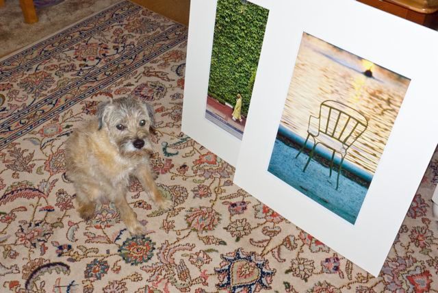
Mounted glossy prints with helper.

To learn more about the Seal press click the download buttons below. If you track down a used one, look for the S or M designation in the model number, indicating it’s a later model which does not use asbestos in the wiring insulation. Life’s too short as it is.

Download the Seal 160M/210M manual. 160M – up to 2×18.5″,
210M up to 2×23″. Both accommodate any length.

Download the Seal 110S manual – up to 2×12″

The maximum width of a board which these will accept is twice the larger dimension of the platen – you simply flip the board around. Overlapping/reheating a previously sealed area has no deleterious effect. The maximum length is infinite as you simply slide the board sequentially through the press. A 13″ x 19″ print needs two passes in my 160M, whereas an 18″ x 24″ requires four, both when centrally mounted on a 22″ x 28″ mat. It’s the size of the mat, not of the print, which constrains capacity. 2 minutes under pressure per ‘press’ using Drymount mounting tissue and release paper does the trick.

Nothing beats a professionally mounted print and, as I have written before, I am still searching for evidence of fading or discoloration in prints I mounted almost 40 years ago using a domestic iron. So when snake oil salesmen come calling, telling you that heat mounted prints fade, ask to see the evidence.

Glossy paper

The touchstone of the photographer’s art.

Its been quite a while since I made glossy prints. In the darkroom days I would squeegee the print, face down, onto a high gloss sheet of chrome-plated steel then heat the thing in a press. If you got things right the resulting print would emerge with an indescribably high gloss (this was before awful RC papers ruined traditional printing) which was also quite incredibly fragile. Any moisture or fingerprints and the surface would be ruined. But the definition afforded the image was beyond compare.

This was not all good, of course. Every imperfection in the image was disclosed, every grain of Kodak’s unbeatable TriX emulsion revealed. Sometimes you wanted that. Sometimes not. And the whole process was a real pain in the nether regions but once you saw an unglazed, normally dried glossy print you never wanted to go there again.

Nearly all the many prints I have made on my HP DesignJet 90 dye ink jet printer have been on HP-branded Premium Plus Satin paper. This paper has a semi-gloss finish, retains detail well and is very easy to use. It has a swellable surface, meaning its pores open when sprayed with ink to absorb the dyes. After a few hours the swelling subsides and the print is less fragile and can be handled easily. Until then the surface is quite fragile. I always handle paper using cotton gloves because any grease from fingers on the surface can result in poor ink absorption, blotchiness and reduced life. Done carefully, HP’s Vivera inks are certified by Wilhelm Research for some 80 years longevity.

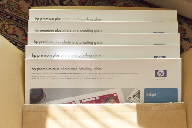
Well, take a look what arrived on my doorstep the other day:

Nice things happen to nice people.

The buyer of a hefty chunk of my Canon 5D outfit found several goodies in the shipments I made. A few CF cards, a wired and wireless remote, an LCD protector, a CF-to-SDHC adapter and so on. He had been a pleasure to deal with, none of the usual game playing or nickel and dime nonsense so beloved of buyers of even fairly priced gear, that I felt it was the least I could do. Well, Barry B. dropped me a note saying that he no longer made prints and would I like some HP Glossy? Is the Pope a Catholic? It gets better. The small fortune in printing paper is not only the swellable type specific to my HP DesignJet, it was shipped to me at no charge! There are decent people left in the world …. thank you, Barry.

On receipt the first thing I did was to download the paper profile from HP and make it available to Lightroom. Then I took an image which would really benefit from the ability of glossy paper to render fine detail and ran a test print. In this image I had retouched some overhead wires using Photoshop CS5 and Content Aware Fill and it looked just fine on my Dell 2209WA display. But, oh! boy, the test print clearly displayed my retouching so I had to go back into PS and try harder. That’s glossy paper for you. Every imperfection, every pore, every blemish, is writ large to the world.

A second print – I have no fewer than 125 sheets of 13″ x 19″ to play with so I’m feeling a tad profligate – put all to rights and the quality is simply breathtaking. And this from the Panny G1’s poncy little MFT sensor!

A warning. Before these swellable papers dry, a matter of a few hours, they will show a mottled surface reflecting (!) disparate ink absorption across the surface. Give them a few hours and the surfaces returns to normal, meaning a high gloss almost as good as those monochrome prints from ages ago, but a lot easier to make.

Glossy is not for everyone. It’s hard to display, attracting reflections as it does. It’s fragile and really needs mounting behind glass. It’s unforgiving when it comes to the photographer’s technique. And it needs to be handled with kid gloves …. OK, cotton gloves. But, done right and displayed right, a glossy print remains the touchstone of the photographer’s art.

Why do you think that nice Mr. Jobs insists on those dumb glossy screens on all his computers? Because they plain look better on a casual acquaintance. That’s fine for prints. Not so good for computer screens.

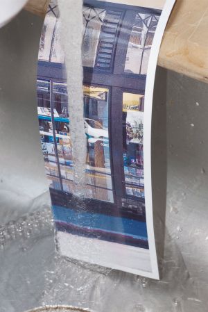
HP Glossy is anything but water resistant, so keep it away from rain drops and the like:

Two minutes under a tap and the emulsion starts to run.

HP DesignJet monochrome printing

Using the right profile.

I’m really not a black and white guy, having last seriously used the medium in 1979. Still, now and then I make a monochrome print from a color original, using the ‘B & W’ option in Lightroom’s Develop module. This is well engineered as you can still vary the mix of the original colors using the sliders for each, and can easily alternate between color and monochrome renditions to gauge the effect.

The dye ink HP DesignJet printers are renowned for the outstanding depth of their black inks with no bronzing on HP Premium Plus Satin Photo paper. Read on to get the best black and white rendition possible, short of paying up for custom profiles.

Using the stock Premium Plus Photo Satin color profile a monochrome print from my DesignJet 90 is too cold. I mostly prefer a slightly warm rendition, so I set about finding dedicated monochrome profiles for this fine paper.

HP still offers free downloads of icc paper profiles from its website for black and white printing and warn that these should not be used for color prints as the results may be unpredictable.

Click below to download these:

Click to download HP monochrome profiles.

There are many to choose from. Basically you experiment until you find the profile that suits your tastes. The download includes instructions for Photoshop but you can readily adapt these to Lightroom.

After downloading, I installed the HP neutral profiles by dragging and dropping the downloaded folder to Username->Library->Colorsync->Profiles. I printed the test print (named Neutral_Profiles,jpg and to be found in the ‘Index_profiles’ folder in the download) using Snow Leopard and Lightroom, and telling LR to use the Neutral 0 profile.

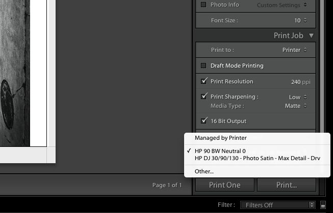
As luck would have it that one gave me the result I wanted, viewed by daylight, warmer than the stock color profile and just right for my taste, so I renamed the Localized Description String as explained here in the ‘Neutral 0’ profile to HP 90 Neutral 0, and checked it off, along with the regular color profile in the Print module of LR (you can also see the other B & W profiles which I did not rename in this screenshot):

Now when I go to the profile selector in LR I see:

It takes less time to do than to explain and is a worthwhile step for best black and white print quality. You can use any one of the many profiles to suit your preference. I like life simple, so I only use the two profiles above with HP Premium Satin photo paper.

HP DesignJet printhead diagnosis

Finding faulty heads.

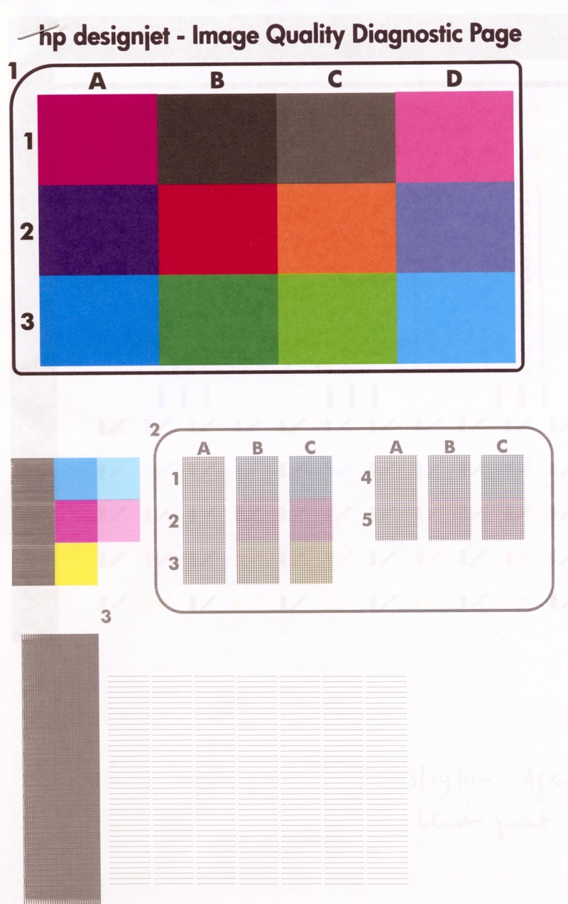
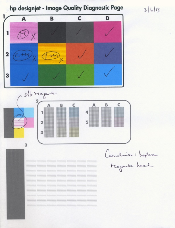
For the HP DesignJet six head dye ink 30/90/130 printers and their four head predecessors (10, 70, 120, etc.) HP recommends running its Image Quality Diagnostics Page using the System Management Utility when you experience print quality issue; the Utility can only be run for Mac users using OS Leopard or earlier. That’s a shame as HP has committed to stocking repair parts, heads, inks etc. for 10 years after the printer is discontinued, and as they still sell the DJ130 on their site that means through 2021 at least. Too bad their Mac software is obsolete, requiring an earlier Mac OS or a Windows PC.

When the DesignJet has a faulty printhead the front panel indicator for the head is meant to flash. The problem is that it does not always do so.

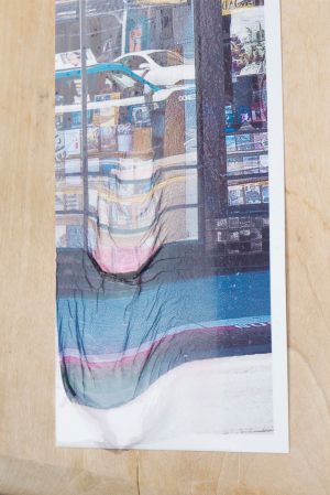
Here’s a print I was making the other day; all was proceeding swimmingly until the last few inches on the right of the 13″ x 19″ original, where the color suddenly goes awry. The image below is a low quality photograph of the 13″ x 19″ print as my scanner does not go beyond 8 1/2″ x 11″!

Prining problem with the DesignJet.

This problem is not unknown to DesignJet users and generally indicates a clogged or faulty head. However, there was no indication on the printer’s front panel of any problem and the first Image Quality Diagnostics Page report I ran showed all the color squares at the top to be solid and full.

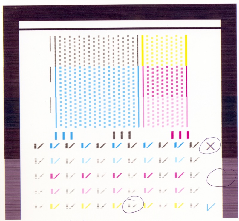
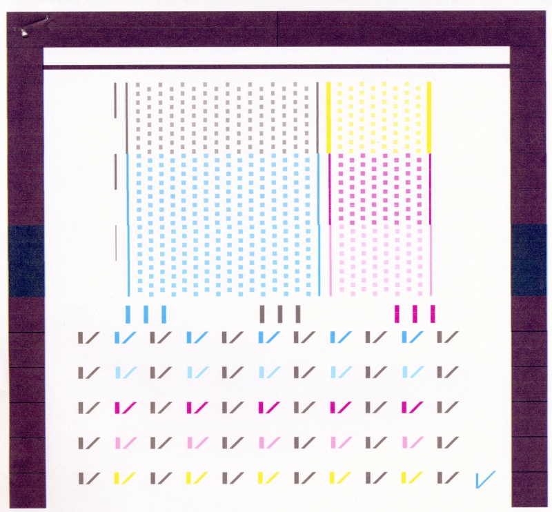
However, because sometimes a head can temporarily recover from a clog, I simply ran the report again and the problem was now disclosed clearly, as follows:


Faulty head disclosed.

Consulting this chart from HP ….

…. I immediately concluded that the Cyan head was at fault. Rather than try and clean it, I simply ordered a replacement as the original was over 1,100 days old. Further I have found cleaning to be a quixotic exercise which rarely fixes a printhead problem for long. While HP states that the smaller color squares are merely for warm-up before printing the head alignment grids to their right, the total absence of Cyan in the related small square confirmed my conclusion, suggesting that the little color squares have some value after all.

Also, note that HP’s statement that “All patches associated with a given color must have banding, for the corresponding printhead do be determined at fault” is incorrect in my experience. As you can see, Cyan affects squares A2, A3 and B3, yet only A3 and B3 disclose banding, above. After many print head replacements, I have never seen three banded patches and five of the six cartridges – all except Black (K) – affect three patches each. I have had all five of Y, C, LC, M and LM fail and in each case the report only disclosed two banded patches.

The LC, LM and Y ink cartridges are much larger than the K, C and M ones, meaning that on average HP expects prints to use more LC, LM and Y ink. Yet with all my non-black heads failing it seems that volume of ink use is not the driving factor. Mine were all over 1,100 days old so age may be the deciding issue for light users. Whether age of the ink is relevant I have yet to determine. Some of my ink cartridges are past their expiration date.

After changing the Cyan printhead I placed three sheets of plain letter sized paper in the DJ; the DJ automatically runs a head alignment when a head is replaced and will do so up to three times. A check mark on my first and only page confirmed all was well, and printing was restarted.

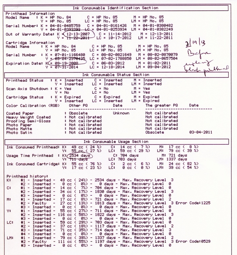
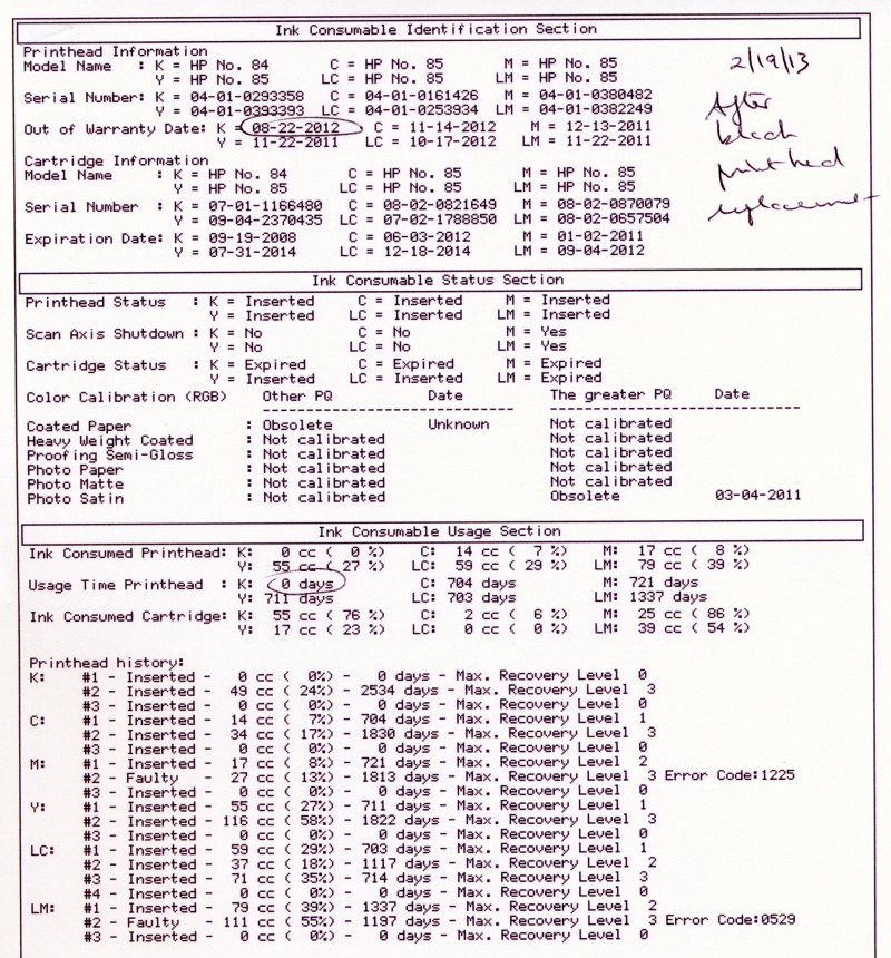
The Ink Consumable Usage report section:

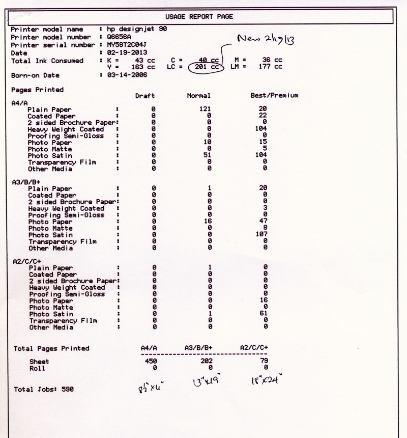
But wait a moment, you say. I just checked the Ink Consumable Report on the two page Information Report I ran from my DesignJet. It says that all is well as my head has only used up a fraction of its life.

Oh yeah?

The unhelpful Ink Consumed Printhead data for the old LC head.

Well, right after I replaced the Cyan head, above, and made one print, the Light Cyan head blew! Yet the report, above, says the LC head was only 18% through its life (green oval). That statistic is useless, it seems, for old heads. Read further down and you will see that the LC head is no less than 1,117 days old! Now I have only the ancient K (Black) head left to blow. The K head is a model 84, all the others are 85, so I’m running it until it drops, hoping that any design difference will help. As a minimum it will be an interesting discovery process. And it’s still cheaper to waste a sheet of paper than buy a new head. Moral of this story? Old heads are likely to fail even if modestly used. Keep spares.

Am I complaining? Not really. After four years of sitting there, mostly inactive, I can hardly grumble about a $35 head failure.

All is once again well. Now I have to make a lot more prints to bring down my average cost per print – logic akin to that of the US Government spending more money on its war machine to keep down the cost of oil.

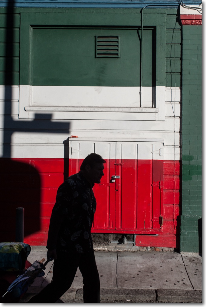
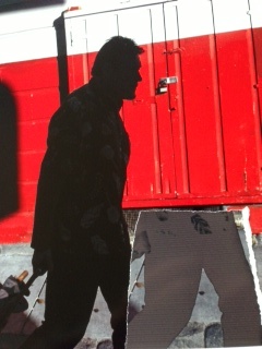
Flagmakers, San Francisco. G1, kit lens @ 29mm, 1/500, f/5,2, ISO320.

Note on the picture: The original was taken in a dark alley with insufficient room for square composition and is surpassingly bland. A few seconds in Lightroom and a round trip to Photoshop to fix leaning verticals, and the power of RAW is writ large in allowing me to restore some color to the original.

The original of Flagmakers.

Soft proofing with Lightroom

Using Snow Leopard.

Why soft proof?

I have mentioned this before but it bears repeating. Soft proofing – meaning previewing on your display what a print will look like with the paper profile of your choice – is easy with Snow Leopard and Lightroom. If you want to get an accurate preview of how your print will look without wasting printing paper and time, you need to soft proof. (Click here for the earlier OS Tiger version of this piece.)

Even outstanding technical writers like Martin Evening (in his LR3 book) say that you cannot soft proof when using Lightroom! Others would have you generate a print file and then open it in Photoshop for soft proofing. Yet others want to sell you a Lightroom plugin for soft proofing.

Well, read on for Dr. P’s free version.

Monitor profiling:

What follows presumes you have a well profiled display in the first place. I recommend the Eye One colorimeter, but be warned the software with which it currently ships will not run with Mac OS X Lion, shortly to replace Snow Leopard. If your display is not profiled you are wasting your time. I profile my three displays monthly – they all drift over time and as most display screens are made by LG, Sony or Samsung, chances are your display drifts too regardless of the label on its case. I address a workaround to allow you to continue using xrite’s dated software once OS Lion comes along here.

You want to profile your display in much the same ambient light as you will be viewing your print, and colorimeters like the Eye One allow you to measure ambient light. The reason is simple. If you profile your display in daylight then view the print in incandescent light, your viewing light temperature (much yellower) is dramatically different from your profiling light temperature (much bluer). You are not comparing like with like.

Don’t believe me.

Take a print and walk around your home with it – from a bright room illuminated by daylight to one illuminated by incandescent light. The changes in perceived color are anything but subtle. The light you profile by is especially important for the accurate rendition of skin tones of loved ones, where visual memory is most acute. (Sort of like judging a sound system – listen to opera or lieder, because we know how the voice sounds). If your portrait is to be viewed by incandescent light then your display should be profiled in like lighting if soft proofing is going to make any sense. Professional proofing stations recognize this by providing a temperature controlled light source.

The GTI EVS-1SP – 29 x 52″ – Graphiclite D5000 Viewing System
– for when your ship comes in. $6,000 from your friendly dealer.

Very large devices like this will house two monitors and your print!

Using Lightroom:

In the Print module of Lightroom (I’m using Lightroom 3 in what follows), make sure that in the Print Job->Color Management pane, Lightroom is NOT set to ‘Managed by Printer’. You want Lightroom to take care of color management, meaning it will pass the print job through your paper profile of choice before you spool the job out to your printer.

To confirm you have done this right, click ‘Print’ in Lightroom’s print module, then click Color Options in the lower drop down menu and you should see the following:

Color Options in Lightroom.

Select the appropriate paper profile in Lightroom:

Lightroom is set to take care of color management duties.
The profile for the paper of choice has been selected, above.

Using Apple’s Preview:

After selecting the paper profile for your paper of choice as shown above, click on ‘Preview’:

Printer and quality selected in red circled boxes.
Preview button clicked next in the green circled box.

After clicking on ‘Preview’, your Mac will open the Preview application, displaying your print file.

Click on ‘View->Soft Proof with Profile’ and then mouse or arrow down to your paper profile – the one you chose in LR3 will be highlighted. Click on it and you are seeing a preview of your print with the profile of choice applied.

Paper profile selected in Preview.

Apple mentions this Preview capability in passing on its web site.

From Apple’s web site.

If you do not like the colors, go back into Lightroom, reprocess and try again. Otherwise click ‘Print’ and you are done.

The effect of paper profiles:

In the following screen snap I have illustrated how paper profiles clearly affect Print Preview – the left is with HP Premium Plus Satin, the right with Arches Infinity which is far ‘warmer’; the difference is clearly visible on my Dell 2209WA display:

The effect of different paper profiles in Preview.

Orange umbrella. G1, kit lens.
By using soft proofing I was able to get the the colors I wanted
in the print without wasting printing time and paper.

Hopefully, one day Adobe will add the soft proofing capability to Lightroom so that soft proofs can be viewed from within Lightroom, but it’s not like it’s a big deal to do this using Preview.

Note for HP DesignJet 30/90/130 users:

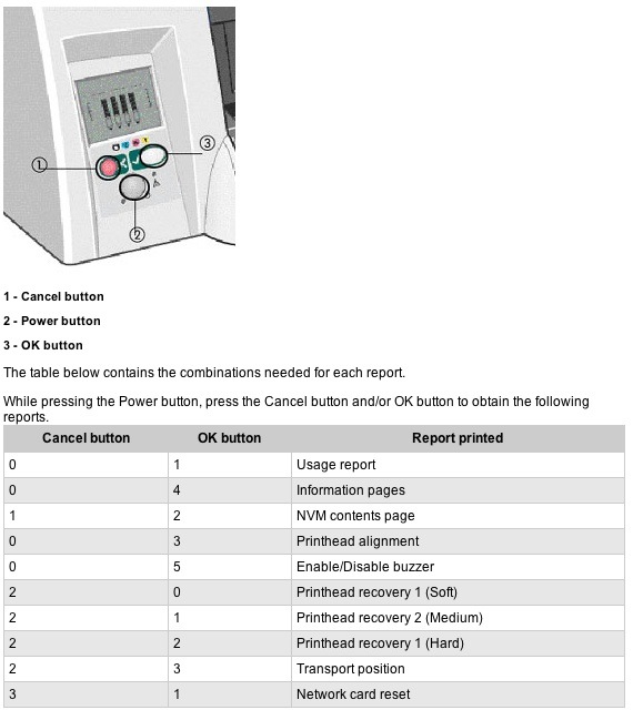
The HP DJ 30/90/130 printers have an internal colorimeter which will generate a profile for any paper of your choice, storing that profile in the printer’s ROM. While many of the DJ’s functions can be activated with front panel pushbutton sequences, color profile generation cannot. You must run the HP DesignJet Maintenance Utility which, for reasons only know to some twit at HP, resides on HP’s servers and cannot be run locally from your computer. To make matters worse, you cannot run this Utility using OS Snow Leopard or Lion. To generate the profile you must insert a letter sized piece of the paper of your choice, run OS Leopard or prior, make sure you have an internet connection, pray that HP’s servers are not down, load their System Maintenance Utility, and the profile will be generated and stored by the printer. You can confirm generation of the paper profile by running the Information Pages from the printer and looking for this:

HP Satin paper profile generated on March 4, 2011.

The pidgin English reference to ‘The greater PQ’ means the profile you will be using when you select ‘Best’ in this drop down box; ‘Best’ forces the DJ into one directional printing for highest quality, but is slower than ‘Normal’ which uses bi-directional printing. I always use ‘Best’:

I have saved these settings in an LR Preset named ‘HP Satin Best’, as shown above.

If you adopt this paper profiling approach, then to use the profile generated by the DesignJet’s colorimeter you would elect ‘Color managed by Printer’ in the Lightroom Print pane – see the second screenshot in this piece, above. In practice I find no significant difference in colors on the print whether printed using the DJ’s ROM profile or the ‘icc’ profile which resides on my HackPro’s disk drive. However, as the use of icc profiles is not limited to just six papers (which is all the DJ’s ROM has room for) and because you cannot rename the ROM profiles to something other than the names provided by HP, using an on disk profile gives you far more paper choices and makes those easy to select – the names are obvious. Finally, letting the printer manage color takes away the ability to soft proof the image on your display before hitting ‘Print’.

Later HP wide format printers – the ‘Z’ series – are much smarter; they also cost three times as much as a DesignJet. The Z3100, as an example, has an Eye One colorimeter built in! The Z series uses pigment inks as opposed to the dyes use in the 30/90/130 DesignJet. The six printheads used for the twelve inks each cost $70, twice as much as those in the 30/90/130 DesignJets. The Z3100’s colorimeter creates an icc profile for any paper of your choice then stores it on your computer’s hard drive. Neat.

B&H still lists the DesignJet 130R (presumably the ‘R’ indicates inclusion of the roll feed attachment) for a stunning bargain price – there is no cheaper way to get into top quality large printing:

I discuss use of non-HP papers and profiles here and here.