Category Archives: Printing

Printing with an emphasis on the HP DesignJet dye printer

HP ink costs

The old HP 12C helps out.

In my piece on framing Really Big Prints I guessed at the cost of ink used by that frugal beast, the Hewlett Packard DesignJet 90 printer.

Well, in the HP engineering spirit, I whipped out the old 12C and set to work.

Checking the ink levels on the printer showed the following:

Yellow 3/4 full
Black Full
Magenta 3/4
Cyan 3/4
Light Magenta 1/2
Light Cyan 1/2

Now as the level in each cartridge is reported in one quarter steps, I averaged 3/4 full to mean 5/8 full (i.e. half way between 3/4 and 1/2) and so on, making for ink use aggregating 2.5 cartridges.

Production?

13 18″ x 24″ prints and 27 13″ x 19″ prints, or 12,285 sq. in.

With cartridges averaging $35 (the prices differ, strangely, according to color), that works out to $87.50 in ink, or $1.75 for a 13″ x 19″ and $3.07 for an 18″ x 24″.

So my $4 ink cost-per-print estimate in that earlier journal entry was a tad high. You can make an 18″ x 24″ print with the HP DesignJet, paper included, for the price of a hamburger-and-fries at the local fast food joint.

The HP DesignJet dye-based series of printers (30, 90, 130) are frugal, indeed, when it comes to ink use. I cannot express how pleased I am with this large printer and, in truth, rather regret not having bought the 24″ carriage model, though how I would handle mounting and framing 24″ x 36″ monsters in 32″ x 42″ frames boggles the mind.

Mounting Really Big Prints

Some practical hints.

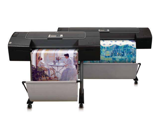
Every year, a couple of months before Christmas, I invite a few friends to select a couple of prints from a small web presentation, asking that they elect 13″ x 19″ or, now that I have the HP DJ90, 18″ x 24″.

So as this year’s print ‘orders’ came in, I thought it might be instructive to share my technique with readers. Those who see obvious errors are encouraged to set me on the straight and narrow and those contemplating the self-abuse that is print mounting might like to see what they are letting themselves in for.

First, I should point out that I do not accept the apologia proferred by many for ‘hinge mounting’ where a print is held to a backing board with a few pieces of tape at the top in the purported interest of archival permanence. The moment the humidity changes, the print cockles and you have a throw away print. It’s just another excuse to cut corners masquerading as technique. Don’t believe them when they tell you ‘curators insist on this’. Sheer Rot. I have prints which I dry mounted thirty years ago (using a domestic iron, no less), before we knew about acid free this and pH neutral that, and they remain perfect and unfaded. So when people tell you dry mounting is no friend of permanence, look elsewhere.

Key dimensions:

I typically mount both 13″ x 19″ and 18″ x 24″ prints on 22″ x 28″ boards. The HP DJ90 and 130 leave a 1/4″ border top, left (long side) and right (long side), with a bottom border of 9/16″ (short side). For the HP Designjet 90/130, after allowing another 1/8″ for safety,the mat openings are as follows:

  • 13″ x 19″: Opening is 12 3/8″ x 18 1/16″
  • 18″ x 24″: Opening is 17 3/8″ x 23 1/16″

These openings will leave 1/16th of an inch of printed image to work with on all sides, for alignment purposes. Matboard & more will custom cut these for you. Stock mats which come with 12 1/2″ x 18 1/2″ and with 17 1/2″ x 23 1/2″ openings will not work, leaving white borders on the matted print.

Archival issues:

My goal is a print which will outlive me and here’s what is involved:

1 – A printer with fade free inks. The DJ90 uses dyes, others use pigments. Both are great. Most modern ink jet printing inks are fade free. Look for them when making your printer selection. Older designs will fade in as little as a year in bright light.

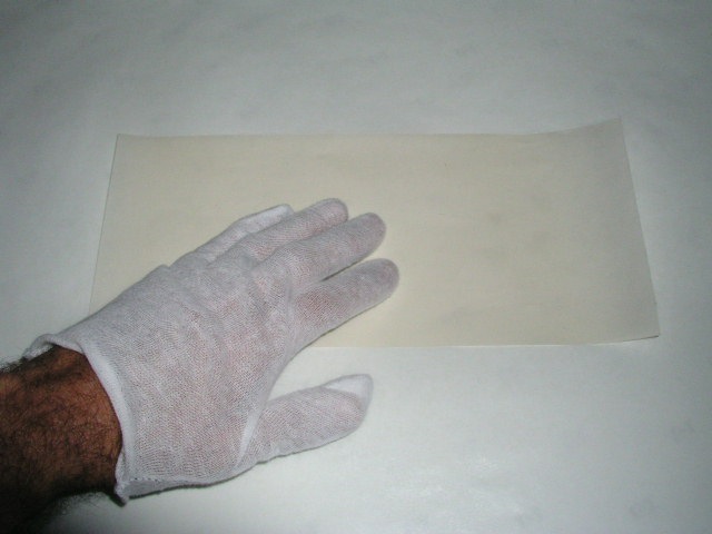
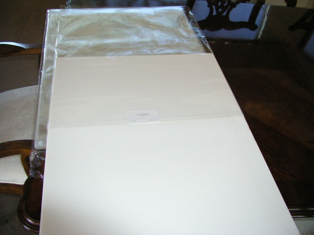
2 – Cotton gloves. Yes, I do advocate delegating the drudge of routine printing – meaning anything under 8″ x 10″ – but when it comes to show prints I am not about to let the clerk at the framing store, who has just feasted on a Big Mac, cheese and fries, get his hands on my print. Grease is the last thing I need. Not to mention that ten of these will pay for that overpriced Seal press. The cotton gloves are used from the moment the printing paper is removed from the box all the way through final placement of the mounted print in a protective glassine bag for shipping. Cheap insurance.

3 – Acid free mounting board. I use the 3/16″ thickness – it costs little more than the 1/8″ and is more robust.

4 – Acid free mats cut by Redimat. Their machine cutter is incredibly accurate. As Apple’s Aperture leaves a 1/2″ border around the print with the DJ90, my 18″ x 24″ prints get a 16 7/8″ x 22 7/8″ cut out, while the 13″ x 19″ ones use 11 7/8″ x 17 7/8″. That way I have 1/8″ to play with when positioning the print on the mounting board. Color? Anything your heart desires. I mostly use black. Simple. No distractions.

5 – Seal Bienfang RC Colormount tissue. This seals at 185F and is intended for RC paper. Its low sealing temperature is ideal for ink jet prints. Go much over 210F and these start to fry.

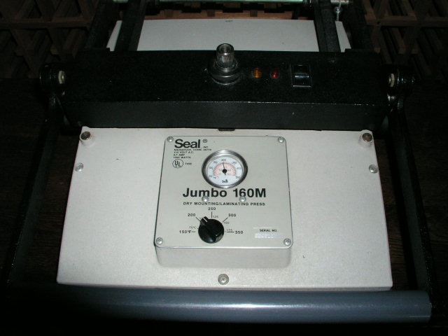
6 – A Seal mounting press.

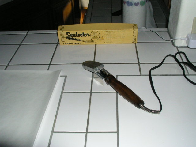
7 – A Seal tacking iron to tack the mounting tissue to the print and the print + tissue to the mounting board.

8 – 3M two-sided adhesive tape to attach the mat to the mounted print.

9 – Release paper for tacking and heating in the press

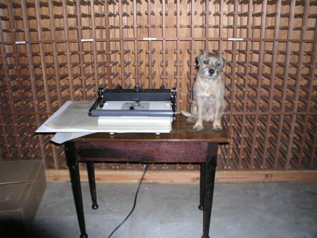
10 – Bert the Border Terrier to keep me company. These are very hard to find and, in my opinion, essential.

Strict cleanliness throughout this process is key. Any dirt or grit and your print is shot.

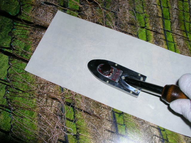
The tissue is precut using a sharp knife and a granite counter.

The Seal tacking iron, set just below ‘Med’ and no higher, is warmed up.

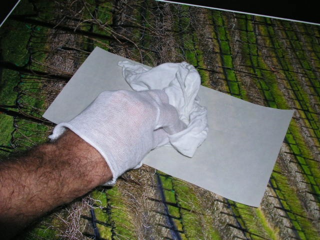
Using a small piece of release paper betweeen the mounting tissue and the back of the print, the tissue is tacked to the print – count for 10 seconds – remember those darkroom days? “Elephant One, Elephant Two, Elephant Three….”

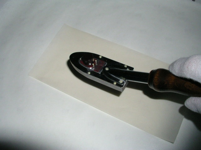
Hold the tacked part down for a couple of seconds to cool.

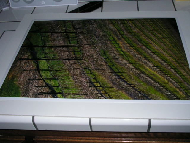
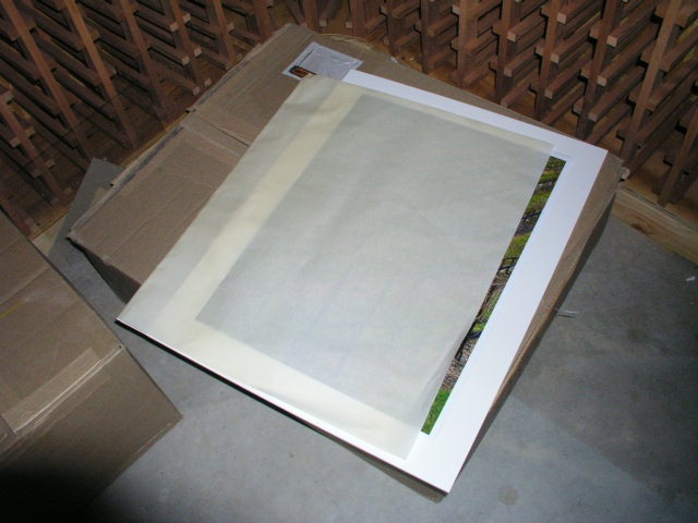
Get one mounting board and one mat – the latter will be used as a positioning template.

Having positioned the print + tissue on the board using the mat (the mounting board and mat must have identical outside dimensions), tack the print to the board, protecting the print with the release paper:

Once more, hold the heated area for a few seconds to ensure a good ‘tack’.

The print is now tacked to the board.

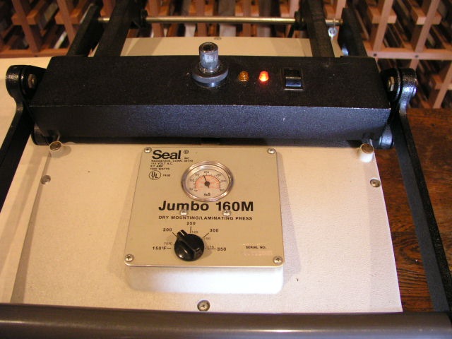
Heat the press to 170F.

Place the print + board in a folded over piece of release paper.

The press must be adjusted so that reasonable hand pressure on the lever closes it. Too much and you will have creases in any print that needs multiple passes. In my press, an 18″ x 24″ print needs four passes. This is where you put the Border Terrier in play.

The red light indicates the press is on, and the orange light to the left will extinguish once the set temperature is reached. Once the orange light goes off you are at the set temperature. I do not bother to preheat the print or board to get rid of moisture as both are stored in a dry, heated home.

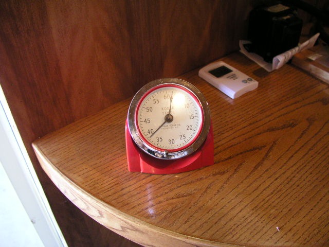
Each heating cycle must be for at least 90 seconds – pull out that 60 year old Kodak analog timer, the one you can read from across the room. Overdoing it is not a problem – I sometimes let it run 4-5 minutes while I do something else, but if you are in a hurry, less than 90 seconds is a no-no.

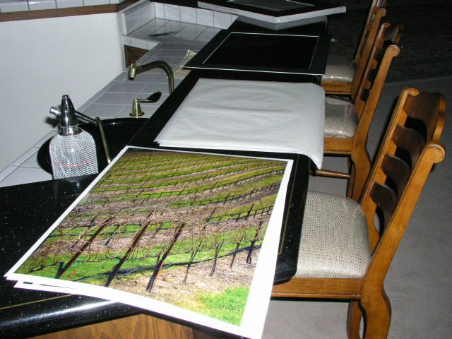
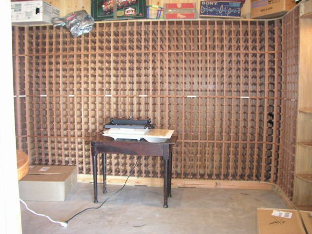
My press makes its home in the wine cellar, but yours does not have to.

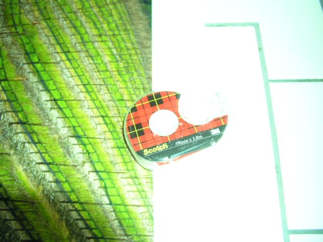
Once the heating process is complete, pull out the Scotch 3M double sided tape dispenser. Do not economize by using something cheap.

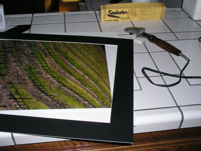
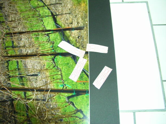
Place two inch strips in the center of the board on all four sides of the print between the print edge and board edge. Now place the mat on the print, aligned edge to edge, and press down on these four points. The goal is to lightly glue the mat to the board – the framing process will ensure the two stay together.

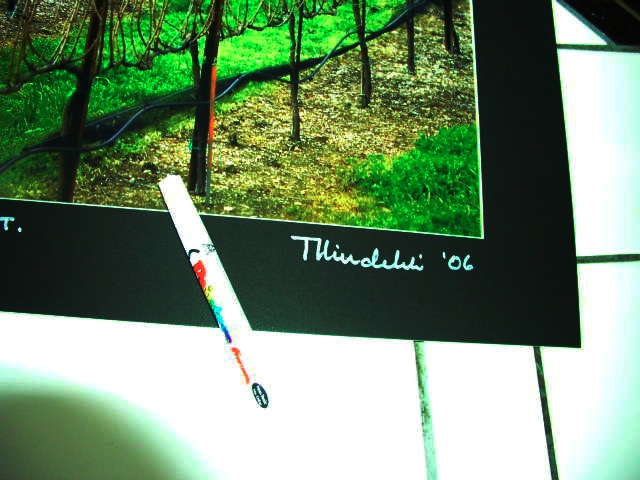
Do yourself justice – sign the bloody thing. Wilting violets …. wilt. I use a white ink pen from the art store.

Sticking with the cotton gloves, insert the ‘sandwich’ into an acid free, sealable, glassine sleeve for storage and transit.

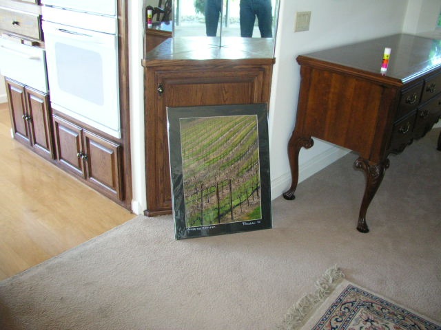
Stand back and admire your work.

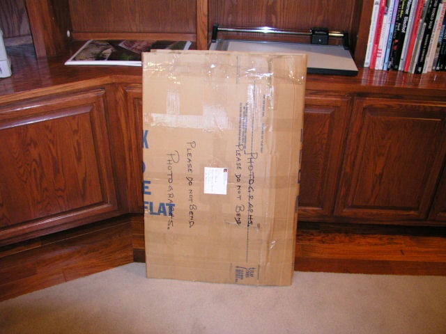
Finally, pray the post office does not bend your prints in transit.

Framing is addressed here.

HP DesignJet Z photo printer

Brought to you despite the Board of Directors.

If you have been following the financial news recently, you could be excused for thinking the Board of Hewlett Packard couldn’t organize a booze-up in a brewery. Depsite the twits in the corner office, the great engineers at HP continue to make innovative products. The most recent announcement is the HP DesignJet Z photo printer.

Long time readers of this journal will know how pleased I am with my HP DesignJet 90, which will make up to 18″ wide prints using fade-resistant inks. Having made some forty 13″ x 19″ and 18″ x 24″ prints in aggregate over the past six months on mine, ink levels remain astonishingly high – if those meters are linear this has to be one of the most economical printers available. Three cartridges are still showing full, the other three three-quarters full. Print quality is as good as it gets.

The new floor standing DesignJet Z comes in 24″ and 44″ widths and is focused on extreme color accuracy, courtesy of a built-in Gretag/Macbeth/X-rite spectrophotometer to automate paper profiling and ICC profile generation. I use an external version of the X-Rite to profile my screen and then adjust the ICC profile manually for the paper used with HP’s provided tools, as I explained in my review. Well, now the need for tortuous manual ICC paper profiling is gone. You can get some idea of HP’s target market by looking at the picture above – that looks like a photograph of a Tissot painting in the printer on the left.

These are not cheap. The base 24″ model will sell for $3,400, compared to $1,300 for the six ink 24″ DJ130. The price of the new printer compares favorably with that of the 24″ Epson 7800 at $3,000. The new DesignJet will come in eight or twelve (!) ink models, so you can see how totally focused HP is on color fidelity. As a point of reference, my six ink DJ90 goes to 18″ wide and sells for $1,050. This will be a great machine to fool all those Label Drinkers. Just tell them the print was made using traditional darkroom techniques, just like Ansel Adams used.

Which just goes to show that no matter how disfunctional your Board of Directors may be, you can’t kee a good engineer down.

HP DesignJet 90 – Part IV

A very capable monochrome printer

In addition to doing a very poor job of emphasizing the DesignJet 90’s self calibration capabilities, courtesy of the built in colorimeter, Hewlett Packard does an even worse job as regards explaining quality monochrome printing. You have to delve deep into their web site to find a document named ‘ICC Profiles – for black and white images’. This leads you to downloading a file containing 8 Jpgs, each containing 7 copies of the same monochrome photograph with slight tint variations. You start by printing the Neutral profile Jpg on paper of your choice then select the picture with the most pleasing tint. Say it’s the one captioned ‘Magenta’. You then proceed to the Magenta profile and print that Jpg, electing the best. Then all you have to do is download the related ICC profile from the HP web site and drop it into the /Library/Application Support/Adobe/Color/Profiles folder and choose that profile when printing in Photoshop.

It all takes less time to do than to describe and, once again, HP’s instructions are outstanding. I did this using the three sheets of free HP Photo Matte paper provided with the printer, which is recommended for monochrome ‘art’ prints, whatever that means. As Himmler once remarked, “When I hear the word ‘Art’, I reach for my gun”. Frankly I find the surface of this paper to be deader than yesterday’s news but I suppose it’s fine if you want to mount 4″ x 6″ prints in 30″ x 40″ mats, sign in 2B pencil and make sure you append a 1/10 designation. This confirms for the twit with a big checkbook that this is none other than a Limited Edition of ten, and the price, of course, is inversely proportional to the size of the photo.

Here’s a snap of three of the profile pages and a 13″ x 19″ print made with the profile of choice on the DesignJet. This is an outstanding fine tuning capability, though I think I will stick with HP Photo Satin paper as I like a little life in my print surface.

In the original print a very full tonal scale is retained, though a glossier paper would improve on this further.

HP Designjet 90 – Part III

An 18″ x 24″ print emerges after a spot of calibration

I can think of several dozen things I would rather do than calibrate a photo printer. Like pulling weeds, bathing the dog, polishing shoes, changing the oil in the car, stripping old paint, and on and on.

However, it rained today so that ruled out the weeds and paint. The oil is fresh. Bertie the Border Terrier is clean and my shoes look fine. So the inevitable came to pass and I spent a big part of the day calibrating the HP Designjet 90 for optimal results. By that I mean that the screen and printed images must be as close as possible with regard to colors and tonal range.

I concentrated my efforts on HP Premium Plus Photo Satin paper, which I expect to use the most. On more critical examination, it has slightly less sheen than Epson Premium Luster and slightly finer stippling. Either way, both papers retain detail well without the specular reflection problems of glossy surfaces.

First I learned what I had done wrong to cause the paper jam yesterday. The HP’s paper source tray is large and must abut just so with the body of the printer for the paper feed to work properly. I really do not have enough room behind this monster to load paper from behind and in any case I like the idea of the paper being properly supported as it wends its way past the print heads. I fancy a touch of furniture polish on the sides of the source tray will do wonders to ease the stiction between the mating plastic surfaces which makes full insertion of the tray tricky. Epson has it all over the HP here, as the paper is simply dropped in the feed slot from above and things work fine.

Still, 18” x 24” is a lot larger than 13” x 19” and cavalier handling of the paper will result in creases and malfunction. I found myself (literally) on the carpet more than once while loading the large size paper into the source tray, for lack of a large enough flat surface to place things on.

As regards color calibration, one thing I did not have to do is re-calibrate the screen with the Monaco colorimeter, as that profile was fresh. That still leaves a ton of variables and where the Epson preferred to deny Photoshop any color management, the HP’s instructions are quite the opposite and very detailed. There are so many steps it’s easy to miss something.

When I finally printed my first 18” x 24” it was like being back in the darkroom 35 years ago.

Breathtaking.

Simply breathtaking.

No question about it for this photographer. Nothing beats a Really Large Print.

Color matching is near perfect. I can do better but we are very much in the area of diminishing returns here. As for resolution, smoothness of tone, ease of creation of the original file, I challenge any medium format photographer to equal the output and sheer involving quality of the Canon EOS 5D’s full frame sensor. And I’m still only using JPG Fine here. RAW has yet to come.

I struggled a bit with nomenclature. It seems that 18” x 24” is called ‘Arch C’ in that moronic European size naming convention that printer manufacturers have adopted. For goodness sake, what the devil does Super B3, or JB5 or A2 mean to you? Now 12” x 15” or 16” x 20” we can all understand. Well, the engineers be damned. I scrawled ‘Arch C’ with one of those indelible pens beloved of graffiti artists all over the box of HP’s paper, the better to know what to dial in next time.

How much larger is 18” x 24” than 13” x 19”? See for yourself – the Leica is for scale (no, not for sale):

Yes, that’s our boy Winston on his fourth birthday. I learned from one of Canon’s tutorials on the web that setting the Threshold slider in Photoshop’s Unsharp Mask (what a stupid name for something that is intended to sharpen – engineers at it again) to 1 or 2, rather than zero, takes the bite out of facial pores and makes for a nicer look in portraits, so I dialed in 250/1/1 for this portrait. Despite being at 400 ISO and some two stops underexposed (ooops!) it’s near perfect as regards definition and tonal range once fixed in Photoshop.

There’s a lot of nonsense written about printers on the web. One ‘prominent’ site gave the HP a mediocre review, accusing the machine of color casts. Now I have no axe to grind for any particular manufacturer. I’m not paid by Hewlett Packard, or anyone else, and I do not get free printers and supplies to play with. I will use what works for me. But I cannot help suspecting that the boob writing this piece is fairly clueless about proper calibration of a printer which starts with the use of a colorimeter to profile the screen. He makes no mention of using one. The old rule applies. Garbage in, garbage out. I may denigrate technique as a means – nay, a hurdle – to an end, but you have to have it to get there consistently at a high level of quality

Want lousy prints from the HP? I have several I can offer you from today’s efforts. Want lousy prints from the Epson? Same answer. But want stunning, drop dead gorgeous framed pictures from either and you only have to calibrate things properly to be assured of the best results. The only way you will be able to tell the difference between Epson and HP prints is by the size. The market is simply too competitive for it to be otherwise.

Ink jet printers have not come very far in the last six years, based on my experience. Meaning the Epson 1270 was terrific back then and remains so today. Maybe inks are more permanent, maybe manufacturers’ paper profiles are better than before, but my standard for comparison is the old Epson 1270 and, believe me, that’s a very demanding benchmark indeed. I think I’m almost there in matching it with the HP Designjet 90. The only difference is that I can now go larger.

So if you want a good large format printer at some 60% of the price of the 17” Epson, you could do worse than the HP DesignJet 90. Or get the 130 model for a bit more if you need 24” wide. They do versions with a roll paper feed, and I avoided that like the plague. Ever tried to get roll paper to lie flat? They also do a version with a colorimeter for screen profiling, but as I already had one the base model printer worked for me.

‘Expert’ reviewers seem to overlook the fact that the HP DesignJet has a built in colorimeter to aid creation of a perfect paper profile for each of their papers. This does not obviate the need for a screen colorimeter like the Monaco to create a screen profile, but it ensures the paper’s profile is accurately defined.

Here’s how it works. You insert an 8.5″ x 11″ piece of HP paper of your choice and run the Calibrate Color utility. It prints a test pattern and then sucks the paper back in and, using the built in colorimeter, compares ideal against actual, adjusting the paper’s profile as appropriate. That is very clever and HP does a lousy job of marketing a feature that no other consumer priced printer offers, as far as I know.

I have created three profiles thus – Satin, Gloss and Matte. Once done you throw away the pattern and get on with life. As with any paper, you have to remember to tell Photoshop which surface you are printing on but the rest is automatic.

By the way, the 18″ x 24″ print took 13 minutes to make and the HP Photo Satin paper is 76 lb. weight compared to 67 lbs. for Epson Premium Luster.