Not a lot of fun.
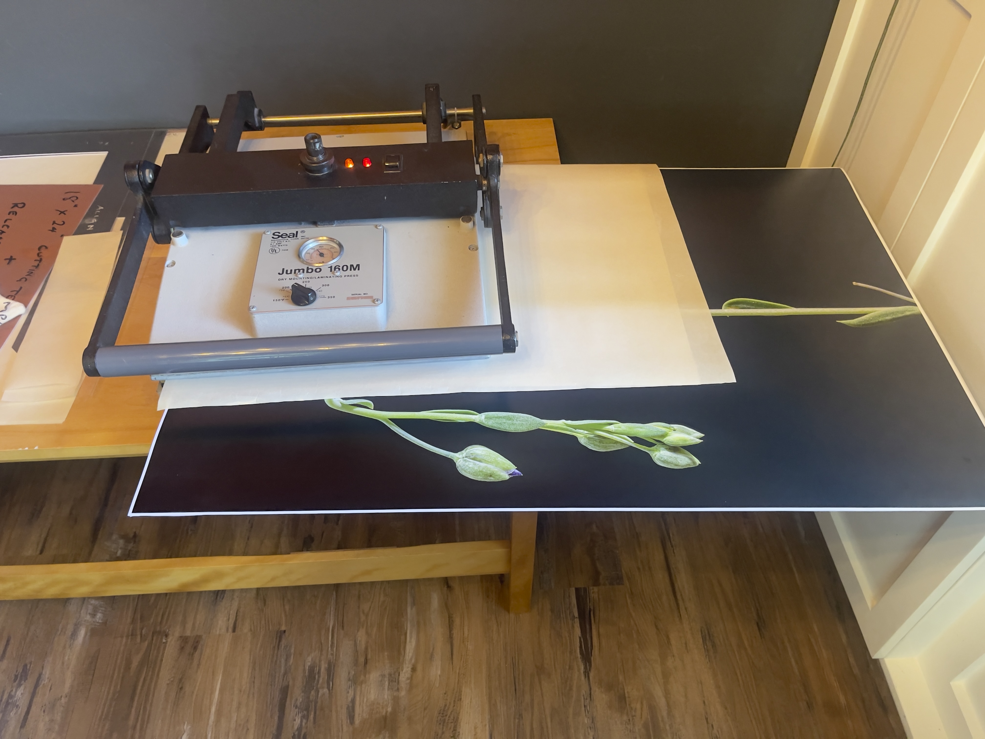
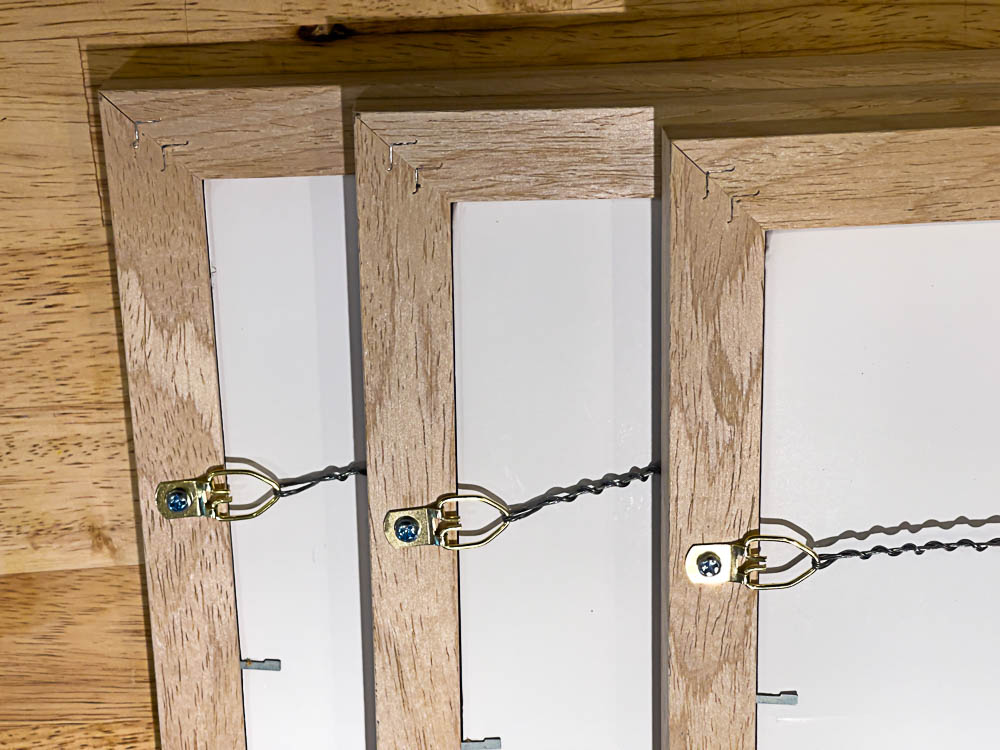
Having mounted and framed the three 24″ x 36″ prints for my living room it came time to hang them. The post production time for printing, mounting, framing and hanging is a multiple of the time required to take and process the images, but there are no short cuts. Scrupulous cleanliness is dictated as even the smallest particle of grit will destroy the mounted print’s surface and white cotton gloves for handling everything are mandatory, if greasy fingerprints are to be avoided. In other words, the whole process is a royal pain.
First my son and I debated in which order the prints should be hung. After trying all the variations we decided on this:
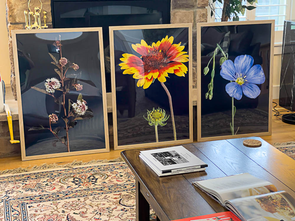
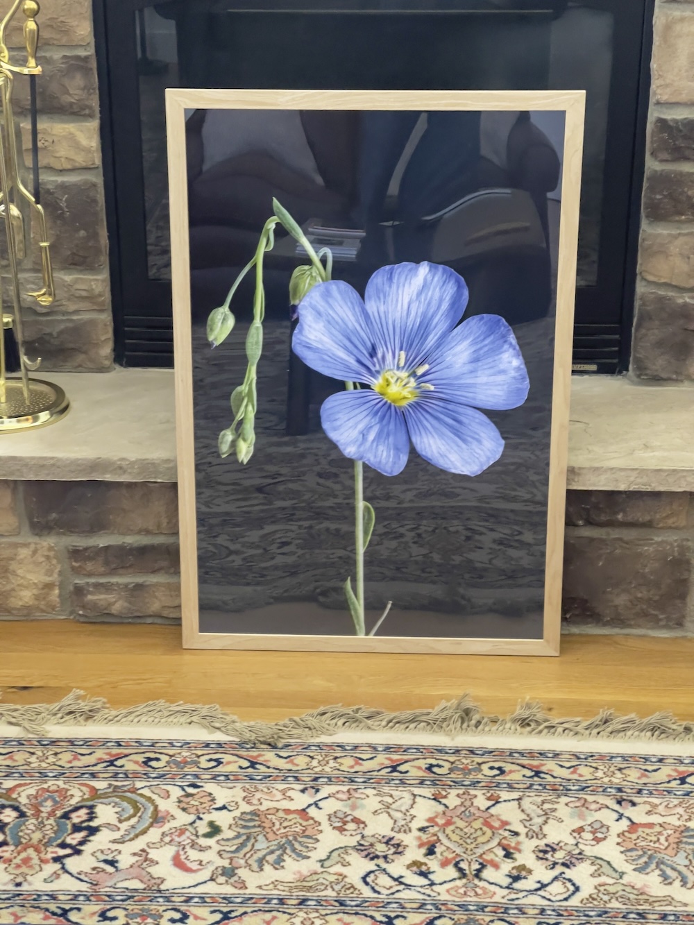
Common Ninebark, Common Blanketflower and Flax wildflowers.
The print location is above three sets of louvered window shutters and we used a self-leveling laser level which projects a pair of 90 degree laser light lines on the wall, making alignment with the center of each pair of shutters a simple matter:
Laser level on the Linhof tripod.
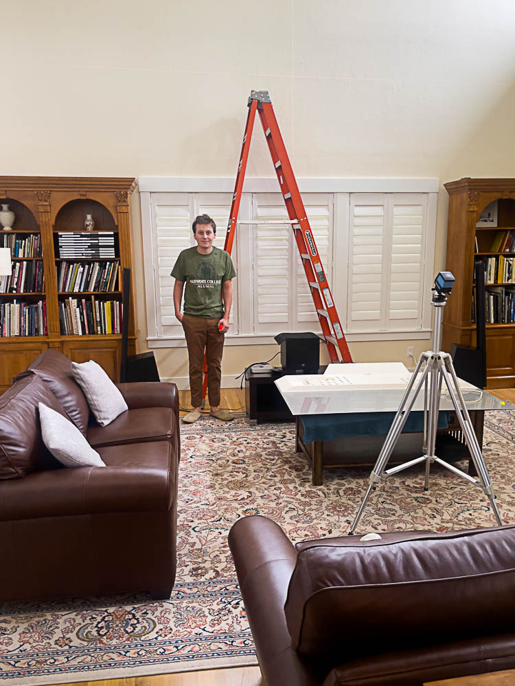
A very tall ladder is involved.
As this location has a 19′ ceiling and we wanted the prints approximately half way up a very tall ladder was called for. Not much fun, I confess.
Here is the result after much struggling with this monster ladder, not to mention moving furniture around to accommodate it.
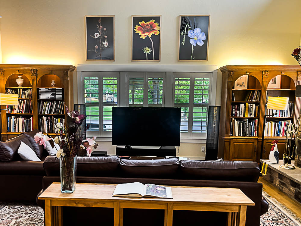
Common Ninebark, Common Blanketflower and Flax wildflowers.
A lot of work, with much fun finding the wildflowers in my community and photographing them, followed by hours of mirthless, hard labor to complete the project.
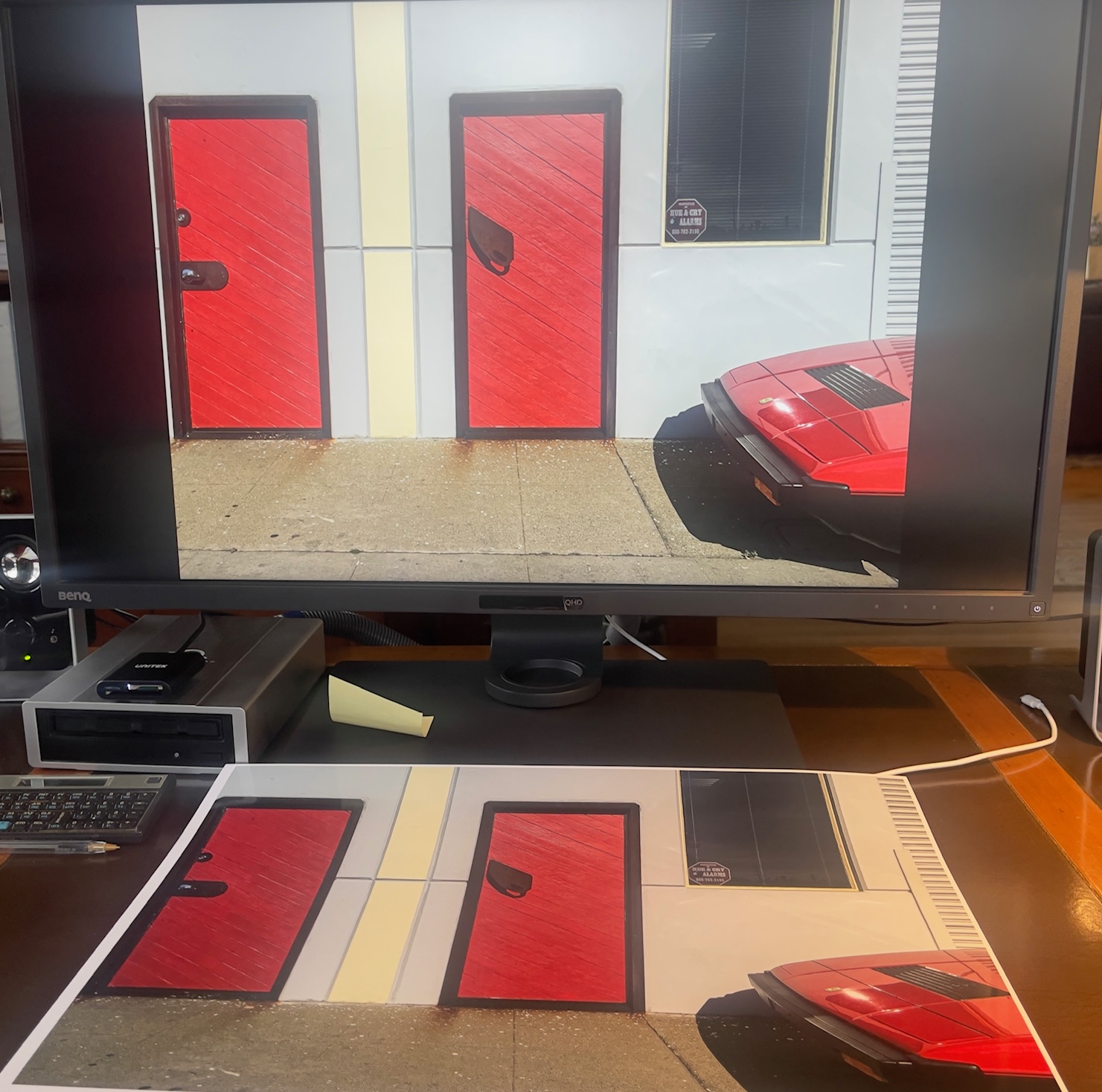
This will convey a sense of the enlargement ratio. I am holding the original of the Common Blanketflower in my right hand:
Holding the original and the print.