Monthly Archives: March 2006

Elton John’s collection

Chorus of Light – Photographs from the Sir Elton John Collection – book review

Elton John (sorry, ‘Sir Elton’ just sounds too silly) has a lot of talent. He also has a lot of money which allows him to feed his manic collector’s streak. The collection on view here is of his photographs.

The only reason to buy this book is that it can be picked up for just a few dollars, having been remaindered no sooner than it was published. What you get is a 13” x 9.5” collection of some 150 photographs, nicely reproduced, representing many of the classic images of the twentieth century. Why anyone would want to pay huge sums of money for ‘original’ photographs – a contradiction in terms if there ever was one – beats me, but you get to peek, almost free, at a fine collection here.

The interview with John, who is predictably egotistical, is actually quite interesting.

If you like classic photography this is a cheap entrée.

Walker Evans

Book review

It’s hard to know what to make of Walker Evans’s photography.

On the one hand he is justly famous for his depression era photographs of American sharecroppers and the misery of their existence, photographic work commissioned by the Roosevelt administration.

On the other hand, much of his work can be dismissed as a twentieth century variation on Atget’s nineteenth century pictures of a seemingly deserted Paris.

In Atget’s case, the lack of people can be attributed to the slow films of the era, where a passer by would render a ghostly image, if he recorded one at all. By contrast, for Evans the stillness of the cities he photographed is solely due to careful planning and composition. And frankly, the architectural photographs are, for the most part, unexceptional and boring, despite having been set up with infinite attention to lighting and timing.

To make matters more difficult, this book comes from the ‘sell it by the pound’ philosophy of American biography, one of the saddest developments in modern writing. Weighing in at some six hundred and fifty pages, it closes in 1956 with the death of the author, James Mellow, who died in 1997. Evans died in 1975 aged 72, leaving the last eighteen years of his life sketched by Mellow in a few paragraphs. So even allowing for the fact that those years were not amongst the most productive in Evans’s life, they would have conceivably added another 200 pages to an already ominously thick tome

These were some of the thoughts going through my head as I approached the daunting task of reading about one of America’s most respected photographers. It has to be said, then, that this biography is really quite gripping. Mellow writes beautiful, idiosyncratic English and displays a genuine love for his subject. His exhaustive research never makes the text lugubrious or boring. Best of all, the many reproductions of Evans’s work are interspersed with the text, thus placing them in context with the writing. It is well worth trading some loss in reproduced quality for this optimal presentation of the work.

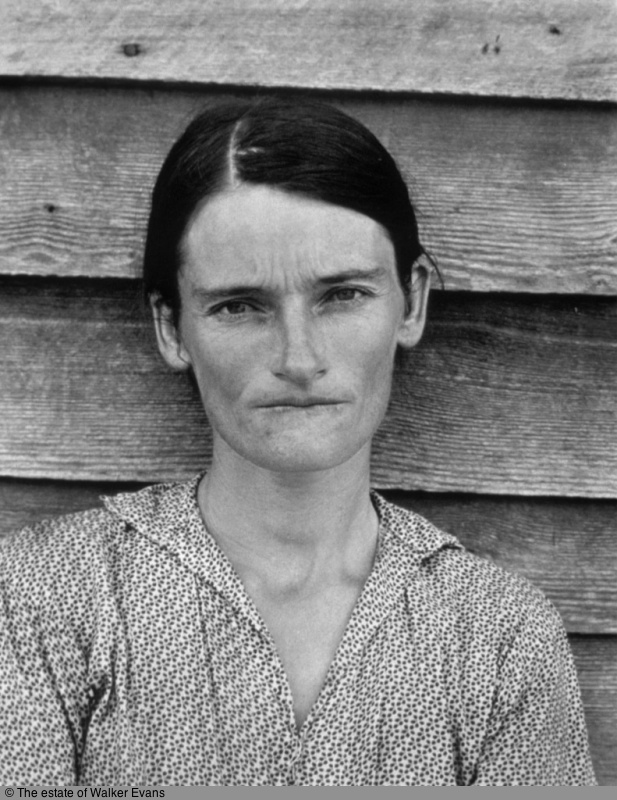
Evans was a curious mixture. Well versed in literature and painting, he more or less stumbled on photography. Maybe his most telling comment about his contemporaries was to the effect that he denigrated the obsession with technique shared by Ansel Adams, Edward Weston and Paul Strand “….none of whom I admire”, while admitting that technique interested him more than it did Cartier-Bresson “….though I admire his work very much.” A telling statement when you consider that Evans’s second exhibition at the Julien Levy Gallery in New York in 1934 was with Manuel Alvarez Bravo and….Henri Cartier-Bresson. So one can read an element of envy into the comment on technique, and it brings one in a roundabout fashion to the realization that his best work by far was very much in the style of Cartier-Bresson.

Sharecropper’s wife.

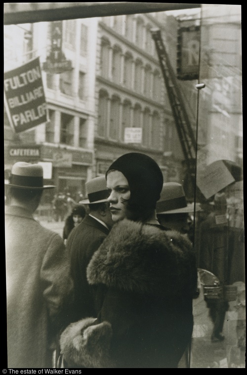
Memorable photography is just that. Memorable. One remembers the pictures without having to look at them and those of Evans’s pictures I recall are all from the great street and subway images he took in the late-1920s and throughout the 1930s. The aggressive girl snapped on Fulton Street in 1929, the incongruously fur-attired black woman on 42nd Street in the same year and those incredible subway pictures taken in the late 1930s. Amazingly, Evans had challenged himself to take the subway pictures but then had to be pushed by mightily impressed friends to complete the project. He was nothing if not self-effacing. This seems very much a character trait – he was no self starter and needed the prodding of colleagues and business associates time and again to get on with the job. A self-starter would have left a broader body of work albeit maybe one of lower quality.

Girl on Fulton Street.

So Evans’s work can be enjoyed on many levels, from straight reportage and historical documentary to some of the finest street photography of his time. No prizes for guessing which impresses as great photography, though. Don’t be put off by the weightiness of this tome. It is an excellent study of a great photographer.

Damaged.

HP DesignJet 90 – Part IV

A very capable monochrome printer

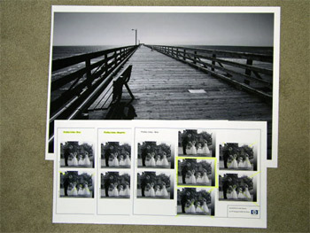
In addition to doing a very poor job of emphasizing the DesignJet 90’s self calibration capabilities, courtesy of the built in colorimeter, Hewlett Packard does an even worse job as regards explaining quality monochrome printing. You have to delve deep into their web site to find a document named ‘ICC Profiles – for black and white images’. This leads you to downloading a file containing 8 Jpgs, each containing 7 copies of the same monochrome photograph with slight tint variations. You start by printing the Neutral profile Jpg on paper of your choice then select the picture with the most pleasing tint. Say it’s the one captioned ‘Magenta’. You then proceed to the Magenta profile and print that Jpg, electing the best. Then all you have to do is download the related ICC profile from the HP web site and drop it into the /Library/Application Support/Adobe/Color/Profiles folder and choose that profile when printing in Photoshop.

It all takes less time to do than to describe and, once again, HP’s instructions are outstanding. I did this using the three sheets of free HP Photo Matte paper provided with the printer, which is recommended for monochrome ‘art’ prints, whatever that means. As Himmler once remarked, “When I hear the word ‘Art’, I reach for my gun”. Frankly I find the surface of this paper to be deader than yesterday’s news but I suppose it’s fine if you want to mount 4″ x 6″ prints in 30″ x 40″ mats, sign in 2B pencil and make sure you append a 1/10 designation. This confirms for the twit with a big checkbook that this is none other than a Limited Edition of ten, and the price, of course, is inversely proportional to the size of the photo.

Here’s a snap of three of the profile pages and a 13″ x 19″ print made with the profile of choice on the DesignJet. This is an outstanding fine tuning capability, though I think I will stick with HP Photo Satin paper as I like a little life in my print surface.

In the original print a very full tonal scale is retained, though a glossier paper would improve on this further.

HP Designjet 90 – Part III

An 18″ x 24″ print emerges after a spot of calibration

I can think of several dozen things I would rather do than calibrate a photo printer. Like pulling weeds, bathing the dog, polishing shoes, changing the oil in the car, stripping old paint, and on and on.

However, it rained today so that ruled out the weeds and paint. The oil is fresh. Bertie the Border Terrier is clean and my shoes look fine. So the inevitable came to pass and I spent a big part of the day calibrating the HP Designjet 90 for optimal results. By that I mean that the screen and printed images must be as close as possible with regard to colors and tonal range.

I concentrated my efforts on HP Premium Plus Photo Satin paper, which I expect to use the most. On more critical examination, it has slightly less sheen than Epson Premium Luster and slightly finer stippling. Either way, both papers retain detail well without the specular reflection problems of glossy surfaces.

First I learned what I had done wrong to cause the paper jam yesterday. The HP’s paper source tray is large and must abut just so with the body of the printer for the paper feed to work properly. I really do not have enough room behind this monster to load paper from behind and in any case I like the idea of the paper being properly supported as it wends its way past the print heads. I fancy a touch of furniture polish on the sides of the source tray will do wonders to ease the stiction between the mating plastic surfaces which makes full insertion of the tray tricky. Epson has it all over the HP here, as the paper is simply dropped in the feed slot from above and things work fine.

Still, 18” x 24” is a lot larger than 13” x 19” and cavalier handling of the paper will result in creases and malfunction. I found myself (literally) on the carpet more than once while loading the large size paper into the source tray, for lack of a large enough flat surface to place things on.

As regards color calibration, one thing I did not have to do is re-calibrate the screen with the Monaco colorimeter, as that profile was fresh. That still leaves a ton of variables and where the Epson preferred to deny Photoshop any color management, the HP’s instructions are quite the opposite and very detailed. There are so many steps it’s easy to miss something.

When I finally printed my first 18” x 24” it was like being back in the darkroom 35 years ago.

Breathtaking.

Simply breathtaking.

No question about it for this photographer. Nothing beats a Really Large Print.

Color matching is near perfect. I can do better but we are very much in the area of diminishing returns here. As for resolution, smoothness of tone, ease of creation of the original file, I challenge any medium format photographer to equal the output and sheer involving quality of the Canon EOS 5D’s full frame sensor. And I’m still only using JPG Fine here. RAW has yet to come.

I struggled a bit with nomenclature. It seems that 18” x 24” is called ‘Arch C’ in that moronic European size naming convention that printer manufacturers have adopted. For goodness sake, what the devil does Super B3, or JB5 or A2 mean to you? Now 12” x 15” or 16” x 20” we can all understand. Well, the engineers be damned. I scrawled ‘Arch C’ with one of those indelible pens beloved of graffiti artists all over the box of HP’s paper, the better to know what to dial in next time.

How much larger is 18” x 24” than 13” x 19”? See for yourself – the Leica is for scale (no, not for sale):
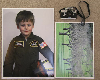
Yes, that’s our boy Winston on his fourth birthday. I learned from one of Canon’s tutorials on the web that setting the Threshold slider in Photoshop’s Unsharp Mask (what a stupid name for something that is intended to sharpen – engineers at it again) to 1 or 2, rather than zero, takes the bite out of facial pores and makes for a nicer look in portraits, so I dialed in 250/1/1 for this portrait. Despite being at 400 ISO and some two stops underexposed (ooops!) it’s near perfect as regards definition and tonal range once fixed in Photoshop.

There’s a lot of nonsense written about printers on the web. One ‘prominent’ site gave the HP a mediocre review, accusing the machine of color casts. Now I have no axe to grind for any particular manufacturer. I’m not paid by Hewlett Packard, or anyone else, and I do not get free printers and supplies to play with. I will use what works for me. But I cannot help suspecting that the boob writing this piece is fairly clueless about proper calibration of a printer which starts with the use of a colorimeter to profile the screen. He makes no mention of using one. The old rule applies. Garbage in, garbage out. I may denigrate technique as a means – nay, a hurdle – to an end, but you have to have it to get there consistently at a high level of quality

Want lousy prints from the HP? I have several I can offer you from today’s efforts. Want lousy prints from the Epson? Same answer. But want stunning, drop dead gorgeous framed pictures from either and you only have to calibrate things properly to be assured of the best results. The only way you will be able to tell the difference between Epson and HP prints is by the size. The market is simply too competitive for it to be otherwise.

Ink jet printers have not come very far in the last six years, based on my experience. Meaning the Epson 1270 was terrific back then and remains so today. Maybe inks are more permanent, maybe manufacturers’ paper profiles are better than before, but my standard for comparison is the old Epson 1270 and, believe me, that’s a very demanding benchmark indeed. I think I’m almost there in matching it with the HP Designjet 90. The only difference is that I can now go larger.

So if you want a good large format printer at some 60% of the price of the 17” Epson, you could do worse than the HP DesignJet 90. Or get the 130 model for a bit more if you need 24” wide. They do versions with a roll paper feed, and I avoided that like the plague. Ever tried to get roll paper to lie flat? They also do a version with a colorimeter for screen profiling, but as I already had one the base model printer worked for me.

‘Expert’ reviewers seem to overlook the fact that the HP DesignJet has a built in colorimeter to aid creation of a perfect paper profile for each of their papers. This does not obviate the need for a screen colorimeter like the Monaco to create a screen profile, but it ensures the paper’s profile is accurately defined.

Here’s how it works. You insert an 8.5″ x 11″ piece of HP paper of your choice and run the Calibrate Color utility. It prints a test pattern and then sucks the paper back in and, using the built in colorimeter, compares ideal against actual, adjusting the paper’s profile as appropriate. That is very clever and HP does a lousy job of marketing a feature that no other consumer priced printer offers, as far as I know.

I have created three profiles thus – Satin, Gloss and Matte. Once done you throw away the pattern and get on with life. As with any paper, you have to remember to tell Photoshop which surface you are printing on but the rest is automatic.

By the way, the 18″ x 24″ print took 13 minutes to make and the HP Photo Satin paper is 76 lb. weight compared to 67 lbs. for Epson Premium Luster.

HP DesignJet 90 – Part II

First serious prints and some myths debunked

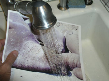
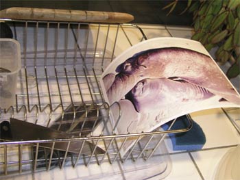
Let’s get the myths out of the way first. I had read somewhere on the World Wide (disinformation) Web that so much as a sneeze or a hint of moisture would make the inks on prints made with the HP DesignetJet printer run. I had the 8 1/2 ” x 11″ print from yesterday’s evening trial run handy (it was made without any attempt to color balance nor did I use the right paper profile) so I let it dry for one hour and then took it to the Pindelski High Tech Test Lab, also known as the kitchen sink:

My dry elephant seals were now well and truly in their habitat as I soaked the lower half of the print with tap water for thirty seconds. That’s a little more moisture than from a sneeze, I would think. Placing the half wet seals on the Pindelski High Tech Moisture Removal Center, aka the dish drying rack, I let the print air dry overnight and came back in the morning.

Guess what. No color changes or running ink to be seen. Just ’cause it’s written don’t mean it’s so.

As it’s raining today I decided to calibrate the printer and see what she could do on large prints. HP includes 3 sheets each of their Photo and Proofing Gloss, Photo Satin and Photo Matte with the printer in 13″ x 19″ size. Such generosity. I had also taken the precaution of buying 40 sheets of the HP Photo Satin in 18″ x 24″ to try the largest width the DesignJet 90 can handle. That’s a lot larger than 13″ x 19″ – 75% larger.

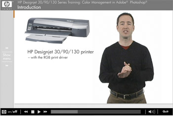
It has been quite a while since I set up Photoshop to match the Epson 1270 and their Premium Luster paper to make things automatic, so I had quite forgotten how to get through all the arcane menus in Photoshop. Mercifully, HP provides a tutorial CD with the printer (what is happening at Hewlett Packard?), and this one actually loaded first time on the iMac G5, unlike the recalcitrant driver disk. The on-screen tutorial is really outstanding, narrated in clear, non-technical English. The thrust is simply one of “Select these options for the best print” without a lot of gobbledegook about gamuts, color spaces and all that garbage which has little interest to real life photographers who just want their print to come out like it looks on the screen.

I had earlier created a profile for the screen using the Monaco EZColor colorimeter thingy, so I left that alone as the monitor has not been on that long that color drift from age would be an issue.

Unlike the Epson 1270 which is silent when switched on and dormant, the DesignJet has a fan whirring away. Not really obtrusive but a wear part nonetheless, so I switched it off overnight. Warm up took just over a minute and I gave her a try with one of the free 13″ x 19″ sheets of HP Photo Satin whose sheen is identical, to my eye, to Epson Premium Luster though the weight of the paper seems quite a bit more. The back of the HP paper is rough rather than smooth, but I can’t see that mattering either way.

I set up Photoshop as instructed on the CD video and saved the setting as ‘HP Photo Satin’. I haven’t tried the other papers but the HP Photo Matte looks interesting. It is dead matte, lighter in weight than either the Gloss or Satin and very much whiter viewed in daylight. HP recommends it for black and white printing which seems to make sense and indeed their web site has a ton of paper profiles together with very detailed instructions on how to get the best monochrome prints from the DesignJet. Nice to know but right now the focus is color, so that will have to wait.

Clearly, HP has done a great deal of work on color matching and paper profiles as you would expect from a company that has long had a leading position in large format printing in the graphics design and architectural work places.

The Epson 1270 is a very quiet printer. I always had to use it in non-bidirectional printing mode to avoid tracks on large prints, so that doubled printing time and, as I recall, a 13″ x 19″ would take some 28 minutes to make. The DesignJet is a different kettle of fish. It clanks, whirrs and grinds a lot when starting up and then gives a distinctive ‘clack’ with every pass of the print head on 13″ and wider prints, although once running on smaller prints it’s near silent. The table on which it sits has a space frame base construction – light but extremely strong – yet I could clearly see the table vibrate gently with each pass of the print head. To cut a long story short, the print emerged in 9 1/2 minutes and I let it dry an hour before comparing it to the screen in natural daylight. It was immediately clear that print quality was exceptional, indistinguishable from the Epson, and there was no sign of any ink tracks on the surface. The printed area had a 1/4″ margin on the top, bottom and left side and a 7/16″ margin on the right, making for a print size of 12 1/2″ x 18 5/16″, a tad larger than that from the Epson 1270.

One thing I do not like is that you have to adjust the input and output trays in disparate ways depending on the size of the paper, so I’m going to make a little guide for the commonly used sizes and paste it to the top of the printer. HP provides a good guide in their book, but it’s more detailed than I need and involves too much hunting for the right settings.

After the print had dried for an hour I compared it with the image on the iMac’s screen, which is some 14″ wide and I must say it was very, very close. Greens in this landscape subject were a tad darker in the print but everything else was in order. The next test will be with a portrait, whose flesh tones should really provide for critical evaluation. That one will be 18″ x 24″.