Keeping it simple is the best solution
In a spare moment the other day I was meandering through a selection of web sites using the remarkable Firefox browser plug-in Stumble Upon. Two things struck me. First, just how much work has been put into many of the photography web sites out there and the growing prevalence of Macromedia Flash animation effects.
Indeed, it sometimes seems that the author’s prowess in writing animation code takes pride of place over the photographic content. As site after site made me wait while all the animation code loaded – and that’s with a fast connection – I found myself simply clicking though Flash sites in serach of something simpler. The reality is that if you are forced to wait while all this digital noise ensues, your likely interest in looking at pictures fades away. And just imagine having to sit through this every time you go there. Hardly condusive to repeat visits.
Now I’m not saying that my web site avoids Flash simply because I don’t like it. In fact, I wouldn’t know how to write Flash code if you paid me. Heck, I just learned how to make clickable page references open in a new browser window! Rather, I have focused the design of my web site on simple, clean lines, with consistent presentation of all pages. I adopt a white ‘Apple look’ thanks to using the Better HTML plug-in for iPhoto ’05 or ’06 to generate the web pages (I use the DP Polaframe template) and have a very simple menu system to access these.
A while back I learned how to have all the choices in my web site menu reside in one file which is referenced by each page of thumbnails, so if changes are made, I need only make the change once in a central menu for it to appear everywhere.
I also try to constrain each pictorial to no more than three pages of thumbnails, eight to a page. In this way any photo can be accessed with just a couple of clicks. Further, the DP Polaframe template has a neat feature so that when you click anywhere on a full sized picture, you are automatically taken to the next picture.
When I first started my web site some five years ago, it suffered from ‘menu creep’. Selections were constantly being added and maintenance was not fun. I knew it was time to make a change when that most dreaded of choices – ‘Latest Work’ – made an appearance. You see this often on web sites. I never click on it. After all, as I don’t know the chronology of the ‘earlier’ work, what possible relevance could ‘latest’ have to my interest or enlightennment? No, ‘Latest Work’ had to go.
Then I agonised over the picture used on the home page. It has variously been clickable, static, many pictures or just one. I have settled for one static picture which I change every month or so, as the whim takes me. And clicking on it does nothing.
Picture size is another dilemma. First, large images have to be in files no more than 200kB in size to load quickly. Attention spans are short in the modern world, and rightly so. Secondly, make them much over 800 pixels wide or 600 pixels tall, and you will cause someone with a laptop viewing agony – the picture should not have to be scrolled to be completely visible. Obvious, but I got this one wrong a lot in the early days.
Finally, I decided to scrap all reference to equipment or technical information regarding the pictures. I may write lots about that sort of thing here, but it’s simply irrelevant when showing your work. If you want that sort of thing, there a link to this blog in the web site menu.
So that’s how, through trial and error, my web site came to look the way it does. I hope you like the pictures, but even if you do not, I trust you will enjoy clicking around.
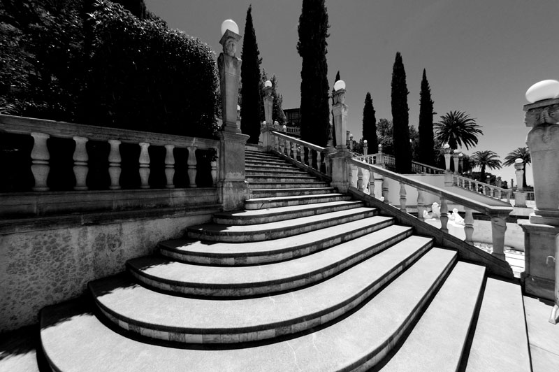
Main stairway, Hearst Castle. Canon EOS 5D, 15mm Fisheye, Image Align, PS CS2, TLR Orange filter