Monthly Archives: March 2007

Black and White is dead

Time to move on and get with the real world

My subscription to LensWork magazine – a bi-monthly small format photography magazine which holds itself in higher regard than the Kennedys – was up for renewal and, I confess, I thought long and hard before paying for one more year. The reason? Each 90 page issue is completely devoid of color photography. This is the oh! so serious world of High Photographic Art, you see.

Let me tell you that the leading contributor’s work over the past year was a book of pictures of tramps. Now a tramp is a tramp is a tramp; he is not a street person, a mendicant or disadvantaged. He is a tramp. No one forced this choice on him and he is neither to be respected or adulated. These tramp snaps were reproduced in volume (sadly, high volume) with obligatory excess contrast in search of drama. Now do you get the drift of this sometimes fine publication? The tramp series said absolutely nothing new and the use of Club Mono was, well, tediously predictable for such cliché subject matter. The sum total of photographic art was, in other words, untroubled by this derivative, poorly printed work.

So why waste money on a publication whose dominant content appears to be snaps of derelict steel and coal town in America’s Rust Belt, longing for the good old days of tubercolosis and black lung? Because, maybe twice a year, a great photographer is discovered in its pages. That almost makes the very high cost of this rag worthwhile. Take Dan Normark’s outstanding work as an example.

Anyway, putting my gripes behid me I renewed with the promise to the publisher/editor that this would be the last time if no color crops up in the publication over the next twelve months. One has to draw the line. And if they can do Club Mono so well, why not some color?

We live in a world defined by color. A lot of photographers, choosing the easy way out, opt for monochrome and then wax lyrical over how some ink jet printer or other has purer blacks and whiter whites than the other guy’s. Please. These people sound like a washing detergent ad. The result is that you see a lot of truly miserable work, matted in acres of white with the obligatory thin black frame, signed, as often as not, in pencil. The latter is mute testimony to the monochrome worker’s recognition that membership in Club Mono dictates this sort of thing if you are to be taken seriously.

So why are all these hard working photographers excluding 90% of the content of their photographs by making monochrome prints?

  • Because it’s far easier to take a good moochrome picture.
  • Because the man in the street can’t get it at the local drug store.
  • Because you automatically get the ‘art’ premium associated with this form of pretentiousness.
  • Because you have neither the talent nor guts to see in color.
  • Because color is infinitely more difficult to do well.
  • Because someone else who is ‘arty’ does it.
  • Because it worked for Ansel Adams and Bill Brandt.

And on and on. Not a good reason to be found.

Take a look at the current issue – #69 for Mar-Apr, 2007. There is a lovely set of pictures of Hanoi, moving and expressive. Some are of street scenes at different times of the year. They simply scream for color. But no. This is Club Mono.

So I’m voting with my feet. Add color, Mr. LensWork, or subtract one subscriber. And next time you see a Club Mono snap, just ask yourself how much better it would have been in color.
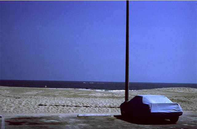

South Beach, Santa Monica, CA. Pentax 6×7, 105mm Takumar, Kodachrome 64

Getting ready for the show

There are easier ways of making money

With but seven days left to my month long, one-man show at a local gallery, marketing has taken a front seat in the ongoing efforts to make this a success. I’m not sure what success means – but selling everything on show would be a start. Even if the net reward to yours truly is the order of magnitude of a few hamburgers at the local hang out.

I checked out the local town on a sleepy Sunday afternoon a few weeks ago, making note of the businesses who cater to wealthy cutomers. Not that wealth is needed to buy one of my prints, but wealthy people predominate amongst those visiting wineries – just check the parking lots – and the gallery happens to be located in the center of a winery. At $245 for a framed 18″x24″ or $95 for an unframed one, no one will be getting rich here, but fame never was easy or cheap to acquire.

No one has yet refused to hang my poster, so my reserves of courage are building and I hope to have a dozen on display around town (meaning Paso Robles and Templeton, in central California) by the time the show opens.

I have also printed up some postcard invitations to one hundred of my closest friends, and you can see these in progress in the picture above.

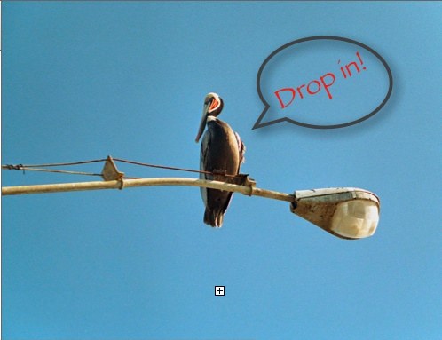
Here’s the front of the card:


Pelican, Morro Bay. Leica M2, 90mm Elmar C, Kodak Gold 100 – yes, I was still using film 2 years ago when this was snapped

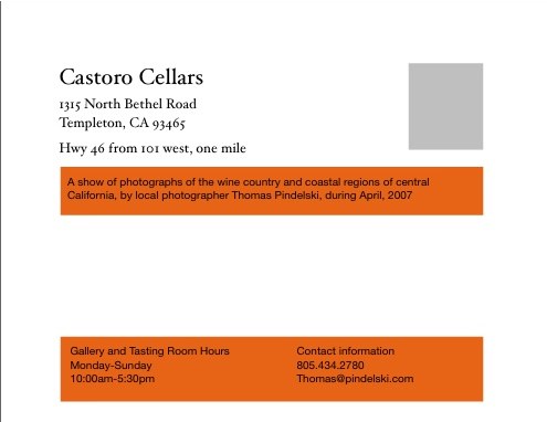
And here’s the back:

The cards were composed in Apple’s Pages, ideal for this type of project, though that application’s weak mail merge function means that I had to go with stick-on address labels rather than printing natively on the card. A shame, but the results looks pretty professional all the same. I used some two sided, heavy satin paper which works well with the Hewlett Packard DJ90’s dye based inks, meaning the paper does a good job of absorbing these. I print four to a page and then slice them up with my Rotatrim trimmer, a device I have used for ages and recommend unreservedly. No matter your state of disrepair, it is impossible to cut yourself on this latter day guillotine.

While I know this is far from the truth, here is how this two year project feels right now in terms of labor (mine!) allocation:

Marketing 50%
Printing/mounting/framing 49%

The other 1%? Well, that was used up in actually taking the pictures ….

The power of RAW

RAW offers a vast range of adjustments without destroying image quality

Here’s a case in point where RAW originals really make sense.

I was traipsing along through the charming side streets of Burlingame in the Bay Area of San Francisco when this neat wall sconce presented itself. Now I did have Bertram the Border Terrier straining at the leash in the other hand, so I did a pretty lousy job of holding the camera level. Add the high contrast of the scene and I knew some post processing would be de rigeur.

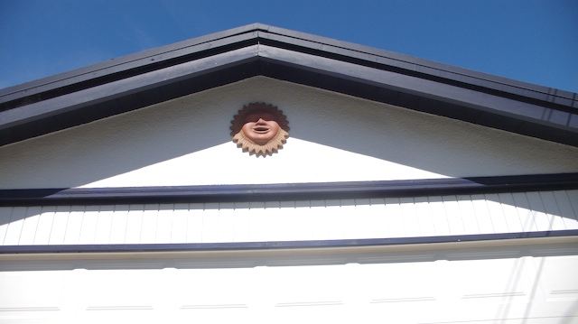
Here’s the original – if this was a film scan it would be pretty much past saving, the highlights comprehesively blown out (not hard to do with digital!), the perspective badly in need of repair, everything tilted.


Wall sconce. Lumix LX1, RAW, 16:9 format

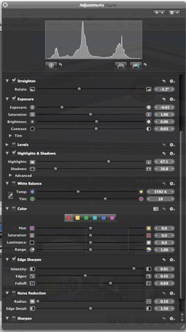
Rather than recount the adjustments made in Aperture at length, here’s a snapshot of what I did:

I also had to roundtrip the file from Aperture through Photoshop, where I fixed the lens distortion and perspective, tilting the top of the picture towards the viewer to correct for the low angle from which the picture was made; Aperture does not (yet) provide these adjustments.

And here is the result:


Cropped for 4:3 format

The highlight details (look at the textured stucco wall finish) have been nicely recovered with a combination of the Exposure and Highlights sliders. While Aperture does not support Lumix LX1 RAW, I used the workaround explained here to give me the full range of RAW adjustments.

The ‘repaired’ version will scale nicely to an 18″x24″ print, something you would not dream of doing with the original.

Formula One – Bravo Honda!

Can you think of a better use for photography?

Now it’s no great secret that I graduated from the same college as Colin Chapman of Lotus Cars fame – University College, London. Indeed, while I shared the education of Mechanical Engineering with that inspired genius, I never practised as an engineer. Not only was I far from Chapman’s class, it was just too hard a way of making a living, and too fraught with risk. In my case, I suspect, that risk would have gestated in the guise of serious injury to users of my designs. No, the engineering world became a safer place for my absence from it.

However, none of this in any way dilutes my interest in one of the only two sports I care about (the other is cricket), which is Formula One auto racing. The near senseless pursuit at vast expense of solutions to problems no one ever imagined has a certain perverse appeal, I must admit. Sort of like an expensive woman. You know you should know better. But you get involved anyway. When it comes to photography and Formula One racing, it has largely been a desert strewn with forgettable detritus. How many snaps of cars at speed and babes in tight tops do you really want? OK, I can do with fewer of the ones of cars at speed.

With the honorable exception of photographers like Jesse Alexander, little great photographic work has been done in this sport, despite the fortunes expended on motor drives and extreme telephotos. However, watching the 2007 season opener in Melbourne, in the fair land known as Australia, I was captivated by the new Honda car, which is devoid of stickers and sports a magnificently applied picture of the earth. The picture is from Honda’s web site, God bless them.

It gets better. Honda has offered to pixelate the names of the first two million donors on the car, so that you can honestly say you support the racing effort. And the money goes to saving the world. That’s a twofer. Rest easy, the boob who was one heartbeat away from the presidency a while back isn’t going to be stealing it, as he is not involved. Anyway, he’s too busy with cinema ticket sales.

I have always greatly enjoyed the huge pictures of produce on those delivery trucks and now Honda has gone one better.