Yearly Archives: 2011

The BJP

A British institution.

The British Journal of Photography has been around since Fox Talbot was snapping on his wet plates, meaning over 150 years. While today if you want detailed, insightful gear reviews you go to DPReview.com (if, that is, you can stomach the endless brand flame wars and detritus passing for Comments), until digital came along the place to go was the BJP.

Under its former long standing editor Geoffrey Crawley (editor 1966-87), you got technical analysis at a high level, unsullied by commercial considerations. Maybe his landmark work remains his review of one of the most advanced (and complex and expensive) cameras from the end of the film era, the Zeiss Ikon Contarex Super. He also extensively reviewed pro grade equipment, frequently Nikon and Canon hardware, each eventually accorded a book of his reviews.

When I was a kid you would find me every Saturday morning at the Kensington Public Library poring over the latest edition of the BJP, back when it was a weekly. The BJP was always a very serious – and slim – offering and once a year they used to publish an annual book of the best avant garde photography, containing some 150 pages – the BJP Almanac of Photography, to give it the full Victorian-era name. I remaindered my many issues a while back. What was purportedly new and modern in 1970 was simply awful in 2000. Tired, derivative, excessive. But it seemed like fun at the time.

Now the paper magazine is monthly and I’m not even sure if you can get it in the US. However, BJP just released an iPad app which I have been trying for a couple of days now, with mixed results.

What follows is based on my use on the iPad1. As the iPad1 represents fully 45% of all iPads ever sold, it doesn’t cut it to excuse slowness because of the more modest A4 CPU in this model. It accounts for almost half of all readership, after all. Maybe it’s faster with the A5 in iPad2? I do not know as I do not own one.


The blinking model on the cover of the first issue. A needless gimmick.

The first issue is free if, that is, you can figure out how to download it, matters being made worse by the fact that a couple of the articles in it are also advertised as for sale. Stability is reasonable – I was kicked out a couple of times in a couple of hours of browsing, and returned to the last page viewed. Screen refresh rates are so-so – it takes a couple of seconds for the image to sharpen. Zinio started much like this and progressively improved. BJP has to do better if it is to succeed as an online publication. Blur-to-sharp delays look most unappealing. Navigation is sub-optimal. Sometimes a touch-and-drag is refused. You flick side-to-side to view photographs yet many pages require the iPad be turned to landscape to view the 5% of the image cut off in portrait mode. Everything should be in portrait fit – that’s how we read. Keep the landscape option, by all means, but make everything fit in the portrait orientation. Worse, when the content switches from photograph to text, the text has to be scrolled vertically rather than simply continuing to the next page. Consistency of finger motions between pages is a must for touch screen consumption.
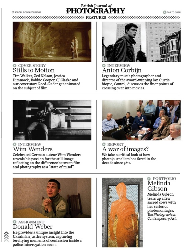
One of the (many) index pages.

I have no idea what the eventual price will be but if I have a major issue with the iPad magazine it is that the editors seem to have forgotten the old dictum that ‘less is more’. The first issue resembles more of a core dump than edited content, running to some 182 unnumbered pages, and it’s simply too much. No working pro, who is after all the target audience here, will have the time to go through this sea of mediocrity in search of the occasional gem. Over half the pages contain photographs, which is good, but the content is shockingly mediocre. There are some two dozen photographers featured and most, names withheld, really should consider road construction or sewer cleaning as hobbies, where they would doubtless excel. A random search of online photoblogs will, for the most part, find better work. That one of the photographers interviewed seemingly prides himself on his ignorance of technique makes a statement about editorial policy in a pro magazine that I do not want to think about.

As for the gear reviews, they vary from poor to awful. with the one addressing the Sigma SD1 being one of the worst pieces of pseudo-technical clap trap I have ever read. It manages in one fell swoop to leave you confused, angry and dumber than when you started reading it. Quite an accomplishment.

Indexation is a mess. The main index at the front repeats every page of the many subsequent indexes buried in the body of the work. What is needed is a simple multiple choice main index – Features, Profiles, Technology – with a touch on any one of these jumping the reader to the relevant sub-index where the contents can be displayed without clutter or confusion. The sub-index, in turn, should have a ‘return to main index’ touch icon. As it is, the consolidated index page at the front is very hard to use, being one huge, scrolling mess. Simple always wins, especially within the space-constrained confines of an iPad’s display.

There are also a dozen or so gear advertisements – not enough, I fear, to sustain this effort – with many including videos to display features. The Hasselblad ads are especially well done.

It obviously took a lot of hard work to produce this massive tome, but hard work alone does not correlate with success. The publication needs the underlying code tightened and made to work faster and more responsively, indexation needs a major work over, the photography content needs drastic editing and a move to excellence and the gear reviews would best be dropped, being largely useless. These are done much better by any number of web sites and it’s hard to see how the BJP adds value here. Geofrrey Crawley must be spinning in his grave. You might as well read manufacturers’ press releases where the lies are more prolific, but the English far better.
The Mirrorless Revolution

Bloomberg nails it.

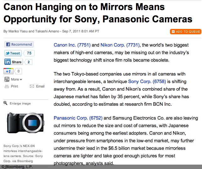
Bloomberg has an interesting piece on how Nikon and Canon are missing the boat by not offering a mirrorless DSLR.


Click the picture to read the article.

As an early adopter and buyer of the first EVF interchangeable lens MFT DSLR, the Panasonic G1, I tend to agree that it’s the future. The EVF will only get better, it’s cheaper to make than the prism/mirror combination used in old tech, and there are no moving parts and no need for complex retrofocus lens designs to clear flapping mirrors.

While I tend to take this quote – “Mirrorless cameras accounted for 40.5 percent of SLR sales in the country in July, surging from 5 percent in early 2009, according to BCN.” – with a bushel of salt, there’s reason to believe that mirrorless DSLRs are gaining market share. Apochryphal data are mostly useless (just because your local bookstore is full does not tell you whether it’s booming or having a going-out-of-business sale), yet I constantly read that big DSLR owners are dumping their heavy gear for something they actually will take along on the next trip. I know, having done likewise with my (quite superb, I hasten to add) Canon 5D outfit with no fewer than eight lenses, in preference for the Panny G1 with but three compact zooms. Yes, it almost always goes along with me, not something that could be said of the 5D.

Still, I keep hoping that someone at these two dominant gear makers is working on an APS-C or full frame EVF design with a silent shutter and fast focus – things now found in several models in the Panasonic range. The disappointing Fuji X10, with its miniscule sensor almost got it right. What’s needed is a fast lens with a 28-90mm zoom range, compactness, silence, no shutter or focus lag and a proper sensor, not some nail clipping. The lens doesn’t even have to be removable. Price it at $750 and you will be rich. Canon and Nikon – are you listening?

Dick Blick

A great place for mounts and supplies.

I first made mention of Dick Blick in these pages when writing about how I mount and frame large prints.

My Fletcher FlexiMaster Framing Tool came from Dick Blick Art Materials making trivial a job which would otherwise be too horrid to contemplate.

The other day I wanted to order some 4B (super soft) graphite leads for my son’s pencil, which he uses for schoolwork. My interest in writing instruments is not new to this journal; I wrote of that great ball pen classic the Bic Cristal earlier and my accidental over order has me set for life! When it comes to pencils, the best pencils come from Germany – just like the best cameras used to. Forget your Genine Murrican Dixon Ticonderoga with its wretched soft wood construction, lack of heft and a graphite lead waiting to snap at the merest provocation. Real pencils say ‘Staedtler’ on the body and while I was an aficionado of their splendid wooden ones when younger, time marches on. So when our son needed a really good pencil for homework it had to be a Staedtler, one of the retractable ones. The ergonomics are superb, the design appealing to the eye and the range of hardness in graphites large – everything from 4H (so hard you wonder who needs this) to 4B, the latter a pleasure to write or draw with and easily erased when errors crop up.

Now, elegant as they are, I cannot abide those super fine 0.2mm/0.5mm/0.7mm offerings from Staedtler or the Japanese. Those are for limp wristed pansies. A Real Man (my son) writes fast and presses hard. Those sub-millimeter graphites do not cut it. Period. And forget built-in erasers which always run out when you need them. Carry a big one.

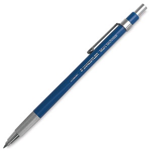
The Staedtler Technico Lead Holder.

Indeed, the criteria for nomination to the exalted level of ‘Classic’ set forth in that earlier piece on the Bic ball pen apply equally here:

  • It has to have class. I can’t define that but I know it when I see it.
  • It must be superbly functional.
  • Its use must be second nature.
  • It must have magic. Yes, that sense of fitness for purpose you get when you pick it up, use it.
  • It must be made well enough to survive the ravages of time and use.
  • It must be reliable.

So you can add the Staedtler Lumograph to a short list where others of the like of the Porsche 911, the Leica M2, the Rollei 3.5F, a Patek Philippe Golden Ellipse, an iPad and the Border Terrier make their home. Most have a definite attitude, but only the last comes with a wet, cold nose.

The Staedtler Technico Lead Holder runs all of $5 and holds a real lead – 2mm in diameter. You are not going to break that. The retraction mechanism is easy, simple and fun and the removable cap includes a point sharpener. Perfection. Ideal for signing your limited run prints with chi-chi ‘1 out of 100’ nonsense (because you will never sell that many). And while you can find these in many local art stores, good luck finding 4B leads. So I dialed up DickBlick.com on the web and ordered the boy some 4B and 2B inserts. Except, being the doofus that I am, I ordered 4H and 2H, realizing my error only after I hit ‘Pay’.

This is where it gets good, and this is where you will want to give your business to Dick Blick. I called them with the usual dread of interminable phone trees and someone who speaks English on a par with the guy behind the counter at the local 711. Well, blow me down. A lady with a genuine American voice speaking perfect English (errr, American) answered on the first ring. No punch this for English, that for Spanish and kick your cat for Swahili. I pleaded stupidity, she changed the order like that, and my boy is now rejoicing in 4B leads in the best mechanical pencil on earth, and has no excuse for a less than perfect point. The two I bought him will likely last through graduation, and he’s in Fourth Grade!

There’s more to it than that. Blick’s paper catalog may only show a fraction of what is available on their web site, but it includes a cornucopia of supplies for mounting and framing photographs. Frames, mats, mounts in any shape, material, finish and color you desire. And tools galore, from the point setting tool I mentioned above to mat cutters, tools and jigs for making your own frames, and so on.

While I have long been a customer of Documounts for my mounting and framing supplies, Dick Blick is going to get my next order. All because of my silly mistake.

More on keywords

Do it now, save time later.

I wrote about the need for key wording back when Lightroom 2 was the current thing here.

Since then I have been eating my own cooking and after several ‘catch-up’ sessions now make it a practice to keyword all new snaps placed in the LR3 catalog immediately. You are not restricted to one keyword per snap and can mix and match in any way that works for you. Exciting it is not, but apply this discipline routinely and you will find that the ease of picture retrieval with a burgeoning catalog is greatly simplified.

My overall approach tends to be to break down catalog directories by genre – Cityscapes, Landscapes, etc. – with sub-directories dedicated to locations. So Cityscapes->New York, Cityscapes->Los Angeles and so on. The keywords added tend to be snap specific, such as humor, mural, street sign, etc.

I still occasionally struggle when trying to find a favorite picture but it’s getting better all the time as I make a practice of adding keywords in spare moment from time to time. And bear in mind that the target is not stationary here. Especially with digital capture, catalogs tend to grow faster than in the days of film, so constant enhancement of key wording helps you stay ahead of a steepening curve.

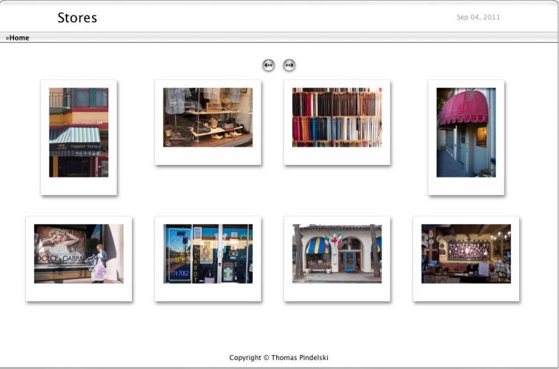
It does work. The other day a friend remarked how many store front pictures I had shared with her over the years from diverse locations. Some of these are filed under ‘Abstract’, some under ‘Cityscapes’, etc., but all share the keyword ‘shop front’. She asked whether I could assemble a collection for my semi-static web site, and all I had to do was pull up all the snaps with the ‘store front’ keyword and select the two dozen best, which you can see by clicking the image below.

Click the picture to see more.

If you want to determine which pictures in the LR3 catalog have no keywords whatsoever, read this.

Murals

Off the wall.

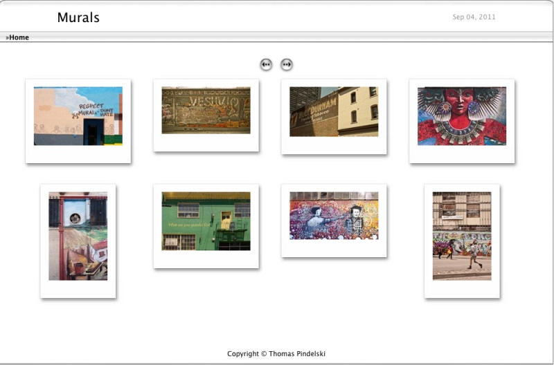
As long as I can remember I have had a fascination with murals. In addition to presenting a visual history of a time and place they fade gracefully and can add a particular sense of poignancy to a location.

Click the picture below and you will be redirected to my photo site with a selection of two dozen favorites from recent years.

Click to view.

These were taken on a wide variety of gear – from the Panasonic G1 at the high-tech end of the scale to a Crown Graphic 4″ x 5″ at the no-tech end.