Testing Hahnemühle matte and textured papers.
_sampler.jpg)
Hahnemuühle matte paper sample pack.
I set forth the background research done to find swellable papers for use in the HP DesignJet 30/90/130 printer here. The goal is to find archival non-HP branded paper replacements as HP paper in cut sheets becomes increasingly hard to find. The paper used must be compatible with dye based printers like the HP, which means it must absorb the inks into its surface and remain archival as regards freedom from fading.
In this article I’ll address results with eight different matte Hahnemühle papers. Glossy paper tests will be reported on in a third piece.
First, some preliminaries.
There is a host of variables when printing an image so whatever can be done to standardize these will help in meaningful critical assessment. Variables include:
- A properly calibrated display to permit accurate soft proofing in Lightroom 4
- A display which has been properly warmed up before use, to allow colors to stabilize
- Constant temperature daylight consonant with the viewing environment
- A reference print on HP paper for comparison, viewed in identical light
- Prints which have had 24 hours to ‘dry’ to stabilize colors
- The use of the correct paper profile from the manufacturer
I calibrate my displays with an EyeOne colorimeter and make sure they are on for at least 30 minutes before soft proofing on the screen. Images are viewed by noon daylight, the same light by which I calibrate my displays. All test prints have dried for 24 hours or more. Reference prints were first made on HP Premium Glossy using the appropriate HP paper profile. I never use aftermarket or continuous flow inks as life is too short to worry about their longevity all for the sake of insignificant savings.
When picking the appropriate Hahnemühle profile for use with each of their papers, things get a bit trickier, as not all of the papers in the sample paper pack have profiles available from Hahnemühle for the DJ 30/90/130 printers. These profiles are available:
Available Hahnemühle paper profiles.
All of these are for matte papers. I have yet to find any glossy paper profiles.
Downloading Hahnemühle paper profiles:
The profiles listed above include some from Hahnemühle’s current site and some which are no longer available but which I downloaded years ago.
The simplest way to install these is to download the file from my server by clicking on the ‘Download’ icon below. I have changed the ASCII names in the profiles from cryptic (as supplied) to English (as above), making recognition much easier when printing without having to refer to lookup tables. Other than the naming changes these profiles are stock.
You can download them by clicking below:
Click to download Hahnemüle paper profiles.
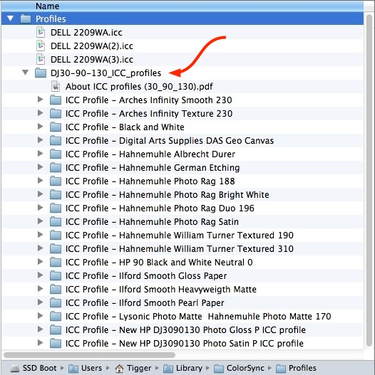
Here is where you want to move the downloaded files on your Mac, using Snow Leopard, Lion or Mountain Lion, using drag-and-drop:
Location of additional paper profiles in Snow Leopard and later.
Replace ‘Tigger’ with your username.
Here is how your Mac’s folder/directory should look after you have installed these using drag-and-drop on the location denoted by the red arrow. I do not know where they go in Windows, but the process is the same. Frankly, the very thought of printing using Windows makes a one way ticket to North Korea look like an attractive alternative. I also have other profiles in the folder shown above; take no notice of those for purposes of this article.
Profiles installed on the Mac.
If you cannot see the user directory – a truly moronic Apple ‘enhancement’ in Mountain Lion – go to Finder->Go and hold down the option key. The user Library directory will appear in the drop down Finder list. Click on it then continue navigation to the location shown.
Then go into the LR4 Print module, select the profile drop down list of profiles, click ‘Other….’ at the bottom and check all the profiles you want to see in future when accessing the drop down list, otherwise they will not appear.
Choosing the right paper profile:
If an exact match was not available, I studied the color and texture of the paper and used the profile for the closest match. For example, the Museum Etching paper (no profile available) is very similar in color and texture to the German Etching paper (profile available) so the German Etching profile was used for printing on Museum Etching paper.
Matte paper characteristics:
This table summarizes the characteristics of the eight matte paper samples included in the sampler pack, which comes with two of each, clearly labeled on the rear.
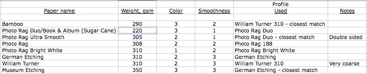
Hahnemühle paper characteristics – matte.
Making the prints:
I chose two images to make test prints for comparison with originals made on HP Glossy paper, the latter revealing the most detail and delivering the greatest dynamic range.
The first has both fine detail in the lettering and a broad color range, with dense blacks and pure whites. Further the neutral gray of the columns of the Ferry Building in the rear poses a stringent test for proper color rendering:
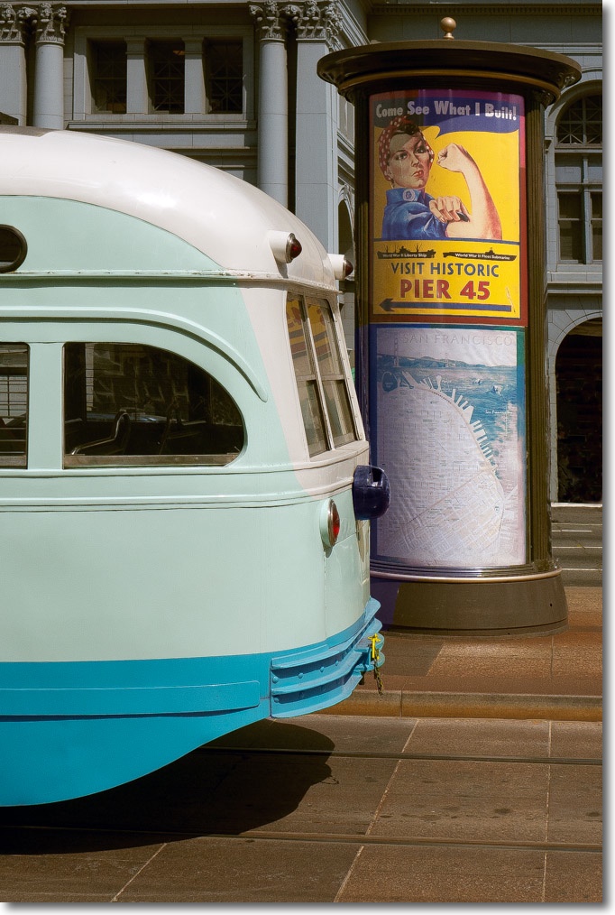
San Francisco trolley.
The second has a face I know well and very deep blacks, something the DesignJet 30/90/130 excel at rendering:

My son Winston.
In fairness, it’s hard to say whether I used the best profile for papers where none is available. But it’s the best I can do short of having a costly custom profile generated by a specialist with uncertain results.
Printer settings:
I previewed results using Soft Proofing in LR4’s Develop module, which allows both the print and the color of the paper to be previewed:
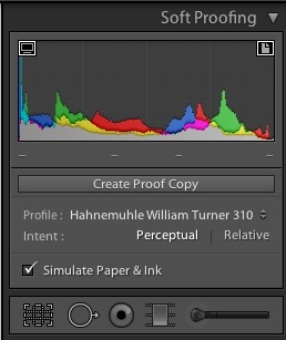
Soft proofing settings.
Note that you have to select the paper profile again when going into the Print module even if already selected in the Develop Soft Proofing step – it is not automatically conformed between the Develop and Print modules.
To apply a profile of choice, we want LR to manage colors, not the printer, so check you see this in the Print Settings dialog in the Print module:
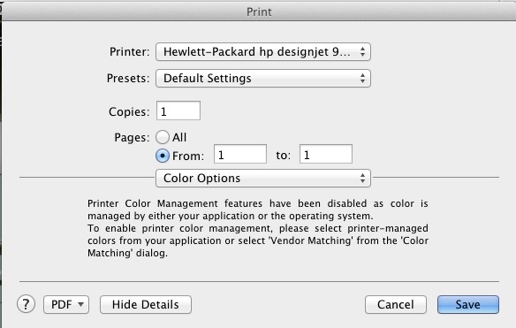
Confirmation that LR is managing colors, not the DesignJet.
Here is how the Print module in LR appears prior to printing:
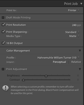
LR4 Print module settings.
Results:
Here are my subjective opinions based on the prints I made.
Color fidelity:
These were best:
- Photo Rag Ultra Smooth
- Photo Rag Bright White
- German Etching
- Museum Etching
These papers were incapable of rendering neutral greys in the building’s columns, having an easily noticed bluish cast:
- Photo Rag Duo
- Photo Rag
- William Turner
This paper did a very poor job with a blue cast in the column, washed out yellows and over bright skin tones – there has to be a better profile available but I do not particularly like the very warm color of this paper so I will not be doing any further work on it:
- Bamboo
Textures:
Three of these papers have very heavily textured surfaces:
- German Etching – a parchment-like finish
- William Turner – very coarse elongated stippling
- Museum Etching – parchment like finish on a very heavy base
These sort of papers, all very warm colored, give a very dated looking image verging on the pretentious. German Etching, which has a faint parchment-like texture is at least bearable. The other two are really unsuitable for photographic prints unless you are trying to pass them off as some sort of high art. If you are into claiming limited edition status for your snaps and signing them in pencil like you are Seurat using conté crayon, these may be for you.
None of the textures on the others is objectionable, but the only truly white one is Photo Rag Bright White which also does an outstanding job of detail rendering, despite the light texture of the surface.
Ink absorption:
None of the papers emerged wet from the printer, suggesting the dyes inks are being well absorbed. The Photo Rag Duo was slightly damp to the touch, dry after an hour. This paper allows printing on both sides, and is the lightest tested, maybe accounting for this. I did not test double-sided printing.
Freedom from fading:
Based on color rendering, I have cut prints for three of the best papers – Photo Rag Ultra Smooth, Photo Rag Bright White and German Etching – in half. One is placed in a window with full sun exposure for 4 hours a day and daylight exposure for an additional 8 hours a day. This is in CA so lack of sunshine is not what you would call a risk factor. The other is kept in a cardboard box. I will report back in three months to state whether fading is noticeable.
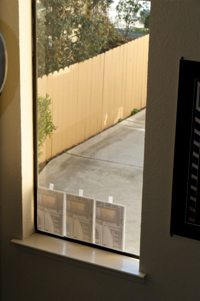
High tech test bench. Direct sun arrives in one hour.
Photo Rag Ultra Smooth, Photo Rag Bright White and German Etching papers.
Feeding the paper through the DesignJet 90:
With the sole exception of the very light Photo Rag Duo, all of these papers are heavier than the 280/286gsm of the HP branded ones. Only one showed any signs of feed issues. The heaviest, Museum Etching at 350gsm, showed minor ink smudges on the lower print border, maybe ink remnants coming off the feed rollers which would be under more pressure than with the lighter papers. I would guess a proper cleaning of the rollers would cure this. All papers were front fed using the HP DJ’s paper tray with only one sheet loaded at a time. Accompanied by the usual clanking from the DesignJet, there were no feed issues.
Dry mounting, fading and why so thick?
I am somewhat mystified why these papers have to be so thick and heavy. While that makes them nice to handle with cotton gloves, any decent print will end up being mounted on board and matted, it’s thickness irrelevant. Even the very light Photo Rag Duo handles just fine.
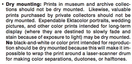
Maybe it’s some sort of one-upmanship selling feature? Maybe it stops them cockling when ‘hinge mounted’ – a process adopted by some for display, using tacky fold over tabs for adhesion to the display surface. The usual reason given is impermanence when dry mounting is used. If anything the surface area open to attack by pollutants – assuming the use of acid free dry mounting tissue and mounting boards – is halved once dry mounted (meaning heated in a press with dry mounting tissue between the print and mounting board). I have monochrome prints I dry mounted forty years ago and HP DesignJet 90 color prints made 7 years ago, displayed in bright sun, and there is not a hint of yellowing or fading. Wilhelm, the alleged authority on fading (see below) repeats this anti-dry mounting rant in his book, while adding that there is zero empirical evidence for his statement. Frustrating.
Failed logic from Chapter 11 of Wilhelm’s book.
In conclusion, the thickness of these papers makes no sense to me. Further, I encourage you to dry mount your work for the best look, using acid free dry mounting tissue and acid free mounting board. Framing behind UV glass will maximize fade resistance. A properly mounted and framed print is the touchstone of the photographer’s craft.
Do not use aftermarket ink cartridge refills:
Here are data from Wilhelm Research. Self explanatory:
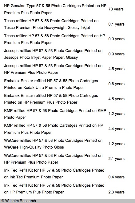
When Wilhelm (arguably the worst home page in web history) tested the HP Vivera dye inks with the HP DesignJet 130 and 90 in June/July, 2005, they used HP-branded papers only, so not of help for our purposes here. I also downloaded Wilhelm’s 600+ page research document and while Hahnemühle is mentioned a few times it is never referred to in connection with the use of HP Vivera dye inks. It is referred to in connection with HP Vivera pigment inks, where the fade life of many of their papers is identical to that of HP-branded pigment ink papers, for what it’s worth.
In Part III I will look at Hahnemühle’s glossy and satin papers sold in their sampler pack.
The problem with matte papers: Not one of these eight papers comes anywhere close to rendering the deep inky black that is par for the course with glossy paper. Nor are any capable of rendering the resolution of glossy, with the textured papers especially poor in this regard. The ‘pop’ which comes with the use of good gear is gone, replaced by Lomography definition. It’s not a subtle difference, it’s painfully obvious when the prints are held side by side. An excellent way, in other words, of turning your high resolution lens and sensor into mush. Photo Rag Bright White is the least bad, but in an A-B comparison it’s still pretty awful. Nor is color depth remotely comparable in any of these to the glossy reference print. My advice is to studiously avoid matte papers and to stick with glossy or, at a pinch, satin.
The results of fade tests appear here.