Testing Hahnemühle glossy papers.

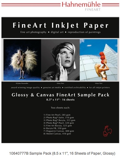
Hahnemühle glossy paper sample pack.
Tests for the Matte paper sample pack appear here. I concluded that not one of these papers was adequate for high resolution photographic prints, the color and/or texture taking out too much resolution. The heavily textured papers were downright awful.
The Glossy sample pack mysteriously includes two types of canvas paper which I consider totally unsuitable for photographic prints and did not test. Photographs are not faux paintings. They are photographs.
My first reaction on opening the glossy sample pack was one of disappointment. After discarding the two canvas horrors, only one (Baryta FB) of the remaining six papers was a true white, in fact slightly whiter than the HP-banded Premium Glossy paper, with Fine Art Pearl being almost as white. None was anywhere near as glossy as the HP brand, the Photo Rag Satin was anything but Satin (here the HP Premium Satin truly excels) being surpassingly flat and bland. How this can be included in a ‘Glossy Sample Pack’ beats me.
Paper profiles:
Hahnemühle does not provide any paper profiles for these papers when used with the HP DesignJet 30/90/130 dye printers. Accordingly, I used the stock HP Premium Glossy Maximum Detail profile, with colors controlled by Lightroom, not by the printer.
Glossy paper characteristics:

Hahnemühle paper characteristics – glossy sample pack.
Printer settings:

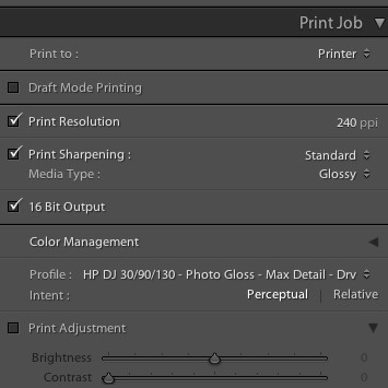
In Lightroom. Note that a matte profile was used for Photo Rag Satin in preference to a glossy one.

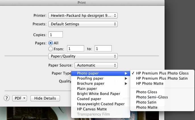
In the printer dialog. Note that the Photo Matte setting was used for Photo Rag Satin in preference to a glossy one.
As is always the case when using an HP Glossy profile, the DesignJet will hold onto the printed sheet for a few minutes before ejection, thus allowing the print to dry. It can always be manually ejected, but be aware that the surface is very fragile at this juncture.
One sheet of the whitest glossy paper, Baryta FB, had a small black blemish, maybe 0.5mm long, but enough to destroy a print if it appeared in a light area. Inexcusable.
Results:
My gradings are based on three simple criteria for a glossy print. The paper must be a stark white and the gloss has to be a high gloss or a true satin for papers named ‘Satin’. The third is that colors have to be accurate.
Color fidelity:
This was the best:
This paper is extremely heavy at 350gsm, like the matte Museum Etching paper in the earlier matte paper test. Like that paper some color tracks were left in the bottom white margin from the printer’s roller, though strangely none on the printed area. The color rendering is outstanding, identical to HP Premium Glossy, but the finish s more satin than glossy.
I cannot recommend any of the other papers – too yellow, nasty surface finish or just plain yecch! (Canvas).
Fade tests in strong sun:
I will report results for both glossy and matte papers after three months of sun exposure, compared to a control sample stored in a cardboard box.
Conclusions and alternatives:
If my tests of 16 Hahnemühle printing surfaces proves anything it’s that the HP-branded papers are very good indeed. But my remaining supply of some 120 sheets of 18″ x 24″ is dwindling, so a replacement has to be found. HP’s paper avoids ridiculous excess weight, which serves no purpose and can cause roller marks.
There is no true glossy Hahnemühle paper here. The best is the Baryta FB, and it bears more resemblance to HP Premium Satin than to HP Premium Gloss, and Baryta FB’s high weight may result in ink smudges from the feed rollers.
Hahnemühle Fine Art Pearl leaves nasty blotches viewed at an angle, and only two paper base colors equal or exceed the whites of HP Premium Glossy – that same Fine Art Pearl (forget it, because of the blotchiness) and Baryta FB whose thickness causes dirt tracks from over-pressured rollers.
All the other papers in this sample pack are too yellow to pass muster for proper color rendering. Some of the finishes belong in a morgue, not on a photographic print.
Bottom line is that there is only one paper in the Hahnemühle mis-named ‘Glossy Sample Pack’ which I can recommend, the Baryta FB with the roller pressure caution mentioned above. And it’s not even glossy.
These tests of Hahnemühle papers have been very dispiriting. Not one of their Matte papers has anything to recommend it compared to HP’s Premium Glossy and Satin offerings and the Glossy ones are anything but.
Accordingly, I did some more research and will soon be testing Moab’s glossy papers. While I originally wrote these off as not suitable for dye inks, a revisit and more careful reading of Moab’s site, spurred by the poor experience with Hahnemühle’s offerings, suggests that their papers are suitable for dye inks, come in the large cut sheet sizes (13″ x 19″, 17″ x 22″ and A2 which is 16.5″ x 23.4″ – click here for paper sizes) which I prefer, and there are even profiles available for the glossy offerings specific to the HP DesignJet 30/90/130 dye printers. That is encouraging. As glossy print appearance and permanence are the very touchstones of the photographer’s craft, it’s worth the effort to find a long-term replacement for HP’s superb but discontinued Premium offerings. And I promise that is the last time I will use the words ‘superb’ and ‘HP’ in the same sentence.
For those photographers who revel in big prints and are trying to get the best print quality using the latest high megapixel sensors, high gloss surfaces are the answer. The quickest way to turn a 36mp sensor into a 6mp one is to use something ghastly like canvas paper.
Fade tests:
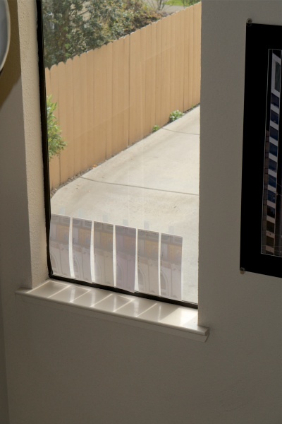
As with the matte papers, I will report back in three months on the extent of fading noted after daily all day exposure to bright sun:

Three matte and three glossy test strips in the sun.
