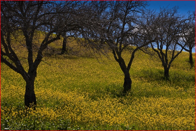
And with it an abundance of flowers
The days are finally getting longer and color abounds.

5D, 85mm at f/11, ISO 250
And with it an abundance of flowers
The days are finally getting longer and color abounds.

Sadly, no more.
For an index of articles on art illustrators, click here.
I wrote despairingly about America’s End of Empire at the conclusion of last year and now think I was being optimistic. How years of prosperity and growing wealth were flushed away by a corrupt Wall Street, an incompetent series of governments and an all too willing US borrower, all in a matter of a few years, is now ancient history. What is yet to come is a depression of a severity that will fundamentally change the position of the US in the world, which is still in deep denial of the true depth of the chasm we all face.
It was easy to be reminded of this when reading the current issue of Vanity Fair – still the best photography magazine in the US – which profiles the decaying of the American dream. I’m not about to repeat the populist ethic at work here (anyone buying VF for its writing has a serious case of socialism to attend to) but the pictures accompanying the article are extraordinary.
They are reproductions of the enormous posters Kodak hung in Grand Central Station over four decades. Nothing less than an attempt to recreate the world of Norman Rockwell using photography, the result is in equal parts gauche, tasteless and saccharine. A new low in bad taste which, understandably, has not been repeated in a decade or more as Kodak is …. well …. bankrupt. Hardly surprising for a company whose management makes the captain of the Titanic look like a steady hand with great foresight and judgement.
Without further ado, here they are, all copyright of Eastman Kodak, though I’m not sure it’s something I would sue about:


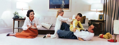


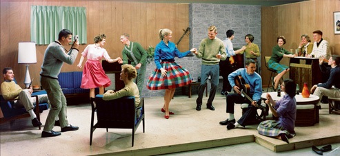



So how many people did you count who are not named Scooter, Chip or Buffy and have colored skin? Are all these people simply stuffed mannequins ready for Madison Avenue’s predators?
In case you missed it, here’s a snap of the new US Treasury Secretary (I believe I am the first to disclose this) – the dude making the rabbit’s ears – from today’s Wall Street Journal.

He’s right to be concerned as the jerk put all his eggs in one basket.
As for Eastman Kodak, well nothing has changed judging by today’s headlines:

Amazing what you can find when you try seeing
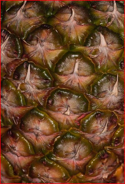
I really do not like pineapple. Too tart and acidic for my constitution, yet I was struck by the incredible complexity and beauty of the fruit at the local grocery store.
So I picked one up (carefully!) and took four differentially focused snaps, stitching them in Helicon Focus.
The ring flash head was half covered with black tape to add some modeling.
Still cannot get over it
The enormous 24″ iMac screen beams a series of studio photographs of my son at me, each seemingly more thrilling than its predecessor. The show, as I flick through the images and cull the losers is, well, nothing short of enthralling.
“There he goes again, babbling on about full frame digital” you mutter. And rightly so.
But when I tell you that I continue to be simply blown away by the combination of the Canon 5D, 85mm f/1.8 Canon EF lens and my three head Novatron studio outfit, as I view the results on that huge screen, it’s not like I’m talking the latest and greatest in gear. But it’s still better than I am.
And where there are errors it’s usually in the area of critical focus not because the 5D isn’t always spot on (it is) but because yours truly swayed a bit before pressing the button. Age not booze, I assure you. And boy, is depth of field limited at these distances or what?
And this, dear reader, is what I have to deal with:

Life is short. Live it well.
A few thoughts on color balance
If accurate sound reproduction is your goal, then listening to the human voice (no, not some drug addled rock star; try German lieder or opera) or the piano (the one made by Steinway, not Roland – no electronics are involved) is the most critical test.
Humans know how a piano or human voice should sound. There is no such capability when it comes to electronic instruments as there is no ‘standard’ to refer to. This whole concept of a known reference is as valid for judging pictures as it is for determining accurate sound reproduction. With human subjects the equivalent of the piano or voice is the color of the subject’s flesh. We know what accurate flesh tones are. That is a known reference point.
Each year we take a studio portrait of our boy to document his early years. Inevitably, color balance is all over the place and adjustments need to be made.
No one has ever accused the Canon 5D of accurate color balance with artificial light sources, but a small investment in a white balance card easily fixes that.

It takes seconds to do.

The subject holds the card and a test snap is made. Later, in Lightroom, the eye dropper in the Develop module is simply placed over the white card and clicked.

This renders the card neutral in shade, and all other colors are adjusted accordingly.

And the result, true skin tones and all, is at the beginning of this piece. Note the substantial drop in the Blue component in the ‘After’ picture.
There’s no need to restrict this approach to the studio. Place the card in a landscape, for example, and the result is the same. Add proper screen and printer profiling and true colors are a snap – no more messing about with sliders and suspect visual memory.
If you routinely take pictures in identical lighting, it’s easy to save a preset for the color balance adjustment in Lightroom, obviating any future need to use the white balance card in like lighting. Useful for studio work where lighting can be replicated exactly.
You can buy white balance cards for a few dollars or make your own from a nice piece of white card. There’s no cheaper way of getting true colors and when it comes to flesh tones the issue is binary – they are either right or wrong. My white balance card includes an 18% reflectance grey card which is also useful for exposure measurement.