Finally, some pictures.
In Part I, I looked at some of the design aspects of the Olympus 9-18mm MFT lens for the Panasonic G1 and in Part II set forth some thoughts on how it handles.
This article addresses results. How good is this lens in practice?
So what qualifies me to pontificate on wide lenses?
I have always been a ‘wide’ rather than a ‘telephoto’ guy, liking to get close to the action. That’s my street snapper thing. In that context the widest lens I have used, and still own, is the Canon full frame f/2.8 8 mm fisheye for my 5D which, with de-fishing software, yields an effective Full Frame Equivalent (FFE) of 12mm. That’s insanely wide. That Canon lens is no slouch but the micro contrast is simply not there in big prints and definition is not that great at the corners until you stop it down to f/8.
The next widest lens I have used is the very costly 14mm f/2.8 Canon L for the 5D, a loaner. At thrice the cost of the fisheye it underperforms in every way with heavy chromatic aberration at most apertures and poor edge detail. A real dog. Apparently improved in the Mk II version but at $2,100 you can forget it. And it’s an absolute monster in your bag or on your camera.
The next widest was a sweet and minuscule 20mm f/2.8 Takumar which I used for years on my Pentax ME Super 35mm film camera. Small, fast, no bulbous front element and sharp all over. Everything was right about this optic which explains why it is much sought after on the used market.
My worst experience with ultra-wides was with the Canon 20mm f/2.8. No fewer than two of these soiled the rug and I was glad to see the last of them. Poor corner definition at most apertures, horrible vignetting, there’s really little good to be said about this excuse passing for a lens. Canon should be ashamed.
Then came two really heavy hitters. The unsurpassed 21mm f/2.8 Leica Aspherical Elmarit for my Leica M bodies (really a bit too large to equate well with the compact Leica M’s ethos) and the huge 21mm f/4 Super Angulon for my Leicaflex SL (a nice pairing) and Leica R4 (which it overpowered from a balance perspective). The former cost me $1,000 lightly used, I sold it for $2,000 and it now costs $4,200. The latter, actually a Joseph Schneider design licensed to Leitz, moved on with my Leica SLR gear when digital came along. It was almost as good as the Aspherical but sported a huge front element and was immensely heavy. Over-engineered in the way only Leitz knew how back then.
In use:
To check things out I set out for Half Moon Bay, a rather down-at-heels coastal town a few miles south of San Francisco. That is a good feature. Have you ever taken a good snap in the pristine, manicured sterility of Beverly Hills?
Half Moon Bay has some funky beach streets and an interesting boat marina and commercial fishery on the wharf.
Using the lens, absent the reverse rotation of the zoom ring compared with the two Panny lenses in my G1 kit, is unexceptional. The size, once extended, is similar to that of the 14-45mm kit lens and operation is much the same except, of course, that the 9-18mm Olympus is really wide at 9mm.
Loading the pictures into Lightroom 3, three considerations arise:
1 – Orientation sensor: In common with other Olympus MFT lenses, this optic has no orientation sensor to automatically rotate pictures in Lightroom 3. (Olympus does this in their MFT bodies). All pictures load in landscape orientation so it’s necessary to Command-click all the portrait images and turn them through a right angle using LR3’s controls. A minor irritant.
2 – Barrel distortion: Panny lenses on the G1 have in body distortion correction. Load the images into LR3 and distortions are notable for their absence. Because there is no in camera distortion correction with the Olympus lens on the G1, barrel distortion is noticeable – straight lines at the edges bow outwards in the center. This is easily fixed, where it matters, using the Lens Corrections->Manual->Transform->Distortion slider in the Develop module of LR3. (LR2 does not have this feature). This has to be done in the Manual section, as Automated (“Profile”) corrections in LR3 are currently limited to Canon, Nikon, Sigma, Sony and Tamron lenses. I do not know if Adobe will add Olympus lenses mounted on a Panasonic body. To get things dead straight, the slider has to be at +10 with the Olympus lens at 9mm and +3 at 18mm. The distortion is not severe and need only be corrected in architectural or landscape shots with prominent straight lines. You can also automate distortion correction by clicking here.
3 – Chromatic aberration (color fringing): As with barrel distortion, this has to be corrected manually. It’s mostly noticeable as a red fringe when pixel peeping at 9-10mm focal length and a setting of -15 to -20 on the Lens Corrections->Manual->Transform->Chromatic Aberration->Red/Cyan slider in LR3 does the trick.
It makes no sense to incorporate these settings into an import profile as that assumes that all pictures imported are taken on this lens at a specific, wide, focal length. Simply add the settings on the ‘keepers’ – it takes seconds to do.
None of these are disabling issues as the pictures from the lens are in every way as detailed and sharp as from its Panny stablemates, which means superb. There is a total absence of vignetting at any focal length or aperture and if you see any in the pictures here it’s because I added it in LR3 to heighten the impact of an image. Rather funny that designers go to all that effort to eradicate vignetting and photographers then proceed to add it when processing their pictures.
Examples:
Barrel distortion:
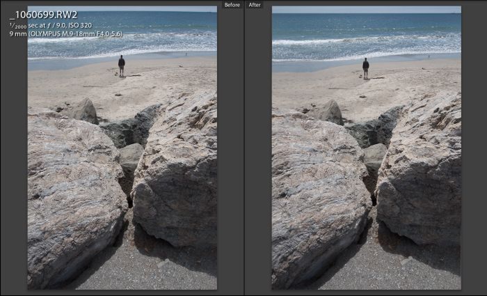
Barrel distortion at 9mm – look at the horizon.
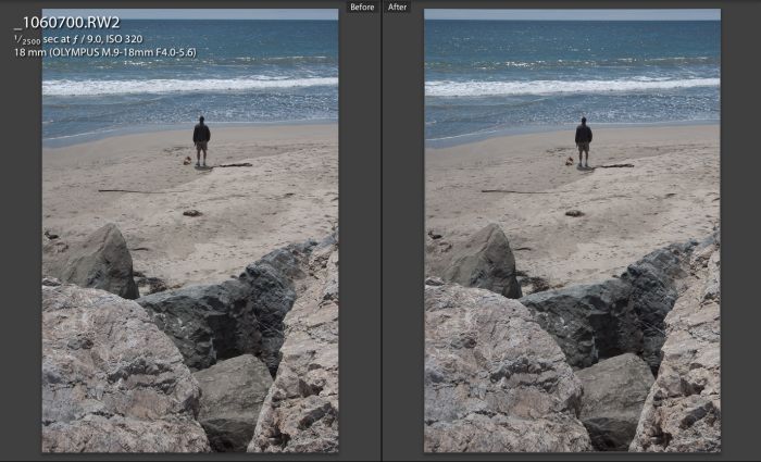
Barrel distortion at 18mm – less pronounced, but still there.
Chromatic aberration:
Not illustrated as it’s only visible to pixel peepers.
How wide is 9mm (=18mm FFE)?
18mm FFE is incredibly wide and if you are new to something this wide be prepared for disappointment with your first few snaps. Take a look at the two pairs of pictures above – one is at 18mm FFE, the other at 36mm. The increased amount of foreground is immense – I have kept the horizon at the top of the frame for comparison purposes. If you think you need this lens to ‘get more in’ forget it. Unless your back is against a wall or unless you have strong foreground interest, your pictures will be awful, your subject a tiny blob in the distance. And if you are afraid of getting in close, stick with your longer lenses and save your money; an ultra-wide is not for you.
Here’s another case in point – I was but a couple of steps away from this surfer dude throwing the ball to his retriever:
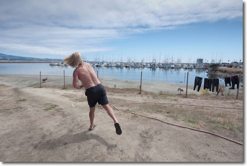
At 9mm, f/4.5 – the chocolate lab gets ready to retrieve.
An 18mm FFE lens is a surrealist’s delight. Sure you can take the proverbial interiors of cathedrals with it, and that’s fine, but I prefer to buy picture postcards of those as they are far better done than anything I want to spend time on.
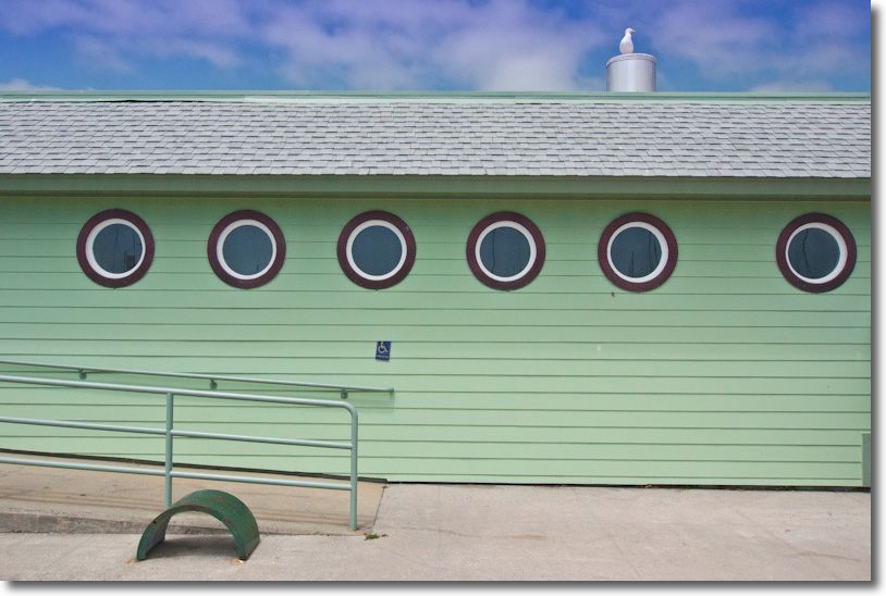
At 9mm. Portholes and gull. Lovely architecture for a building in a fishing village.
How about flare?
The wider a lens gets the higher the likelihood that strong light sources will be in the frame. This is an extreme example – the dynamic range between the interior of the bar and the strong sun outside is some 10 stops.
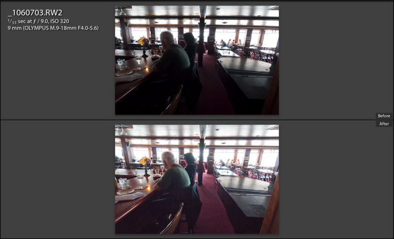
At 9mm, f/4.6. Lower picture shows the effect of using the Fill Light slider in LR3.
Flare is very well controlled, even in this extreme case. There are only minimal light source haloes to be seen in either interior or exterior pictures at 9mm. I do not, and will not, use a lens hood. Here’s a larger image:
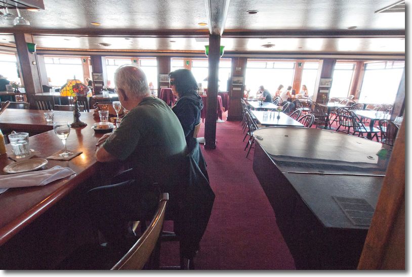
At 9mm, f/4.6. Flare is well controlled.
What’s the depth of field like?
It’s extreme at 9mm no matter what aperture you use. 9mm is 9mm. No matter whether it’s on an MFT body or something larger – depth of field is a function solely of focal length and aperture and has nothing to do with the size of the film or sensor used. While in the picture below I stopped down to f/22 to be safe (the rusted beams were inches from the lens) this also shows that, DP Review’s charts notwithstanding, where they show definition falling as the lens is stopped down, f/22 is as sharp in practice as is f/4.

At 9mm, f/22. A few inches to infinity ….
Finally, when your back really is against the wall, this sort of thing becomes easy:
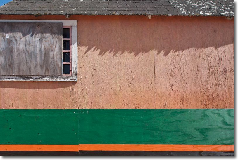
At 10mm, f/9. Colors on a wall. Taken in a narrow alleyway.
For more snaps over the next few days check my photoblog, Snap! While I have emphasized pictures taken at the wide end of the lens (a primary reason to buy it) performance at longer focal lengths is every bit as good.
Be honest – Micro Four-Thirds is lousy for big prints!
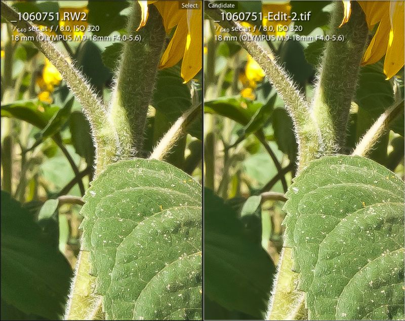
OK – here’s a full frame image:

At 18mm, f/8. Sunflowers.
Now here’s a magnified section which, if the whole thing was printed, would make a 30″ x 45″ print:

Magnified section of above – screenshot.
And your point is?
Conclusion: Despite a few quirks – a contra-rotating zoom ring, a non-existent image orientation sensor on import to LR3 and the need to manually correct chromatic aberration and barrel distortion if needed when used on a Panasonic rather than an Olympus body, the performance of the Olympus 9-18mm MFT ultra-wide zoom is as good as anything I have used at this focal length range. Color rendition is identical to that of the 14-45mm and 45-200mm Panasonic MFT lenses for the G1 camera range. At $600 it is an outstanding bargain.

42 lbs. The fish and the amount of fat this fisherman needs to lose. At 9mm, f/4.5
As the above shows, one huge advantage of an ultra-wide is that your subjects have no reason to believe they are in the frame!
Automating aberration corrections: If you want to learn how to create profiles for this lens which will correct aberrations automatically in Lightroom 3 – or if you simply wish to download the ones I have already created – please click here.