A serious player.

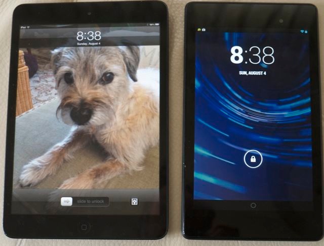
The iPad Mini and the Nexus 7.
Reasons to buy:
Three things attracted me to the Google Nexus7 marketed by Google (N7 from now on), and made by Asus.
First, I am curious to learn more about Android which I have never used, and with the N7 running the latest Jelly Bean 4.3 version, it’s high time I learned the OS which dominates mobile devices.
Second, I was intrigued by the HD display which is 1920 x 1200 pixels. The most obvious comparison is with the iPad Mini whose display is standard definition 1024 x 768, in 4:3 aspect ratio. Watch a widescreen movie on the iPad Mini and you are using a screen whose pixel size is 1024 x 576, so the N7 packs 168% more pixels into a movie image. That’s non-trivial.
Third, how could one not be interested in a tablet selling for $229, or $100 less than the base model iPad Mini?
The outside:
Packaging is ‘Apple quality’, with easy tear-off protective film and a minimum of instructions. For those new to Android, like me, there’s an excellent free 90 page book in the Google Store which went a long way to familiarizing me with the many touch screen gestures in Jelly Bean. The back is rubberized whereas the Mini’s is metal. This makes no difference in practice, both collecting fingerprints faster than the IRS collects taxes. Fit and finish of the N7 is fully the equal of the Mini. Both look and handle like high quality hardware.
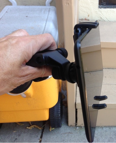
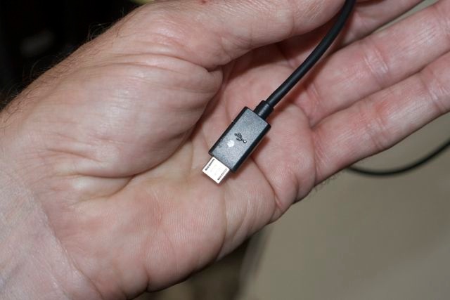
The narrow size of the N7 makes it much easier to hold in one hand, the Mini being a stretch of the hand span by comparison. However, where the N7 falls down is that it uses the truly execrable MicroUSB socket for the charger, surely the acme of poor design. Small, fragile, very hard to make out the correct orientation and doomed to premature failure if you are ham handed. The new Apple connector, with no orientation need, is the state-of-the art here. The first thing to do is this:

A white pen dot identifies which side
is up on the ghastly MicroUSB connector.
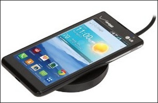
The second thing to do is to spend a few dollars on the LG wireless charging pad. The N7 comes with Qi (Eh? Straight from the School of Silly Names, that one, just down the road from the Ministry of Silly Walks) technology which permits inductive, wireless charging by simply placing the N7 on the LG puck. Sure, the puck still has to be connected to the mains but thereafter you never have to curse the MicroUSB connector again. And your N7’s life will doubtless be extended. Amazon is asking $50 at the time of writing – I bought mine from Verizon online for $40. Avoid the Google charging pad whose inclined surface suggests that its designers never paid attention in school when Galileo and gravity were the topic.

A cell phone on the LG puck.
The puck should work with any device with Qi inductive charging technology. The LED indicator on the front has three states:
- Amber – No device or device not centered on puck
- Solid green – charging
- Flashing green – charged
I computed the time for a 0%-100% charge at 4 hours and 10 minutes.
With charging issues resolved, the only other noticeable design change from the Mini is the absence of a Home button at the base of the screen and that’s about it. On the N7 the Home button is a touch icon. One less mechanical thing to go wrong, but it does take some time getting used to, considering I started on iOS with the iPhone 1 on the day of introduction in mid-2007.
First reactions to use:
The first surprise comes when you turn the device on with a long (3-5 second) press of the top right power button. Thereafter the button needs just a brief push. Mine came on in Malay! I sort of got through setting up wi-fi in what is not exactly my first language, and then it mercifully flipped over to English. OK, American. And the real eye opener is the display quality. An absolute knockout. More resolution than anyone could reasonably ask for and, good as the Mini is, it pales in comparison. The display will go far brighter than anyone needs. In bed at night you have to turn it down to almost zero – the auto adjustment option is consistently wrong in my experience.
Much of the learning experience after that – and I do recommend a reading of the book for Android newcomers like me – is very similar to Apple’s iOS6, with the N7 being faster in all regards than the RD full size iPad and the Mini.
Now it’s no secret that I detest Google and its evil ways. A company where you are the product and an advertiser is the customer is never going to be troubled by business scruples, doing evil at every opportunity available. So it’s little surprise that when you fire up the N7, most of the installed apps are Google-this and Google-that, each with an invocation that you sign in with your Gmail account, so that your every thought and action can be recorded, analysed and sold. So how does one get around this evil?
It actually proved surprisingly easy.
iCloud:
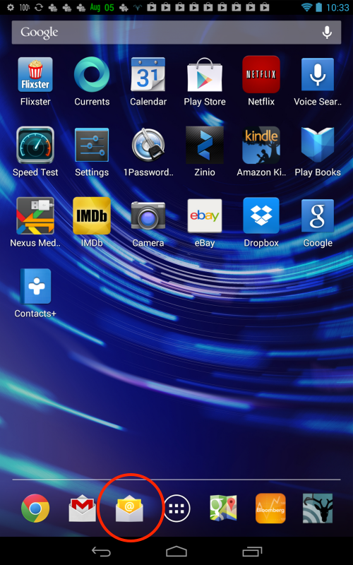
For those invested in the Apple Cloud there are three key databases to access which are not at Google. Apple Mail, Apple Contacts and the Apple Calendar. To access Apple Mail, avoid using the Gmail app in the N7, go straight to the yellow email icon and enter your Apple Mail account details there.

Regular Mail app is circled – that’s where you want to go.
The ‘Do Evil’ Gmail app is the one with the red M to the left.
The only difference in the N7/Jelly Bean implementation is that your Apple Mail will be ‘pull’ rather than ‘push’. You can pull in new messages automatically by electing a refresh frequency in Settings, or you can simply touch the Synch icon when in the app for an immediate update.
Next up are Contacts and Calendar, and both require the purchase of an inexpensive app to permit synchronization with Apple’s Cloud. Both these SmoothSync apps are in the Google Play Store (what Apple calls the AppStore – functionally identical) and are a must-have for Apple migrants with iCloud content:


Essential tools for Android users migrating from iOS.
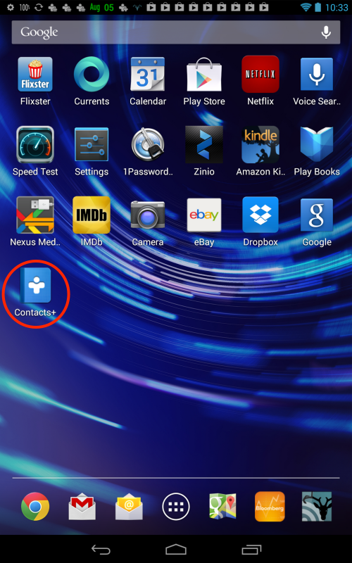
Once installed these apps can be hidden away on a remote screen as you do not have to access them again. Sync is two-way, seamless and perfect, and all your Contacts become available to both the Email and Gmail apps. Hop over to the built-in Calendar app and your iCloud calendar will be displayed in full. Nice. If you wish to see your full list of Contacts, download this free app:

You can see it circled below:

eBay you ask? Just selling off old Hackintosh parts!
Don’t even think of logging in to iCloud.com using the built-in Google Chrome browser. You will be rudely told that it is inaccessible. Some schoolboys never grow up.

What you get when pointing Chrome on the N7 to iCloud.com.
Note the ‘Back’, ‘Home’ and ‘All open apps’ icons at the base of the display.
If you absolutely must access icloud.com from your N7 or Android device, I illustrate how to do that at the end of this article.
Fine tuning displayed data:
There’s a couple more fixes to replicate the iPad/iPhone/iCloud experience which need to be made. First, mysteriously, Jelly Bean lets you display the time at the top right of the home screen, but not the date. For a dollar or two, or even free, you can have your choice of many apps which add the date – see above. I used one named (amazingly) ‘Date in Status Bar’.
The other fix is to add the battery percentage remaining which, again, is strangely missing from the OS. (Musn’t carp too much – remember how long it took iOS to get rudimentary Cut and Paste?). I paid a few pennies for the ‘Battery Percentage’ app which you can see above at the top left.
RSS:
Finally, you need a good RSS reader. I use the FeedHQ service to keep my feeds in sync across multiple devices ($12/year – a result of Google Reader having been discontinued by the Evil Company, allowing them to mine more of your data by trying to force you to use Google+) and the estimable Bruno at FeedHQ pointed me to Deer Reader. Though it sounds vaguely North Korean it works really well:
Another one for the big spender, this:

The interface is simple, beautifully engineered and sync with your RSS feed status at FeedHQ is perfect:

Deer Reader on the N7.
Printing:
Other hardware comments? Forget about wireless printing to a wi-fi printer if it’s an older model. You can use free apps like Cloud Print, which you set up on your desktop or laptop using Google Chrome (in Settings). Cloud Print will only work if the printer is hard-wired to a laptop or desktop on the same wi-fi network. Otherwise, forget it. There are new apps like Printhand coming to market which support wireless printing, but my older Brother laser printer is not listed among those supported. Shame. On iDevices I print using an app named FingerPrint from Collobos, and it has been working well for years. Android urgently needs to address this significant shortcoming in Jelly Bean.
Screen orientation lock:
There is no physical switch for locking the screen orientation, such as the one found on all iPads. Instead, you swipe down from the top right of the display and the orientation touch toggle presents itself. Elegant, and another wear-prone mechanical switch deleted. The one on my original iPad1 is pretty shot, I must say, so these are not purely theoretical considerations.
Use with Levi 501 button-front jeans:
Finally, the N7 fits easily in a rear jeans pocket where the Mini is a real squeeze. Just try to remember not to sit on either.
Key applications:
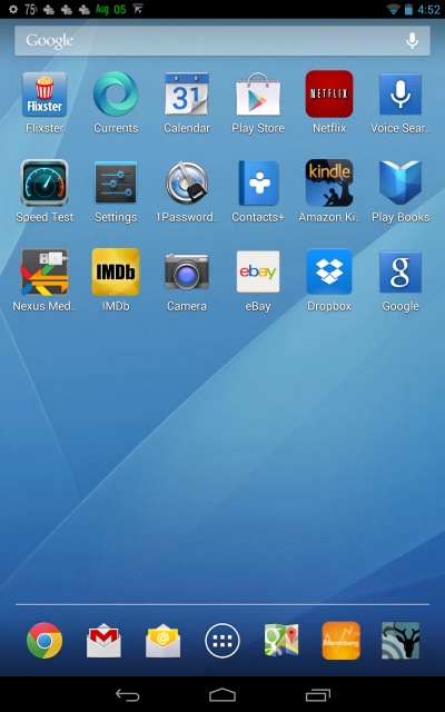
Check the screenshot above (to take one, depress the volume and power keys simultaneously for 1-2 seconds – it takes a bit of learning – then swipe down from the top of the display to access/mail/share your screenshot) and you will see the usual selection of Apps found on many tablets – Play Store (Android’s AppStore), Netflix (nice job, but I cannot seem to access my saved queue of Watch Instantly movies), Google Voice Search, 1Password which syncs to your password file at Dropbox with all your usernames and passwords, Amazon Kindle book reader, Play Books (Android’s version of Apple Books), Nexus Media Manager (access to MicroUSB connected storage – more of this later), IMDb for movie information and Dropbox, the invaluable file sharing utility.
Problems:
In extensive use of all of these I have only had a couple of issues. Try un-pinching text to magnify it in a Kindle book and you will quickly find that the app is unusable. The responsiveness is either zero or very delayed. This needs work – it’s perfect on iDevices. Additionally, the brightness is absurdly high and cannot be turned down. These have to be app issues as the N7 is otherwise very fast on everything it does and brightness is consistent across apps. Bad job, Nr. Bezos.
Separately, when switching to a wi-fi hotspot provided by my iPhone, I had difficulty reverting to regular wi-fi, necessitating a restart. That means holding down the power button for 5 seconds then going through a start cycle. This takes half the time to do compared with iOS. (See Part IV of these articles for the fix). It’s not like iPads have anything to boast about here, either. Frustratingly, at first the N7 asks you for your hotspot password every time you login, whereas iOS remembers it, though after a few uses of the hotspot it seems to have recovered its memory and is now working fine.
By comparison, trying to get the Mini to recognize a hotspot is an exercise in frustration, generally requiring several on/off cyclings of both the iPhone’s hotspot and the tablet’s wi-fi setting.
Google Voice – the killer advantage:
In addition to the N7’s stellar display, for me one of the most exciting features is the near-universal availability of Google Voice in nearly every app. I found I use it constantly. It also works to find apps in the home screen. For example, touch the home screen’s microphone icon top right and say ‘Run Play Store’ and the app opens. What really distinguishes Google Voice from Apple’s offering is that it works nearly every time. It’s a masterpiece of coding. Apple’s version is so poor that, like the doubting Thomas I am, I feel extreme aversion to ever wasting time with it again, no matter how many times Apple and the miserable Cook tell me it’s been fixed. Sort of like Apple Maps.
At first I struggled a bit with voice recognition. (This reminds me when, as a young immigrant in the US, I once asked for a rubber, expecting an eraser, yet being offered something distinctly different). Then it dawned on me that there was an option in the N7’s Settings for the Queen’s English as well as for the Other Kind and a quick switch fixed all that ailed.

“Pictures of Border Terriers”
Try that in Siri and you get a guided map of the Parisian sewer system, with the Eiffel Tower missing.
Google Maps – superlative:
And speaking of Apple Maps, the Google Maps app is the finest there is, leagues ahead of any other and now with spoken turn-by-turn directions you can easily integrate your N7, connected to cellular broadband through your phone’s hotspot, in your car as an excellent, large screen GPS. It’s not for nothing that Apple has poured money into Maps. They realize that direction finding and location sensitive information is the future of mobile. Call it Evil Genius. It will eventually allow them to command a meaningful income stream from everyone from car makers to advertisers. For Apple, I’m afraid, this ship has not only sailed long ago, Cupertino is attempting catch-up aboard the Titanic.
Conclusions:
Overall then, there’s little to complain about. In three days of intensive use I have not had one lock-up, any complaints about responsiveness or any display glitches. Stereo sound (still absent from iPads) is fine but cannot go super loud. Over Apple ear buds the quality is excellent. Pairing with Bluetooth headphones is fast and reliable – I still recommend the Arctic Sound ones I have been using for 2 years, even more now that they have halved in price to below $30. The microphone, which is on the right below the volume rocker, is exceptionally sensitive and Google Voice does a truly remarkable job of filtering out ambient noise, barking dogs and Asiana jets attempting landings in San Francisco Bay a few hundred yards from here. Subjectively, this is easily the fastest tablet I have used and the equal of the RD iPad for screen definition.
I am averaging 9 hours of battery life per charge with mixed use – movies, email, surfing and so on. Disappointingly, my N7 shipped only 35% charged. That and the Malaysian language start-up problem (I’m glad it wasn’t Chinese!) are really so easy to fix one wonders how Google can let these happen. For all of Apple’s shortcomings, you would be picking up a pink slip in Cupertino if you let those boo-boos get by you. This just screams schlocky, Mr. Page.
Several friends asked me about what sort of bloatware comes with the tablet. The answer is ‘None’. This is Google, not Microsoft. They give you all sorts of gateway drugs, called Google apps, to ensnare you into their advertising sell/web, as your use of these enables them to steal your data, but you do not have to use any of their apps, as I illustrate above. There is no pure advertising bloatware included.
Still to come:
In subsequent parts I will report on my son’s gaming experience with the N7, whose CPU/GPU is reputed to be exceptionally capable for this purpose. I will also look at connecting and using external storage devices, using the MicroUSB port, given that the N7 has no MicroSD expansion slot. And there will also be some commentary on the two built-in cameras, but don’t hold your breath. The only really good mobile camera I have used so far is the one in the iPhone5, ‘really good’ meaning capable of 13″ x 19″ prints needing no excuses. The cameras in the N7 are of far lower quality, and those in the Mini are pretty awful, too.
Competition issues:
At $100 less than the iPad Mini, Apple has a lot to worry about here, and not just because they have a leader with the charisma of a snail and the vision of Mr. Magoo. They dare not drop the price of the Mini, which would argue with their “add features not discounts” business model (because that’s where the money is – software features cost nothing to add from a fixed cost payroll perspective). On the other hand, they cannot afford to add a Retina Display to the Mini as that would both destroy their vaunted profit margins and cannibalize the full-sized iPad yet further. By now even Cupertino must know that Android is fully iOS’s equal with a robust ecosystem. All the claims about a bazillion more apps in the App Store compared to the Play Store are sheer nonsense, statistics to be indulged in by teenagers. No user needs more than a handful of Apps with most of the others being noise. The tablet market is in a race to the bottom, not of quality but of price, and I do not see how Apple’s business model can win that.
Perhaps the biggest challenge for Apple is what I have illustrated above. You can get a competing device for 30% less which yields nothing in performance or build quality, and one whose operating functions can be made to emulate iOS in a few minutes, with full access to stored iCloud essential data. The implication is not just for tablet sales. When it comes time to sell my iPhone5 to some Russkie black marketer for a huge profit (as happened with my iPhone 4S) and move to a later model, my population of choice has just grown by an order of magnitude. No longer is it just iPhone 5 or iPhone 6. It’s now iPhone 6 or Motorola this or Nexus that or anything-which-uses-Android no matter what the labeling. Apple has just lost its stranglehold on its precious ecosystem which, until now, has kept iPhone and iPad users wedded to the company’s products. The last shoe to drop will be porting of iTunes content and you can bet some clever 15 year old is busily working on that as you read this.
Google is not free and clear either. Pressured in mobile search from below by Facebook and their traditional desktop advertising revenues showing slowing growth, they are busily adding hardware which competes head on with Apple for quality and function. With devices like the Nexus 7 and the just announced Motorola Moto X cell phone they are getting there. Given their ‘give away the hardware and software, steal and sell your data’ business model, it remains to be seen if that translates into growth.
Facebook has its own issues. Despite recent traction in mobile advertising revenues they are only so many pimply faced pre-pubescents on the planet, they are growing up quickly and getting mortgages to worry about, and their current combined aggregate global attention span is likely less than 24 hours. Not what you would call a sticky user base. Unfriend me, please.
Interesting times. But as this long time user of iOS can attest, with the Nexus 7 on the market there is a very real choice for the user of a 7″ tablet and the Nexus 7 offers a great deal at a killer price. It’s only going to get harder for Apple to maintain its premium pricing.
Fix that revolting desktop image:
One final touch. The canned selection of desktop images which comes with the N7 is truly tasteless. There’s nothing stopping you from using the classic OS X Tiger background with its graceful swooshes on an azure sky. Take a screenshot of it on your desktop, email it to yourself, then on the N7 download the image and make it your background, thus:

How a desktop should look.
Accessing iCloud.com from your N7:
This probably works for other Android devices but I can only speak for the N7.
Access is a tad sluggish, but this will get you there.
Go to the Play Store and download the Dolphin browser.
Go to Settings->Web Content and set up as shown:

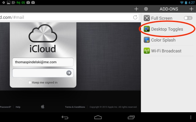
Now go to Setings->Add Ons and download Desktop Toggles:

Again in Settings, set User Agent to ‘Desktop:

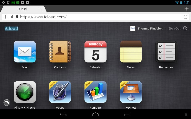
Nasty Google now thinks you are accessing iCloud from a desktop computer, not an Android device. Type in the iCloud.com address and you will get to the iCloud login screen. Login with your iCloud username and password:

Here I have clicked on the Mail icon and maybe 20 seconds later I see my native email boxes in iCloud:

All iCloud functionality is available, even Find My iPhone! Here’s the N7 displaying the location of my various iDevices – iPads and the iPhone:

Why, you could even run Numbers, Pages and Keynote, though preservation of sanity suggests there are better things to do than using a spreadsheet on a 7″ tablet. I have tested Mail, Contacts and Calendar – each takes some 20 seconds to load first time, 2-3 seconds on a subsequent try. Sluggish, but it works if you like that stock look, rather than what you get through the ported approaches to native Android apps which I illustrate above.
Part II is here.

