Category Archives: Paintings

Without paintings we are nothing

Thomas Eakins

Book review

Growing up as a lad in London I knew but three things about Philadelphia.

  • It’s the HQ of the Mob.
  • The great impressionist painter Mary Cassat was a native.
  • Photographer Thomas Eakins also hailed thence.

Well, I’m no longer sure about the first fact (I think the mob has now moved to Detroit where it runs GM), though Rocky did make out well in Philly.

I’m certain about the second, having adored Cassat since I first saw mention of her work in John Rewald’s definitive ‘A History of Impressionism’. Now famous, her work holds its own with the best. And while you are at it, check out Berthe Morisot’s canvases – another less known but outstanding painter of that age.

As for the third, I grew up knowing Eakins (1844-1916) as a photographer not as a painter. This book is one where various scholars pen chapters on aspects of Eakins’s work, so you never get bored with any one writer’s approach, and has an excellent chapter addressing how Eakins used photography as a tool in his painting. Indeed, Eakins was most secretive about his use of photographs to flesh out details in his paintings, in the face of a raging debate whether photography was art.

The book, gorgeously produced and illustrated, shows that this fine photographer was a superb painter. The idiom is uniquely American, strong, forthright, confidently realist, and his work is always memorable, as the 243 plates and 209 illustrations attest. Even if you don’t care to read the text, get the book for all those pictures.

Not cheap, it’s available from Amazon and is a splendid value.

At the beach with Eugene Boudin

The painter who taught Monet leaves an indelible impression.

Eugene Boudin (1824-1898) is more famous today as having been Monet’s mentor than as a painter in his own right.

Yet reading John Rewald’s definitive book The History of Impressionism (unreservedly recommended) some 30 years ago, I found myself drawn to Boudin’s subtle art enough to explore it more. And, as happens, the impression his work made on me must have planted a deep seed for when I started getting serious about taking beach pictures again a couple of years ago I was shocked to realize just how much Boudin’s work had permeated my way of seeing.

His canvases are invariably small and frequently in what we now think of as widescreen – a perfect match for the infinite horizons a beach offers. And while the great English photographer Tony Ray Jones saw the English at the beach in his book A Day Off with a familiar air verging on the satirical (pink skinned Anglo-Saxons rushing out for a spot of sun with handkerchiefs on their heads, the corners knotted just so, trousers rolled up to the knee for a quick paddle, no sunblock in sight), Boudin’s fascination was not so much with individuals as with how people at the beach were part of the greater landscape. His elegantly dressed ladies with parasols speak of an earlier era, true, but their placement in the canvas is what makes the painting great.

Boudin’s vision was not limited to these somewhat formal arrangements. He could really let fly when it came to man made things – take this example:

Even in his desolate landscapes, the magic is there. Subtle, it does not shout at you like some Monets may, and there’s less technical exhibitionism on show.

So here’s a small sample of some beach snaps I have taken in the past couple of years, Boudin everywhere doing his thing with my grey matter. I hope you enjoy them.

Sunhat. Pismo Beach, California, 2004. Leica M2, 50mm chrome Summicron, Kodak Gold 100.

Dune Buggy. Oceano Dunes, California, 2004. Bessa T, 21mm Asph Elmarit. Kodak Gold 100.

Umbrella. Cayucos, California, 2006. Canon EOS 5D, 15mm fisheye, ImageAlign.

High Dynamic Range photography

Not quite as new as it sounds, but much easier today.

Stumbling the ten yards down the main drag from bedroom to office this morning, I tripped on not one but two border terriers. Which is strange as, last I checked, the Pindelski estate was the proud owner of just one of these fine beasts. So either there was some serious hanky panky in the night or something else was afoot.

Now, come to think of it, yesterday was Friday night and it happened to coincide with a presentation of Steve McQueen’s superb film, Le Mans, on the big screen. Anytime one sees a brute Porsche 917 race the gorgeous Ferrari 512 is an occasion for some serious medication to calm the nerves and suffice it to say that the gin martinis were flowing freely.

Which probably accounts for the presence of that second border terrier this morning.

Sitting down at the computer and erasing all those email suggestions that I could not possibly satisfy my woman without a horse’s dose of Viagra, my first reaction was to do something more exciting like paying the bills, but I gave one of the HDR links in a clean email a passing click only to come across this page from Photomatix. When the first thing I saw was their exhortation ‘Increase the Dynamic Range of your Photographs’ I wondered whether this was some sort of spam, and that in fact this was yet another attempt to sell me performance enhancing chemicals. Look, I know I grew up in England where the average male prefers a hot water bottle to a cuddle with his girlfriend, but this was going a bit too far.

Anyway, I scrolled the little wheel on my Genuine Apple Mighty Mouse down the Photomatix page and, well, saw a revelation. What their application does far better than Photoshop can (no surprise there) is to combine three photographs, identical except as to exposure, to create a result with huge dynamic range. You now see the highlight and shadow details that were missing before. The revelatory aspect of this is that the Photomatix software does this with one click, even working on RAW files. All the photographer has to do is take three exposures, 2 stops under, correct and 2 stops over, then let the software work its magic.

Not that this is all that new. Unknown to me I have been an HDR devotee for most of my photographic life. With black and white prints it meant overerexposing, underdeveloping, then printing on a contrasty grade of paper with lots of burning in using the hands over the easel. Then for a long time, having migrated to color film, it was either displaying the slide on a screen using a projector, which confers tremendous dynamic range, or living with prints which either opted for burned out highlights or dungeon dark shadows. Once those slides could be affordably scanned in the 1990s they took on a new lease of life as dynamic range could be restored to some extent with software. Plus, while a computer screen cannot compare to a projected image for dynamic range, it’s a lot better than a print in this regard. The way I would do it is to simply use the Highlight-Shadow slider in PS, later the far better one in Aperture, and bring back the details. For example, take these two snaps of a shaving shop on St. James’s Street in London, taken in 2000 on Kodak Gold 100 negative film:

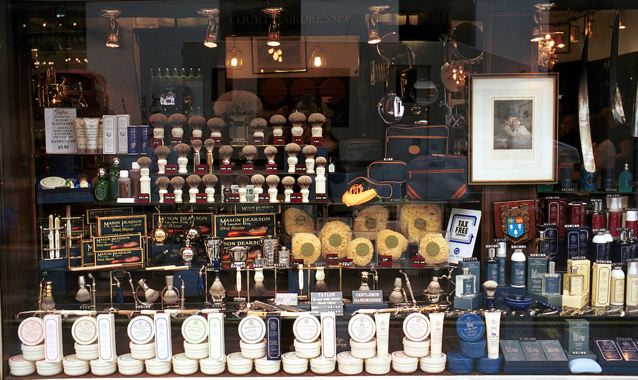
The original, scanned using a Nikon Coolscan scanner.

With Highlight-Shadow correction applied using Aperture.

There’s life in those old pictures yet!

With more recent pictures, taken using RAW in the 5D, the manipulation range is far greater. In this example, I underexposed by a couple of stops to preserve details in the exterior, then corrected exposure and used the Highlight-Shadow slider in Aperture to balance interior and exterior lighting. The Aperture RAW converter was used.

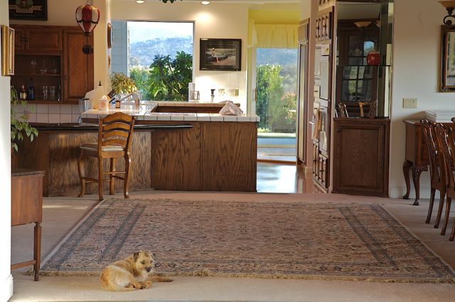
This suggests that, if I do indeed have two border terriers, one was away at the time this was snapped.

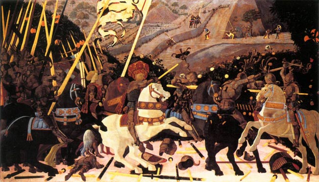
So maybe HDR isn’t so new after all. Indeed, look at what chaps like Canaletto did when lazing around Venice trying to make some coin from his oils:

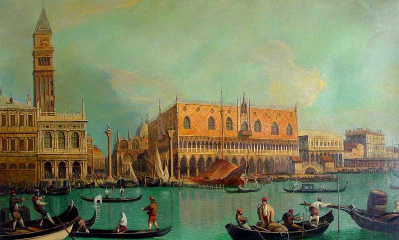
Canaletto has a go at the Grand Canal

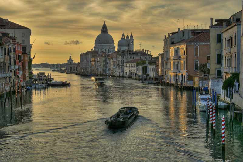
A latter day Canaletto from the Photomatix web site.

It’s little wonder that modern HDR photographs tend to look like oil pantings, as they recreate the great dynamic range that the old masters were creating intuitively. I sort of doubt that Pope Julius II would have ponied up the lira had the ceiling of the Sisitne Chapel been delivered with blown out highlights.

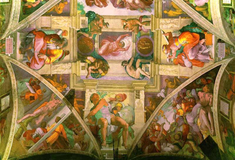
Michelangelo. The Sistine Chapel, 1512.

So Michelangelo was into HDR some 500 years ago. Clearly, he did not use Windows or he would never have finished the job.

In my early experiments with Virtual Reality photography, I mentioned the challenge posed when it came to correct exposure. To permit seamless stitching of the panorama, the camera has to be set on one fixed, manual exposure while all the pictures are taken. To do otherwise is to ask for trouble. The issue, of course, is that means the likely huge dynamic range of a panorama will results in exposure problems in some of the frames. Now it seems that the automated approach offered by products like Photomatix would cure that. True, you have to take at least three pictures for each frame and there’s a little more work to do in assembling the panorama, but cameras like the 5D allow automatic bracketing at two stop intervals – press the button in burst mode and the camera takes three pictures in one second.

So now it looks like my return trip to the redwoods will call for some burst mode under and over photography. More when I have the pano head in my hands. Which probably means my own head will be in my hands shortly thereafter.

By the way, here’s another picture where I used HDR. I wanted a picture of our home theater in daylight, to show the environment and photographs on the walls, but I also wanted the screen filled with a movie picture.

The Home Theater. Canon EOS 5D, 24-105 at 24mm, PS CS2, RAW

I simply exposed for the room, reckoning the fabulous sensor in the 5D would preserve data for the screen image, even if it would be washed out. After converting the RAW file to PSD in ACR, I used the Lasso tool freehand to highlight the screen area then used Levels to bring back the detail. Hey presto!

In search of Edward Hopper

An American painter who has inspired generations of photographers.

I came to the works of Edward Hopper (1882-1967) late in life. I say ‘late’ as I was well familiar with the great European masters while still a teenager. No, it was not until the early 1980s, when I was in my thirties, that I became aware of this American master. England was not the best place to learn about Hopper. Becoming an American fixed that.

I was traipsing up Madison Avenue on a warm summer day, when I came across what has to be the ugliest building in New York City – the Whitney Museum of Art. Whereas the Guggenheim can be thought of as an interesting building in the wrong place, flanked by stately Fifth Avenue mansions, the Whitney is just plain bad. Frank Lloyd Wright’s Guggenheim should probably be in the mid-West somewhere to liven things up (please, not in downtown Chicago which boasts America’s finest buildings) but Marcel Breuer’s Whitney is nothing so much as a wrecking ball special. Not even Iowa would improve were it to be magically moved there. In any case, the city fathers would probably reject the offer.

Enough about architecture. So I was about to shuffle past, Leica insouciantly slung over one shoulder, when the poster caught my eye. No, not the iconic ‘Nighthawks’ but rather ‘Early Sunday’ which could have been painted in any number of American cities over the past fifty years.

The lighting was just so, that languorous sun ready to turn another American downtown into a cauldron. No one in sight. It is early Sunday after all. I simply had to go inside. The art was a revelation. On the one hand it played to the manic depressive Eastern European gene in my blood. On the other it spoke to the eternal loneliness of the big city. Here was a man after my own heart. Introspection and solitude permeate his painting – emotions somewhat alien to the American soul.

Over the years since, I have gazed much at Hopper’s art and it has unconsciously become a part of me. Yet, when I press the button on those special occasions, it’s the American master dancing in my head.

San Francisco. Leica M3, 90mm Apo Summicron Asph, Kodak Gold 100

San Diego. Leica M6, 90mm Apo Summicron Asph, Kodak Gold 100

Early photographic vision

Uccello and Carravaggio had it down 500 years ago

As a boy growing up in London I lose count of the number of visits I made to The National Gallery in London. Whether going through my Impressionist period, High Renaissance or early Renaissance, there was always something there to fascinate and to intrigue. While photography had always been my first love in the visual arts, I think I learned more about seeing from gazing at the art in this great collection than from any number of photography books.

Some of these experiences left deep impressions. When asked which of the works on display I liked most, nay, desired to possess, the choices narrow to a few. Titian’s ‘Noli Me Tangere’ (1512) (Do Not Touch Me) of course. I have always been captivated by the dynamic use of diagonals – Christ, Mary Magdalen, the tree, the lovely warm light, Christ’s daring near-nakedness. You can feel the motion as he grabs the shroud to prevent Mary pulling on it. It is hard to conceive of a more perfectly balanced composition and if you think you cannot get away, as a photographer, with lampposts growing out of people’s heads, well just look what Titian did with that tree!

I have always felt that The National Gallery has way over-restored its Titians to near-Cibachrome color intensity, and that clearly shows here, but the magic of the picture saves the day.

So when it comes to lessons in composition, just check a few Titians out.

Botticelli’s Portrait of a Young Man (1485) is simply arresting. It’s one of the smallest paintings on display at 16″ by 12″ – the size of a regular photographic print. But you walk into that gallery and there’s only one thing you can see. The certainty of the gaze, the confident bearing, the red cap accent, the somewhat rushed rendering of the tunic, all to good purpose. It places all the focus on the eyes. When I first saw this – I was probably fourteen at the time – I made such a bee line for the picture that I nearly knocked over one of London’s dowager ladies in my rush. It’s that good. I frequently fantasized about pinching this masterpiece – how hard would it be to make off with a 16″ by 12″ canvas, after all? To this day the use of daylight and the way shadows model the face leave anything Vermeer did with lighting in, well, the shade.

As a photographer it is simply impossible not to like Caravaggio. Versions of The Supper at Emmaus hang in both the National Gallery and the Louvre, the diners’ ragged clothing rendered just so, the worms in the fruit on the table and, of course, Caravaggio’s signature lighting. But great as that painting is, it is simply eclipsed by The Conversion of Saul (St. Paul). In London’s Swinging Sixties the 21mm lens on a 35mm camera was de rigeur for any self respecting trendie. You saw its abuse everywhere, especially on record sleeves of the more extreme rock groups. Wild perspective, severely receding lines, objects very close to the lens, distortion galore. Well just take a look at this. Caravaggio had the 21mm figured. What is breathtaking about this canvas is how little space he has worked in. Painted in 1601 the canvas is simply enormous – some 7 1/2 by 6 feet. In other words, the horse is rendered at almost life size. Why so large? Caravaggio was a student of perspective. He knew that viewers would get too close to the painting, but that, by doing so, the grandeur of his ultra-wide angled vision would be correctly rendered and the perspective distortion would disappear. And so it does. The painting is immensely involving. You are there. Like a movie in a theater compared to the same thing on television, you have to see this live. Not reproduced.

But easily the strangest use of perspective on view in The National Gallery belongs to a visionary whose work preceded that of all the above, none other than Paolo Uccello. In 1450 he painted three enormous panels depicting the battle at San Romano in which the Florentine army defeated Siena some twenty years earlier. The three panels are some 6 feet by 10 feet in size. One (the weakest, and that’s a cruel critique) hangs in The National Gallery. The others hang in the Louvre and the Uffizi. Fitting that three of the greatest masterpieces of the early Renaissance should hang in the three greatest Renaissance collections.

Appropriately, the best hangs in the Florentine collection, but look, if you gave me the one in London I would have no issues with finding wall space for it. I assert that there is more to be learned, as a photographer, from this one painting than from any number of academic studies on the use of perspective. By the time this painting was made, artists understood the rendering of perspective well. Uccello just chose to disregard the rules, dramatically foreshortening perspective, predating surrealism by some six hundred years. The repeating motif of the lances, the purposeful abuse of sizing (look how small the dead soldier in the left foreground is), the steep, tilted, climbing background with the horsemen rendered way too large, the detritus of battle painted in seemingly random perspective. It’s magic. Simply the greatest lesson in the (ab)use of perspective on canvas.

As photographers, we have a lot to learn from the masters.

And no, I harbored no fantasies about making off with the Uccello. It’s just too big to stash under a genuine English raincoat.