Category Archives: Technique

HP DJ90 with Snow Leopard

Phew!

Long time readers will know that I use a Hewlett Packard DesignJet 90 to make large prints using my iMac. I suggested it made little sense to rush into the OS 10.6 upgrade (Snow Leopard) until many of the incompatibility issues were resolved. Indeed, Snow Leopard has already had one upgrade to address security issues since I wrote that piece.

Well, some good news. HP has released new printer drivers for the DJ 30/90/130 series (respectively 13″, 18″ and 24″ wide) as stated in this Apple Support document. This is great news for those of us using what may be one of the best ink dye printers made. While recently discontinued, I confess prints made with it today look every bit as good as they ever did! My only grumbles have been the occasional blocked printer head, easily replaced. Click ‘Printing‘ on the right for more about this outstanding piece of hardware for serious sized printing.

Update 1/2016:

There is one more benefit to keeping a Snow Leopard boot drive handy. SL was the last version of OS X to include Rosetta, the emulation software which allows Intel Macs to run PPC (IBM G3/4/5 CPU) apps. This is important if you want to run the HP online System Maintenance Utility which is coded to work with PPC CPUs only. And you really want to be able to run that utility as it is the only definitive way of identifying printhead issue, allowing you to hone in on the faulty head – see Page 3-10 in that linked PDF. See here for details.


Snow Leopard – the last great OS from Apple before the tinkerers took over.

You can still buy Snow Leopard from Apple for $20. This is not altruism or nostalgia on Apple’s part. Rather, SL (10.6) was the first version of OS X (from 10.6.4) to permit access to the AppStore wherefrom all subsequent OS X upgrades are made over the air, Apple no longer shipping OS X on DVDs. So without SL you cannot access the AppStore.

I actually use an old PPC iMac G4 to access HP’s utility but you can do just as well using SL for less trouble.

An excellent Lightroom book

Evening writes good English.

It’s now coming on for two years since I made the painful switch from Aperture to Lightroom and scarcely a day passes when I do not rejoice in that decision.

From the resource intensive Aperture (sells more ‘newer, faster’ Macs, I suppose), illogical and buggy application to one that is logical, has yet to lock-up on me and is blisteringly fast on my middle-of-the road iMac, Lightroom (I’m on version 2.4) is a joy to use. I visit some of the Lightroom blogs now and then and find I am always picking up new tips, no thanks to the lack of a proper instruction book from Adobe, as none is bundled with the software.

Indeed, to my own surprise, I actually find that after 50 years of processing pictures, I’m beginning to enjoy what is ordinarily a drudge. Anyway, a while back I decided to get a good book on the product as it was increasingly irritating to find out more or or less by accident about features that really helped the processing step along.

In selecting my book of choice, the first dictate was that it had to be written by a photographer who can actually take good pictures. Why on earth would you want to learn any skill from an academic, clueless in real life application of his expertise? That dictate promptly excluded most of the many books out there – some of these people really have no right to be preaching about Lightroom when they cannot take a well composed, decent photograph.

The second driver was that the author has outstanding communication skills.

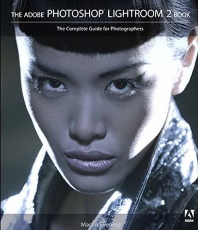
Having watched some of his instructional videos on the web the book to choose was easy – Martin Evening’s The Adobe Photoshop Lightroom 2 Book: The Complete Guide for Photographers. (Disclosure: The link is to Amazon – I get no ‘click through’ payment if you click on it. I have no position in AMZN at the time of writing.)

My main reason for buying a good reference manual, dictated by the poor quality of the materials included with the software and the generally poor Help files within LR – was that I wanted to be absolutely sure how best to integrate two catalogs of pictures. I wanted to add the one from my laptop to the master on my desktop computer. While I have daily back-ups of everything, I would rather get this right first thing than scramble to recover from mistakes by resorting to the back-up.

Evening’s book not only walked me through this in accurate detail, I found that it added value in many other areas where the apparently simple user interface of LR hides many special functions, often invoked through the use of the Alt key on the keyboard. Areas where I find real value was added include:

  • Importing and creation of import profiles specific to a camera or lens
  • Using filters to find images
  • White balance corrections
  • Sharpening – a whole chapter, much of it addressing magic simply invisible to the normal user
  • Custom profile printing

The book, at 600 pages, seems long, until you realize that much of that is the result of copious illustrations which make it much easier to follow along. I still think of it more as a dictionary – something you look up to learn from – than a tutorial, but I find I keep it at hand when processing and frequently dip in to learn a new trick or two.

It’s published by Adobe Press (I only learned this after buying it – it was most certainly not a reason for purchase) which simply begs the question why it isn’t included with the software in the first place.

Quibbles? On p. 582 Evening states “The graphics card does not play such a vital role in Lightroom’s overall performance.” This contrasts with my experience which shows that screen rendering of previously generated previews when flicking between images is considerably faster with the new nVidia 7600 GPU (256 mB RAM) in my iMac 24″, compared with that using the nVidia 7300 GPU (128 mB) it replaced. But I have no objective measurements to bear this out and it may just be the placebo effect at work as I try to justify all the time I have had to waste in repairing my faulty Apple computer.

Overall, it’s a fine manual by a real, working photographer who has had the benefit of a proper education in the use of the English language. Highly recommended.

Meet my new view camera

A Panasonic G1? Are you crazy?

I have absolutely no reservations about cropping and manipulating an original picture if it results in a better result.

Never does this apply more than in architectural photography.

The other day, making my way through the horrors of the UCSF-Mission campus in south east San Francisco, I was struck yet again by how ugly much modern architecture is. Given the incredible cost of land, bribes to officials and unions, the cost of design and materials, how much more would it take to make something beautiful rather than just another precast, soulless box? And this is on a campus of higher learning, for goodness sake, where you are meant to encourage open communication, sharing and ample leisurely exchange to help brains grow. How do you do that surrounded by architecture seemingly inspired by concrete makers and designed by structural engineers?

Gazing at the horrors around me I was reminded how Prince Charles has been pilloried over the years for his stance on keeping British architecture beautiful. Whereas he was written off as a privileged nutter with nothing better to do but gripe about buildings and talk to his daffodils, we now increasingly see him as a voice of wisdom in an ugly urban world and a pioneer of the green movement. UCSF-Mission needs him.

Back to the topic at hand, architectural photography. When I know I cannot but have leaning verticals, I make a point of leaving plenty of space around the subject as it will be needed when correcting these at the processing stage, if correction is needed.


Before and after. G1, 41mm, 1/250, f/8, ISO 100

Here the G1’s kit lens was almost fully extended to bridge a building lot in front. I knew that what I wanted was a borderless image of the multi-colored glass (a movement originated by Cesar Pelli in New York, if I am not mistaken). The lamp standard lower right was simply icing on the cake. Here’s an example of the use of modern materials in a lovely, refreshing manner, providing visual interest and harmony in an otherwise uninspiring box shape. And some of the windows actually open! Nice work.

Once the RAW original was in Lightroom 2, I exported it to PS CS2, set up a background layer and used the Edit->Transform->Perspective function with the Grid turned on (Command-Apostrophe) to aid in aligning the verticals. This corrects leaning verticals but shortens the image, squashing it vertically, so to return the correct aspect ratio to the windows I switched to Edit->Transform->Distort and simply stretched the picture vertically until the windows looked right. Finally, before saving (PS integrates with LR so the ‘Save’ creates a second stacked image in LR – nice) I go to Layer->Flatten to keep the file size small – no need for the bloat of layers in the LR catalog of images. I use a lossless TIFF format to save the PS-processed image.

So there you have the G1 as a compact view camera! Here’s the final image. It will make for a nice 30″ square print.

The Race Track improved

Dykinga was good. Edwards is better

There’s a magical place in Death Valley, Arizona and it’s called the Race Track playa.

Jack Dykinga illustrated it in his magnificent book which I reviewed a couple of years ago. Simply stated, stones of substantial mass move, magically, yet no one has ever seen this occur. I choose not to dwell on the reasons. Some things are simply magic. The Race Track is one of those.

Why not leave it there?

Well, because a fine photographer whose work I have been privileged to mention here on occasion, has done it better.

Rod Edwards, a UK professional, is that photographer and he has taken Dykinga’s work to a higher level in his rendition of that phenomenal place in Death Valley.

I have been unsuccessful in monetizing my QTVRs, much as I have tried. I would take my iBook around various wineries in central California and show them to proprietors, only to be met with blank stares. Indeed, when I had my one man show I considered including a couple of big screen TVs to better show them off, sound effects and all, but gave up on the idea based on those self same stares.

However, to Edwards’s credit, he has persevered and has been justly rewarded with a commission from Britain’s National Trust – an institution which you can best learn about from the wonderful writings of James Lees-Milne, a magnificent conservator and writer about the early years of the NT. Simply stated, the National Trust is charged with the preservation of the UK’s architectural and cultural heritage – a rare good use of taxpayer monies.

No need to dwell further on the subject – just click on the picture below.


Rod Edwards’s Race Track

Update August 27, 2014: The mystery of the moving stones has finally been solved and you can read all about it here.

Going glossy

Just doing what it takes

I have been unsparing in my criticism of Apple’s cynical move to producing only glossy screens on its displays. The thinking is identical to that of the jeweler who installs strong quartz iodine spotlights in his store. That 1 carat bauble that so impressed in the store, thanks to the Hollywood lighting, leads to a sense of dismay when viewed at home. It’s no different for Apple’s glossy screens.

So what on earth was I doing ordering glossy printing paper for my HP DJ90 the other day?


An engineering company. Note the micrometer and the Swiss manufacturer!

Well, I may dislike glossy when it comes to making and printing my photographs, but I am not beyond learning from the ace salesmen at Apple, Inc.

Simply stated, I have not submitted a photo for publication since 1977 when I left England and started getting paid for my labors in America. So great was the increase in income and reduction in tax (the top income tax rate when I left the UK in 1977 was 83% ….) that the modest amounts that publication brought no longer made sense. I could earn more the easy way and use the money to take the pictures I wanted to take, not the ones some editor preferred to see.

But the bug bit again recently and while I have no intent to make any money from getting my stuff in print (and the odds of doing so are, let’s face it, pretty remote in an internet world), my ego can now afford it. And as first impressions are 100% of the battle with photographs, when that editor opens my envelope of snaps I want them to say ‘wow’. Glossy paper does that.

So the medium, not the content, may be the message, but if it ghastly glossy paper helps get me into print, so be it. Just don’t expect these prints to be gracing the walls at home any time soon.

This is my first experience of using HP Premium Glossy. The inked areas are matte whereas highlights where no ink was deposited retain the original high gloss of the paper. However, after drying for a couple of hours the inked areas take on a good gloss, although not as high gloss as virgin paper. So it may explain why some later printers now use a glossing agent to restore high gloss to a print – the DJ90 does not have this technology.