Category Archives: Technique

Meet my new view camera

A Panasonic G1? Are you crazy?

I have absolutely no reservations about cropping and manipulating an original picture if it results in a better result.

Never does this apply more than in architectural photography.

The other day, making my way through the horrors of the UCSF-Mission campus in south east San Francisco, I was struck yet again by how ugly much modern architecture is. Given the incredible cost of land, bribes to officials and unions, the cost of design and materials, how much more would it take to make something beautiful rather than just another precast, soulless box? And this is on a campus of higher learning, for goodness sake, where you are meant to encourage open communication, sharing and ample leisurely exchange to help brains grow. How do you do that surrounded by architecture seemingly inspired by concrete makers and designed by structural engineers?

Gazing at the horrors around me I was reminded how Prince Charles has been pilloried over the years for his stance on keeping British architecture beautiful. Whereas he was written off as a privileged nutter with nothing better to do but gripe about buildings and talk to his daffodils, we now increasingly see him as a voice of wisdom in an ugly urban world and a pioneer of the green movement. UCSF-Mission needs him.

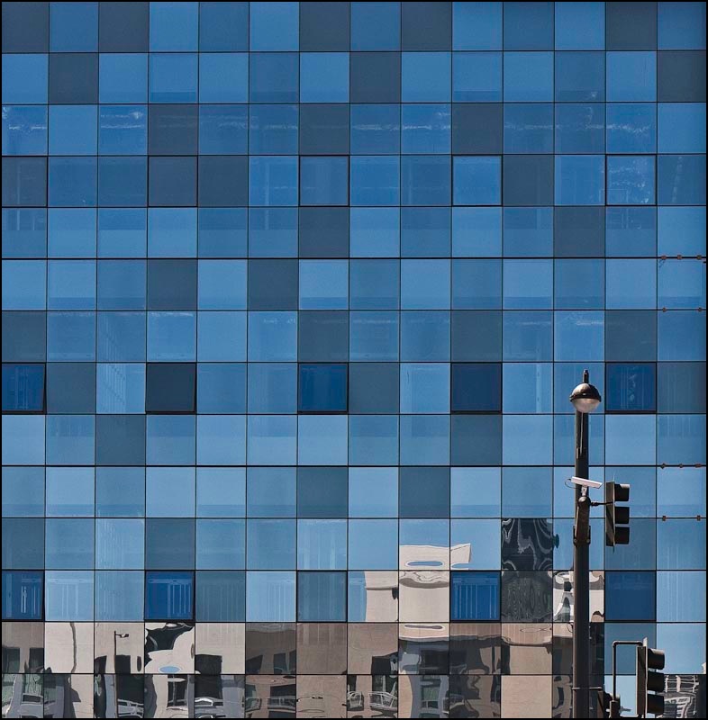
Back to the topic at hand, architectural photography. When I know I cannot but have leaning verticals, I make a point of leaving plenty of space around the subject as it will be needed when correcting these at the processing stage, if correction is needed.


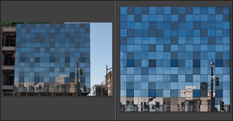
Before and after. G1, 41mm, 1/250, f/8, ISO 100

Here the G1’s kit lens was almost fully extended to bridge a building lot in front. I knew that what I wanted was a borderless image of the multi-colored glass (a movement originated by Cesar Pelli in New York, if I am not mistaken). The lamp standard lower right was simply icing on the cake. Here’s an example of the use of modern materials in a lovely, refreshing manner, providing visual interest and harmony in an otherwise uninspiring box shape. And some of the windows actually open! Nice work.

Once the RAW original was in Lightroom 2, I exported it to PS CS2, set up a background layer and used the Edit->Transform->Perspective function with the Grid turned on (Command-Apostrophe) to aid in aligning the verticals. This corrects leaning verticals but shortens the image, squashing it vertically, so to return the correct aspect ratio to the windows I switched to Edit->Transform->Distort and simply stretched the picture vertically until the windows looked right. Finally, before saving (PS integrates with LR so the ‘Save’ creates a second stacked image in LR – nice) I go to Layer->Flatten to keep the file size small – no need for the bloat of layers in the LR catalog of images. I use a lossless TIFF format to save the PS-processed image.

So there you have the G1 as a compact view camera! Here’s the final image. It will make for a nice 30″ square print.

The Race Track improved

Dykinga was good. Edwards is better

There’s a magical place in Death Valley, Arizona and it’s called the Race Track playa.

Jack Dykinga illustrated it in his magnificent book which I reviewed a couple of years ago. Simply stated, stones of substantial mass move, magically, yet no one has ever seen this occur. I choose not to dwell on the reasons. Some things are simply magic. The Race Track is one of those.

Why not leave it there?

Well, because a fine photographer whose work I have been privileged to mention here on occasion, has done it better.

Rod Edwards, a UK professional, is that photographer and he has taken Dykinga’s work to a higher level in his rendition of that phenomenal place in Death Valley.

I have been unsuccessful in monetizing my QTVRs, much as I have tried. I would take my iBook around various wineries in central California and show them to proprietors, only to be met with blank stares. Indeed, when I had my one man show I considered including a couple of big screen TVs to better show them off, sound effects and all, but gave up on the idea based on those self same stares.

However, to Edwards’s credit, he has persevered and has been justly rewarded with a commission from Britain’s National Trust – an institution which you can best learn about from the wonderful writings of James Lees-Milne, a magnificent conservator and writer about the early years of the NT. Simply stated, the National Trust is charged with the preservation of the UK’s architectural and cultural heritage – a rare good use of taxpayer monies.

No need to dwell further on the subject – just click on the picture below.


Rod Edwards’s Race Track

Update August 27, 2014: The mystery of the moving stones has finally been solved and you can read all about it here.

Going glossy

Just doing what it takes

I have been unsparing in my criticism of Apple’s cynical move to producing only glossy screens on its displays. The thinking is identical to that of the jeweler who installs strong quartz iodine spotlights in his store. That 1 carat bauble that so impressed in the store, thanks to the Hollywood lighting, leads to a sense of dismay when viewed at home. It’s no different for Apple’s glossy screens.

So what on earth was I doing ordering glossy printing paper for my HP DJ90 the other day?


An engineering company. Note the micrometer and the Swiss manufacturer!

Well, I may dislike glossy when it comes to making and printing my photographs, but I am not beyond learning from the ace salesmen at Apple, Inc.

Simply stated, I have not submitted a photo for publication since 1977 when I left England and started getting paid for my labors in America. So great was the increase in income and reduction in tax (the top income tax rate when I left the UK in 1977 was 83% ….) that the modest amounts that publication brought no longer made sense. I could earn more the easy way and use the money to take the pictures I wanted to take, not the ones some editor preferred to see.

But the bug bit again recently and while I have no intent to make any money from getting my stuff in print (and the odds of doing so are, let’s face it, pretty remote in an internet world), my ego can now afford it. And as first impressions are 100% of the battle with photographs, when that editor opens my envelope of snaps I want them to say ‘wow’. Glossy paper does that.

So the medium, not the content, may be the message, but if it ghastly glossy paper helps get me into print, so be it. Just don’t expect these prints to be gracing the walls at home any time soon.

This is my first experience of using HP Premium Glossy. The inked areas are matte whereas highlights where no ink was deposited retain the original high gloss of the paper. However, after drying for a couple of hours the inked areas take on a good gloss, although not as high gloss as virgin paper. So it may explain why some later printers now use a glossing agent to restore high gloss to a print – the DJ90 does not have this technology.

Picture Packages

A useful Lightroom technique

When I make large prints on the HP DJ90 dye printer, it’s usually strictly a ‘one at a time’ sort of thing. The prints are 18″ x 24″ (‘Super A4’ is the uninformative European description), which is as large as my HP will go and, after an obligatory 24 hour ‘drying’ period to let the ink dyes set, they are dry mounted and framed.

However, with my new found determination to get some work published again, smaller prints were called for – 9″ x 12″- and these just happen to divide an 18″ x 24″ sheet into four equal parts.

Rather than cut up the paper first and then do four print runs, it proved just as easy to make one combined print job and do the cutting last.

First I went into the Library module of LR2 then clicked on Library->New Collection. I dragged the candidates into this new collection and oriented them all vertically (Photo->Rotate Left/Right). These candidates had been processed and cropped just so, so that no further adjustments would be required.

Into the Print module of LR2, where I clicked on Tempate Browser->Lightroom Templates->2×2 Cells. Lightroom comes with this template installed. Moving the mouse cursor to the base of the screen to disclose the filmstrip – which I have set to hiding mode so it is ordinarily invisible – I simply highlighted four contiguous images, which then appear on the print ‘canvas’.

The screen now looked like this:

Then it’s off to the races, printing in the usual way. It takes a lot less time to do than to explain and you have the benefit of applying the same print settings to all pictures on the ‘canvas’. Of course if you process the originals poorly, then you may end up with four clunkers, but I seem to have lucked out.

Note the personalized nameplate at the top left of the Lightroom pane in the last picture above. You can do this by going to Lightroom->Identity Plate Setup.

At the grocer’s

Amazing what you can find when you try seeing

I really do not like pineapple. Too tart and acidic for my constitution, yet I was struck by the incredible complexity and beauty of the fruit at the local grocery store.


5D, 100mm Macro, ring flash at f/8, 4 images, Helicon Focus Pro

So I picked one up (carefully!) and took four differentially focused snaps, stitching them in Helicon Focus.

The ring flash head was half covered with black tape to add some modeling.