A number-blind nation’s output.
One of the most obvious ways to economic success is to do the difficult thing, meaning you study math, or chemistry, or engineering at school. Not English or Poetry. While the latter are doubtless noble aspirations their result is that all you are qualified for is to turn out …. more English and Poetry scholars. Neither avocation creates wealth for you or the nation.
And capitalist society is expert at avoiding doing the ‘difficult’ thing, given its desire for instant and easy gratification. Be it passive activities like TV or watching sports, vicariously living the experiences of a highly paid athlete, we are simply being passive consumers, creating no wealth in the process. And the alternatives to creating wealth are easily seen in Africa or North Korea, like it or not.
In Western societies the passivity of populations and their general unwillingness to study difficult subjects is seen daily in macro economics. (In Asia, by contrast, the pure and applied sciences are revered). Had consumers learned one iota of math or finance, the housing bust would never have happened. Predatory lenders would have been short of suckers to buy their criminal products. Liar loans would have not seen the light of day and borrowers would have looked at prospective cash flows in the light of rational expectations for income and expense and made objective, informed decisions as to whether a home and loan were affordable.
So continuing yesterday’s aerial theme, here’s a truly exceptional image from Google (presumably taken by US taxpayer-owned satellites, which makes it especially poignant) of the greed that results from number blindness. It’s of a halted residential real estate development off the I75 freeway in Florida on that state’s central western coast – you know the once pristine one now covered with BP’s crude oil. No great photographer was involved, just a passive drone designed and launched by the same people we denigrate as nerds and mad scientists, which we so sorely lack. They make them in copious numbers in India and China but, being the smart people we are, we refuse them entry. It wouldn’t do to actually enhance the gene pool now, would it?
Take a careful look. This development just stopped – the plots at the upper right have pads but no homes. The others, I would bet, are empty or in foreclosure.
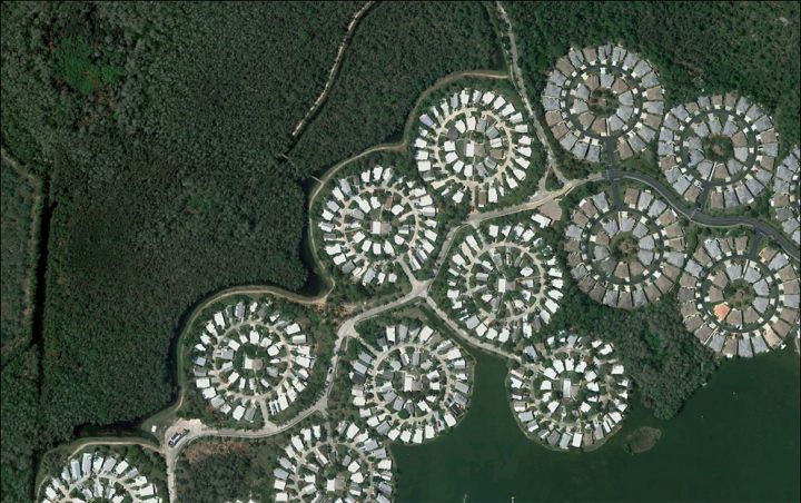
Greed as Art. Stalled real estate development in Florida from Google.