Lightroom 3 distortion correction

Better and better.

I mentioned the addition of vertical and horizontal distortion corrections when first taking a look at some of the new features in Lightroom 3.

I have been using these quite a bit recently and find that my round tripping to Photoshop is greatly reduced (hooray!), limted to only the most dramatic distortion correction needs.

Here’s a case in point. Taking the original I had no choice in the matter – the cafeteria’s sign could only be shown against the skyscraper’s backdrop withsome serious tilting of the camera and as I couldn’t even get in line with the sign the whole thing is off kilter to boot. Anticipating that I would want to make some pretty serious corrections when processing, I zoomed to a wider than required lens focal length, as corrections will cut off much peripheral details.

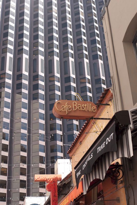
To correct this I first rotated the image a few degrees clockwise so that the keystone distortion was evenly distributed. Then I simply used the Lens Corrections->Manual->Vertical slider, adjusting it to -35 degrees. LR3 shows you a handy grid to preclude having to guess when your verticals are really vertical. A quick tweak on the Clarity and Saturation sliders and I was done.

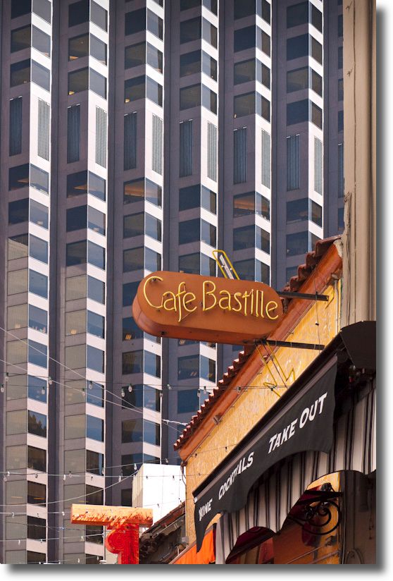
G1, 1/500, f/5.6, ISO 320, kit lens at 25mm

It takes far less time to do than to describe and is a feature which adds significant value to Lightroom 3, especially if you do not want to spend the large amount asked by Adobe for Photoshop or, if like me, you dislike Photoshop with a passion. (Part of that emotion, I confess, is an admission of incompetence!) A related benefit is that your Lightroom catalog suffers no data bloat if you avoid the PS roundtrip, as all the correction settings are stored in a small sidecar file, unlike the TIFF or PSD monster that PS will foist on you when you save it back into your LR catalog.

Bankster lawyers

Plotting their next coup.

How do I know these people are lawyers?

Because their clients do not deign to carry their own papers whereas lawyers still have to. Plus, they get to charge for it.

G1, 1/250, f/5.6, ISO 320, kit lens at 17mm.

Spotted commandeering the sidewalk in San Francisco’s business district the other day.

The Tadich Grill

165 years and counting.

San Francisco is blessed with several traditional eating places in the financial district which date from the days when men were men, drank two large Bloody Marys for lunch and women were not welcome.

The standout is the Tadich Grill on California Street which remains standing at its original location despite an earthquake or two, the Great Depression and Jimmy Carter. If you can survive that lot your future is likely assured.

As you can see, the city has grown up around it but the Tadich Grill remains stubbornly unchanged.

G1, some messing with perspective and processing in LR3

A lucky break in traffic and a mysterious absence of parked cars allowed me to snap this yesterday on a simply glorious, sunny San Francisco morning.

The regulars would have it that the place is not what it once was. After all, women are now not only admitted, they are now served as courteously as men.

So what if the market went to hell in a hand basket yesterday? Like a real man I was manfully short, if you get my drift.

Tips for the Daguerrean

From Stanza.

I count no fewer than four book readers on my iPad:

  • Apple’s iBooks – best UI, lousy title selection
  • Amazon’s Kindle – improving UI, huge title selection
  • Border’s – a work in progress, but promising a large selection
  • Stanza – the nerd’s choice, with easy access to 30,000 books on Project Gutenberg among many others

I was noodling through Stanza on my iPad (also runs on a Mac) and came across this intriguing 1849 book on the Daguerrotype process:

And some details:

Seems to me that advice is as pertinent today as it was in 1849. Maybe more so. And you are unlikely to find such elegant writing in any modern tome on electronic this and digital that, whose authors’ written skills generally stop at “click the mouse”.

So if you want to discover your inner Daguerrean, download the free app and book and give it a shot!

By the way, I’m using the gorgeous Georgia font in the above illustrations – Stanza has a large selection of fonts and colors, more than any other reader.