Neither fish nor fowl.
The other day saw me with many accumulated ‘free’ shopping points on Amazon Prime, courtesy of a couple of years of ordering home delivery of groceries during the pandemic (I cannot speak for other states, but Arizona shoppers interpret personal freedom as a right to infect and get infected, dropping masks at the first opportunity, making the supermarkets places to avoid) so I thought I would buy myself a toy.
I no longer have any interest in traditional bulky, inept cameras which lack dozens of the features and capabilities of the iPhone, and the iPhone 12 Pro Max has been my ‘go to’ camera since it was introduced. So a new camera was out. By the way, that iPhone too was more than ‘free’, paid for with the proceeds of all the MFT and FF DSLR hardware.
So I sprung for an iPad Mini, the current 2021 model.
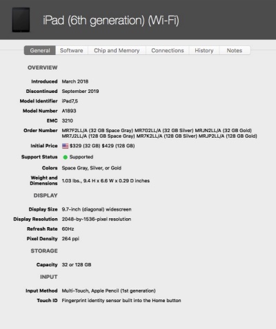
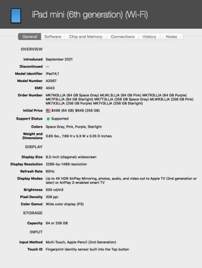
iPad 9.7″ A1893 and the iPad Mini A2567.
I rather think what pointed me in this direction was mention by a friend that saw him with a colleague who whipped out the Mini from his jeans’s back pocket. While I’m not into accidentally sitting on devices, if that can be helped, the idea was planted. And yes, the Mini does indeed fit the rear pocket of a pair of genuine Levi 501 button fly jeans perfectly. Heck, it probably fits the counterfeit pair made in Turkey which are gracing your bottom as I type.
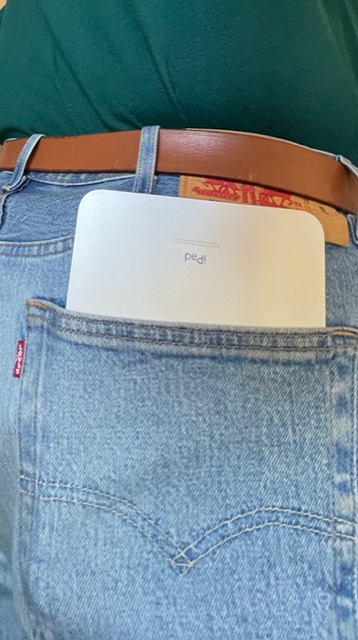
In my Levis – nearly put my back out getting this shot …..
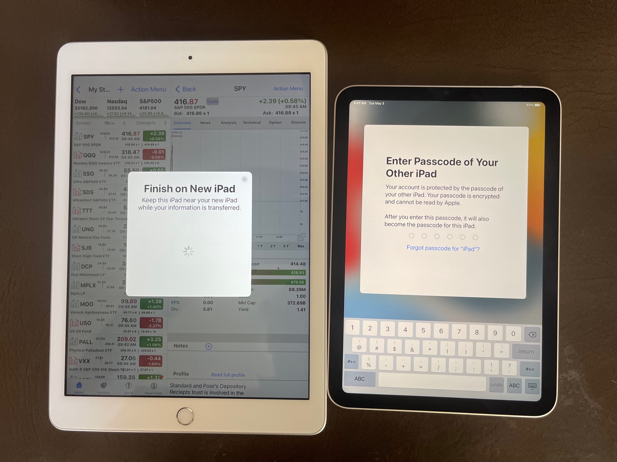
Setup is trivial. I simply downloaded my iPad’s data and apps from the iCloud where I have a monthly backup plan running all of $3.23. But you can just as easily transfer everything from your current iPad. Apple could not improve on this painless process.
On a more serious note I have given up on the Kindle as a reading device having had three fail over the years. They cannot be repaired. Disposable tech at its worst. I read a good deal and while reading on the iPhone 12 Pro Max has been nothing but a joy – light, superbly engineered, nice screen size – the thought occurred that maybe a slightly larger screen than that in the Kindle without the bulk of the full sized iPad would be nice.
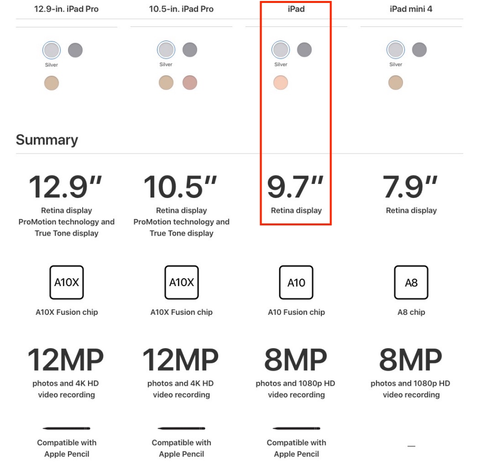
For comparison, my iPad is the 6th generation model, now discontinued. The screen is 9.7″ diagonal and the device remains perfectly fine for reading, composing blog entries, noodling with stock charts and the like. The iPad Mini has a screen area 27% smaller than the full size device. Here are the comparative specifications for the iPad and the iPad Mini, courtesy of MacTracker:
Specifications.
While the older iPad adopts the rounded edges found on iPhones through the iPhone 11, the 2021 iPad Mini has the square profile ones found on the iPhone 12 and later. They make for decent single handed holding, provided you have long fingers which can comfortably span the device. Mine do, but only just. The Mini could be 1/2″ to 1″ narrower for maximum comfort. Here are the weights:
- iPhone 12 ProMax, with bumper – 8.6oz
- iPad Mini – 10.3oz
- iPad 6th gen – 16.5oz
Reading using the Kindle app, there is a very noticeable drop-off in brightness at the edges. Enough that it’s irritating, and frankly inexcusable on so costly a device. I measured it at two stops, which is unacceptable – like a 1970 era wide angle lens before computer generated design improve things. Not visible in other apps. Why have no ‘expert’ reviewers remarked on this? (Answer – because they do not read. Most are besotted with puerile games). By comparison, my sixth generation iPad shows no such drop off. Also, auto color temperature management renders a slightly warmer image than the full size iPad.
I fitted a stick on loop strap to aid in holding the Mini when reading in a prone position. There are many styles on Amazon, and it helps when reading sprawled on the sofa, the Mini held up in the air.
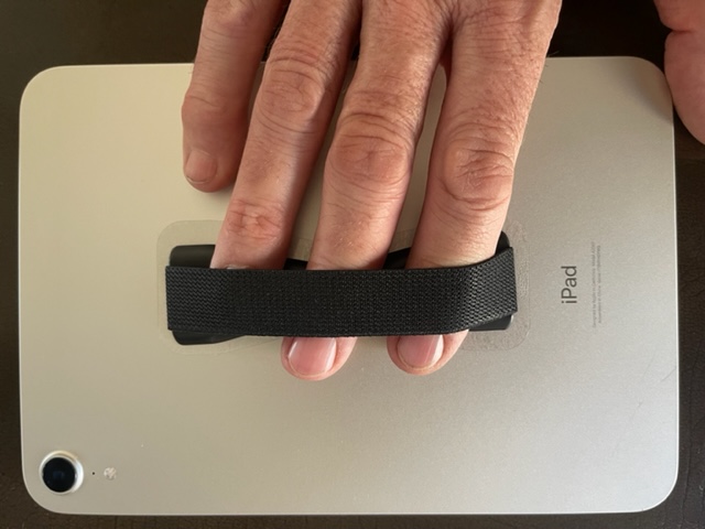
For easier prone reading.
For those who like long reading sessions while sacked out on the sofa, this is an essential addition to the iPad Mini in my opinion, especially if your hands are small as you will have difficulty spanning the rear to hold it up.
While the screen can be very bright in room lighting, it remains useless in direct sunlight. Only the Kindle works well there. Screen definition is outstanding, by the way.
Apple chintzed on the screen coating and deleted the oleophobic coating on the iPhone which is really good at fighting fingerprints. No that big a deal but at the price asked that is really cheap of them. There’s Apple for you. Always squeezing those profit margins.
Conclusion:
After a period of hard use I confess that I think the iPad Mini is very poor value for money, especially if you already own a large screen iPhone. The best use case I can think of is if you have a small screen iPhone and no iPad and wish to read a lot. But, in that case, a full-size iPad might be better and the base model is certainly cheaper.
Perhaps the biggest surprise is that it’s not meaningfully easier to read on the Mini for lengthy periods than on the iPhone 12 Pro Max, and the Mini’s management of font sizes, even in native applications like Apple Mail is poor. The native fonts tend to be too small so you go to Settings->Accessibility to adjust them, whereupon the screen displays frequently become a mess.
The implementation of TouchID to sign in with your fingerprint is also quite strange. On the full-sized 9.7″ iPad you simply hold your finger over the big home button at the base of the screen. With the iPad Mini you have to lightly touch the fairly small and narrow on/off switch at the top right of the device. It’s counterintuitive, so much so that Apple was compelled to add a flag below the button when TouchID is called for. Sure, it’s very fast, and I’ve given it a week to see whether this is just a problem with being comfortable with what I know, but I still come to the conclusion that it is a poor design. Fingers do not react well to small, narrow touch surfaces. Indeed, programming fingerprints for this small area button is a chore as the finger(s) has/have to be repositioned many times for all of the fingerprint to be recorded.
At the recommended retail price of $500 it’s just greatly overpriced. I paid $400 plus tax (AMZN special) and I still think that is $150 too much. At the price asked, the device should, as a minimum, include FaceID and a lot more memory. For comparison the current base iPad retails for $329, uses a fast A12 CPU from the iPhone X (and the Mini is indeed very fast, using the A15 CPU from the iPhone 13), and seems priced about right. How a device with a smaller display and battery can cost 60% more than its larger sibling is hard to understand.
One positive note is that I have not found the modest memory capacity of 64 GB to be a limiting factor. It’s half of that in my full size iPad (the current base model chintzes yet again, as the memory is just 64gB – what is it with Apple and gouging for memory?), but I really do not need very much for my purposes which include reading, blogging, the occasional stock market chart, email and so on. There is absolutely no purpose in using the camera if you have a modern iPhone.
If there is a consolation it is that mine was “free“ as I bought it with those accumulated Amazon shopping points. I’ll lend it to my son to see if he likes it. If he does, it is his. If not, it’s out of here. Save your money. If you must have an iPad, the base model at $329 is an excellent value by comparison.