Monthly Archives: July 2005

Quality Time with Ansel

It must have been back in 1999 when good fortune caught me staying at The Inn on Spanish Bay just up the road from the links at Pebble Beach. Few places offer more breathtaking vistas and opportunities for relaxation. When you next stay there, I greatly recommend the squid special, black ink and all, and that bagpiper chap playing at sunset, praying a gust of wind will not disclose all.

Anyway, as is the wont of ladies in overpriced neighborhoods, my better half went shopping (ouch!) while I strolled the few yards from the front door of the Inn to the grandly named Weston Gallery. A very sincere young man, schooled in the world of sales, immediately buttonholed me and asked my interest. I did not have the heart to disabuse him of his evident belief that Ansel Adams should replace at least one, maybe two, members of the Holy Trinity, so rather than saying ‘Anything But Adams’ I ventured that I rather enjoyed American landscape photography of the west. Noblesse oblige, and all that.

Well, drat, it didn’t work. I was marched over to the Adams Collection, the salesman doubtless eyeing my less than pristine Levi Button Fly Shrink to Fit Jeans, and wrongly concluding that I was another in a long string of Silicon Valley venture capitalists off for a day or two to blow some serious coin. Sadly not the case. Yes, it must have been 1999, for memory suggests that 2000 was not the happiest in history for Silicon Valley, and I was feeling pretty happy at the time, pre-ticker shock.

Now, I first began to smell a rat, nay a giant size capybara, when this smug twit pulls on a pair of cotton gloves, proffering a matched set to me. Now I know that parting photography collectors, excuse me, investors, from their hard-earned dough requires something akin to surgical precision, but I was a tad confused as to what the devil I was to do with these gloves.

Kind of when a friend asked me to belt up in his racing Cobra. I looked at the darned belts with confusion, having seen nothing like them before. “Standard Simpson racing belts” he intoned with the bored air of one who has seen it all before. Do I knot these things together or what? I remember thinking. Only when he made a dive for my crotch – a troubling moment indeed as I never suspected he was one of Those – did I realize these things come up through the legs and buckle together from all directions over the very part my old mum used to afford me sustenance through before I first saw this wonderful world.

Anyway, being offered those cotton gloves caused that same momentary look of fear to cross my face. Was I going to be asked into a dimly lit back room next? Mercifully, El Twit donned his by way of example so I dutifully followed suit, making nary a complaint that my fingers were about two inches too long for what was offered. Discretion, in this case, was surely the better part of valor. I think I sort of pulled it off by affecting an air of insouciance while struggling in a manly way with the wretched gloves.

So there we are, The Twit and I, standing in the Weston Gallery, cotton gloves and all, when he starts pulling prints from a drawer. Each, you should know, was some 5”x7”, matted with acres of white and separated from its neighbor with a sheet of something. Acid Free, I was immediately assured Oh! says I. No hallucinogens in this joint, even when it comes to the price tag. Bother!

Now much as I would die happy never seeing one of these again, there they all were. Half Dome, the fake Moonlight Hernandez (you know, the one taken in broad daylight with poor old AA spending hours dodging and burning in his darkroom, but forgetting to get rid of the shadows cast by the gravestones in the bright sun), the one of Bridal Veil Falls, the absurdly over-filtered Monolith, and many others I shudder to recall. You would think the purifying qualities of monochrome would at least filter out the worst lapses of taste, but Adams managed to hurdle that barrier with supreme ease. Can you say Monochrome and Garish in one sentence? Because, believe me, seeing these ‘originals’ made me realize he had accomplished something his books only hinted at. Loud Monochrome. How so poor a collection of over-manipulated fakes could manage to fit in one drawer boggles the mind, but El Twitto was saving his best, his killer sales line, for last.

“And here Sir is our finest masterpiece from the Ansel Collection”. Needless to say, it was yet another print of Half Dome. But wait a minute, how do I break it to this chap short in grey matter that the print was yellowed and faded? Now I liked the look – at least half the garishness had almost disappeared. “Seems a bit different from the one you showed me earlier”, I offered. “Yes, Sir” responds the sycophantic nonentity, “this print was made by Mr. Adams himself, no less”.

“Oh”, says I, “How do you know?”. Well, that was a bit like calling the Queen German. It may be true, but it is not said in polite company.

“Sir, please”, he intoned, wrist held just so, “It’s our job at the Weston Gallery to know”.

Well, in true civilized manner, I quickly steered the conversation to the weather and isn’t it really lovely here and where would you recommend for dinner?

Sadly, he wasn’t buying it. “Well, sir, what do you think of the Ansel print?” A familiarity available only to those who have never met the famed subject of their dreams. “At $15,000 we think it very attractively priced for an investor like yourself who obviously appreciates fine art.” And to think I could get the really garish one for a mere five large.

Now you must understand that this Weston Gallery is not a place to admit to color lightly. White walls, El Twitteroony all in white, white flowers even. When you see that much white you know sticker shock cannot be far behind. Nonetheless, the vivid shade of green I had just acquired contrasted quite nicely with the foul yellow of this appalling print held in Twitterino’s becottoned manglers.
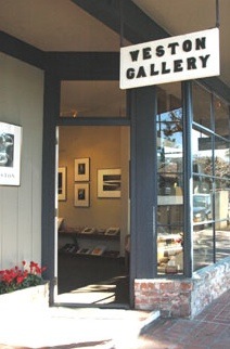

Home of The Twit

So I quickly pulled out that old line which is a curse to salesmen everywhere. “Oh! it’s really quite special, I agree, but let me check with the wife and get back to you”. The power of agency. Always blame someone else. I would love to, but…. Look, I Really love it, but the old ball-and-chain, you know. Got to check with the little lady. Can’t rob the grocery money. So I leg it out of there, shedding cotton gloves right and left and quite possibly setting a new World and Olympic record for the 100 metres.

Why, oh! why, do fully half of all art photographers want to imitate something so bad? Have they not the courage to recognize poor darkroom work and worse photography when they see it? Or is it just the comfort of hordes? Don’t rock the boat and no one will notice. The way to fix art photography? Ban all cameras from Yosemite.

Look, if you love Adams’s work well and good. Ask yourself why and don’t expect everyone else to.

If all else fails, Make Mine Monochrome.

It’s high time we got off the ‘Monochrome is Art’ bandwagon and learned to use Color.

When I was a kid growing up in London, all I used in my Leica, representing some 95% of my worldly assets, was Tri X. Monochrome film. Easy to buy, easy to process, lots of exposure latitude for my wonky exposure meter and not least of all, very macho. Every street ‘shooter’ (that foul word had not yet been applied to photographers) used Tri X. It was a rite of passage. The quirky fellows with the strange odor used HP3 and HP4. You avoided them.

But none of these was the primary reason I used monochrome. The real reason was that it was cheap and cheap was all I could afford. The idea that you could use color never entered my mind. Economically prohibitive and why would you want color when street work dictated monochrome? Why, could Brassai, Kertesz, Cartier-Bresson and Erwitt all be wrong? Of course not. They were Masters. Gods, beyond criticism. Look to points west and further confirmation that Monochrome was Where It Was At could be readily obtained from its American boosters. Adams, Weston, Cunningham, Callahan, Stieglitz, Steichen, the list goes on and on. And while one or two of these would eventually venture into color, they would forever be known for their black and white work. Their subject matter might be the landscape and the nude, but their vision was monochrome. Goodness help us. A monochrome woman….

Then a couple of strange things happened. A great British photographer named Anthony Armstrong-Jones popularized the idea of very grainy pictures, in black and white, of course, whether in his fashion magazine work or in social commentary pieces. Another great British photographer named Sarah Moon, who wisely chose to make Paris her home, followed up on the idea when GAF/Ansco introduced its wildly grainy GAF 500 color slide film. Suddenly, in this world of Seurat redux, pointillism was back and all wrinkles and imperfections disappeared into a gentle haze of colored dots. But there was a photographer far more important than either of these, as regards the history of color, and that photographer was Eliot Porter.

Porter was a devotee of color almost from the beginning, most famously garnering Ansel Adams’s scorn for his adherence to this new medium. Porter, not a voluble man, famously said “I believe that when photographers reject the significance of color, they are denying one of our most precious attributes – color vision.” Porter may not have changed our view of landscape photography, but his vision of the beauty and infinite complexity of nature changed the way we see. If we care to see.

Let’s just make a seismic shift, for a moment, to the mathematical work of Benoit Mandelbrot. Quoting from his paper presented to the Society for Chaos theory in Psychology and the Life Sciences, presented at Berkeley in June, 1996:

“Fractals, as all present know, are irregular geometric objects that yield detail at all scales. Unlike Euclidean, differentiable, objects that smooth out when zoomed into, fractals continue to reveal features as more closely regarded. Fractals also have “self-similarity” which, in one meaning refers to the presence of parts that resemble the whole, or to the continual repetition of a feature. Benoit Mandelbrot not only invented the term fractal, but advanced the position that fractal geometry is the geometry of nature. Eliot Porter, the nature photographer, upon reading of Mandelbrot’s work, realized he had been taking pictures of fractals in nature for decades. To promote the point, he produced a collection of photographs for a book titled Nature’s Chaos “

I do not doubt that there is no more important body of work, when it comes to our fundamental appreciation of nature and of color photography, than that of Eliot Porter. Porter made color respectable for the art photographer. It is that simple.

OK, back to the simpler world of situation comedy, beer advertisements and SUVs.

Now it’s time to ‘fess up.

Take one of your color pictures, you know, one of those not good enough to boast about, but not bad enough to throw away. A decent but not a great picture. You know the one. We all have many to choose from. They are the bane of us photographers. Too good to lose, too bad to print, the result being that we keep the disk drive manufacturers, the album makers, the storage sleeve specialists in business for no good reason other than, were we brutally honest, we would simply throw these mediocrities away.

OK, so you are a sane modernist. You may not have gone the whole digital hog, but you are smart enough not to waste time in a darkroom, preferring the civilizing light of nature. You prefer, in other words, Porter’s world. You scan those mediocre negatives and ruminate over them in Photoshop. Now that insanely complex application happens to have a ‘Desaturate’ option in one of its many tediously detailed menus. Don’t fight it. It’s under Image->Adjustments->Desaturate. Click. Yes, Siree Bob!, you have made monochrome from color. Gold from dross. Art from a snap.

C’mon. Admit it. You have done it. Or you have thought about doing it. Because Monochrome is for artistic simpletons. Two dimensional thinkers too constrained in their cages, too bound by convention, too attuned to mediocrity, to think that anything other than black and white, B&W, monochrome, sepia, platinum toning, etc., etc., can be Art.

I think back over five hundred years of painting. From Ucello and Giorgione, via Raphael and Velasquez, through the Impressionist and the Fauves, to the modern day. Not one, not a one of them painted in monochrome. Why? Because there was no cost difference and because patrons regarded monochrome as the province of the poor. The dictate of the sketch. The conté crayon drawing. The pencil rendition. The idea for a painting.

So stop fooling yourself. You can no longer justify it, as I did, on grounds of cost. The very fact that you are reading this on your computer places you in the top 1% of the world’s income bracket. You can afford color. But your excuse is simple. I Am An Artist, you say. What you mean is that you are not good enough for color. Because you cannot handle it. It’s just one variable too many as you avoid making the effort.

Color is hard.

But, as Porter reminds us, color vision is one of our most precious attributes.

Really Large Prints

Big is good.

Something wonderful can happen when the print is much larger than seems reasonable.

Apropos my toe in the water of large format photography, I found myself in a gallery of photographic prints in one of the many charming coastal towns near my estate in central California. A pleasant ride some 25 miles away on Highways 46 and 1, especially on a fine German motorcycle, no excuse is needed for a trip on a summer’s day.

This particular gallery is home to the work of just one photographer, with content limited to the Large Landscapes of the great American West. Now I do not particularly care for his work, hence my reticence in identifying the spot. However, befitting the grandeur of those vistas, the prints on display are truly huge, as large as anything seen outside the world of the delivery trucks used by the supermarket chains, replete with 10 foot high tomatoes.

What makes the prints apparently larger than they really are – sizes range up to 40” x 60” – is that the gallery space is fairly long and narrow, making it difficult to stand far back enough to make the whole thing in. Thus, you are forced in close. After the first shocked reaction at the sheer size of the prints, one starts to realize they are really quite effective in conveying some of the grandest landscape anywhere. California, Arizona, New Mexico, Nevada – this is landscape writ large. Who knows what Wagner might have been inspired to write were he a Californian….

There is a mixed reaction of techno-shock – My Goodness, those things are Sharp! – and the deafening sound of early warning bells – How Gauche! – to so over-enlarge a photograph. Large format photography is at work here.

Now the old estate is amply provided with large expanses of walls the better to display art. True, you are more likely to encounter a Seurat or Degas sketch on its walls, maybe some noodlings by Matisse, a Rothko here and there, but that’s in no way a commentary on the world of the photograph. Show me a good one and up she goes. Amazingly, I found myself revisiting the gallery in question several times, once with my three year old whose power of appreciation and observation I value greatly.

So what do these very large prints have to teach us? Simply this. They are involving. Once you get over the shock of their sheer size, you find yourself drawn into the landscape. You are one with it. You step back, pushing against the opposite wall to try and grasp the whole. You step in and wonder at the fine filigree of leaves and branches and grasses which define the whole. You ruminate on the wonder that is nature.

Anyway, this experience a few months ago, spurred in no small part by my boy’s repeated ‘Wows’ in the gallery, caused me to make an upgrade in the default print size I adopt when showing my work to friends. For as long as I can remember that has been 8” x 10”. Why on earth 8” x 10”? Lethargy. Laziness. Lack of original thinking. Because they make it that way. Because it (used to) fit the print washer. Because the ink jet handles it easily. Because the computer is fast processing it. Because mattes come in the right size inexpensively. Because frames are available anywhere.

Ice Cream. Mamiya 6. A Really Large Print.

So for the past few months I have disciplined myself to make one 13” x 19” print every day. OK, OK, every other day. My excuse is that that’s as big as my printer will make. Not large by the standards of that gallery but Boy, oh! Boy, you should see the look on friends’ faces when you hand them one.

Go ahead. Keep it! Now you have a memento, not just a photograph. And is that not why we take pictures? To make something lasting?

Try making some Really Big Prints really soon. Once you get over the technical challenges maybe you too, like my three year old, will say Wow!

Film is Dead

This article was written just about the time Canon announced the first ‘affordable’ full frame digital camera, the EOS 5D. Unknown to me one would feature in my future, confirming the facts set forth below.

For an index of all my Film related articles, click here.

Film is dead as sure as the LP is dead.

Wake up! Smell the coffee. Don’t fight it.

Digital is better in every way known to man. Think about it. The medium is all of ten years old. We are already debating, frequently acrimoniously, whether the latest 16 megapixel Canon beats medium format.

It started as a joke. One megapixel was a big deal and guaranteed you a crappy postcard print. But it was chic. You could see the result even before you printed it. Take that, Edwin Land! Take that, Polaroid!

The apocryphal story has it that Edwin Land invented the Polaroid process when his little daughter asked why she could not see the picture right away. It didn’t hurt that he was a world class genius constrained only by the mediocrities around him. Further, he was an American, which meant that being a world class chemist/physicist/engineer was not enough. He had to be a world class capitalist, too, and that means making money from his brilliant invention.

If you are over forty and reading this, you will remember the thrill of that first Polaroid. If you are over 50, you will recall pulling apart the monochrome negative and print, wondering about what we now know as metamerism (it had a strange bluish tint when tilted to the light), extricating that foul smelling pink sponge (it had to be pink. Pink is jolly. Ask the cast of Funny Face, made about the time Land was busy being brilliant). Carefully spreading the goo over the print you made it permanent. But Edwin was not content. He had to go the whole hog, so he made it happen in color. Now you separated negative and print, studiously avoiding the deadly caustic chemicals produced and, hey presto!, a dry color picture with no need for the chemical, carcinogenic goo.

A great American photographer made a wonderful career from Land’s genius, taking huge, I mean huge (4″x5″ was a snapshot for her) Polaroids of quirky subjects. Queer sailors, lonely city dwellers, assorted losers, bizarre low key still lifes. Marie Cosindas was the real thing. An artist who saw an outlet for a new technology and capitalized on it brilliantly.

But Edwin was not done. Or maybe that hellion of a daughter simply would not leave him alone. Why have the silly, pungent, dangerous, useless negative, he wondered? Why not, why not, have the print emerge magically from the camera, powered by a disposable motor, blank as a politician’s intellect, and then, magically, proceed to appear in broad daylight for all to see. And he did it. Without a doubt, George Eastman’s ˜You Take the Picture, We do the Rest” had been well and truly one-upped. For any photographer who has slaved in a darkroom, surrounded by smelly chemicals, stuff dripping on the carpet, this was the civilized white man’s gin-martini variation on the heretefore put-upon-minority-digging-for-diamonds-in-a-South-Africa-mine darkroom worker’s wonder at the emerging print in the developing tray.

So, for a while, those who could afford it wondered at Land’s surpassing accomplishment. They were all American, needless to say, having not only the funds to afford the film (like Gillette, Land believed in virtually giving away the cameras to secure the income annuity from the supplies) but that great thirst for immediate gratification that the Founding Fathers had ordained were the American’s birthright. Life, liberty and the pursuit of immediate gratification. And pursue it they did. Edwin Land and his Polaroid Corporation were, deservedly, King.

But Kodak had bigger fish to fry. Or, more accurately, a larger weight of fish to fry, even if the average fish was a minnow, economically speaking. So they struck back. Big Yellow saw that they could not compete on speed – Are you nuts? You want to beat 60 seconds for instant gratification? – but they could compete on price. With reasonable speed. If Mrs. Middle America, 2.4 kids and a Chevrolet, could drop off her film with Johnny on the way to school on Monday and have 36 perfectly foul, unfocused, ill exposed, prints back when dropping off same Johnny on Tuesday, why she could get over the delay when it meant 25% of the cost compared to Mr. Land’s Magic Machine. That could be reserved for the nouveau riches and the Old Money in Greenwich, Park Avenue and Atherton.

So Polaroid died. Not before winning what was then the world’s largest patent infringement fine in 1985 from, you guessed it, Kodak, who had stolen Land’s technology in a pathetic attempt to beat the master. But sunset was in sight for both businesses by then. Polaroid was just too expensive and the Greenwich Dames lost interest and reverted to riding their horses and attending society lunches. Kodak was King once more. Add the Instamatic and its many variants, which made it easy even for the average inpatient at the local loony bin to load a camera and take a well exposed picture, and you had market domination.

By 1985 Kodak, too, was in deep doo-doo. Throughout the 1960s and 1970s you could buy Kodak film just about anywhere on the planet in a dizzying array of formats: Minox, 8mm, 16mm, 35mm, 828, 127, 120, 620, 4×5, 5×7, 8×10 and larger. Nor was the choice of emulsion compromised, with such great names as Panatomic X, Verichrome, Plus X, Super XX, Tri X, Kodachrome, Ektachrome, Vericolor, all standards in their class. Add imaging products for the medical and scientific worlds and a vast selection of chemicals and papers to render the image real, and you have a stunning exercise in world domination. Competition? Well it was a fly on the proverbial elephant’s rump. Adox, Agfa, Ansco, Ilford, Orwo, Perutz and many others held, in aggregate, a share of the market that was little more than a rounding error. Kodak’s products were indecently good when the lack of real competition is considered.

Students of the American stock market will readily remind you that there were 20 stocks in the Dow in 1900. Only one survives today. General Electric. And good old GE dropped out for a while there on account of a little thing known as bankruptcy. Not conducive to a NYSE listing. But the folks at Kodak were poor historians. Why, they reckoned, our founder may have done himself in, gone the hari kari route, smoked the old gun barrel while tugging on the trigger, but we are King. We invented You Take the Picture, etc. We invented Kodachrome. Hell, Hitler was photographed on Kodachrome. Two Jewish violin players who liked to take snaps and happened to be chemistry geniuses, invented Kodachrome. National Geographic would not publish your stuff if you did not use Kodak film. Not for nothing was the producer of film in Rochester, New York, the Company Town, know as the Yellow God. And, ironically, it was a Kodak engineer who invented digital imaging – Steven Sasson – but the heck with him, the Kodak Board decided. People will always use filom.

What the folks at Kodak refused to recognize is that Everything Changes. A disastrous string of CEOs, guys who committed grand larceny every payday, did a superb imitation of the ostrich, disregarding the world around. First, they missed Fuji which, as is the Japanese habit, started making gold after an extended period of dross. Then they missed digital. By a whole decade. Just think. In 100 years, there will be no Microsoft. A consummation devoutly to be wished. No GM or Ford (OK, 30 years in their case). No Democratic Party (everyone will be rich). And no film. But Kodak did not see the world’s biggest technological revolution coming. There would always be a Kodak. A yellow box assuring quality, consistency, availability.

History will judge whether Kodak awoke in time. They only missed the first ten years, after all. But something tells me the film makers of tomorrow will hail from points east of Madison Avenue and will be named Sony, Hitachi and China Somethingorother. Because film, dear photographer, dear consumer, dear searcher for instant gratification, is about as dead as the dodo.

Don’t fight it. It has had a good run. One hundred years and counting. The first records lasted forty years. The LP 30 years. The CD must be about done at 20 years. So film did OK. But it is dead.

Sure, some poorer economies will struggle on with film for a while, but don’t reckon on opening any new processing plants in China. Having gone from no telephones to cell phones in one generation, why think that the world’s fastest growing consumer society will not do the same with photography? And where do you think all those digital cameras and storage media are made, anyway?

Digital has achieved 60, 70, 80%, go figure, of the definition/sharpness/dynamic range of film in ten years. Ten years! And the consumer gets 1,000 or more shots on a ˜roll”. And they are free after the camera is purchased (assuming he values his time at zero, which is reasonable in most cases). And it is irrelevant, dear advanced photographer, what you think as you are not the market. The consumer is the market and he wants things now. Plus he gets to take 3 pictures a second of revolting Aunt Minnie, the one with killer halitosis who doesn’t give a monkey’s how the snaps come out but only that she can see them before she finally kicks the bucket and gives the funeral parlor some well deserved business.

Too bad Kodak didn’t retain her as an adviser.

Crop it Good

You hear this sort of thing a lot from academics and pseudo-intellectuals. The Alfred Rosenbergs of the photography world. Sadly, unlike Rosenberg, they remain alive to propound their mealy mouthed tripe in an earnest attempt to earn what modest living their lack of intellect affords them. It goes something like this:

“No great photographic artist every crops his originals when printing, knowing that true greatness in a photograph can only be attained when the original visualization is rendered truly and uncompromisingly on photographic paper. To crop is to destroy the integrity of the creative process.”

Often this codswallop will be followed by a reference to Cartier-Bresson whose prints are so intellectually honest that they often include the surrounding frame of unexposed film. What art. What genius.

What utter rubbish.

Given that the sole purpose of an art photograph, as opposed to a commercial one, is to provide aesthetic satisfaction for the viewer, it is irrelevant whether the spectator sees all of the frame or just a slice. The only thing that matters is that the photograph works.

Look at any picture. Crop it with your hands or your mind’s eye this way and that.

Now pretend that you never saw the full frame original. Who is to say that any of the crops is better or worse? The reality, of course, is that the photographer should crop for effect and choose the best possible crop to display his art work.

The academic rule is even dumber when you think that the same effect can be largely accomplished by simply placing a longer lens on the camera. I print it full frame using a 90mm lens on the camera versus cropping from the original taken with a 50mm lens. No difference, maybe except for definition and grain. But the first picture is sacred as it is uncropped, whereas the latter is garbage as I broke a cardinal rule of academia.

All of which goes to confirm that Those Who Can, Do whereas Those Who Cannot, Teach.

Crop away. Keep cropping until it looks good or move onto the next original. And if you really want to fool them, why not can add a frame depicting the unexposed film, with film manufacturer of choice, in Photoshop. How intellectually dishonest of you.