Yearly Archives: 2011

Luna-Tik

A great gadget from Kickstarter.

I mentioned earlier that I had subscribed to one of the first Kickstarter projects, a machined watch band/holder for a sixth generation iPod Nano, turning the iPod into a neat watch. Kickstarter raises small amounts of capital from interested investors using the web and puts the monies to use in building entrepreneurs’ projects once sufficient funds are raised.

I subscribed to the Luna-Tik watch band project for kicks, and because I had a sixth generation iPod nano lying around largely unused; my iTunes mostly reside on an iPhone when portability is required so the iPod, a gift, remained unused.

A later Kickstarter project I also subscribed to is raising money to publicize the works of a newly discovered 1950s street photographer, Vivian Maier, and I think we can expect many more like this. It’s an effective fund raising mechanism as it can reach large potential audiences of prospects at low cost and make books etc. of the works of photographers affordable, where the cost of a speculative print run would be high and the outcome too speculative. Cartier-Bresson can sell advance print runs. You and I cannot.

The Luna-Tik just arrived and a few words on its form and function follow.

The iPod Nano is an awful device for photo display owing to its diminutive screen size but is just right as a modern, large, macho watch. The two piece alloy case is beautifully machined and the soft rubber wrist strap has a large range of adjustability, meaning anything from our 8 year old to generic American-obese fits. Four recessed Allen head screws hold a hidden inside threaded post and as the latter is not captive – meaning it rotates freely – two Allen wrenches are provided to allow the screws to tighten the casing around the Nano, one wrench acting as a counterhold. A captive inner post would have been a better idea, making assembly easier and requiring but one Allen wrench, but this is a minor criticism. The whole thing took our 8 year old five minutes to figure out and assemble.

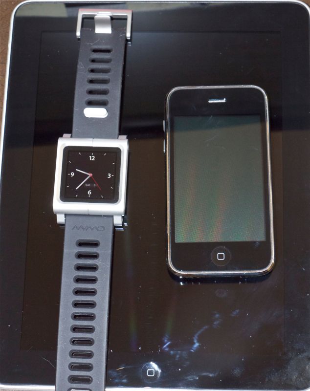
The Luna-Tik and the iPod. The clock face can be changed to a white background in ‘Settings’.
Note the movable strap retainer just above the watch face, set for maximum strap excess for small wrists!

Fit and finish is 1950s Leica quality, meaning beautiful machining and finish, with no sharp edges. The seam is about 5/1000th inch misaligned on mine and you can actually see that in the photo above; there is insufficient play to get perfect alignment before snugging up the Allen screws. A bevelled edge at the seam would have done a better job of hiding the inevitable Chinese mass production imperfection, as well as making the bevel a design feature, much as a bevel is used in the iPad’s frame. My iPad’s alloy frame, for reference, displays a variation in the relative positioning of the glass touch screen of 3/1000th inch around its periphery. For both the Luna-Tik and iPad that’s still a lot better than the fit and finish of all but the best Leicas, the engineering quality standard – meaning M2, M3 and M4 models made 1954-1965, after which quality control went to pot and prices went ballistic. (Earlier screw mount bodies were positively awful by comparison as the many I owned attest).

The generous length rubber wrist strap on the Luna-Tik comes with a movable retainer so that excess strap length can be clipped in position just so. Way superior to the usual loop retainer. Both the iPod’s volume buttons and power switch on one side and the recharging/data port and earbud socket on the other are easily accessible and the whole thing, once assembled, oozes quality and contemporary looks. The ‘watch’ is large, immediately qualifying the wearer as a Formula One groupie.

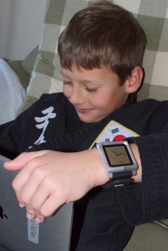
Future Formula One Champion Winston models the Luna-Tik, while racing on the iPad.
The white watch face is on display here. Strap retainer function is just visible.

Congratulations to the inventors at Minimal, Inc, for a great product. If you want one you had better rush as the iPod Nano sixth generation will be replaced soon by this year’s design. There may be cheaper alternatives to the Luna-Tik but I doubt there are any which are better made. There’s a neat informational video here.

This model of iPod was conceived with watch use in mind as it can be set to come up with the analog watch face when powered up. Handy. The inventor is contemplating adding a Bluetooth earphone option which will make for a neat wireless mobile music system.

Disclosure: I own one Luna-Tik, have no interest in Minimal, Inc. and love entrepreneurs.

Claes Oldenburg

Getting tired.

I recall the first time I saw one of Claes Oldenburg’s public sculptures. Union Square, NYC, 1981. It was a toothbrush some seven stories tall. Or maybe it was a corn-on-the-cob. I forget. After a while these giant daily objects all meld into one. Rarely has the old dictum “When you have seen one you have seen them all” been more true.

The best that can be said for these huge ‘sculptures’ – a denigration of the noun – is that they can provide opportunities for amusing pictures but if my apartment faced one I would likely turn to a life of crime, procure some high explosive and rig the thing in the middle of the night.

Sometimes they are placed well away from homes, like the Cupid Bow and Arrow on San Francisco’s Embarcadero. It’s mildly amusing in a gauche sort of way, sufficiently isolated to prevent it from becoming an eyesore and, after a while, I imagine one walks past it without noticing. Wit, whimsy and lightness are strangers to the Oldenburg school of public works.

Cupid’s Bow and the Oakland Bay Bridge, Embarcadero, SF. G1, kit lens @ 14mm, 1/4000, f/6.3, ISO320.

Oldenburg’s works are now to be found in every big American city, the municipal planners proving yet again that one of the key dictates of government employment is a total lack of original thinking and a wild disregard for the wise use of taxpayers’ money.

But the other day I did come across a neat piece which had everything Oldenburg’s lugubrious works lack. Humor, lightness and smart placement. And not a taxpayer cent involved. This pair of martini olives shaped into a heart with a swizzle stick denoting Cupid’s arrow, can be found in the forecourt of a restaurant not a thousand yards south of Oldenburg’s charmless bow and arrow. And it really works well.

Martini olive heart. G1, kit zoom @ 23mm, 1/1250, f/4.7, ISO320.

MoMo’s restaurant is located at Second and Townsend Streets in San Francisco and I wouldn’t go there to order girlie drinks, if I were you.

Green

A sort of theme.

It’s not that I go out with specific themes in mind, but doing the chore of keywording in my LR3 library the other day I was struck by how often monochromatic green subjects feature in my snaps. So it was a matter of moments to make these into a Smart Collection, sorting on the keyword ‘Green’ and a few seconds later I had a handful worthy of publication. Here they are:

Greenwich Village, NYC, 1983. Leica M3.

Ojai, CA, 1991. Leica M3.

Morro Bay, 2005. Mamiya 6.

Laguna Seca, 2005. Canon 5D.

Paso Robles, CA, 2004. Canon 5D.

Filoli, CA, 2006. Canon 300D.

Half Moon Bay, CA, 2009. Panasonic G1.

Mission District, San Francisco, 2010. Panasonic G1.

Columbus Avenue, San Francisco, 2010. Panasonic G1.

Mission District, San Francisco, 2011. Panasonic G1.

I guess you could say green is my favorite color!

Moderne

A last flowering of beauty.

Before America embarked on yet another of its unending wars in support of the military industrial complex (though in fairness to the Land of the Free, while this may have been the last hot war they won the cause was not oil but freedom) the movement known as Art Deco came to its final fruition in the variant most often referred to as Moderne.

Any fan of late ’30s movies, especially musicals, will get an eyeful of Art Deco with its sensual curves and light touch. Moderne took this to a new high, incorporating nautical themes and yet cleaner lines. Few buildings illustrate the style better than the Portside building on the Embarcadero in east San Francisco.

The Portside Building at 38 Bryant Street, San Francisco. G1, kit lens @ 31mm 1/4000, f/5,4, ISO 320.

Portside overlooks the east bay and sees morning fog as often as not. For reasons which quite defeat me it is placed immediately under the Oakland Bay Bridge, and while the latter discloses far less of the Art Deco beauty abundantly on show in the Golden Gate on the other side of town, the period is the same. Portside was actually completed in the 1990s and is a recreation of the original Moderne style, seldom seen in San Francisco. Nothing wrong with recreation – you can bet the windows fit, there is modern air conditioning and the interior is silent as the grave according to HKS, the architects responsible. Still, I’m not sure I would want to blow a seven figure sum on a condo here knowing that the bridge above awaits temptation in the guise of the next major earthquake. ‘Penthouse, open sky view’ rather loses its appeal.

Penthouse view of the Oakland Bay Bridge. G1, kit lens @ 16mm, 1/320, f/7.1, ISO 320.

On Two Wheels

A new eBook.

If you are going to ride on two wheels there are some cities you definitely want to avoid. London, for one, where it’s always raining. Rome, where it never rains but every car driver is a homicidal lunatic. And Amsterdam where you will, likely as not, be run over by another bicyclist.

But bring your bike to San Francisco and, so long as you avoid the hills and the attendant coronary, your chances of having a good time are pretty solid, for this is one of the friendliest cities for two wheel transportation in the universe.

You see them everywhere, in every size and shape. They live in the city or pour in daily on the BART or the Caltrain. They park just about anywhere they like, free, and if you want to ride your bike on the sidewalk, have at it. The cops are too busy with their donuts and coffee to care.

The author on the BikeCam, with the Panny G1 in San Francisco.

To download the eBook just click the picture. The file is under 4mB in size and is optimized for the iPad; load it from one and you will have the option of opening it in the Books app. It also shows fine on laptops, and well on all but the largest desktop screens. The image sizes have been constrained to limit file size and to keep download times short.

All snaps taken in San Francisco during January, 2011.

To see how this eBook was made, click here.