More Duchamp.

On Broadway, east of Columbus Avenue, San Francisco.
Nikon D3x, 35/1.4 Sigma.

More Duchamp.
On Broadway, east of Columbus Avenue, San Francisco.
Nikon D3x, 35/1.4 Sigma.
Sidewalk statue.

Montgomery Street, south of Broadway, San Francisco.
Nikon D3x, 35/1.4 Sigma.
Afternoon sun.

Pollard Place, just north of Broadway, San Francisco.
Nikon D3x, 35/1.4 Sigma.
Has to be done.
Why bother cleaning your sensor? If you produce more than one picture in a blue moon your choice is simple. You can retouch dust blobs in your images in your favorite photo-processing application, once per image, or you can clean the sensor once and do a minimum of retouching until it is time for another cleaning. Determining whether to clean your sensor manually is a function of how many pictures you publish and of what your time is worth.

While my Nikon D700 had a ‘sensor cleaner’ built in – an ineffectual mechanism which applies ultrasonic waves to the cover glass over the sensor, a process which could not wipe dried snot off a sheet of ice – it really was not much better than the sensors in the D3x and D2x when it comes to keeping them dust free. Neither of those bodies has a sensor cleaner. For a more technical reading check here for confirmation of the general uselessness of in-camera sensor cleaning systems.
Stop the lens down, take a snap and sooner or later you will see blobs in large expanses of continuous tone – skies are especially sensitive to this. And releases of oil from the camera’s internal mechanisms onto the sensor will only be spread with the ultrasonic treatment. What’s that? You think your precious Leica does not leak oil? Have you checked the road outside your house recently? Every machine which uses oil leaks it.
Forget blower brushes. These are an excellent way of blasting grit around the mirror box right onto those oily bits and represent an effective way of making matters much worse. Vacuum is the answer, not a hurricane, but sticking the hose from your Dyson or Hoover inside your silly-priced Leica M Monochrom is likely going to suck out the sensor and any dirt with it …. no more dirt, but a trip back to the Fatherland.
What is called for is wet cleaning. Well, moist cleaning.
One thing should be clear – you are not cleaning the light sensitive pixels in your sensor. Every sensor of any design, whether it has an anti-aliasing filter (most) or not (Leica M8, Leica M9, Nikon D7100, Nikon D800E, etc.) has a sheet of protective glass between the pixels and the lens. That is what you are cleaning. It’s not that fragile. We will be using isopropyl alcohol (poisonous to drink) at $3 for a pint, enough for about a thousand cleanings. UK and Benelux readers are recommended to use unflavored vodka, the higher proof the better, as they can take a shot when contemplating the grey skies outside when the process is done. Of course, they will run out of cleaning solution much faster.
You can pay your camera’s manufacturer $$$ to do this task, lose the use of your camera, expose it to the tender mercies of UPS (twice) and still have no guarantee the job will be done right. That’s if you ever get your camera back. You can buy a sensor cleaning kit for some $50 which comes with twelve swabs and magic cleaning solution, which has to be God’s way of telling you you have more money than sense, especially when you use up six of the swabs first time out.
Or you can use Dr. P’s low risk, fast and free method and have the job done in 20 minutes, tops.
You need to concoct a tool which prevents the application of excess force to the sensor glass. No, not that rusty old file from the cardboard box in the basement. Not that the sensor glass protective plate is that fragile, but the cack-handed amongst us can be guaranteed to overdo it. Behold Dr. P’s force-buffered, auto adjusting sensor cleaner.
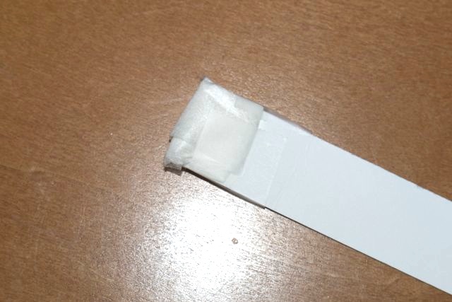
It’s comprised of two pieces of a regular business card just under 1″ wide (for full frame; make it narrower for APS-C or MFT). The end consists of a multiple-folded piece of lens cleaning tissue, attached at the base to the business card with Scotch tape. Do not use Kleenex – loaded with perfumes and grease and abrasive as heck, it’s a sure way to ensure that you will be sending the camera for service.
First, take a picture of a distant plain object like the sky at the smallest aperture of the widest lens you own. That will bring any sensor dirt into sharp focus.
Next step is to get the swab moist, not wet. Soak a piece of clean, laundered handkerchief in 91% isopropyl alcohol from the drug store, then dab the swab in the handkerchief until you can both see it’s moist and smell the alcohol on it. Do not dunk the swab directly into the alcohol. Moist and wet are diverse concepts. We want moist. Fold up the mirror in your DSLR, remove the lens, insert the swab and swipe across the width of the sensor, flip the swab and repeat. You are pressing hard enough to see the business card bend, not break. If you press too hard the business card will simply break (hence the reference to ‘force buffering!’), limiting the force you can apply.
Wait five seconds for the alcohol to evaporate, down with the mirror, then on with the lens and take another picture. If you need more than five seconds to see the evaporation completed, your swab is too wet. (Readers in England are recommended to use a white wall at home for the picture as it will almost certainly be raining outside).
Now load both snaps into something like Lightroom which will permit before:after comparisons and take a look. If there’s still some dirt there, repeat. There generally is.
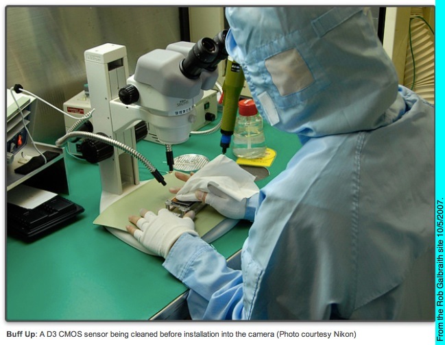
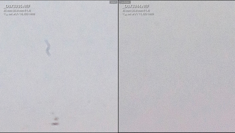
My D3x was simply filthy and needed five or six passes. More crud than crooks in Congress. Better to do these passes one at a time than go into an abrasive frenzy while your swab dries and becomes a fibrous hell. The less you clean, the better. It’s called wear.
To find dirt quickly and to also make it more visible, watch this excellent video.
Here’s the result – Before and After – from identical sections of D3x files, greatly enlarged:
Why does dirt build up on sensors? I discount the oft quoted reason that dirt gets in when lenses are changed, unless you are doing this in dust storms in some hell hole south of the Mason-Dixon during tornado season. I have had dirt build-up even when the lens has not been changed – Canon 5D, Nikon D700, D2x, D3x – makes no difference. It certainly is not squeezing in via the lens mount. The particles are too large. Some lenses – the Canon 24-105 L is one of the worst – act like a dust pump when zoomed, blasting environmental dirt into the mirror box through the zoom mechanism. Don’t believe me – take the lens off, and zoom it holding it to your face. Feel the rush of air? Lousy design, improperly vented.
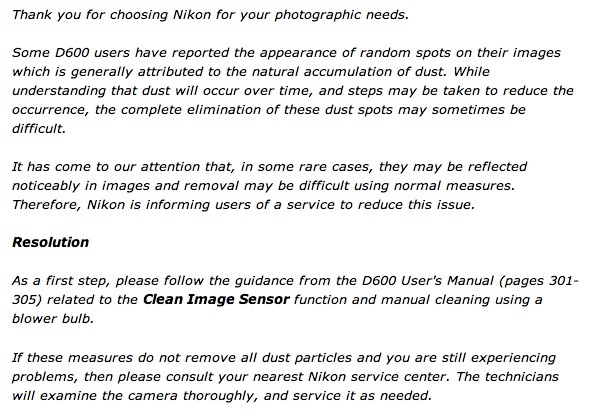
Other causes seem to be sloppy manufacturing processes. Recent reports of the Nikon D600 show dirt build-up with no lens changes, getting worse and worse during the first five thousand or so exposures. Clearly bits of loose material, and excess lubricants left over from the manufacturing stage are being freed up with use and the typically negatively charged sensor is attracting them in the electrostatic hell between lens and sensor. Witness the fact that D600s lose this problem once well run in and cleaned a few times. Motto: Fire off a few thousand ‘wall shots’ at home before using your new D600. Great. Advice to manufacturers: Stop poncing about with inept ultrasonic vibrators and positively charge the protective glass plate instead.
The Panasonic G1 and G3? Never had a problem in years of use and some 20,000 exposures. The sensors in neither have ever been cleaned and realize that these files are enlarged four times as much as files from a full frame sensor, so dirt really shows. I have changed lenses on these bodies with no special precautions on the street many times. Maybe Canon and Nikon could learn something from the fellows at Panny? And guess what? The Pannys have no flapping mirror doing anything up to 10 gyrations a second and flinging oil and detritus around.
It’s not like Nikon et al are new to screwing up with lubricants. Ask any owner of the 55mm f/2.8 Ai-S Micro-Nikkor, made during a long production run from 1979-2006, if he or she has had problems with gobs of oil appearing on the aperture blades. Yup, wrong choice of type and/or quantity of lubricant.
Here’s Nikon’s pathetic D600 sensor advisory, written by some schmuck liability lawyer who wouldn’t know integrity if it whacked him in the chops and whose job it is to help his employer lie and cheat:
Here’s the top secret internal memo from the head of engineering to the C Suite:
“Dudes, we messed up royally. The damned accountants cut so many QC steps from our manufacturing to enhance margins that we had to let our Betty go. She was the babe who mopped up all the excess oil inside our gear before we sold it to pikers. Look, no way we can ‘fess up to this. The liability costs would kill us. We all know these bodies are not really meant to do 8fps but it sure makes for good advertising copy. Let’s just keep a low profile and maybe only one or two come back for cleaning and we can simply say it was operator error. No risk from amateurs and we have the ‘reviewer’ set in our pockets.”

First and last images – Nikon D3x, 35/1.4 Sigma.
Incarcerated.

At 24th and Lilac, San Francisco.
Nikon D3x, 35mm f/2 pre-Ai Nikkor.