Category Archives: Paintings

Without paintings we are nothing

More on aspect ratios

A fascinating subject.

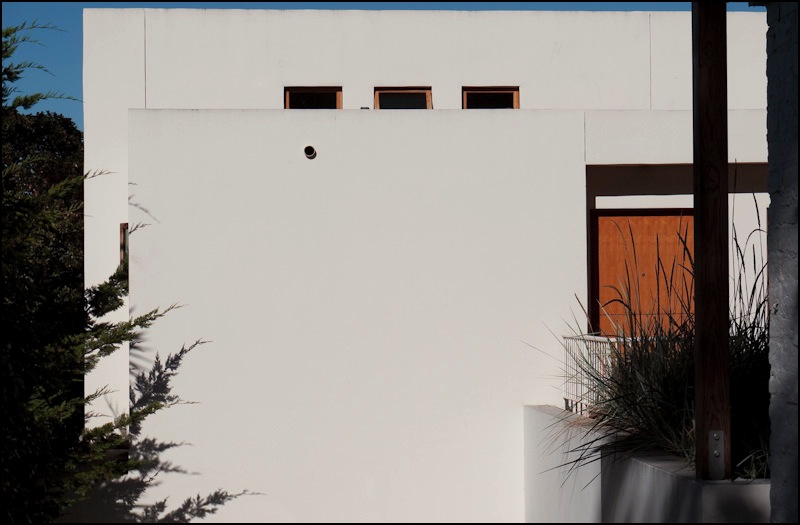
Some three years ago I wrote a brief piece on Aspect Ratios after acquiring my Panasonic LX-1 which came with a widescreen 16:9 picture option.

While 30 years with film Leicas has me pretty much convinced that 3:2 is the best for me (and that’s what I use most often on both the LX-1 and the G1; the 5D is, of course, 3:2, take it or leave it) a recent email from a reader got me thinking about the subject again.

Peter writes:

A subject that has annoyed me forever is the disconnect between common print and frame sizes and the aspect ratio of the most broadly used cameras.

The most common size for enlargements and frames is still 8×10. What percentage of photographers do you think are still using 4×5? How obscure is 11×14?

The move from 5×3.5 to 4×6 took hold just as digital was coming in at 4×3. And why 4×3? Because cathode ray tubes for TV were that size and could be used for early computers. As a fan of 16:9, I pretty much have to crop anything that needs to be printed.

Peter, by the way, typically views his digital pictures on a large screen LCD TV which, of course, is 16:9, consonant with the widescreen format used by most moviemakers today.

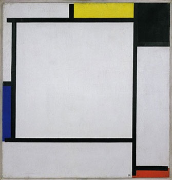
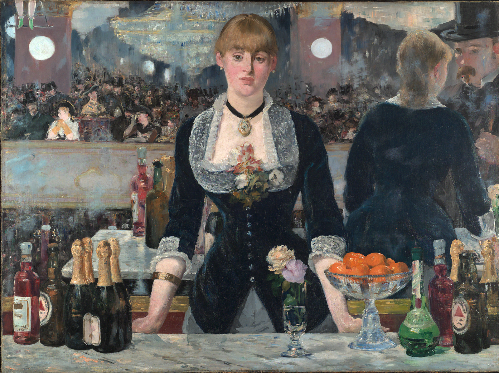
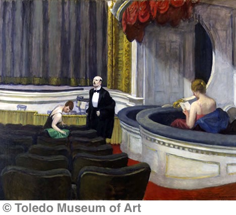
Rather than dwell on photographs, I thought it might be fun to pull twelve favorite paintings from memory and take a look at their aspect ratios, so here they are, in no particular order. These have been in my mind’s eye for, what, 45 years (I am 58)? With the sole exceptions of the Raphael and Uccello, both of which are carefully posed, all the others share an almost photographic snapshot vision, never more so than in the two Degas examples. No surprise, really, as that’s the way I tend to see things. To keep matters simple, I show the aspect ratios in the order longest side: shortest side, regardless whether the format is portrait or landscape:

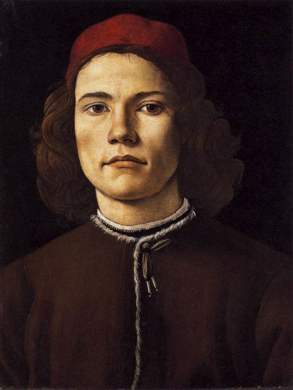
Botticelli – Portrait of a Young Man – 4:3

Degas – L’Absinthe – 4:3

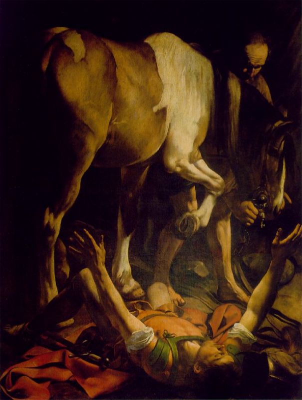
Caravaggio – The Conversion of St. Paul – 4:3

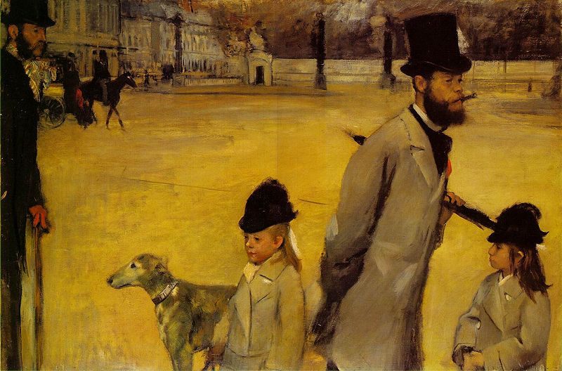
Degas – Place de la Concorde – 3:2

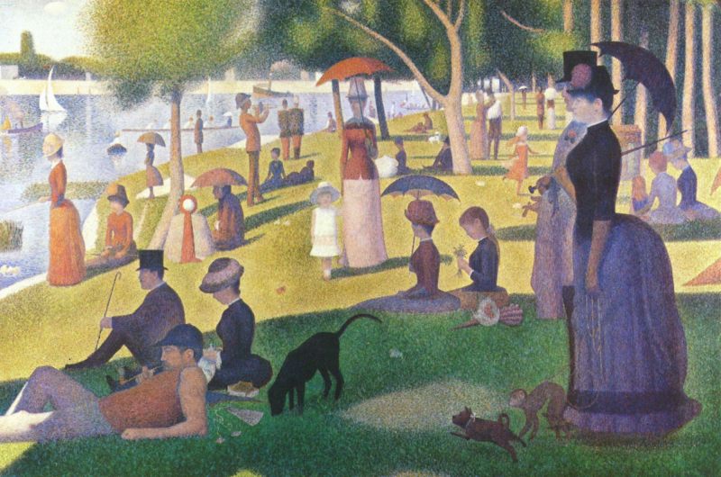
Seurat – La Grande Jatte – 3:2

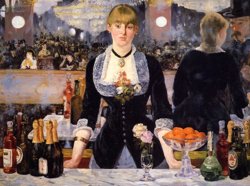
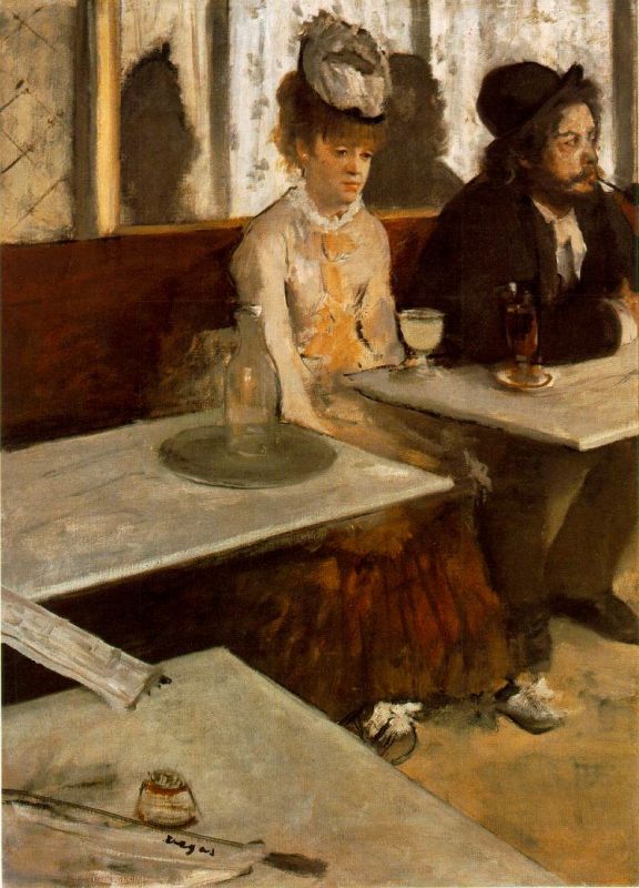
Manet – A Bar at the Folies-Bergere – 4:3

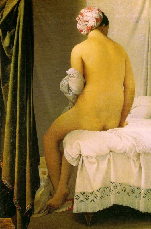
Ingres – Bather – 3:2

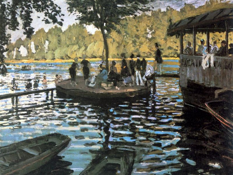
Monet – La Grenouillere – 4:3

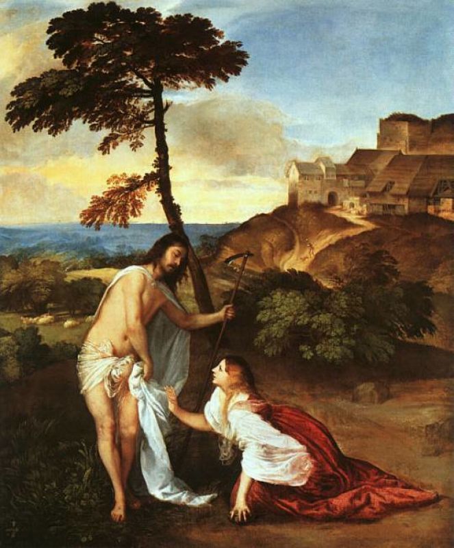
Titian – Noli Me Tangere – 5:4

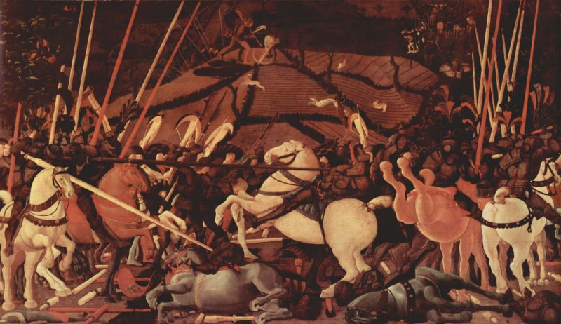
Uccello – The Battle of San Romano – 16:9

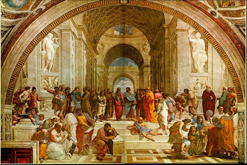
Raphael – The School of Athens – 3:2

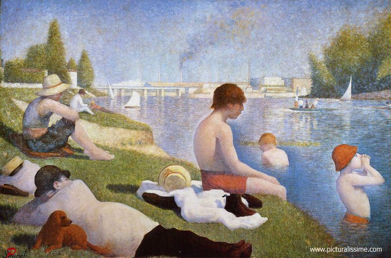
Seurat – Baignade – Asnieres – 3:2

I learned some interesting things from this little exercise. 4:3 and 3:2 dominate in my choices. Had you asked me what ratio Noli Me Tangere or La Grenouillere or The Bather or Baignade were, for example, I would have sworn up and down that they are 16:9 or even longer! Turns out nothing could be further from the truth. And, indeed, when you look at vast canvases like Uccello’s Battle of San Romano (Louvre, National Gallery, Uffizi) their unusually broad aspect ratio for the times – 16:9 and the only ‘widescreen’ painting here – is an awful lot to take in.

So maybe 16:9 is really largely a modern development, one of the movie age, because classical art uses it rarely. I realize that a dozen selections hardly constitute ‘Classical Art’ but I doubt you will find too many widescreen paintings ….

Thanks for those thoughts, Peter.

And as I’m dying to answer the question “Which of the above would you like on your wall at home?” let me say there’s no contest. By a huge margin it’s that magnificent Botticelli work at the beginning of this piece, prosaic as its 4:3 format may be. It’s in London’s National Gallery and once you enter the large gallery in which this very small painting is exhibited you will understand why.

Manet’s Bar

Amongst the great benefits of a 1970s higher British education was the complete laxity shown at my school (University College, London) about attendance. Given that I was a mechanical engineering student and realized early on that there was not a living to be made in the subject, I naturally spent most of those three happy years (1973-76) in the art galleries and auction houses of London. As my net worth was my Leica M3 and one pair of jeans, I wasn’t exactly a bidder at Sotheby’s and Christie’s, but they let me in anyway and I managed to luxuriate in some of the greatest art works never to see the inside of a museum.

Of all these great works that became formative influences none surpasses Manet’s ‘A Bar at the Folies-Bergère’. It didn’t hurt that it was owned by the Courtauld Institute which just happened to be across the road from my college.


Manet. A Bar at the Folies-Bergère. 1882

This is the most intensely photographic of paintings. The use of reflections, the amputated Kermit-like legs of the trapeze artist at top left, the action in the mirror, the sad ‘decisive moment’ look on the barmaid’s face – it’s all there. Best of all, the Courtauld exhibited it under a skylight, meaning that you had a 33% chance of catching the picture at its best (it was raining the other two times) when a beam of sun would illuminate the canvas. The result was magic. You could hear the unruly crowds, smell the booze and sweat and generally revel in the sheer reality of it all.

The most photographic of paintings.

And British beer aficionados amongst you will recognize the red triangles on the bottles on the bar.


An established brand for a few hundred years now

As for my grades, magna cum laude was a perfect ROE (Return On Effort) – six months’ work beating the three years’ worth which a summa dictated. A gentleman’s degree!

Edward Hopper and photography

Even if you don’t care for painting, check him out.

I have written before about the American painter Edward Hopper (1882-1967) and of both the love I have for his work and the strong influence he has exerted over my way of seeing as a photographer. For Hopper is that most photographic of painters. And I don’t mean photographic in the dry, sterile, rather sick sense of the photorealists (gee, if you are going to kill yourself making a painting look like a photograph, why not just photograph the bloody thing and save some time?). No, I mean it in the sense that with his people-in-the-city paintings there are all the elements of photographic composition with the painter’s singular advantage that distracting clutter can simply be blended out with some brushwork.

Case in point:

Edward Hopper, Two on the aisle, 1927

You get a touch of realism in the ‘decisive moment’ timing of the picture, a touch of surrealism in the detailing of the woman’s face and a touch of Degas (also a fine photographer) in the back of the woman in the box on the right. The perspective is gently skewed in the best Bonnard tradition.

Invariably, when it comes to people, Hopper trends to the lonely vision of the American Experience, as here:

Edward Hopper, New York Ofice, 1962

I know exactly how he felt.

Leica M3, 50mm Summicron, Kodachrome 64, Anchorage, 1978

Nor is that vision unique to American cities:

Leica M3, 35mm Summaron, Kodachrome 64, Paris, 1974

There are many fine books on Hopper. One I recommend is “Edward Hopper: Light and Dark” by Gerry Souter, Parkstone, 2007. Barely published and already remaindered, it’s replete with many illustrations (over 140) and Souter’s text makes for interesting reading, devoid of pomposity. Any photographer looking to sharpen and refine his vision could do worse than plonking down $25 for a remaindered copy.

Click the picture for Amazon.