Category Archives: Photography

Making huge prints

Tiling is the answer.

Background:

Back in 2005 I wrote about making Really Large Prints. That meant 13″ x 19″, a veritable wallet size compared to what I am doing here. We are talking 36″ x 48″ or seven times the area.

On occasion I have regretted buying the 18″ wide HP DesignJet 90 printer, wishing I had instead paid a little more for the 24″ DJ130. But when it came to making a 36″ x 48″ print the other day, neither could have done the trick. At least not in one pass. And making something really huge for my DJ90’s seventh anniversary seemed the right thing to do.

With my DJ in perfect tune after its annual checkup I was all set, comfortable that perfect colors would result following a recent colorimeter profile session.

Why not just delegate the work?

There are so many variables you cannot control in delegating this task that I discounted the idea in seconds. They include:

  • Finding a good print shop.
  • You have someone making minimum wage, charged out at $100/hr, giving tender loving care to your baby, in between beer and pot breaks. Yes, they will have a jumbo printer which makes this on one sheet. So?
  • Getting the colors matched correctly to your calibrated display image – good luck with that.
  • Getting the big print home undamaged. USPS/UPS/Fedex? Ha, ha, ha! They will fold it to get it into your mailbox. Don’t laugh – that has happened to me before.
  • Longevity. How can you believe the claims made by the print shop for the inks and mounting board? I use original HP Vivera inks which have been tested fade-proof for 80 years by Wilhelm Research. As I’ll be 6 feet under, pushing up the daisies – or maybe fertilizing them – in under half that time, that seems long enough. My mounting board is certified, acid free, Bainbridge Alpha 3/8″ foam core, and will probably outlive King Tut. So there.
  • Satisfaction. Sure, it’s a menial task and one you might not want to do daily. But it is satisfying as it gets doing this yourself and doing it to a higher standard than any agent ever will. I despise the saying “If you want a job done well, do it yourself” because it’s asinine in the extreme, but this task makes for an honorable exception. “Printed by the artist”, don’t you know.

Get my point?

Choosing the right image:

I had a large expanse of wall space viewable from the landing on the upper level but had never quite found a picture to fill it. As I started working on my Golden Gate Bridge series one image immediately suggested itself. Taken from the GGB overlook at the site of the old WW2 battlements, the image is simple, surreal and uncluttered. Just the ticket.


Simple, surreal, uncluttered. The ultrawide 20mm lens used adds to the effect.

Tiling application:

Next it was time to shop around for a good tiling app for the Mac. Tiling apps allows a print to be made over any number of abutting sheets of paper, the result being trimmed and joined just so for display. You can do this in Photoshop but it’s a pain. I settled for the inexpensive SplitPrint which had good reviews and indeed proved capable and easy to use. $5.99.

Preparing the file for tiling:

Before you do anything, examine your file square inch by square inch for sensor spots at 1:1 in your photo processing application, looking especially hard in big, continuous tone areas. Nothing will ruin your day more than finding you have missed some blobs once the print(s) are made. Retouching them now will save a lot of heartbreak later. Just about every sensor will accrue dust and oil spots with use, regardless of whether it has a cockamamie ‘sensor cleaner’ built in or not.

Thereafter the process is simple. I exported the image at the original pixel size of the sensor in the Nikon D3x as a TIF file to Photoshop CS5. Then I ‘uprezzed’ the image to the final print size desired, which would be 36″ x 48″, or four sheets of 18″ x 24″ paper through the printer – the largest it will take. Resolution was set to 240dpi, the maximum the DJ30/90/130 series of printers can handle.

Uprez dialog from Photoshop.

The file was then saved to the Desktop as a JPG, highest quality. SplitPrint at this time only accepts JPG files. No matter. The file was some 45MB in size.

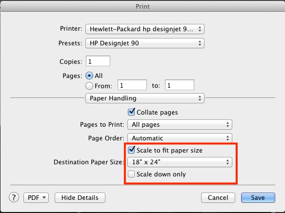
Then into SplitPrint and the required settings were made. I created a custom setting for 18″ x 24″ paper in the Print dialog of SplitPrint and told it to spread the image over four panels thus:


The SplitPrint tile settings.

Dry print runs:

Now 18″ x 24″ paper is not cheap and neither are ink supplies, so I first tested SplitPrint making a 16″ x 20″ print on my office monochrome laser printer using four sheets of 8 1/2″ x 11″ plain paper to see if things aligned and that margins were properly handled. You do not want the margins swallowing any content and neither my laser printer nor the DJ90 can make full bleed borderless enlargements. Margins are unavoidable and the inside ones will have to be trimmed off when assembling the four printed panes.

All went well but, ever cautious, I printed the first panel in color to the DJ90 on a test piece of 13″ x 19″ paper to check that everything was as expected and to verify that colors were true.


SplitPrint printer dialog.

This test confirmed good colors with a perfect match to my display thanks to the EyeOne colorimeter, so I loaded up the printer with four sheets of 18″ x 24″ premium glossy, checked that all the cartridges had ink (running out part way through will not make your day ….) and let her rip, telling SplitPrint to print all 4 images after setting it to use HP Glossy paper with bidirectional printing (‘Best’ quality). This takes a while, some 12 minutes a page, so I did the only rational thing possible. I took my assistant, Bert the Border Terrier, for a walk after the first page started coming out.

Tell me all you want about the romantic days of darkrooms, red lights, blackouts and poison chemicals, for me nothing beats the thrill of seeing a full color image emerging from the DesignJet in broad daylight.


The first pane emerges.

The final prints:

Here’s the finished article, with Bert the Border Terrier for size. I will mount these on acid free board, after trimming the borders (SplitPrint permits small overlaps and draws the cut lines on the images though I had no need of these) then attach all four to the wall, ready for a faux wooden frame. SplitPrint did a perfect job of aligning the images on each page. If it’s of interest I will paint the wooden frame in the colors of the Golden Gate Bridge itself! The paint codes appear below.

Bert and the untrimmed print(s).

Trimming and mounting:

Once the print borders are trimmed (carefully!), the prints are tacked to the mounting boards with the matching sides at the edges of the board. I do not own a 24” trimmer so have to remove the borders with a straight edge and Stanley knife. This is by far the riskiest part of the whole operation, rife with opportunities for error and injury. As the boards are very accurately cut this approach confirms that everything has been trimmed squarely. It’s either right or it looks schlocky. You can opt to leave the margins in place and install these as discrete panels on the wall but I find that sort of thing has been done to death and avoid it:


Tacked prints and boards assembled for dry run to check fit. 26″ bike wheel for reference.

Then it’s off to the dry mounting press to permanently heat mount the prints. Once that is done much of the risk of damage to the fragile prints fades.


In the dry mounting press at 200F. Border Terrier at 102F.

It’s at this point that you start thinking that Michelangelo had it easy daubing that ceiling.

The prints are dry mounted and ready for wall installation:

Ready for hanging.

I use glossy paper. Sure, it’s a pain to work with, fragile as heck and demands very high standards of cleanliness for it shows every blemish, but the result is unrivaled among paper prints for detail, resolution and punch.

Golden Gate bridge paint color codes:

Here are the color codes for those of you into the most beautiful bridge in the world; you can have the shade mixed at your local hardware store to paint any wooden frame you decide to install:


Color codes for the paint used in the Golden Gate Bridge. Click the image for details.

Speed:

There really are no shortcuts here. It’s hard manual labor. SplitPrint makes generating the four panes trivial but after that it’s an exercise in concentration and attention to detail. The next time I do this I doubt I’ll shave more than a few minutes off the total production time, which is several hours. Trimming and wall mounting are by far the most time-consuming steps.
How does it look:

In a word, stunning. While the viewer can get no closer than 10 feet to the print from the second floor landing, even at 2 feet resolution and detail rendering are to die for.
Gear:

Camera? Nikon D3x with the 24mp sensor. But, frankly, a 12mp D700 or any number of similar sensors (FF or APS-C) would be just fine for this setting, though the image would show lower resolution at the same ‘nose in print’ distance. There is more undiluted swill written about the need for high pixel count sensors than you could possibly imagine.

The lens? No magic sauce here either. An old 20mm Ai-S 20mm f/3.5 MF Nikkor – that’s the tiny one which fits in a jeans pocket, handheld at f/8. Mine is 1982 vintage and ran me $215. I added a CPU for $29. You spent how much on that plastic AF-S zoom?


Installed. Wooden frame to come. Prints below are 18″ x 24″.
Cotton gloves on the window sill are used to handle the prints.

Nikkor-H 85mm f/1.8 lens

Maybe the most significant Nikkor ever.


Shown with the period HN-7 screw-in hood.

If ever a lens deserves the appellation ‘famous’, it’s Nikon’s 85mm Nikkor-H f/1.8, first made in 1964. Nikon has made many f/2, f/1.8 and f/1.4 lenses of 85mm focal length since then, and while the current AF-S f/1.4 probably delivers the highest resolution of the lot, few would place the Nikkor-H far behind optically, and only non-users would argue that the current lens is better made. Much as with its contemporaries, the 20/3.5UD, 24/2.8, 28/2, 35/2, 50/1.4, 50/2, 105/2.5 and the 200/4, the construction quality, fit and finish of this lens have not been improved since.

None of the manual focus f/1.8 optics came with the Ai modification which permits mounting on later film cameras and most DSLRs. Nikon made (ugly and no longer available) Ai ‘kits’ which comprise a replacement aperture ring with the wrong surface finish, so if you want an Ai version of this lens you have three choices. Buy one which has already been converted, send it out for machining, or do it yourself. I did it myself and the task is simple. See this piece for details of how to do it yourself.

But ‘famous’? Why yes. Because this is the lens David Hemmings used in the studio scenes in Michelangelo Antonioni’s ‘Blow-Up‘ to photograph Veruschka while she writhed below him. His Nikon F with the Nikkor-H mounted can be seen in the contemporary poster.


Fame.

I have long lusted after this optic but good ones go for high prices and cheap ones are usually beaten up, the anodizing on the scalloped metal focus barrel worn away and ugly. Well, I finally snapped one up in near mint condition for $210 delivered, and when it arrived the other day I immediately set to machining the aperture ring to permit mounting of the lens on my D2x and D3x Nikons. I would love to have used it on a Nikon F but no digital version of that classic was ever made, and I no longer use film.

Amazingly, the filter size is the same small 52mm common to most Nikkors of that era and the HN-7 hood screws in. No clip-on nonsense waiting to be knocked off.

Comparison with the AF-D version:

I set to making a quick test using the local back yard utility pole as my test target. My test was against the ‘plastic fantastic’ 85mm f/1.8 AF-D lens, set in the most ghastly plastic mount imaginable, but of outstanding performance. This lens is still available new in the US for $460. How Nikon manage to make a bitingly sharp optic encased in ductile materials and cheese beats me, so I confess that I ran my simple test with some trepidation. Could any lens significantly improve on the AF-D or, for that matter, even match it? My Nikkor-H is positively geriatric, having been made in February, 1969, meaning 44 years ago. It cost me $212.

I should have known better than to worry. Central definition and overall contrast of the old lens easily beat those of the newer one from f/1.8 to f/4, and vignetting is identical, disappearing by f/2.8 in the old, f/3.5 in the new. Edge resolution in the newer lens is superior through f/4 after which they are identical. In a lens of this focal length, the ideal portrait lens on full frame, central resolution is what counts.

The focus throw on this lens is very long – fully half a circle from infinity to 3 feet, making accurate focus on close subjects easy. Depth of field is very limited at wider apertures so a slow focus ring is actually an asset.

Here’s my thrilling test target, what passes as utility service in the SF Bay area, allegedly part of the most powerful nation on earth. The old MF lens is the left hand image – focal length and maximum aperture are not reported by Lightroom (in the parentheses) as I had yet to install a CPU when this was taken:

Even viewed via this blog on the 11″ display of my MacBook Air the difference is obvious at f/2, remaining so at f/1.8, f/2.8 and f/4. The enlargement above is from 5 foot 90dpi equivalent print sizes.


Chipped and ready to go, one of Nikon’s best ever.

The CPU confers a host of benefits, described here and installation on the 85mm f/1.8 Nikkor-H is a simple glue-on job. One key advantage is that you can pass aperture control from the control wheel on the camera’s body to the aperture ring on the lens, sidestepping the non-linearity issue I explain here. Your kit will handle better too, allowing apertures to be changed by supporting the lens properly from below with the left hand. $29 for the CPU, 5 minutes to glue it in place and another 15 minutes to program it, as described here.

Can a lens make a better photographer? When it comes with a heritage like this and when the user revels in the operational feel and the results it yields …. well, you can make your own mind up. Me? I’m going to track down Veruschka’s granddaughter.


Veruschka writhes as Hemmings snaps.

Lens correction profile:

This lens is so well designed that what optical shortcomings there are – very minor vignetting down to f/3.5 – are easily corrected with my lens correction profile in LR or PS, which you can download here, but of all the pre-Ai MF Nikkors this one arguably needs a profile least. I can detect absolutely no barrel or pincushion distortion. Likewise, chromatic aberration (color fringing) is negligible, though the profile corrects what little there is. My profile was made at f/1.8, f/2.8, f/4 and f/5.6, with the last prevailing at apertures smaller than f/4. It works with both FX (Full Frame) and DX (APS-C) sensors. The profile was made on my D3x but will work on files from any Nikon DSLR.

To get a sense of what this lens can do in the studio, click here. The handling and balance on a modern full size Nikon DSLR are about as close to perfection as these things get. If you can live without AF, search one of these out.

Use on Panny MFT bodies:

A wonderful lens on the Panny G bodies with a $25 adapter, delivering 170mm f/1.8. Very shallow depth of field, and you retain aperture priority automation, the EVF never dims as you stop the lens down (think about that!) and you have a state of the art MF focusing aid which makes dead on focus trivially simple. Read more about the immense capability of the Panny MFT bodies with MF lenses here. As you are really cherry picking the center of the image circle produced by the lens, definition at any aperture all the way to the extreme edges is not an issue.


The Hemmimgs lens on the Panny G3.

A 1969 lens on a 2012 body, and fully functional. Pretty cool, huh?

HP DesignJet annual checkup

A little goes a long way.

My HP DesignJet 90, the 18″ carriage model, was commissioned March 14, 2006, so it’s approaching seven years in age. One recent print with a dark black silhouette showed less than perfect blacks and deep, lustrous blacks are one of the many strengths of this excellent printer. Amazingly, B&H still lists the 24″ DJ130 for under $1300 new, and all ink cartridges and printheads remain available on their site, though you may have to hunt about a bit for the special swellable paper which absorbs the ink dyes used by the machine. Regular modern pigment ink papers do not work.

The HP DJ30/90/130 series is blessed with truly outstanding diagnostics and a quick checkout was all it took to find the cause.

First, I dialed up the HP Maintenance Utility which uses online software at HP. For Mac users you have to use OS Snow Leopard or earlier or an even older PPC machine, as HP never updated the software to run on Intel machines. Snow Leopard comes with Rosetta, the PPC emulator software and will run the HP Maintenance Utility fine. Apple recently re-released Snow Leopard on DVD and if you want to run the HP Maintenance Utility on a modern Mac it’s your best choice, though whether it’s even installable on the latest Macs I rather doubt.

I use a decade old iMac which runs Tiger and uses a PPC CPU. Unlike its modern day descendants it does not overheat and refuses to die.

You can run all these print jobs using plain paper in your printer – 8.5″ x 11″. Here’s the Image Quality Diagnostic – this one can unfortunately be run only by using the online software and is the best for determining if a printhead is failing:

No real issues are disclosed here but printhead alignment is called for, judging my some of the colored squares in the center section. The full interpretive section for the above appears here.

Then I ran a printhead alignment which can either be done using the online utility or using the button presses illustrated here:

This did disclose a problem with the black printhead:

The large ‘X’ mark above testifies to a worn or blocked head.

Before deciding on cleaning or replacement of the head I ran the ‘Information Pages’ printout (see above) and got this:

Gaack! The black printhead is 2,534 days old, meaning 6.9 years. It’s the one which came with the printer when I bought it new in 2006! So rather than trying to clean it, I simply replaced it. Pigs get slaughtered.

After replacement of the black printhead – the new one has been on my shelf for ages and is already out of warranty! Some users claim that heads over 30 months old will not work but obviously my experience does not bear this out.

When a printhead is replaced in these machines, they automatically run a printhead alignment which takes some 10 minutes and requires one sheet of plain paper.

Here’s what I got:

All is well.

Finally, out of curiosity, I ran the ‘Paper Usage’ report:

Some advice on older DesignJet printers:

Would I buy one of these used? Only if I could see the Usage Reports and Diagnostics shown above. Many were used by printshops which have beaten the heck out of them. New heads – there are six – run $35 each and cartridges cost a similar amount, so all new heads and supplies total $420. Add $35 for feed tubes. No bargain. Further, if the printer has been unplugged for any period of time, reckon on changing the clogged feed tubes as I had to do when mine went into storage for a few months when I moved a few years back. I explain how to do that here.

Bottom line? I would not pay more than $200-400 for a lightly used HP DJ90/130 (18″/24″) printer, anticipating that some parts will have to be replaced.

Spare parts:

I get mine from Spare Parts Warehouse. The ink feed tube assembly runs $35 and is easy to replace.

Would I buy a new HP printer? Hell NO. I would not buy anything from America’s worst run business whose customer service is a joke. Buy an Epson. The 24″ model runs $3,000 but they will fix it for you when it breaks.

Result:

Success. Perfect blacks were restored.

Here’s the print which was giving me problems:

In the extract, below, you can see a tear sheet of the old print, before the repair, superimposed on the new – night and day:

Printhead failure and analysis:

I have illustrated this before but it bears repeating. Right after the annual checkup, above, the DJ started printing everything with a green cast. This indicates printhead failure as ink levels were fine.

Here is the analysis chart:

I ran the diagnostic report using the online HP utility and this is what I got:


Diagnostic report showing printhead failure.

Comparing with the above chart, you can see that the color patches at A1 (should be magenta), A2 (should be purple) and B2 (should be red) are faulty.

The chart states that A1=M, A2-C+M and B2=Y+M. Note also that the central patch in the left middle section is wrong – it should be magenta. M (magenta) is the common factor to all four error conditions, so I concluded that the Magenta printhead was faulty. $35 to B&H later and it was replaced (a 30 second task) – do insert plain paper when doing this as a printhead alignment chart will be automatically printed when a head is replaced, and the printhead alignment will be performed automatically. It takes some 10 minutes, so be patient. Sure enough, re-running the diagnostic report showed all is well and the DesignJet is back to perfect operating condition.

Are your images being stolen?

It takes a thief to catch a thief.

It seems incongruous that the arch-thief in American commerce, Google, should have crafted a tool which helps photographers seek out illegal use of their images.

It’s called www.images.Google.com and you have two choices to search for your image on the web:

  • Upload a copy of the image to Google
  • Input the URL for the image

Now the first approach has to be lunacy. Like giving a fresh needle and loaded syringe to an addict. So I opted for the second and searched for my wolfhound picture:


Absent a couple of non-commercial Tumblr illict reproductions – hardly of concern – one cropped up where the schmuck who stole my picture was using it to advertise his tweed clothing on eBay.UK (shock news that eBay might actually be involved in providing a conduit for theft).

So I wrote to the son of an unmarried mother in simple terms:

You may wish to use the thieves’ tool to catch thieves yourself.

Follow-up Feb 16, 2013: The thief has now taken my image off his site. May he rot in hell.

Nikkor 35mm f/1.8G AF-S DX lens

Cheep, cheerful, handy.


Mounted on the D2x with the included lens hood.

This ‘plastic fantastic’ APS-C lens sells new for under $200 with a 5 year Nikon USA warranty. Given Nikon’s repair reputation in the US that probably does not mean much but at the price asked with hood, caps and soft case, there’s a lot to like.

I bought it on a whim for those lazy days when I just can’t be bothered to use manual focus, assuming there was little downside.

Nikon wisely deletes the focus and depth-of-field scales from this optic, both utterly useless on modern AF lenses. It also has that handy feature where you can manually override the focus just by grabbing and turning the focus collar, something which is impossible with the previous AF-D series of optics. The included hood clicks on nicely, using a bayonet fit, and the lens accepts standard 52mm filters like most Nikkors ever made before the AF era.

I like this lens a lot. Focus speed is decent if not stellar but the biggest surprise in store is that it is surprisingly useful on full frame.

When images are loaded into LR or PS, the lens’s EXIF file data will invoke the Adobe profile which ships with their applications. That profile was created on an APS-C body and is very useful, taking out minor vignetting and fairly severe barrel distortion, which really has to be removed when snapping architectural subjects.

But you can do much better. Curious to see whether a profile created on an FF body would bring back the heavily vignetted corners, I created a profile using my D3x and Adobe’s Lens Profile Creator software. Because vignetting varies significantly with aperture, I went all in and made this profile at each of f/1.8, f/2, f/2.8, f/4, f/5.6, f/8, f/11, f/16 and f/22! 81 chart shots in all …. You can use this profile with both APS-C and FF files. It does a far better job on the latter than the one Adobe ships.

If you put the profile here on a Mac –

Replace ‘Tigger’ with your user name on a Mac.

– LR and PS will automatically choose it in preference to the stock one provided by Adobe.

The stock Adobe profile resides here on a Mac – there is no need to delete it if adding my profile in the location shown above.

The respective Windows locations are:

Windows 7 or Vista: C:\User\(User Name)\AppData\Roaming\Adobe\CameraRaw\LensProfiles\1.0

Windows XP: C:\Documents and Settings\(User Name)\Application Data\Adobe\CameraRaw\LensProfiles\1.0

You can find my enhanced profile here. On FF, extreme edge definition is excellent from f/4 through f/11. There’s a lot more to this self-effacing lens than meets the eye.

Here are before and after images on full frame where the lens really is 35mm focal length – ideal for street snapping, no sensor crop involved.. The first pair at f/1.8, the second at f/11. In each case the right-hand image is after applying my profile:


In the snaps below I used my lens profile with the APS-C sensor in the D2x.


Walking the pup. D2x, f/2.8.


San Mateo Post Office. In its usual schlocky under-capitalized way, this failing
business is letting a landmark heritage building rot into oblivion. D2x, f/2.8.


Bits missing and waiting to rot. D2x, f/2.8.


Inside the St. Matthew station USPO. No corner shading whatsoever using my profile. D2x, f/1.8.


Magnificent period detail. D2x, f/4.

Any Nikon APS-C body – such as the D1 and D2 series, the D70, D90, D100, D200, D300, the D7000 or even later bodies – constrained by a lower quality, slow kit zoom lens would benefit from this inexpensive optic. It has excellent resolution and can continue being used with few excuses once the user upgrades to an FF body, provided you also use my profile, above. Further, the discipline imposed by a fixed focal length lens, dictating proper composition before the button is pressed, can only enhance the snapper’s skill set and improve the results. Finally, it’s nice not to have to remember to limit this lens to APS-C bodies only if you use both APS-C and FF.

Some Nikons – the D3 series and the D4 – offer an optional 5:4 aspect ratio frame (too square for my taste) which crops vertical strips either side of the full frame. This format should have no issues with across the frame resolution using this 35mm lens.