Category Archives: Lightroom

Adobe’s masterpiece for processing and cataloging

The power of RAW

Two stops under does the trick.

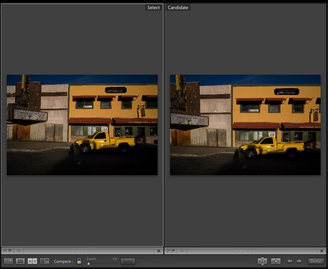
Because very high dynamic range pictures will result in burned out highlights, notwithstanding the fine CMOS sensor in the Canon 5D, I underexposed this one two stops (spot metered on the sky) then brought the detail in the foreground back with the processing controls in Lightroom. Here’s the Before and After – a very well engineered function in Lightroom allowing all sorts of comparisons.


Lone oak. 5D, 20mm. 1/4000, f/8, ISO 250. RAW.

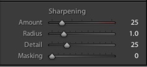
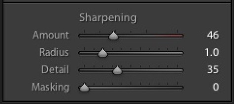
As the controls in Lightroom indicate, I had to add substantial noise reduction and sharpening. As the sun was directly behind the tree, regular exposure would have made the branches unrecoverable – sort of like halation in films of days past. This magnitude of correction could not possibly be done in a Jpg file. The histogram testifies to the complete absence of burned out highlights – there’s no crowding at the right end.


Adjustments made in Lightroom.

I also boosted the Tone Curve substantially in the shadows – this control is perfectly implemented in Lightroom – I used the small pointer tool, which you can see at the top left of the following screen picture,allowed me to see the tone curve in the shadow range by placing the pointer in the foreground of the picture. This helped me determine where to adjust. The dotted line shows the reference starting point.

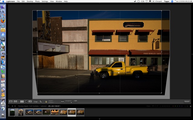
Here’s the final result after slight straightening of the horizon – the sunlight was quite blinding and it was not easy to see much in the viewfinder!

Once stopped down the rather ‘iffy’ Canon 20mm lens is free from color fringing, so no lens corrections were needed.

Lightroom defaults

Don’t forget to set these correctly.

One slightly frustrating thing about Lightroom’s menu structure is that preferred settings for how the application looks and behaves are all over the place. You would expect to see everything under Lightroom->Preferences, but that is far from the case. A last vestige of the truly frightful user interface enjoyed by Photoshop users for years.

I tend to prefer a really stripped down, minimalist look to the screen interface, opting for a minimum of distractions on the screen. Once you learn some of the most useful one-key short-cuts, then you will no longer need the top Apple menu or much of what clutters the side panels.

In the Develop module I right click on the left sidebar and choose to show only the Library and Folders. I have little use for Find, Collections, Keywords or Metadata Tags, so these are switched off. You cannot get rid of the Navigator selection at the top, but the very irritating flashing of the small picture preview as you go through pictures in the Grid view can be hidden by clicking on the small arrow to the left of the word ‘Navigator’. Because my photography is thematic, I do use Folders and sub-Folders named after the theme in question which, with my limited volume of pictures, works for me when trying to find something. Others will opt for keywording and dated folders. Here’s how my left panel looks in the Develop module:

The right panel is similarly stripped down – I have little use for Keywording or Metadata:

Like ‘switching’ can be accomplished in the other modules.

Much as I laud and respect the team which authored Lightroom, I do not need to be reminded of their names each time I boot the product, so I switch the display panel off by unchecking the first box under Lightroom->Preferences->General, like so:

In Lightroom->Preferences->Interface I get rid of the bizarre antique ‘Panel End Mark’ which Lightroom shows by default at the base of each panel, thus:

Now in File->Catalog Settings on the General tab, Lightroom comes with automatic file back-ups every thirty days switched on. First, 30 days makes no sense if you use the application more frequently. Your failing hard disk will not conveniently wait until your last back-up before blowing up. Second, if you are not making daily back-ups to a secure external drive, you are simply living dangerously. So I use SuperDuper! to make a daily bootable clone on an external Firewire disk and switch off this (now useless) choice, electing ‘Never’:

Still in the File->Catalog Settings menu choice in the Library (Grid) view, this time under the File Handling tab, Lightroom comes preset to discard 1:1 Previews after 30 days. Odd. It takes for ever to generate these when you import a lot of pictures and with the small increase in storage (my 40gB picture catalog creates a 6gB preview catalog) and given the vast increase in speed that 1:1 Previews add to the Develop process, you most certainly want to keep these. The third drop-down box is set to ‘Never’:

Next in File->Catalog Settings under the Metadata tab I leave the factory defaults for Metadata alone:

However, were I in the habit of frequent round trips to Photoshop and if I wanted my Lightroom edits to be automatically reflected in the Photoshop image, I would check the third box (‘Automatically write changes into XMP’) above. Otherwise, Photoshop will simply show the RAW unprocessed image in the database or the image as it was last saved. On those (rare) occasions where I do round trip to Photoshop I will do a file save (Command-S on a Mac) before round tripping, thus forcing Photoshop to show any Lightroom edits in its displayed image. If you check this box as a default, Lightroom will slow down as every change gets saved to disk. You don’t want that unless you are running on a Cray mainframe and work at Lawrence Livermore Labs. Meaning you have a super fast machine.

Finally, to get rid of the top white menu, I switch it off as explained here.

Now I have the lean and mean user interface I prefer.

Lightroom Tutorials

Go to the source.

I came across some outstanding tutorials on Lightroom in video format, authored by George Jardine, a member of the Lightroom development team at Adobe.

Click here for an index.

If you do nothing else, download and watch the one titled The Lightroom Catalog – Part 1, or “Where Are My Pictures?” which is definitive on how Lightroom stores files. Without a proper understanding of this you risk loss of files which are stored in disparate Lightroom catalogs.

There are also a lot of useful Podcasts from the Adobe team in the iTunes store, all free. Many are in video format and feature interviews with famous photographers like Peter Turner, Eric Meola, Jay Maisel and Jerry Uelsmann.

While we are at it, I have found an even simpler way of switching off all the panels that Lightroom displays to allow uncluttered picture preview. Simply hit the Tab key on a Mac. Tab again to restore. Finally, to remove the menu bar at the top, go into this menu selection and, henceforth, the menu bar will only appear on a mouse-over:

There does not appear to be a way of doing this from the keyboard. (A reader has corrected me – refer to Comment #1 – the ‘F’ key does this – thank you, Alastair).

Here is the result:

Lightroom soft proofing and printing

Soft proofing in Lightroom is easy.

I do not propose to address image cataloging and developing in Lightroom at any length in this journal as there are lots of tutorials and blogs out there that know a thousand times more than I ever will. Adobe even has a couple of video tutorials out there though they are really poor compared to Aperture’s slick offerings. While presented by real photographers, rather than blackshirts, Adobe opts for a folksy, joking style. The last thing I need in technical instruction materials, Adobe, is someone’s idea of what passes for humor. Just the facts, ma’am. You want humor, you read my blog, OK?

What I want to address here is soft proofing of your Developed Lightroom picture.

You do not need Photoshop for soft proofing if you use a Mac.

‘Experts’ will tell you that Lightroom does not offer soft proofing of the image, meaning the ability to preview the photograph on the screen with the relevant printer drivers invoked to show how the printed picture will look. (Aperture has soft-proofing built in, as does Photoshop).

A soft proof can look quite a bit different from the regular screen image as a print has a much narrower dynamic range than the regular screen image and also has its own color characteristics conferred by your printer and paper of choice.

If you are taking studio portraits then you really must use soft proofing as the eye is especially critical of accurate skin tones. The color differences are significant and easily noticed when switching between regular and soft-proofs.

Profiling your monitor:

The first problem is that monitors are rarely properly profiled – do this right and what you see in Lightroom is what the printer will print, allowing for the lower dynamic range of a print compared to a monitor.

Here’s how to properly profile your monitor:

1. If you can afford one, get a really good colorimeter like the Eye-One Display 2. If not, go to Apple System Preferences->Displays->Color->Calibrate. You must profile the monitor in the same light as you use to compare it to the print. Use daylight – artificial light will give erroneous results as it is missing many colors in the natural light spectrum.

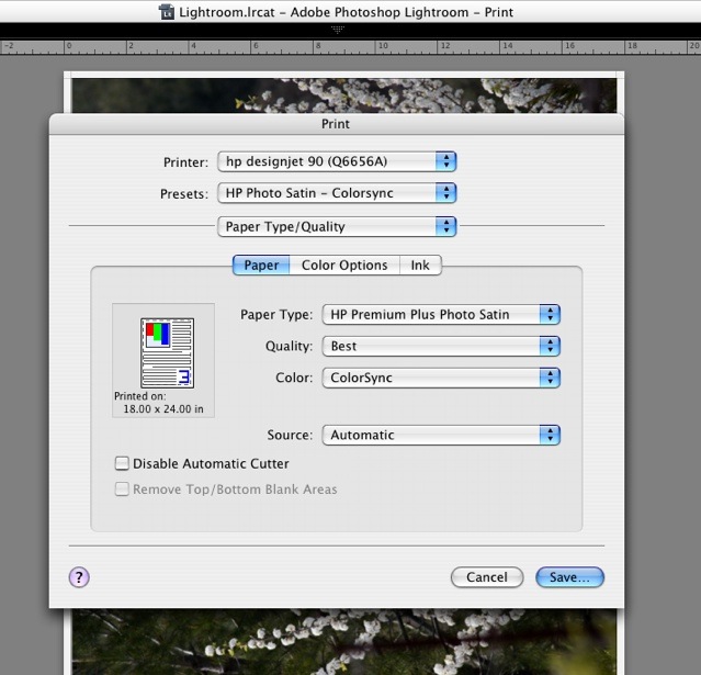
2. In Lightroom, make your adjustments to the image and make a test print. While there are two ways to work with printer profiles – Lightroom Managed or Printer Managed – I find that Printer Managed gives marginally truer colors – there’s little in it. So when in the Print module of Lightroom, you need to set the program up for Printer Managed colors, like so:

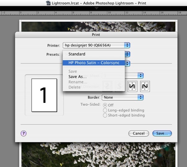
3. When you click on Print, set up the printer to use Colorsync, Apple’s color management utility.

Make your test print (use a familiar person as a subject with flesh tones) after checking that you have chosen the printing paper you are using – this forces the application to use the relevant printer driver. The printer cannot know which paper profile to use if you do not tell it. That is what Lightroom means in the previous picture when it states “When selecting ‘Managed By Printer’ remember to turn on the printer’s color management in the Print dialog box before printing”. (Frustratingly, Lightroom defaults to ColorSmart/sRGB and I can find no way to permanently save the Colorsync choice in a Print Template – meaning you have to choose Colorsync every time you want to print).

4. Now compare your test print to the image in the Lightroom Print module. They will not match.

5. You must now fine tune your monitor color profile. The printer is doing what Lightroom is telling it, but the monitor is not properly profiled for your environment. It is still not displaying colors correctly. Go back into the Apple System Preferences->Displays->Color->Calibrate tool, making sure to choose the display profile you saved in step 1, above, while keeping the Lightroom screen display unchanged. Now work through the Apple software again until what you see on the screen matches the print you just made, wrong as it is – hold the print up to the screen. Doing this at night with incandescent lighting is a complete waste of time.

The key adjustments are Target White Point and Target Gamma. Forget everything you have read about setting your screen to a specific color temperature or to a gamma dictated by some academic. Academics do not make prints. Use your eyes to get the best color match. I ended up with a Target Gamma=1.75 and a Target White Point =6707K. Whatever. Meaningless numbers.

Save the revised profile – you have now matched the monitor profile to the test print.

6. We are done with the test print. Discard it.

Soft proofing:

a. Now go back to Lightroom, choose the Develop module, and adjust the tones to your satisfaction.

b. In the Print module choose Print->Preview. Check the Soft Proof box at the lower left of Preview. This refreshes the display in Preview, forcing the image to use the printer paper profile you elected earlier (see #3, above). To confirm you are using the right paper profile, hover the mouse cursor over the words “Soft Proof” and the driver will be disclosed as in the following screen picture.

You are previewing a soft proof of your photograph which shows what the printer will print.

c. If you don’t like what you see, re-Develop the picture and try again. Do not even think of changing your monitor profile.

d. Make the final print. No need to return to Lightroom – just click on ‘Print’ at the lower right of the picture in Preview.

* * * * *

I get a near perfect match using this technique, and have no need of a colorimeter to effect proper display profiling – my eyes and Apple’s built in tools tell me what I see. In fact, I have found this method to be so powerful that I am going back and reprinting several 18″ x 24″ prints hanging on the wall which simply were not quite right with regard to color fidelity, contrast and brightness. Spot on results every time from originals of widely differing tonal and contrast ranges.

The monitor I use with my MacBook? No, not a mega-bucks Apple Cinema Display – a dirt cheap ($235 at the time of writing) Samsung 216BW, 21.6″ diagonally and with 1680 x 1050 pixel definition. Heck, the articulated wall arm I use to mount this on the wall ran me almost half the cost of the monitor.

The print module in Lightroom is really well implemented in most other respects, not least in its ability to support multiple disparate pictures on one sheet of paper (Command-click non-contiguous images to select them in grid view, then go into Print view, electing, say, the 2×2 template).

Bear in mind that Lightroom is just one year old and is still in its first commercial iteration at v1.3.1. And it’s not as if I am the first person to note the absence of soft proofing within Lightroom, so you can bet Adobe knows of the issue. I would expect them to offer soft proofing within the application in the next major release. But it is not essential if you adopt the approach above and it’s not like it’s a big deal if you use Colorsync.

Now all I will need PS for is to correct lens distortion (Adobe may even add that in Lightroom) and for de-fishing fish eye snaps – though Comment #8 here suggests CS3 can do this. As I use the ImageAlign plug-in in CS2, I’m happy to save my money. A round trip to PS CS2 from Lightroom takes 60 seconds.

And if you think Adobe will cut the price of Lightroom by $100 to $200 like Apple did with Aperture, don’t hold your breath. Apple’s move smacks of desperation. Adobe has no need to cannibalize its pricing if it’s the only game in town and selling like hot cakes, though if they do drop the price all photographers will cheer. Investors may not.

Lightroom on an older Mac

It still cooks!

You can read about how to migrate from Aperture to Lightroom here.

Given the great speed and smoothness of Lightroom on my MacBook (1.83gHz Intel Core2Duo, 2gB RAM, Intel GMA950 graphics card, OS 10.4.11) I thought it might be fun to try it on my old iMac (1.25gHz IBM G4 PPC, 1gB of RAM, OS 10.4.11). This is the elegant ‘screen-on-a-stick’ design after which the iMac’s ergonomics went downhill – the poorly thought out stands on the current crop (G5 and later) need a couple of thick books to raise the screen to the right height. We keep that old Mac around in the living room primarily as an email and Internet browser for guests. The screen is superior too – far less color change occurs as you move your head. Needless to add, Aperture will not even run on this machine which uses a GeoForce FX5200 graphics card. Finally, it’s further distinguished by having a proper, horizontal disk drive which not only accepts 3″ discs (put one of those in your MacBook and it’s toast) but also burns DVDs (an option I avoided, to save money, on my MacBook). Unlike the disc slot in my MacBook, which refuses to read discs 50% of the time, this one really works. So much for progress.

Therefore I loaded Lightroom on the old Mac and tried to access my library of pictures by neworking the two. Well, Lightroom reported that it does not support networked volumes, meaning the drive has to be hard wired to the computer running Lightroom. No problem. I plugged the hard drive with the Lightroom database into the old Mac and fired her up. Loading the largest picture in the database – a 100mB TIFF file – was a snap. It takes a few seconds longer than with the MacBook but thereafter the processing controls that so dog Aperture – spot retouching, cropping, horizon levelling – were every bit as smooth as on the MacBook. The dead reliable iMac is some five years old, the MacBook has but a few months (and one repair already) on it.


The wonderful G4 iMac

So anyone running a machine of this vintage and thinking of using Lightroom should be just fine. If your Mac is even older and you are running Lightroom on it, I would be interested in your comments. There are many fine G3 Powerbooks still in daily use out there.

So, finally, a proper break with the incessant, money wasting, perennial hardware upgrade cycle dictated by Apple’s software design. And now I have total redundancy (hardware and data back-up) if my MacBook breaks down again – I wouldn’t be betting against that given my recent experience with Apple’s poor quality control.

Note that both machines are running the last version of OS Tiger (10.4.11). I have not upgraded to OS X Leopard (10.5) as I try never to buy ‘first of breed’, preferring to let others act as Apple’s unpaid guinea pigs. Indeed, there are many comments out there on chat boards that suggest that Adobe (or Apple – much finger pointing here) has work to do to make Lightroom render colors properly with Leopard. Additionally, all this user sees in Leopard is glitz and gloss, with little improvement in the way of function. Just like Aperture 2.0, in fact.

Aperture on a G4 machine? Fugghedaboutit! Neither that graphics card or the G4 CPU are even supported.

For those photographers out there looking to migrate their Lightroom application from Windows to a Mac (a trivial process requiring copying of your picture files and installation of the Mac version that came on your disc), there are some superb, lightly used, bargains to be had out there in G5 iMacs, Powerbooks and MacPros. A great way of fighting back against hardware upgrade tyranny. The LCD screens are reputed to be better than those on many current models (my G4 iMac testifies to that) into the bargain.